Taylr
Interaction Design, Visual Design, Hackathon
Spring 2017
Overview
In February 2017, I attended my first hackathon, HackBU. My team and I created Taylr, a personal assistant for interview prep, tailored just for each user. After 24 hours of hacking, our team won awards for best design and first place overall.
Teammates
Md Islam: back end
Akash Kothawale: back end
Rohit Kapur: front end
My Contributions
I worked on the Interaction and Visual Design. I created a set of branding guidelines for our product based on goals and our established target users. My design process began with whiteboard brainstorming, establishing the user flow, hand-drawn wireframes, digital wireframes, full visual mockups of each page, as well as work on the front end with HTML and CSS. There were a lot of challenging UX problems to solve in terms of the dashboard and presenting the data in a clear and beautiful way. My main UX goal was for Taylr's users to have a simple and delightful experience.
Problem
As college students, we have gone through the process of interviewing for jobs and internships. Through the on-campus career centers at our universities, we had access to some forms of resources available to practice interviews for prospective job and internship opportunities. Nonetheless, we realized that many job seekers are not as fortunate as we are. We set out to find a way for every job seeker to have easy access to a critical job-finding resource, like interview practice. How could we make interview practice accessible to all?
Concept
Taylr, true to its name, tailors users' interview skills to help them get better at interviews and help them understand their mistakes and make improvements.
Enter some quick questions about the type of interview you'd like to test out, your name and phone number and get a call from Taylr, our interviewer. Taylr will ask you a set of questions which you will answer in real time. Following the interview, Taylr will send you a link to view a dashboard in a simple, sleek and responsive UI to view in-depth analytics about your speech and sentiment.
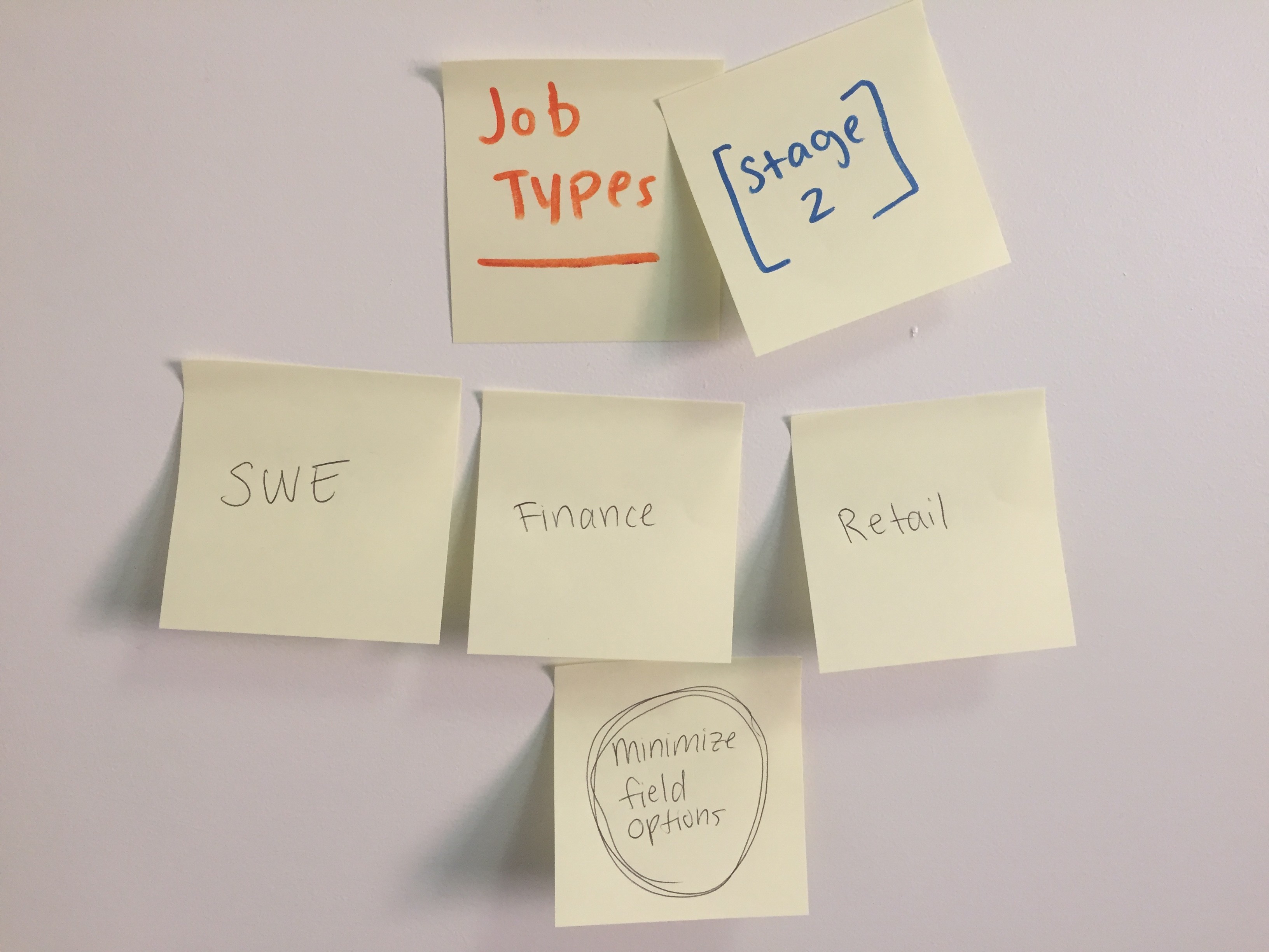
Brainstorming
We began our dev process by brainstorming some broad features for the app.
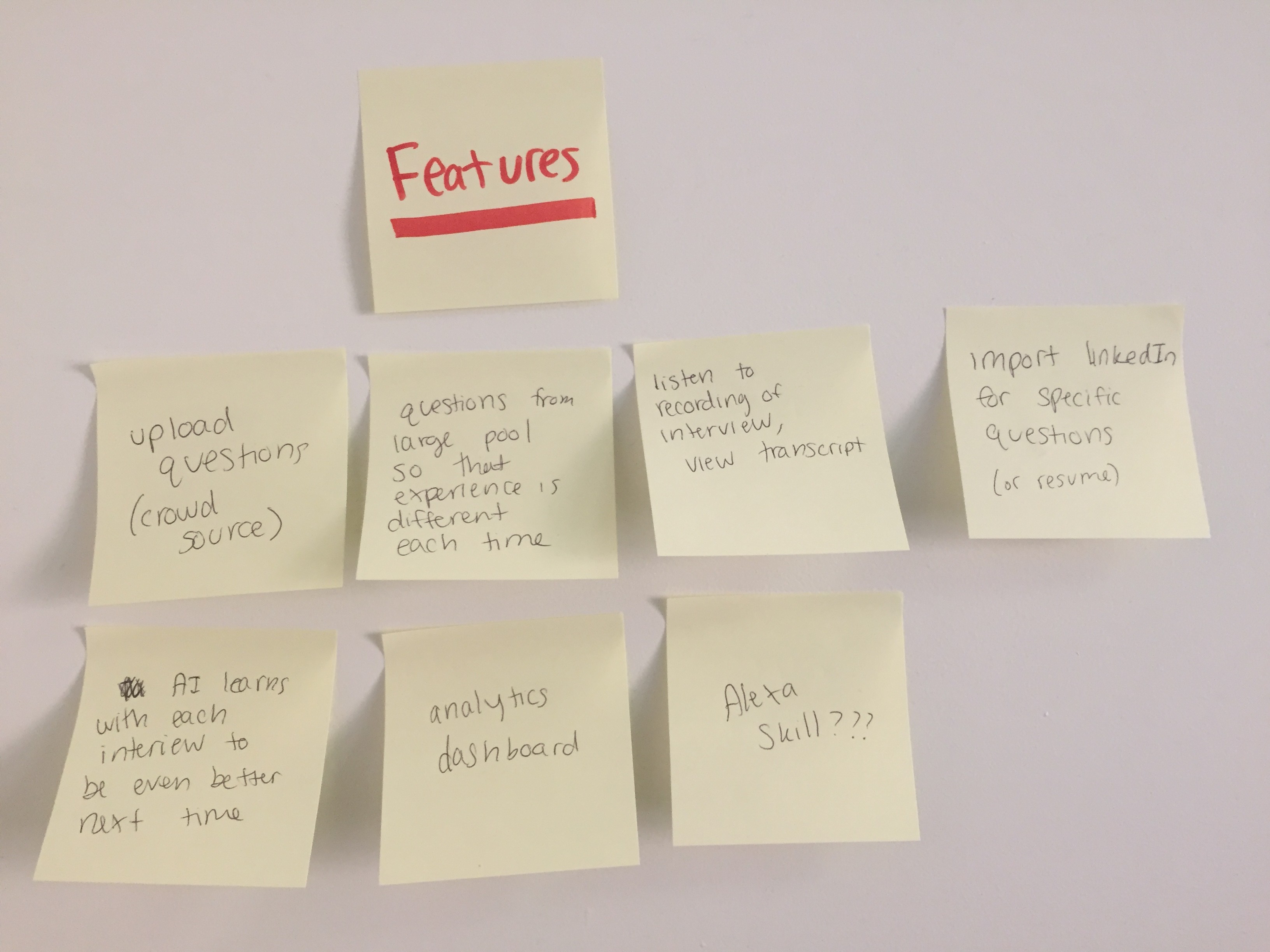
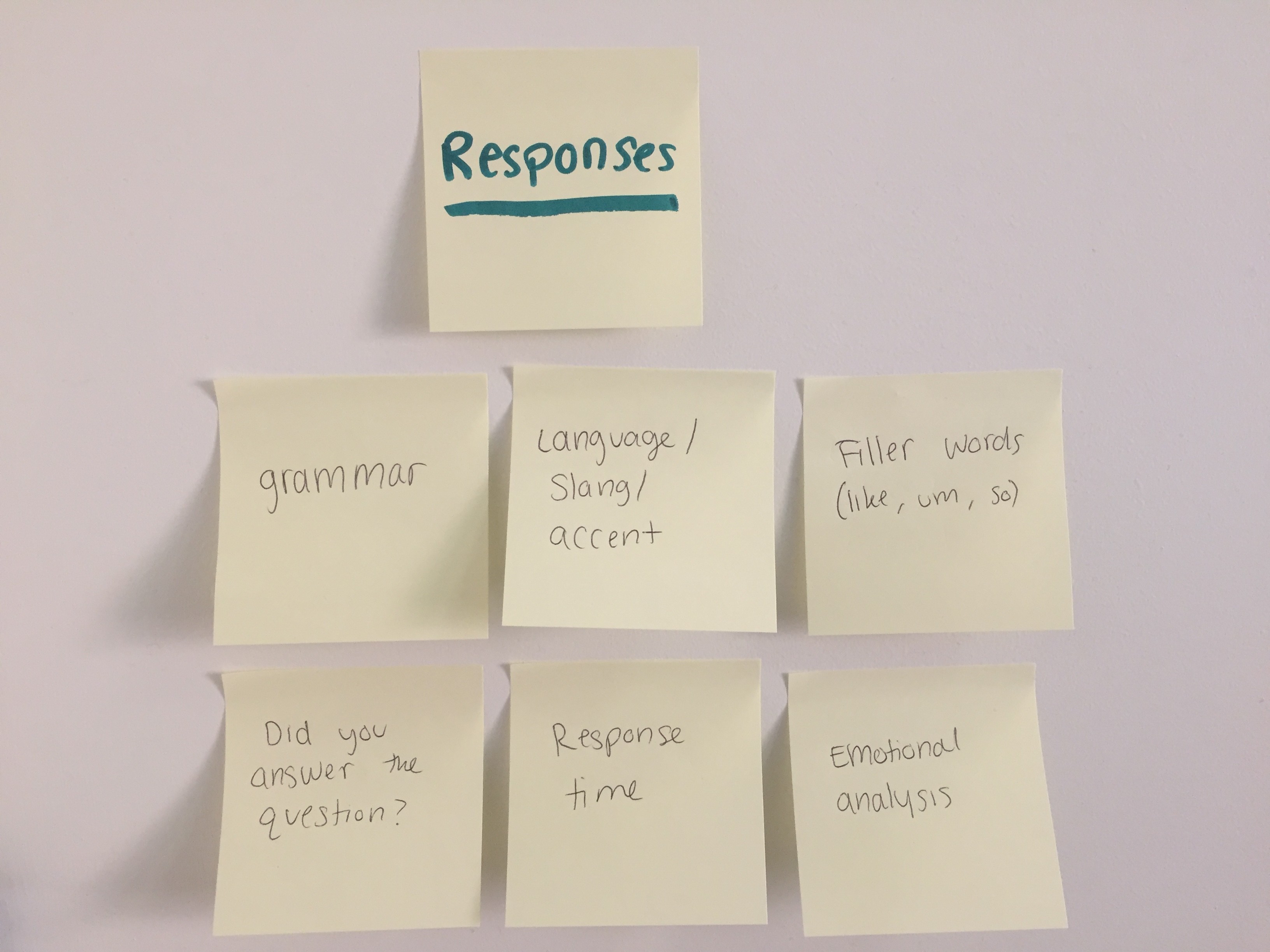
In order to consider the Taylr experience in terms of the entire process, we began thinking of ideas for the end of the experience. What would the end goal look like? In what ways could we solve the problem for our users and provide them with meaningful feedback to help them improve? We brainstormed potential response types.
User journey
The first step of the design process was to define the user's journey through the entire experience. We created two entry points for the Taylr interview: the first is via the web app (followed by a phone call) and second through an Amazon Alexa skill.
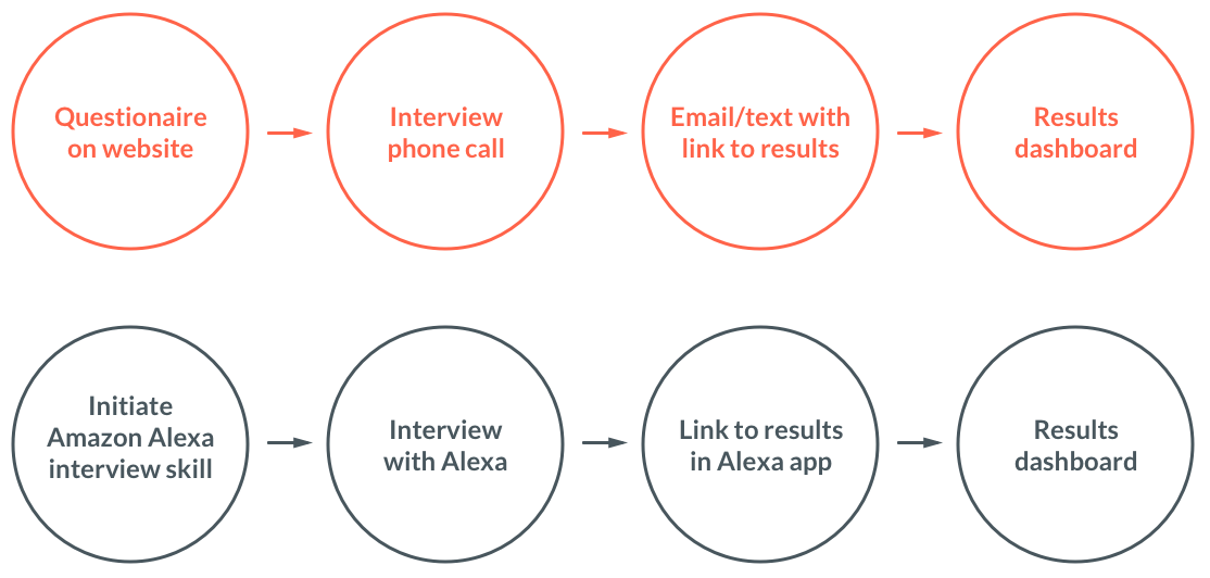
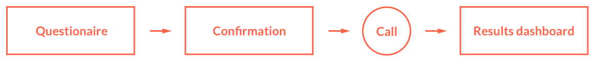
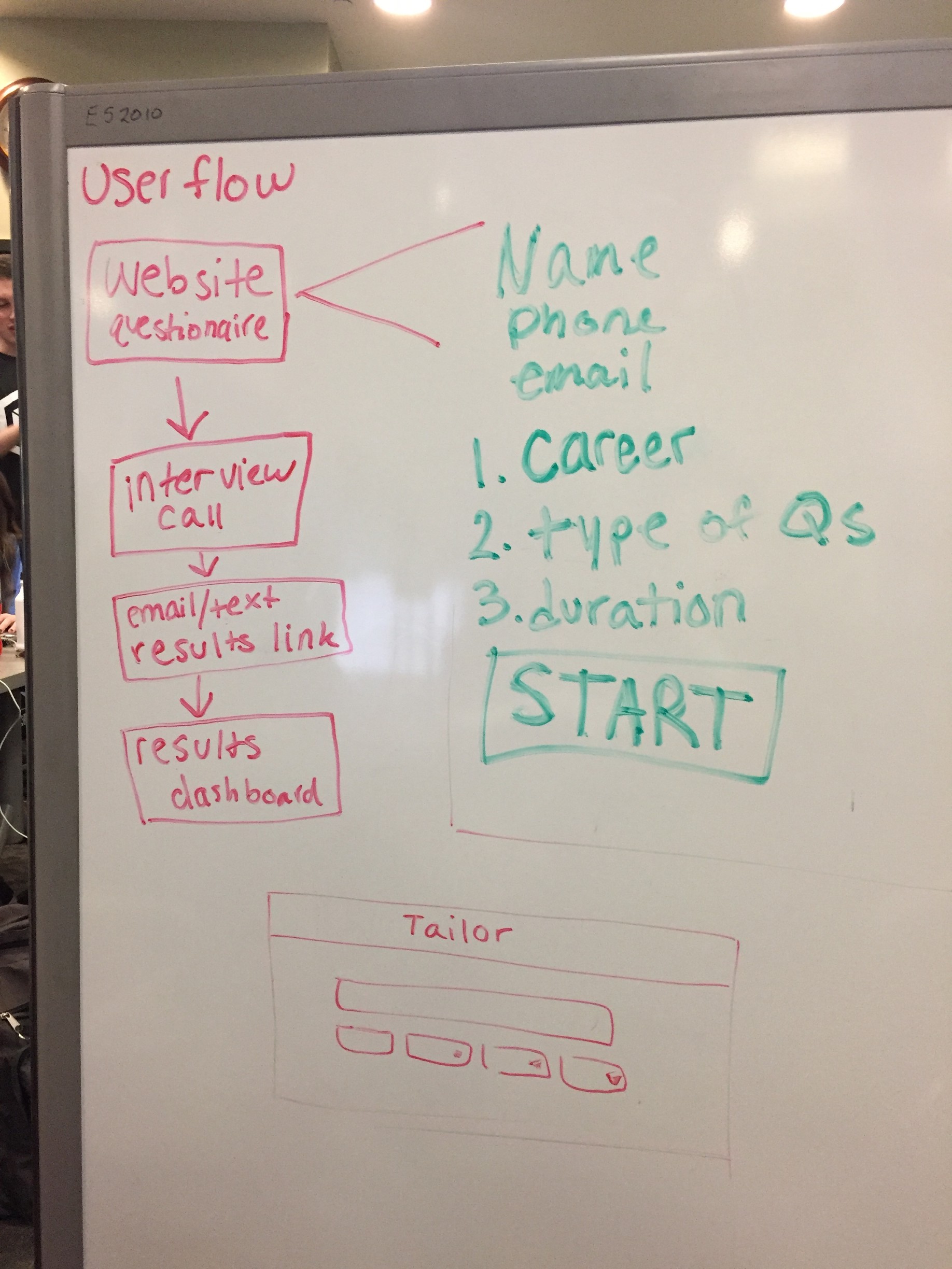
For the first user journey, I outlined the sitemap for the user's experience interacting with the app's interface. Initially, I created a very simple map for the user: the user fills out the questionnaire, sees a confirmation page, does the phone call, and then interacts with the dashboard.
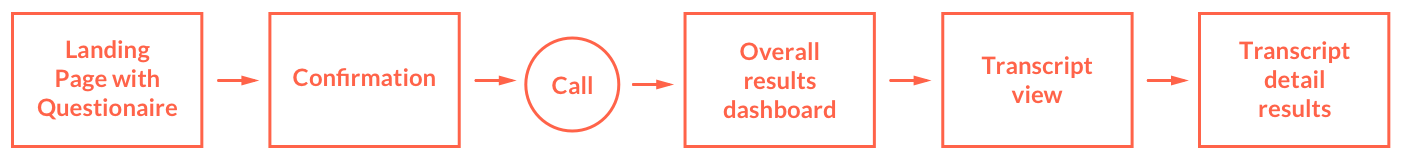
However, after I began designing and realized the scope of the information that would be available to a user in the dashboard, we decided to split up the dashboard into multiple pages. Because the interview's transcript has the potential to be very long, the initial dashboard would just show a preview of the transcript but could see the full text on the next page. Additionally, without much additional work from the back end, we decided to add an additional dashboard of analytics for each of the questions/responses throughout the interview.
Identity
Our goal for Taylr's visual identity was to make the product seem both friendly and professional. The visuals used on the web and mobile app would set the stage for a user's expectations through the rest of the experience.
Since the creative process for designing a product's identity is time-consuming I began the process early on in the hackathon and came back to it regularly. I began with a more text-based approach, with abstract geometric shapes and sharp corners to focus on the high-tech aspect of the artificial intelligence. Throughout my process, I created designs that were friendlier with more rounded and organic shapes.
Text-based approach:
Icon-based approach:
Final Logo
It was a challenge to create an icon for a smart phone interview, a concept that has no physical visualization. I settled on the phone, the main physical object used in the user's experience. I also used lines coming out of the phone to represent the graphs in the interview's analytics dashboard. Designing the identity was a collaborative process with frequent brainstorming and feedback from my teammates.
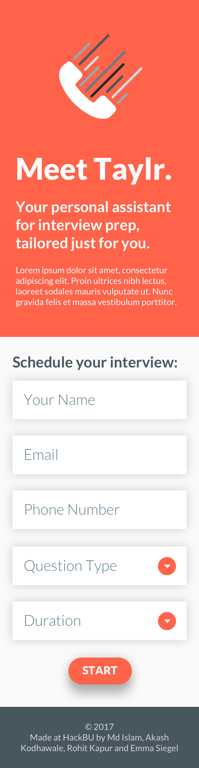
Landing Page
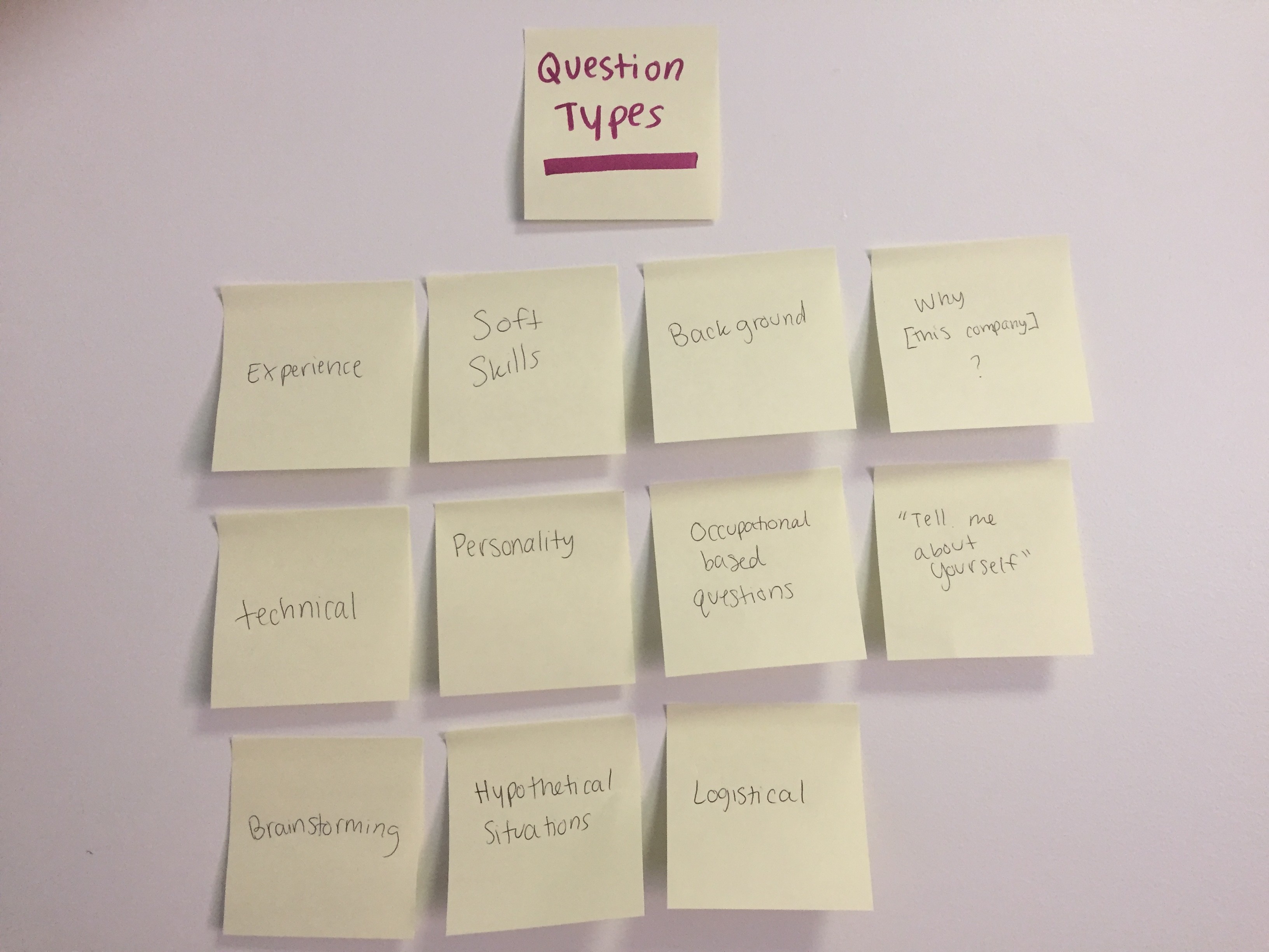
The first step of the user's experience is the form that they fill out to give Taylr some information and to request the interview. To create the form, we brainstormed what the potential options would be for personalizing an interview.
I then created digital wireframes for both the mobile and desktop experiences. Our front end developer began creating the web pages while I simultaneously worked with him to perfect the visual style.
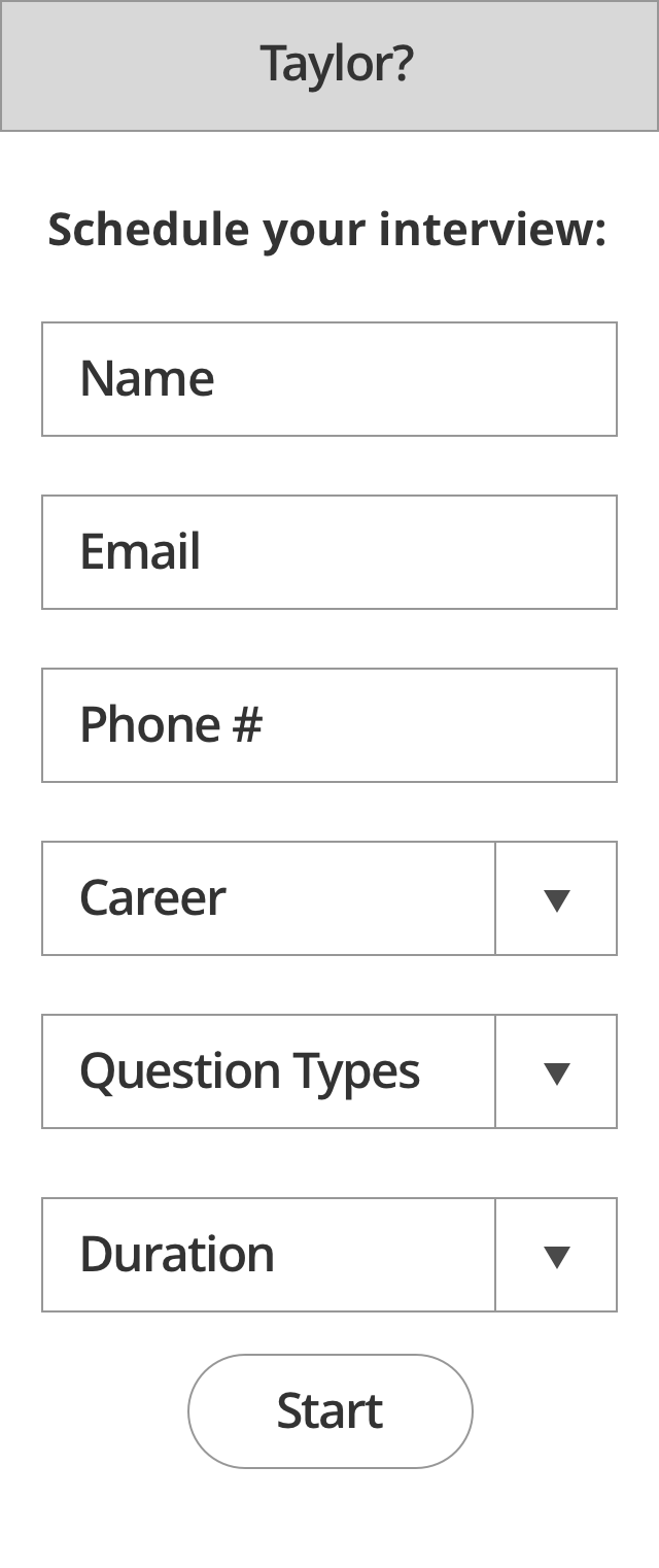
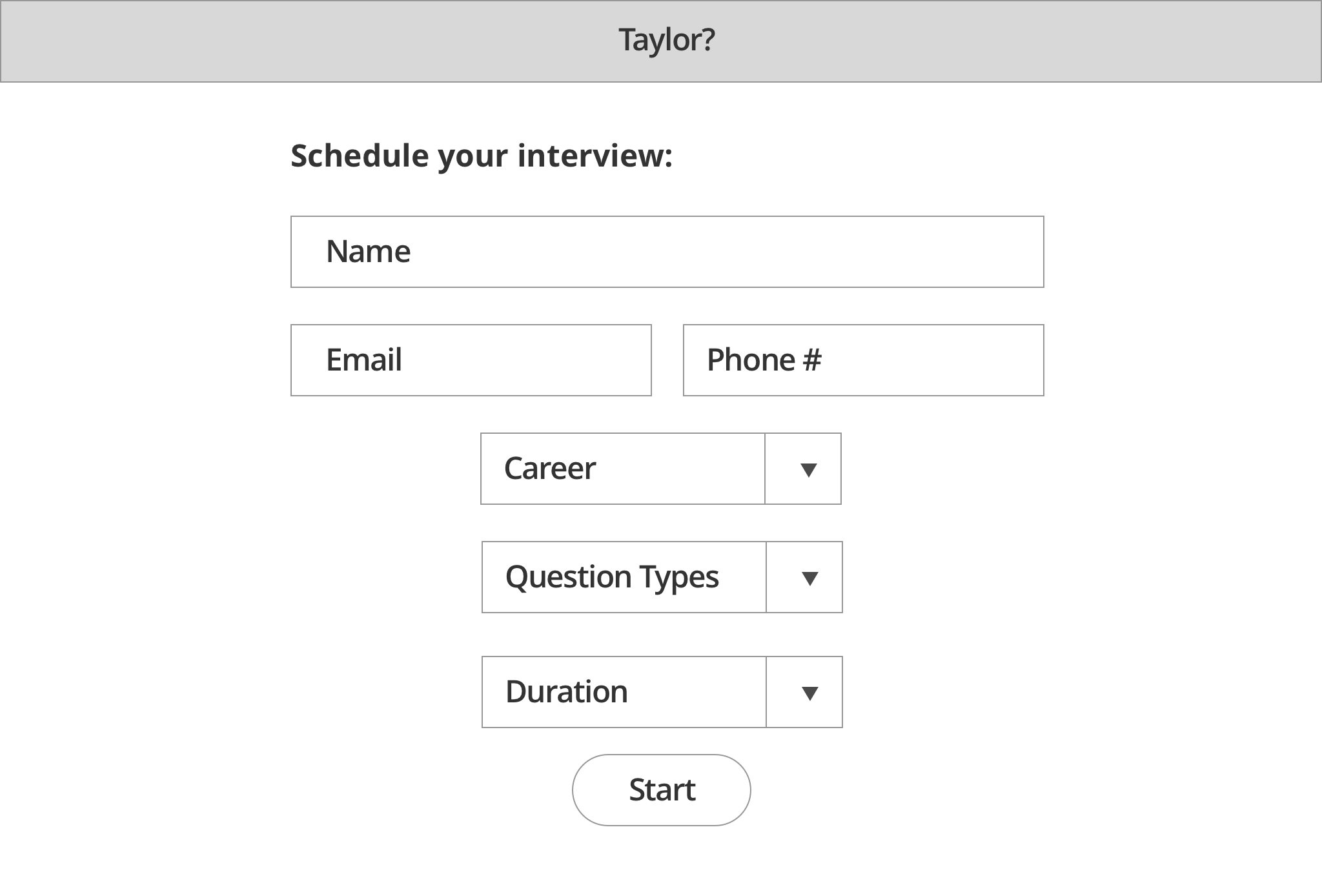
The first high fidelity mock ups were merely stylized versions of the wireframes.
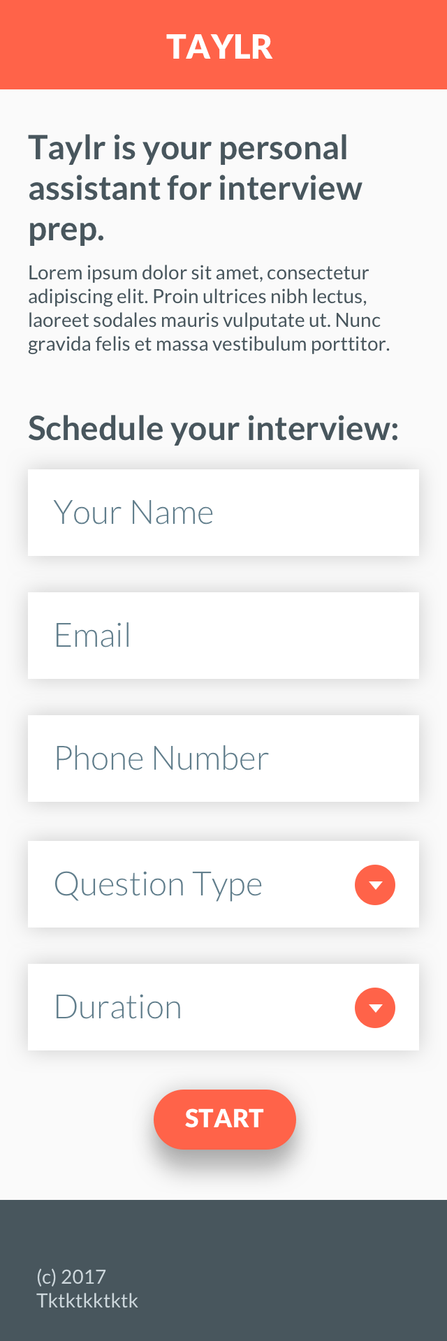
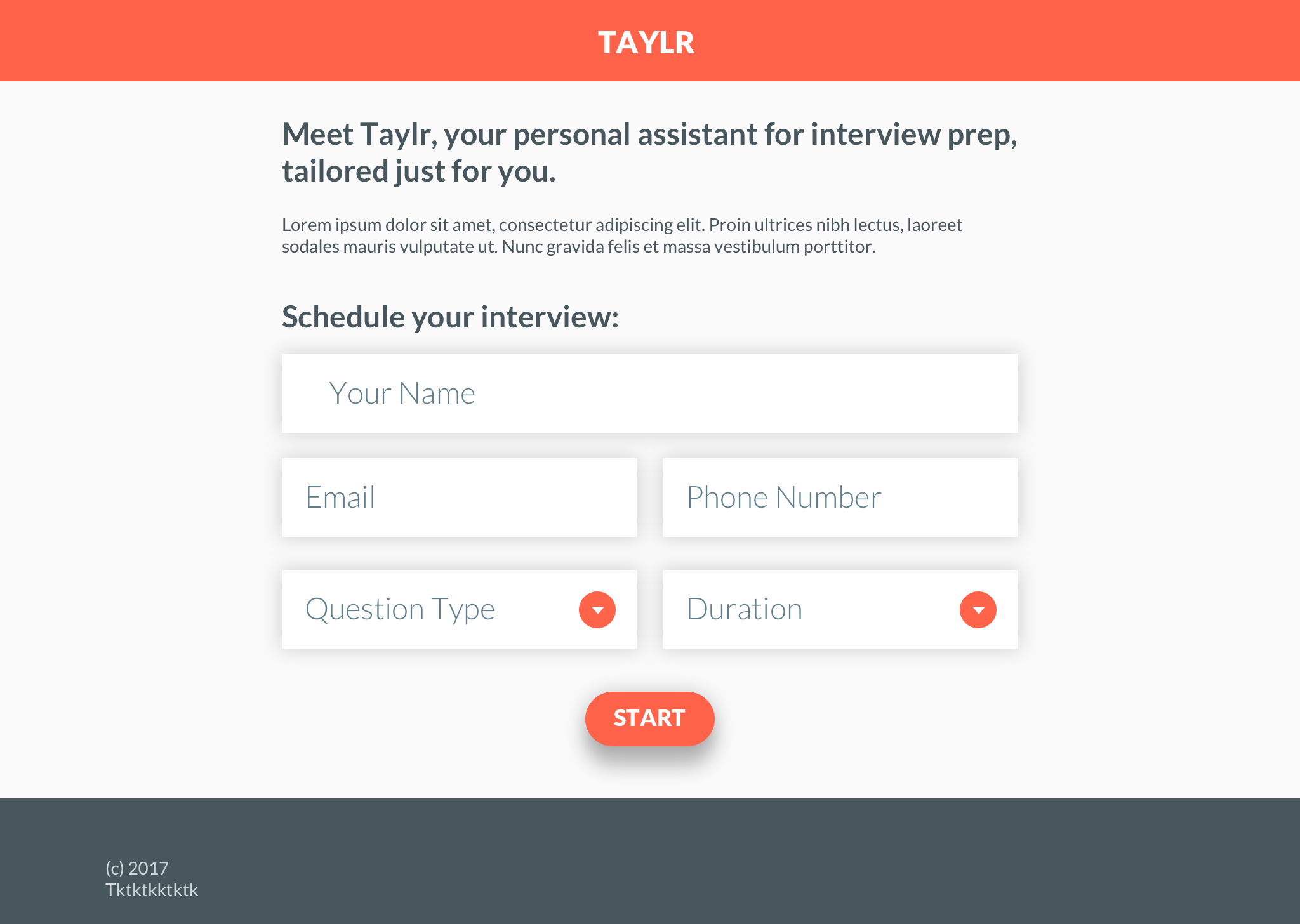
Later on in the process, I came back to the form page. This screen would be the first page that the user sees in their experience and so it had the potential to become an informative and beautiful landing page that would give users a first impression on the product as well as get them immediately started in the experience.

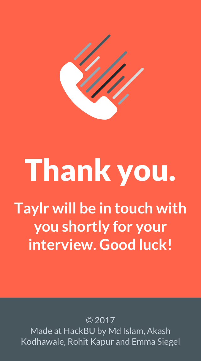
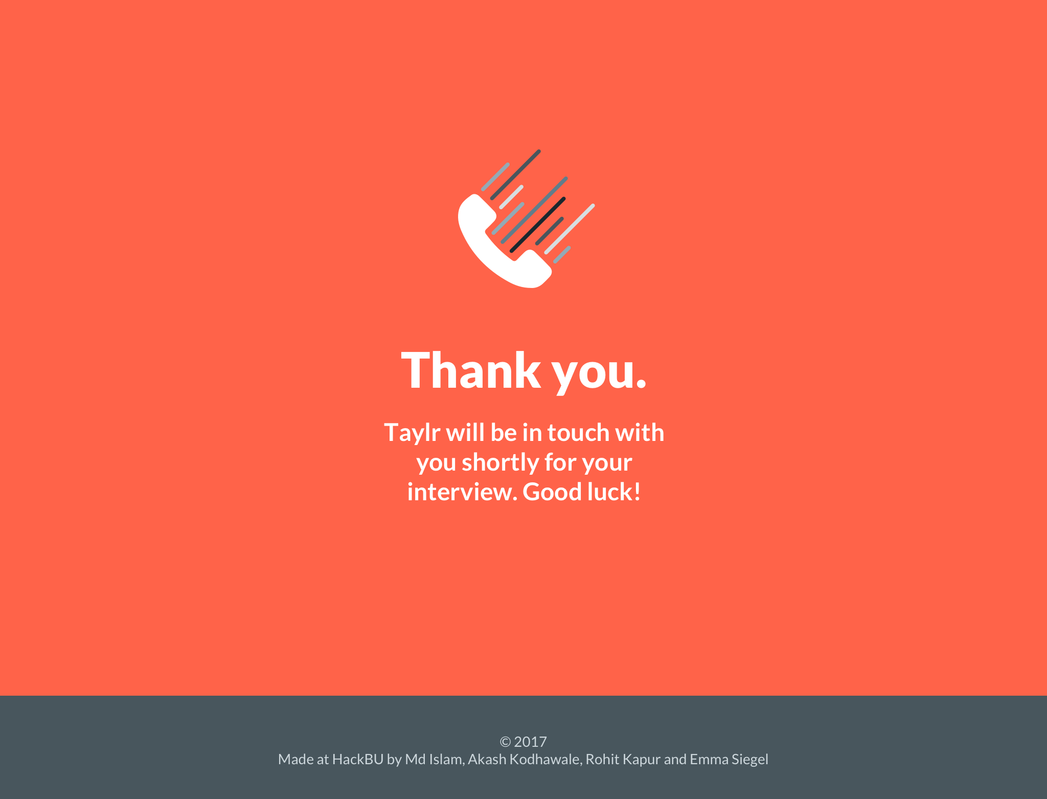
Confirmation
After the user fills out the initial form and requests an interview from Taylr, the user is brought to a simple and delightful confirmation page.
Interview
After receiving confirmation of the interview request, a user would receive a phone call where Taylr would initiate the phone interview. This would also be the point at which Amazon Alexa users are entered into the Taylr experience.
The back end for the Taylr phone interview was built with Twilio's API to call the number and start the phone interview. The user then responds to every question asked by Taylr, who takes all the responses and analyzes them.
Lastly, Taylr sends an email (or a notification in the Amazon Alexa app) with the URL to view the results.
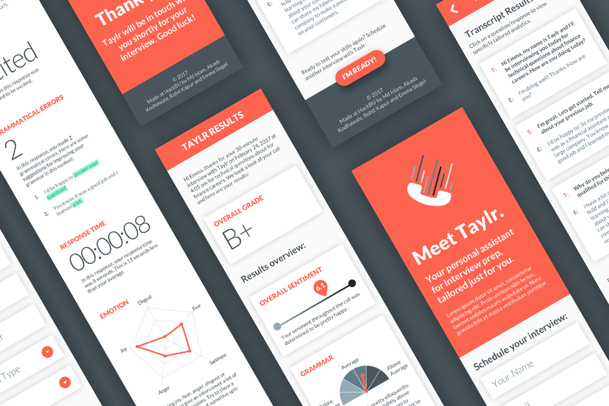
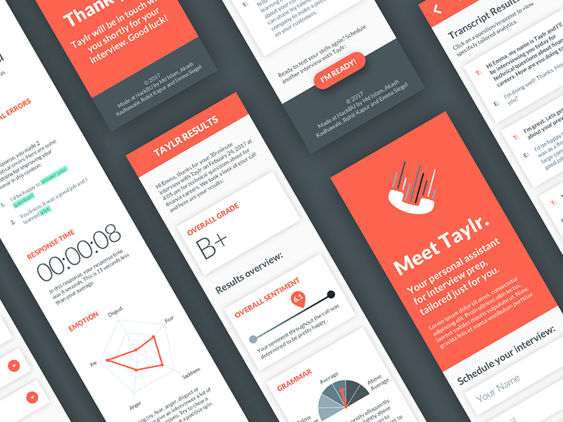
Results Dashboard
We began to brainstorm ideas for the results dashboard in terms of response types. We thought of ideas both that we knew would be technically possible as well as ones that were more of a moonshot in terms of our 24-hour hackathon timeline. The overall question we were answering for the user in terms of the dashboard was, "What did I do well and where can I improve?"
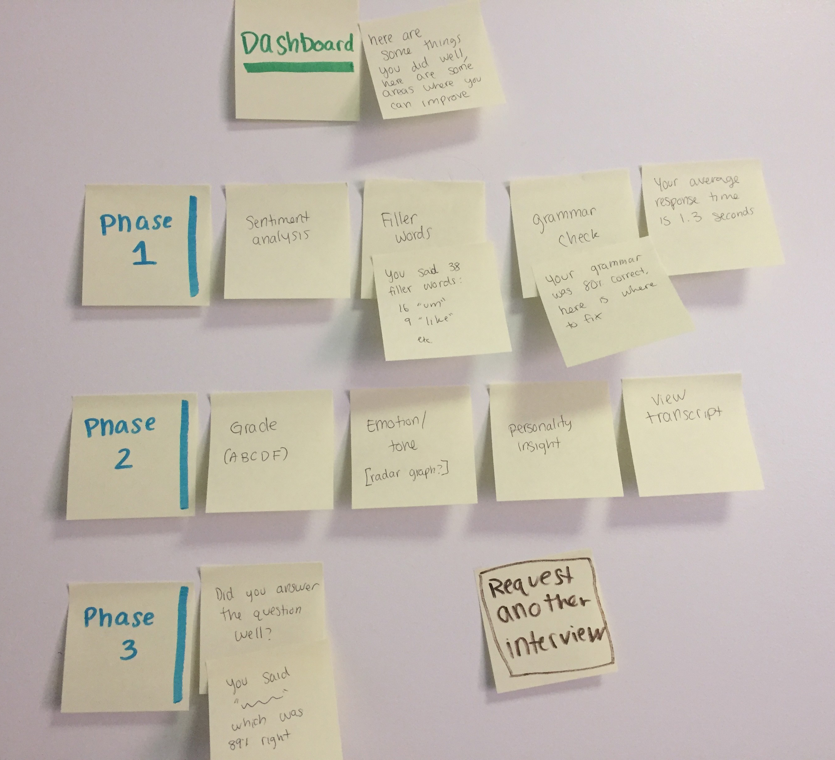
One of the biggest design challenges I encountered in the Taylr process was figuring out how each data point could be best represented in the dashboard. Users may get overwhelmed with lots of numbers and graphs, so it was my job to present as much data as possible in a very clear and communicative way.
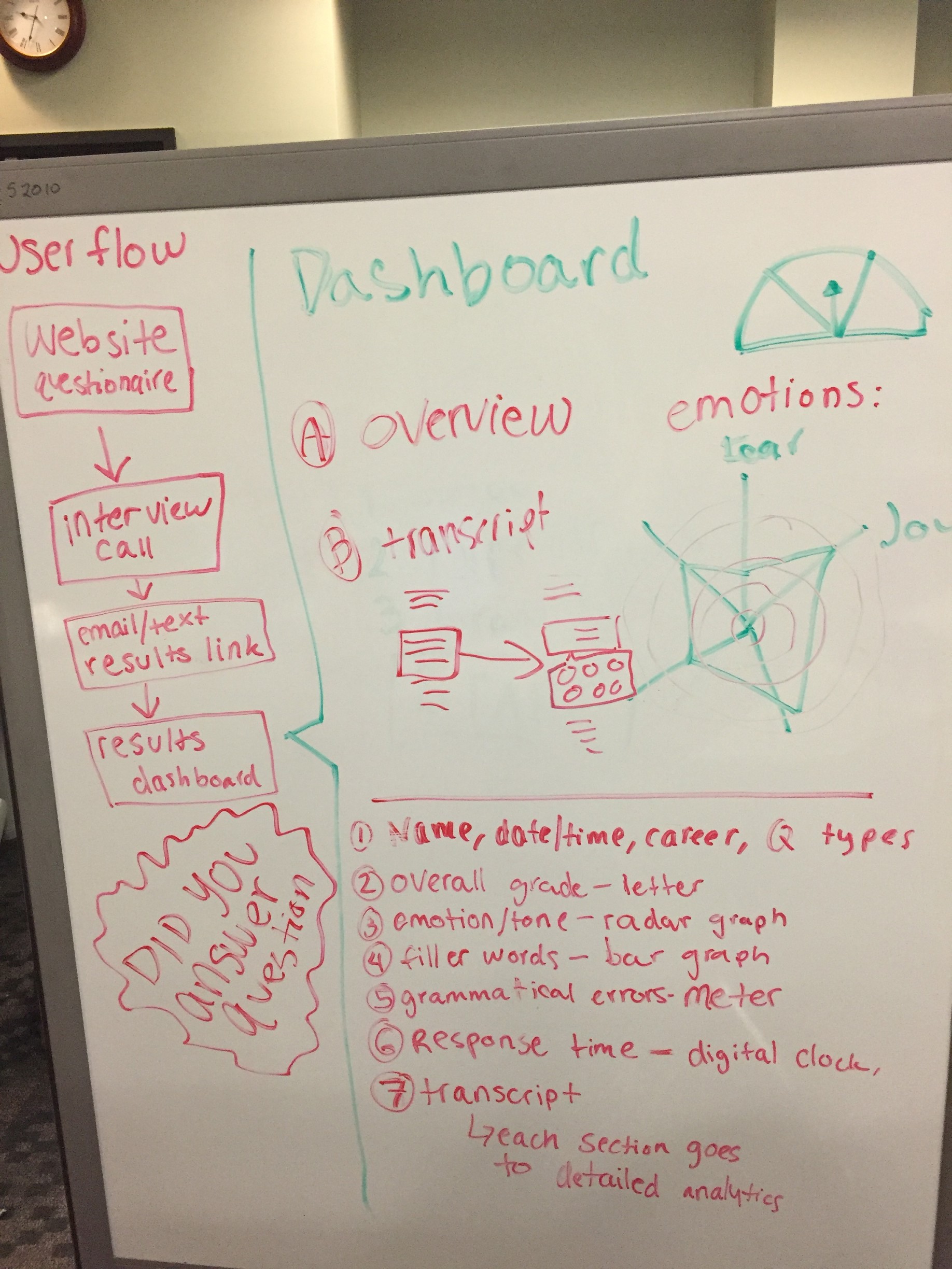
After generating a list of potential data visualizations, I moved on to creating wireframes for the dashboard. Keeping in mind my goal of simple presentation of information, I decided to use a card approach to show each data point as a separate item. I felt that this would help users digest the large amount of information into smaller quantities.
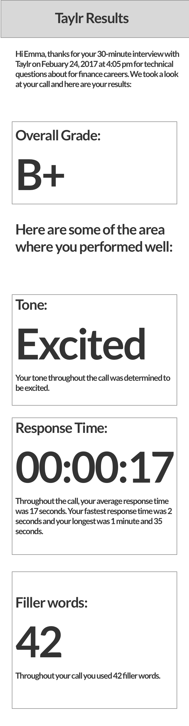
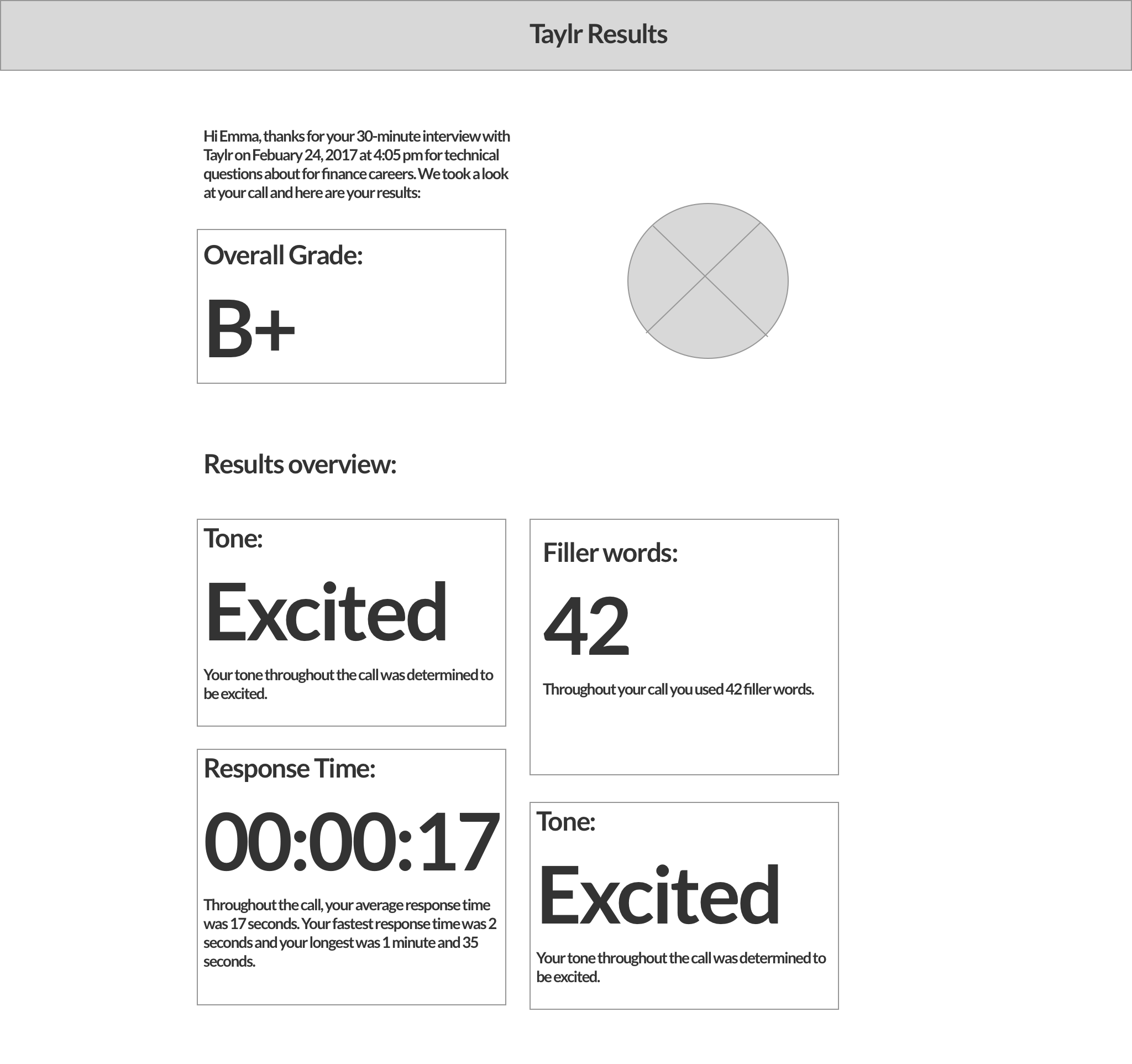
In terms of high fidelity mocks, I implemented consistent visual design as the landing page and tried out different ways to design the data visualizations.
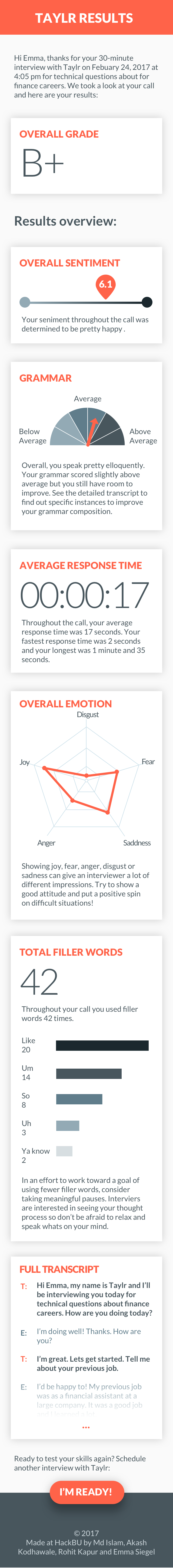
Transcript
A key feature of the interview analytics that would allow the user to really take a look at their responses is through the transcript. Because the transcript could be potentially very long (in the case of a 30+ minute interview), I decided to only show a preview of it on the full dashboard, but allow users to see the full version on a separate page.
Additionally, with the goal in mind of providing users with as much feedback as possible, I had the idea of providing users with an additional dashboard to analyze the results of each question/response in the transcript. I discussed this idea with my team and they agreed that it would be beneficial to the users and not require much additional work on the back end.
Footer
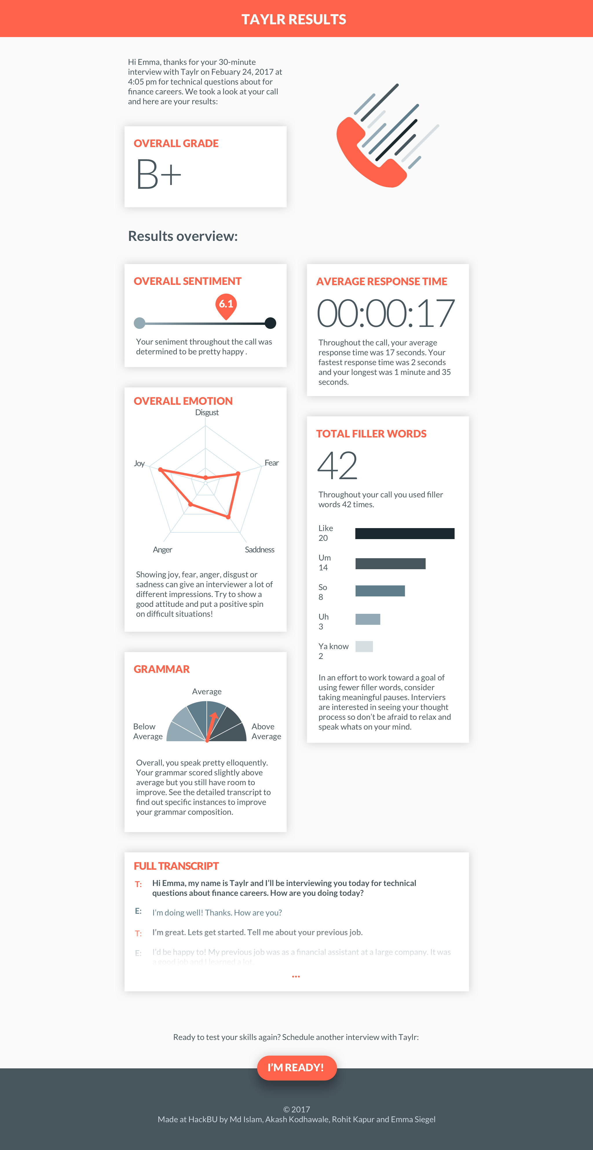
To finish off the experience, and to keep users coming back to Taylr, I designed a call to action in the dashboard's footer to allow users to return to the landing page and request another interview. In the future, Taylr would include features for users to save their results and track their improvement over time.
Solution
After 24 hours of brainstorming, hacking, designing and drinking coffee, our team created a viable product from entry points of both the landing page and Amazon Alexa. We had the opportunity to demo Taylr to Major League Hacking judges. Our team was humbled to win best design and first place overall.
Challenges
In terms of user experience, we had some challenges in figuring out the user flow to contain as few steps as possible. Large amounts of data (in graphs or numbers) can be overwhelming to users, so we made it a priority to create a dashboard that conveys as much information as possible to users but also displays it in a simple interface.
We wanted to implement machine learning to determine whether or not the user's response adequately answered the question that Taylr asked. We explored using a neural net and a vector representation of words but we were not able to find a corpus of training data.
Our main challenge was the time constraint of the hackathon. Since we only had 24 hours, we had to decide which features were feasible to include in the timeframe and which ones would need to be held on the back burner. For UX, the time constraint did not allow time for user testing. We were able to test the product with ourselves in the final hours of hacking but we were not able to get feedback on elements such as Taylr's voice.
What's next
Since we only had a 24-hour sprint to create Taylr, there were a lot of ideas we had that we weren't able to implement at this point. Moving forward, we hope to add the ability for users to have multiple interviews with Taylr and have the ability to compare results and track their progress overtime. We would want to expand our platform to individuals across many career fields by providing a large database of technical questions specific to a variety of positions. In order to achieve this, we would plan to crowd source interview questions in order to build our database. Another potential feature would be for users to have the option to play back audio clips of their interviews so that they could further analyze their responses.
Awards
HackBU: First Place Overall & Best Design
Try out Taylr:
View repository on GitHub.
Read more about Taylr on Devpost.
See full coverage of HackBU from Pipe Dream.
Work
Taylr
interaction & visual design, hackathon

interaction & visual design, ux research
Pipe Line
interaction design, project management
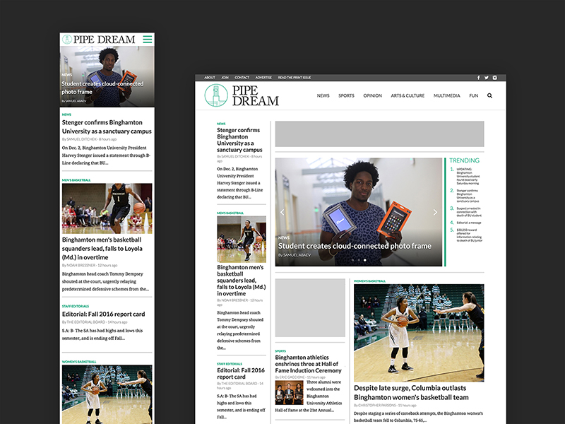
Pipe Dream site
interaction design, project management
KeepUs
interaction design, visual design
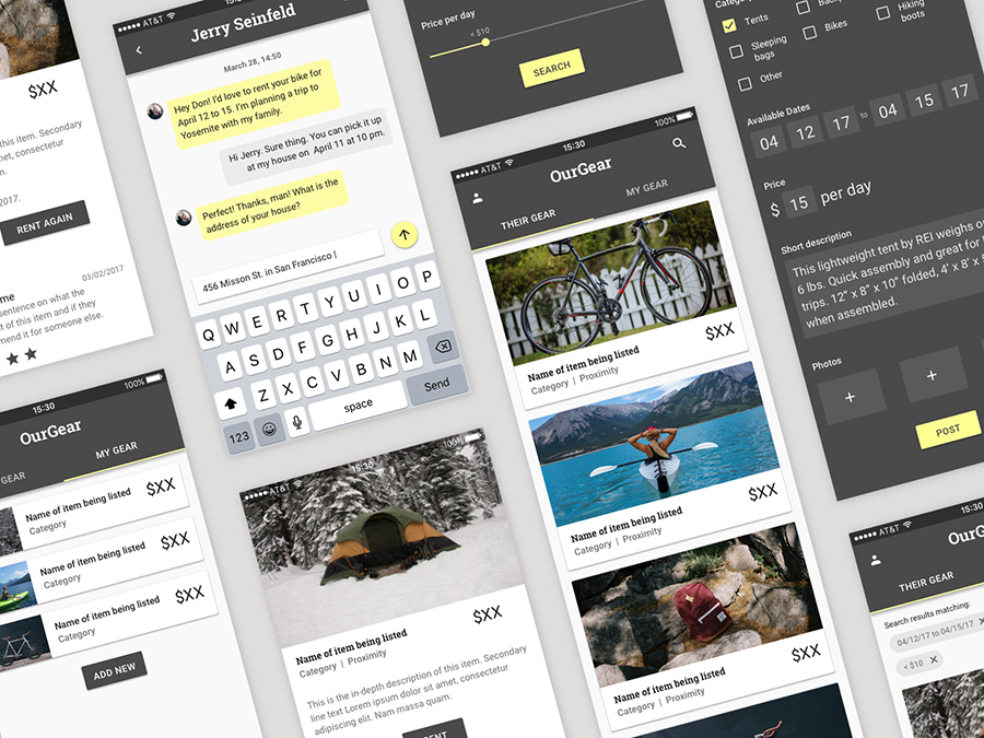
OurGear
interaction design, visual design
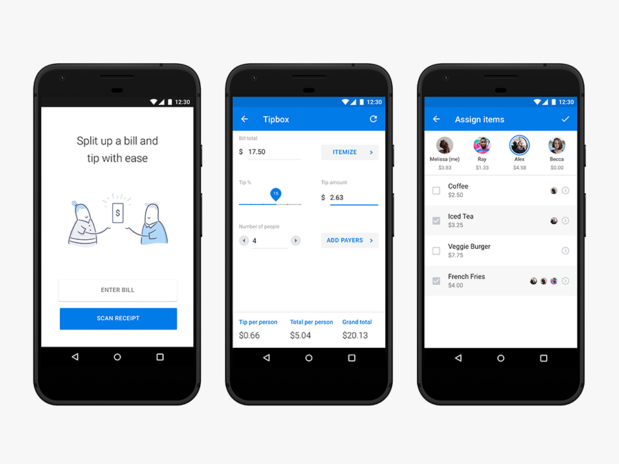
Tip Calculator
interaction design

Illustration
visual design
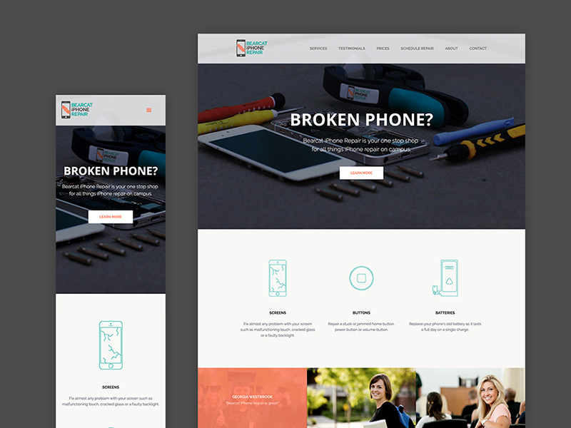
iPhone Repair
interaction & visual design, html/css
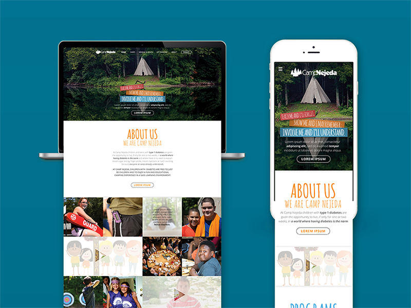
Camp Nejeda
interaction design, visual design
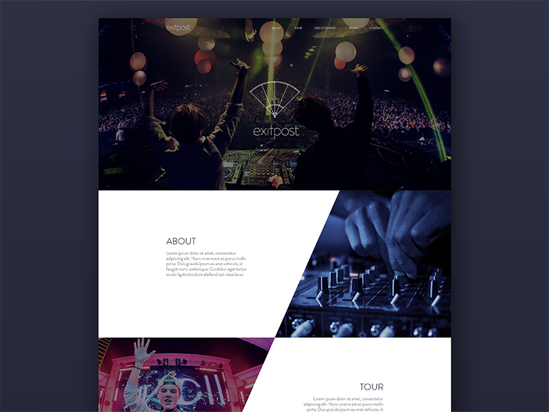
Exitpost
visual design
Island of the Self
motion design
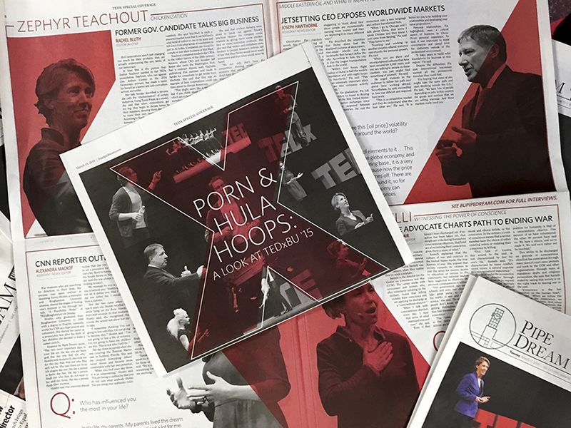
Pipe Dream
interaction design, visual design
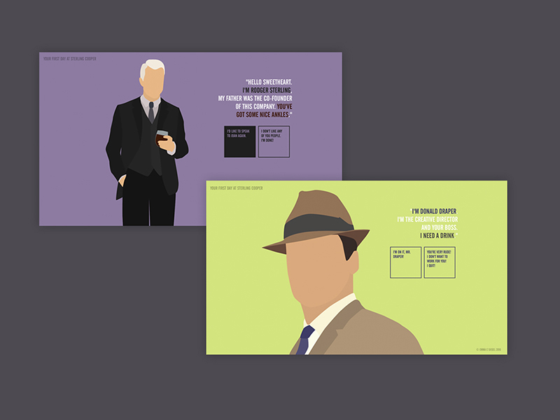
Mad Men
interaction & visual design, html/css
Graphic Design