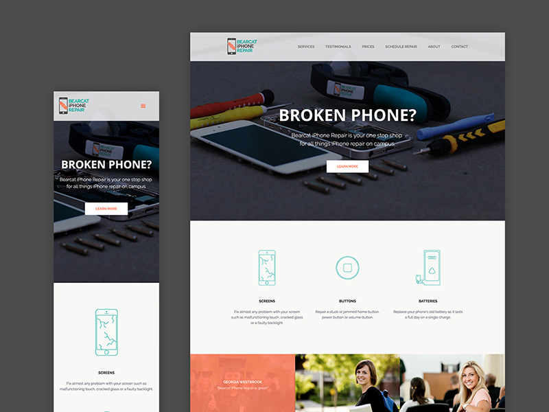
Bearcat iPhone Repair
Interaction Design, Visual Design
Spring 2016
Overview
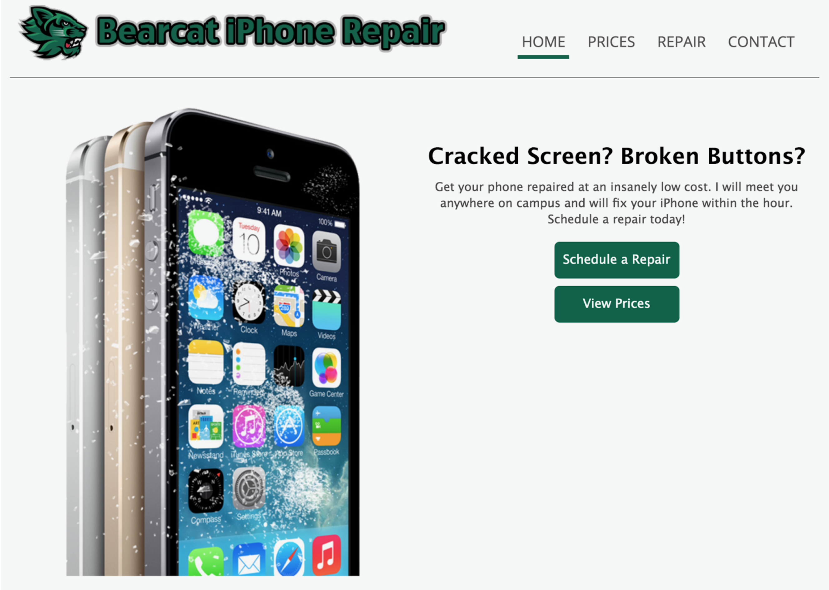
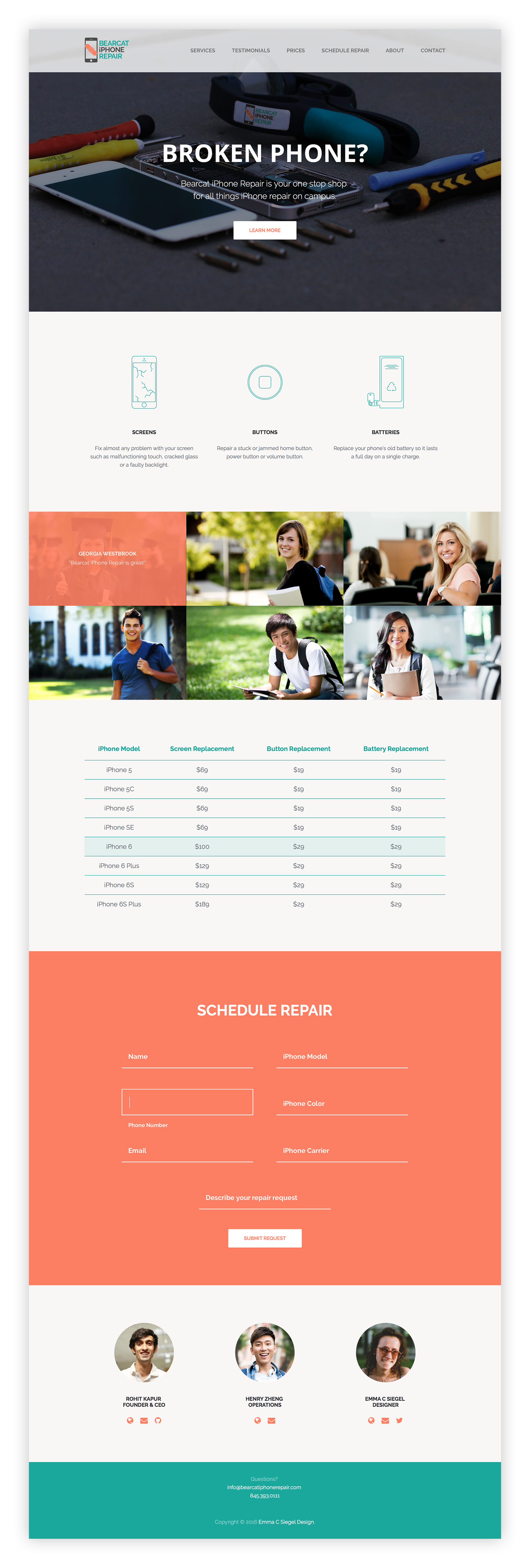
In November 2015, my iPhone slipped out of my hand and the screen shattered upon hitting the concrete ground below. I contacted Bearcat iPhone Repair, but their confusing and clunky website only worsened my negative experience.
A few months later, I teamed up with Bearcat iPhone Repair to develop a new website with the goal of creating a quick and positive experience for users who had just experienced the stress of a broken phone. From my personal experience, I was able to feel empathy and relate to our target users, college students with broken phones.
Problem
The first step of understanding the problem was to identify the pain points of the current website experience. From interviewing users and from my own expertise, I was able to pinpoint the major issues. First, the experience's objective, for a user to fill out a request form) is unclear. The site's information wasn't presented clearly because there were too many pages and the wording was nor concise. Lastly, the site had an overall dated look and feel, which is an issue for a technology company.
Research
To begin the design process, I conducted a competitive analysis with local and national phone repair and technology companies.
We next established our target users: college students with cracked/broken iPhones. It was important to note that these individuals just experienced the stress of a broken phone.
Goals
1. Fast and delightful experience for scheduling a repair through simple navigation and clear communication of information
2. Simplicity in mobile view for customers who might be accessing the site from their cracked or semi-broken phone
3. Change wording on website to reflect delightful and professional brand, more concise
4. Update look and feel to give company a more modern identity
5. To combat competition of other local iPhone repair companies, Bearcat iPhone Repair needs a superior website that higlights the company's benefits over competitors
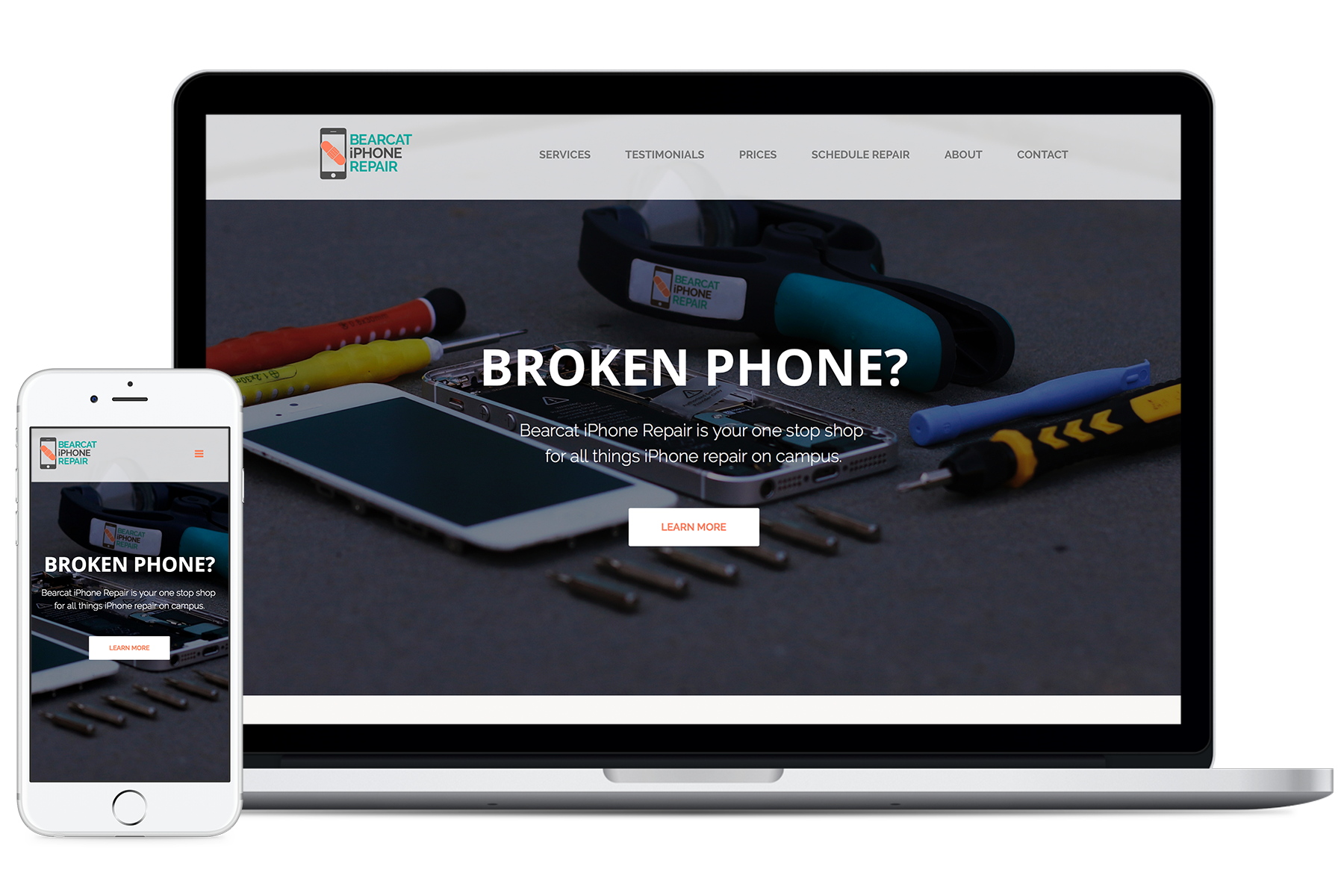
Visual identity
I first created a new visual identity for the company to communicate their professional yet delightful brand experience. I chose to use bright colors and clean, geometic shapes for a modern apperance. I created a logo that scaled well to be printed large on promotional posters or used small in the website's favicon.
Old logo:
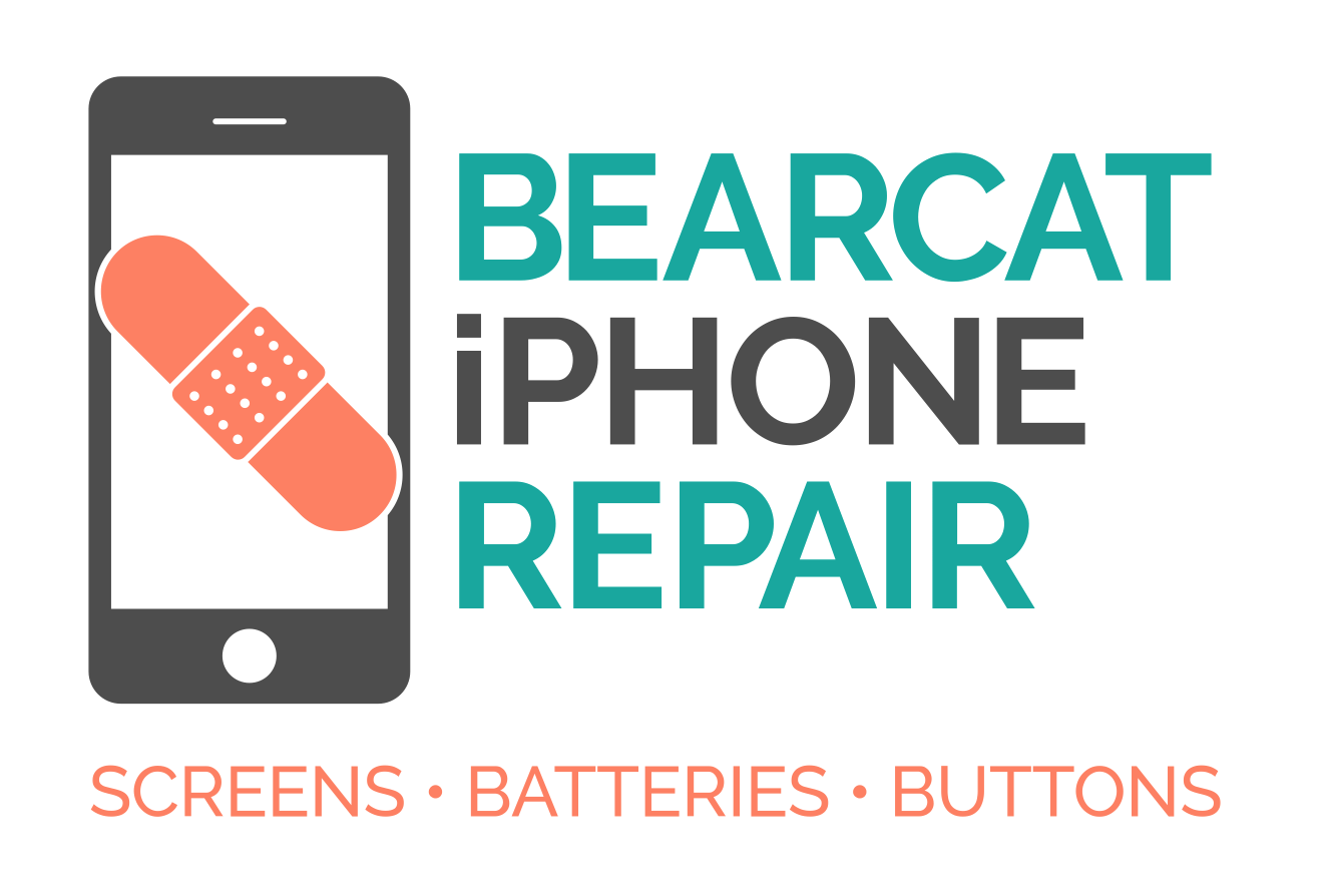
New logo:
Process
I developed mobile-first, responsive visual and interaction design for the website using Sketch, Photoshop, and Illustrator. I ultimately built a live prototype using HTML, CSS, JavaScript, JQuery.
User Testing
Throughout the design process, I conducted user research with past and potential customers to ensure that our goals of a simple and delightful experience were being met.
My contributions
- Interaction design
- Visual Design (website and branding) and product photography
- HTML, CSS, JavaScript, JQuery for website
Solution
The final experience was validated by its ability to please our users and acomplish the goals. I created a single page website with minimal text for clarity and used bright colors and illustrations to provide delight. I included testimonials to combat competition.
Results
After launching the new website experience, repair request form submissions have increased by more than 170%. Though there weren't analytics for page views on the old site, the new website has, on average, 2,200 views per month, and about 12% of viewers fill out a request through the form, with additional requests received via email and phone.
Work
Taylr
interaction & visual design, hackathon
interaction & visual design, ux research
Pipe Line
interaction design, project management
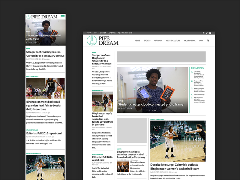
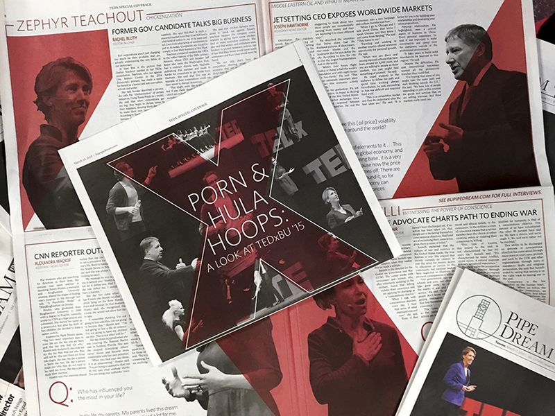
Pipe Dream site
interaction design, project management
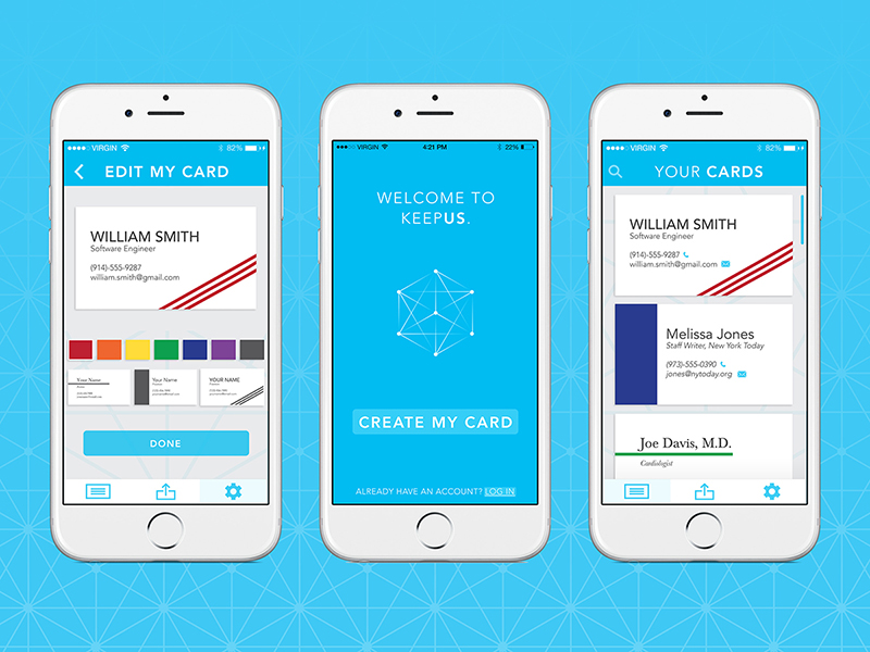
KeepUs
interaction design, visual design
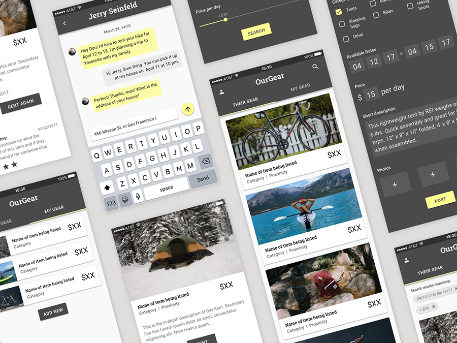
OurGear
interaction design, visual design
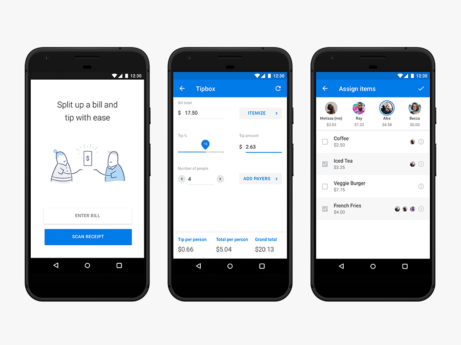
Tip Calculator
interaction design

Illustration
visual design
iPhone Repair
interaction & visual design, html/css
Camp Nejeda
interaction design, visual design
Exitpost
visual design
Island of the Self
motion design
Pipe Dream
interaction design, visual design
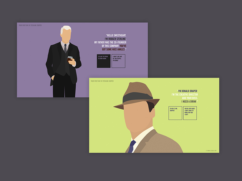
Mad Men
interaction & visual design, html/css
Graphic Design