Pipe Dream Website
Project Management, Interaction Design, Visual Design
Spring 2016
Overview
As Managing Editor of Pipe Dream, I organized a complete redesign of the newspaper's website. In collaboration with departments across the organization, I led the development of a new reader experience with streamlined navigation, updated aesthetics and accommodation for diverse and dynamic digital content.
The team
This project could was the product of incredibly collaborative efforts of our team members. We sourced students who were experts across our organization and recruited other students to help out.
I acted as Project Manager & UX Designer. Our engineering team included two front end developers, Jasper Andrew & Rohit Kapur, and a back end developer, William Sanders. Other contributors included Pipe Dream's Editor-in-Chief, Advertising/Business Manager, News Editor, and Photography Editor. We also had help from the newspaper's design team on visual design decisions.
My Contributions
Project Management: Research, SCRUM-inspired strategy, Creating goals, Setting deadlines, Leading the team
Interaction & Visual Design: Sketches, Wireframes, Fonts/colors/element sizes/layouts, Mock-ups, Prototypes
Problem
As Design Manager of Pipe Dream, I implemented visual changes to the print newspaper with goals to optimize space and create a more modern look and feel. For example, I stacked the logo to save space and allow for more dynamic use.
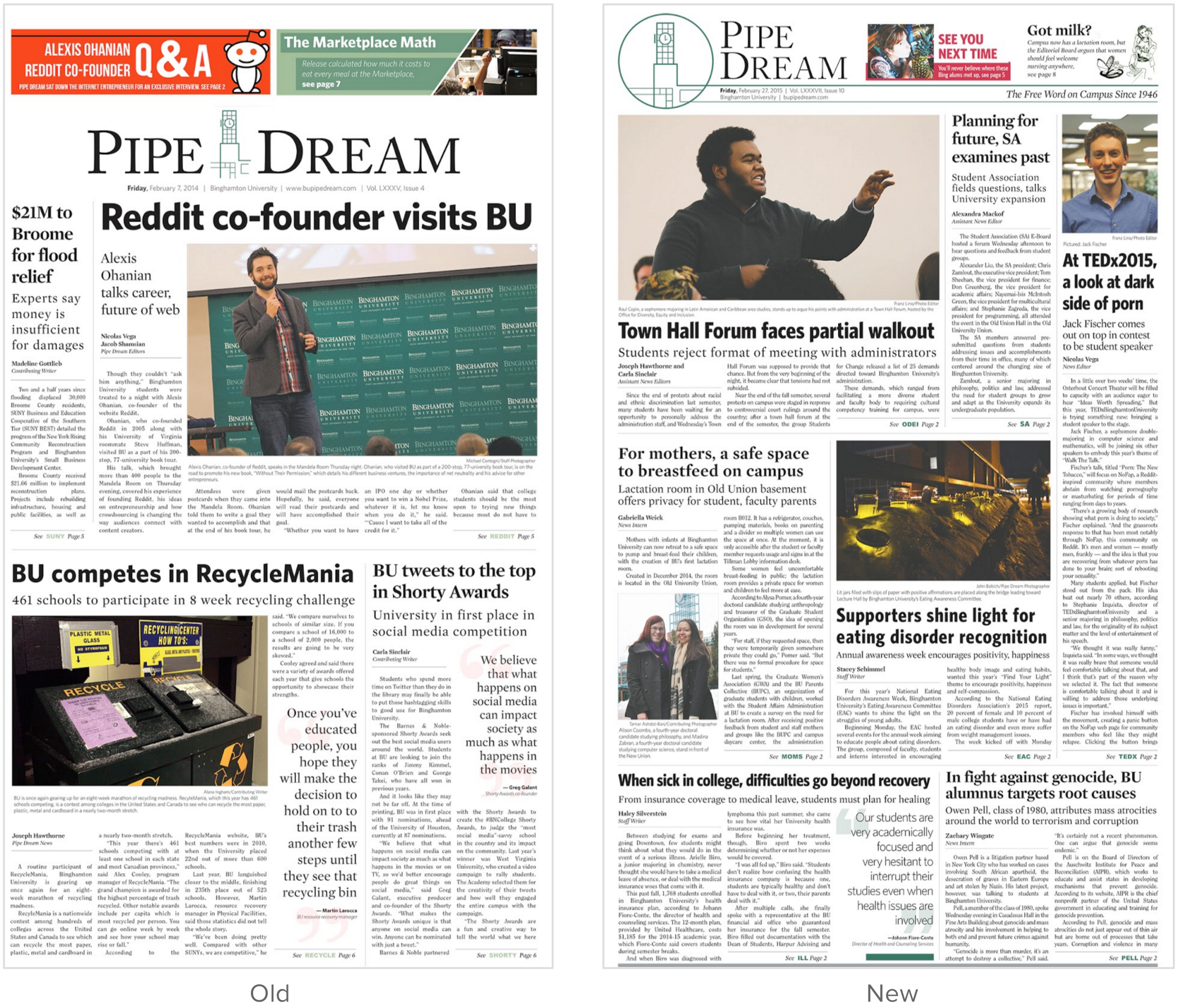
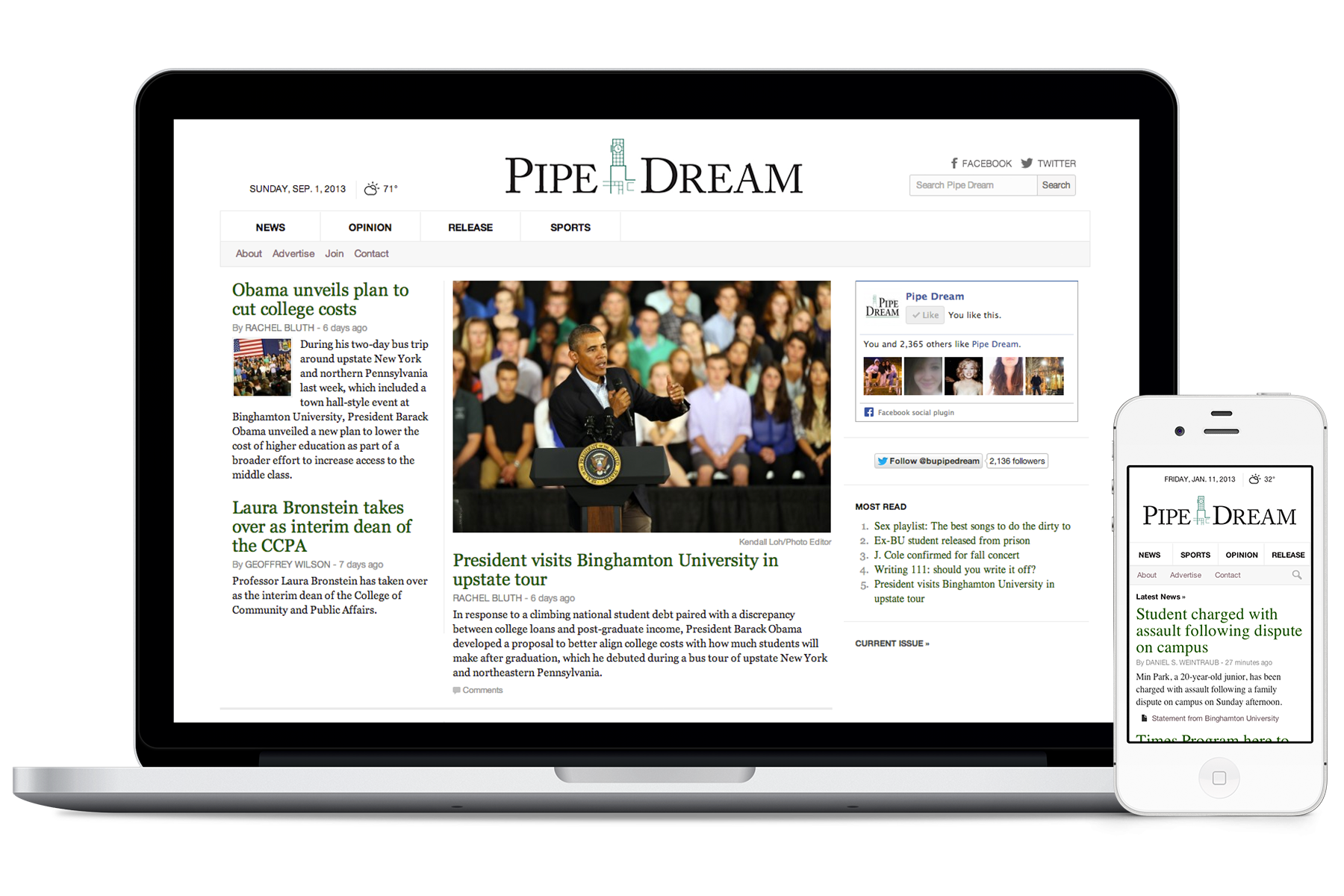
Following these changes, Pipe Dream's web experience was looking dated and no longer consistent with the print product. As a media organization, Pipe Dream must have a professional and modern digital experience for its content to be presented as credible journalism.
Research
To fully understand this problem and project, I ran a competitive analysis of web experiences for other collegiate and national media organizations. In October 2015, I attended College Media Association's annual conference where I met with other college journalists to share ideas and seek inspiration.
Throughout the process, my research remained user focused. I sent out surveys to Pipe Dream's staff, readers and alumni to identify pain points of the current experience, feature requests, design ideas and more.
Understanding the users
Users: students, faculty, staff and members of the Binghamton University community
Mobile: about 60% of Pipe Dream's web traffic is on mobile
Traffic: average 96,000 page views/month when school is in session
Behavior: average 1.6 pages/session, 1 minute/session
Acquisition: 43% organic search, 37% social, 16% direct, 4% referral
Goals
1. Design a modern web experience to maintain journalistic integrity in brand
2. Create a beautiful platform to showcase the creations of our writers, photographers, and designers
3. Develop a simple experience so users can focus on content; include interesting interactivity but not distracting from content
4. Encourage users to stay on the site and view more content
5. Show visual consistency with print product
6. Accommodate for diverse, dynamic content
7. Display more content "above the fold"
Process
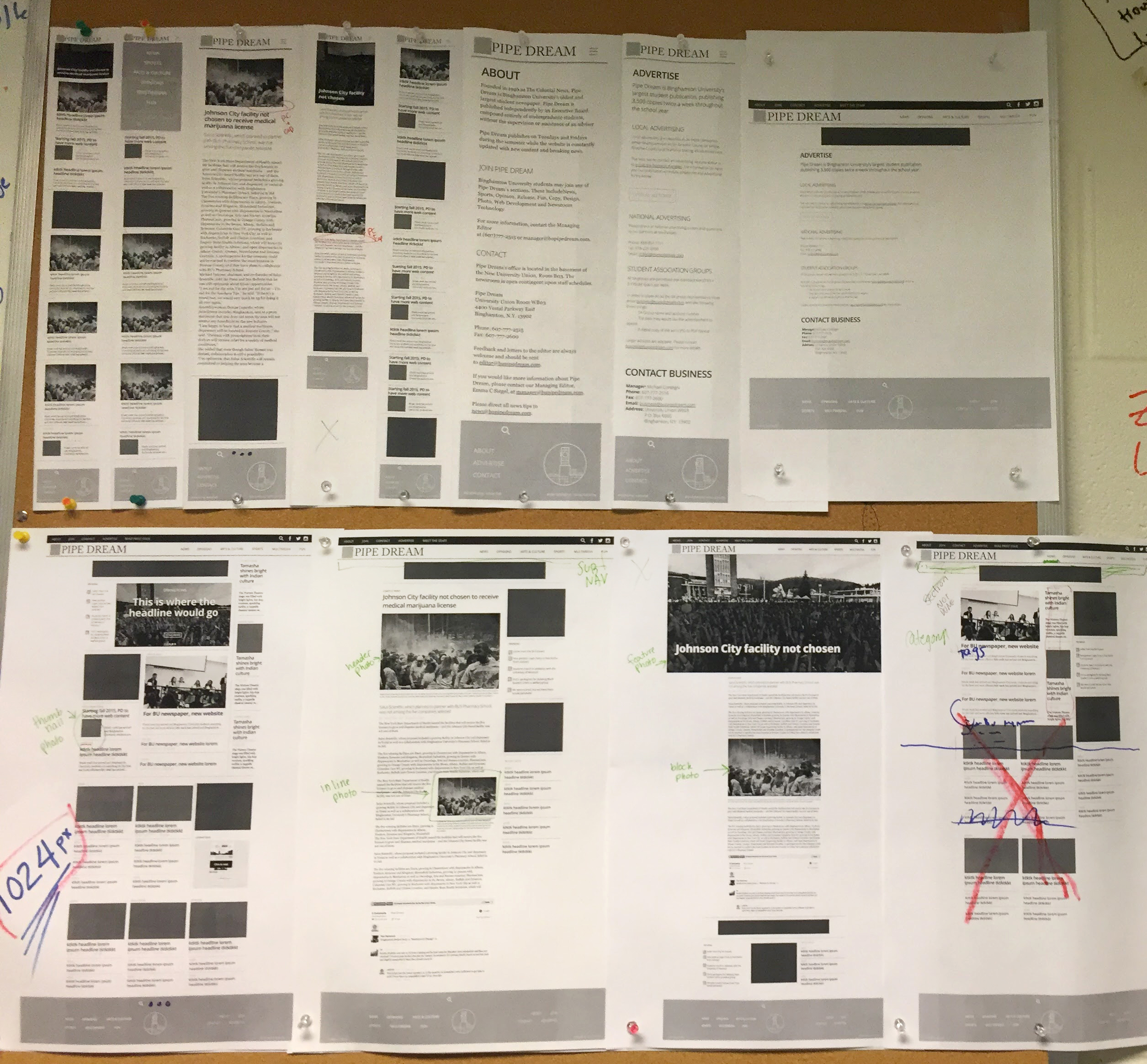
After research, I began the design process by creating initial concepts: brainstorming, sketching, and exploring. I worked with developers to discuss technical limitations. The processes included many, many iterations of creating and tweaking mocks. Users validated concepts in usability testing and our team validated the experience based on its ability to meet our goals.
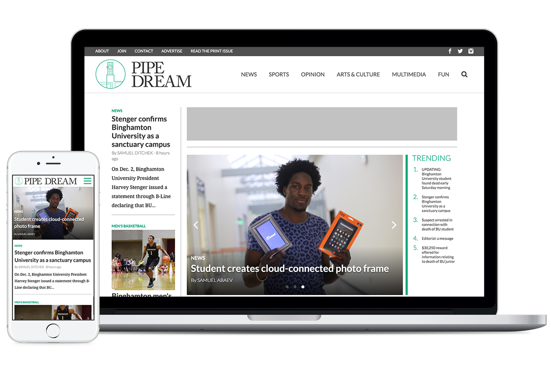
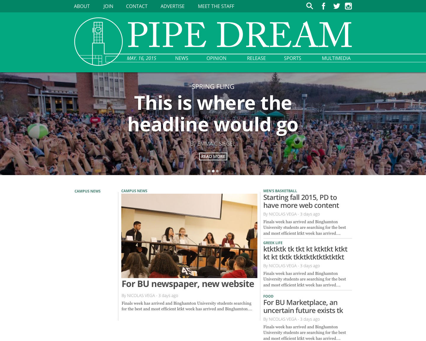
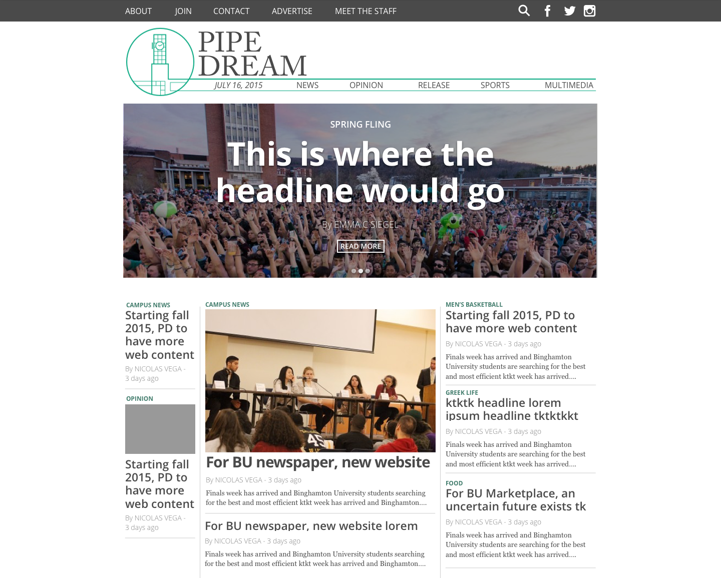
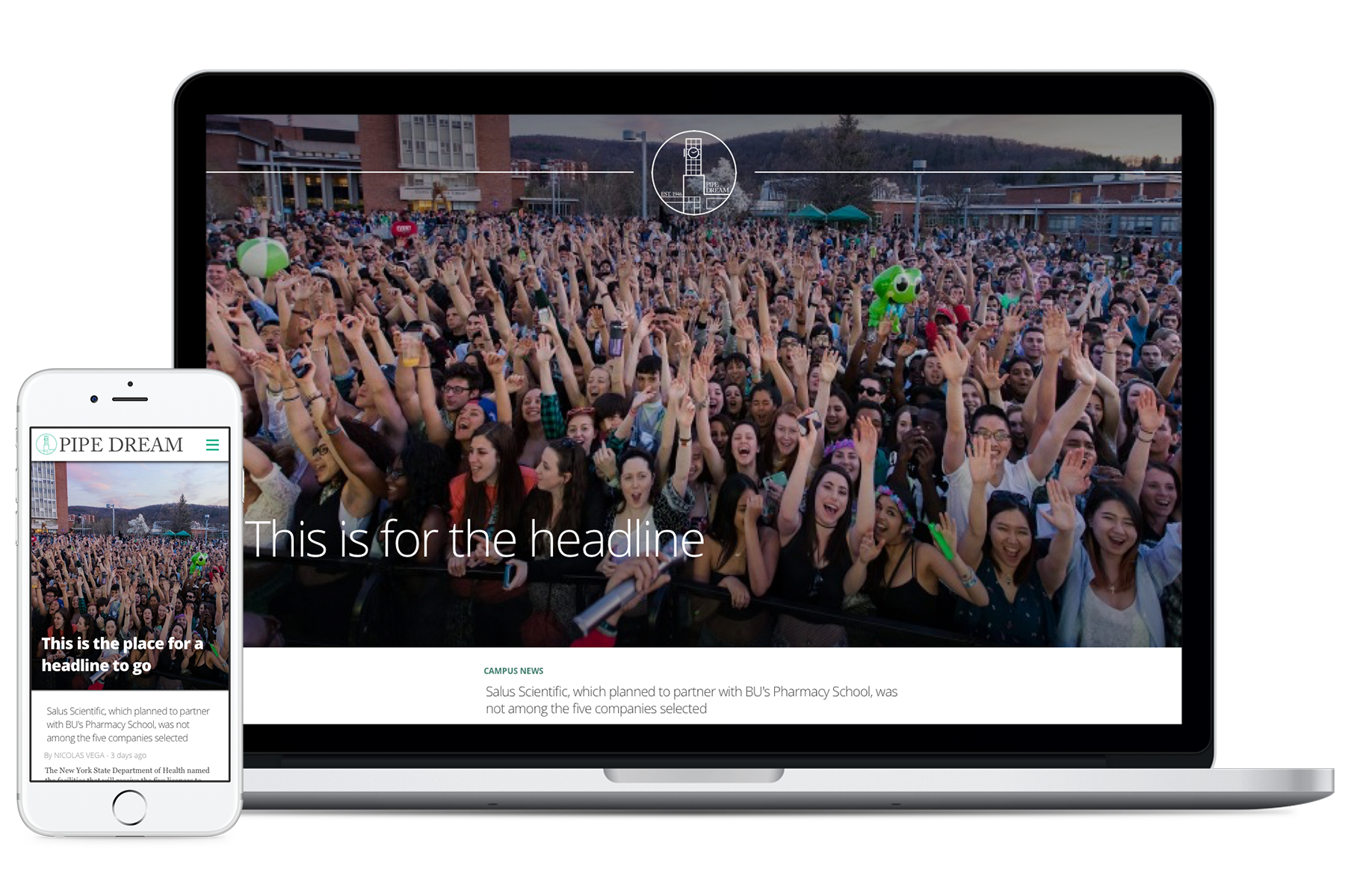
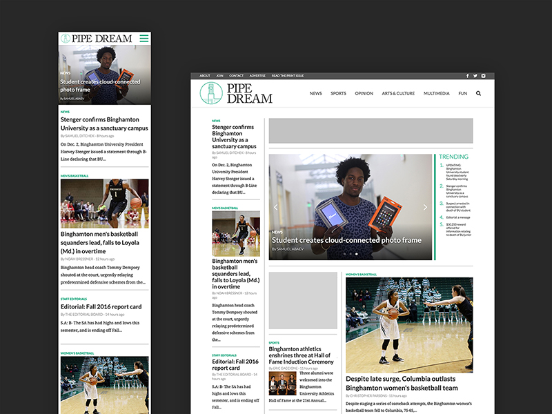
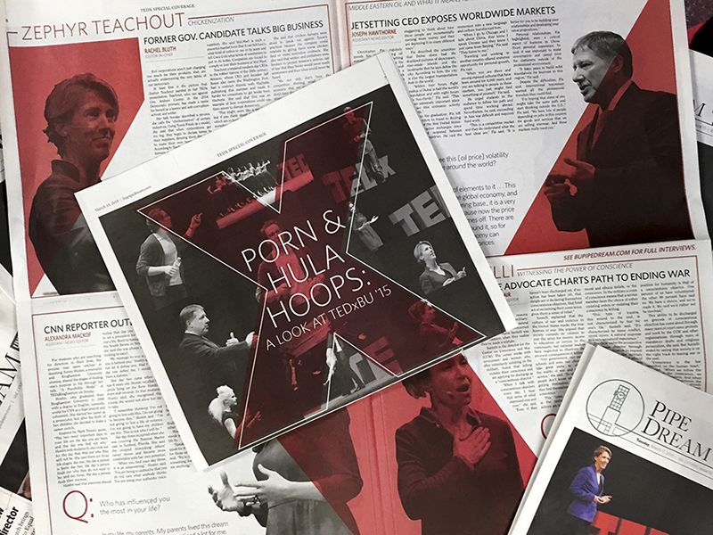
Case Study: Home Page
With 12% of the Pipe Dream website page views on the home page, it was natural that it would be the first one to be designed in the new experience.
One of the biggest questions when designing the home page was "to what extent should the digital experience look like the print experience?" I had to figure out how the concept "Above the fold" would translate from print to on screen. While maintaining visual consistency with the print product, I also wanted to explore interactivity posibilities not available in print such as a rotating image carousel in the hero space. To promote user engagement, I focused on the prominence of trending content.
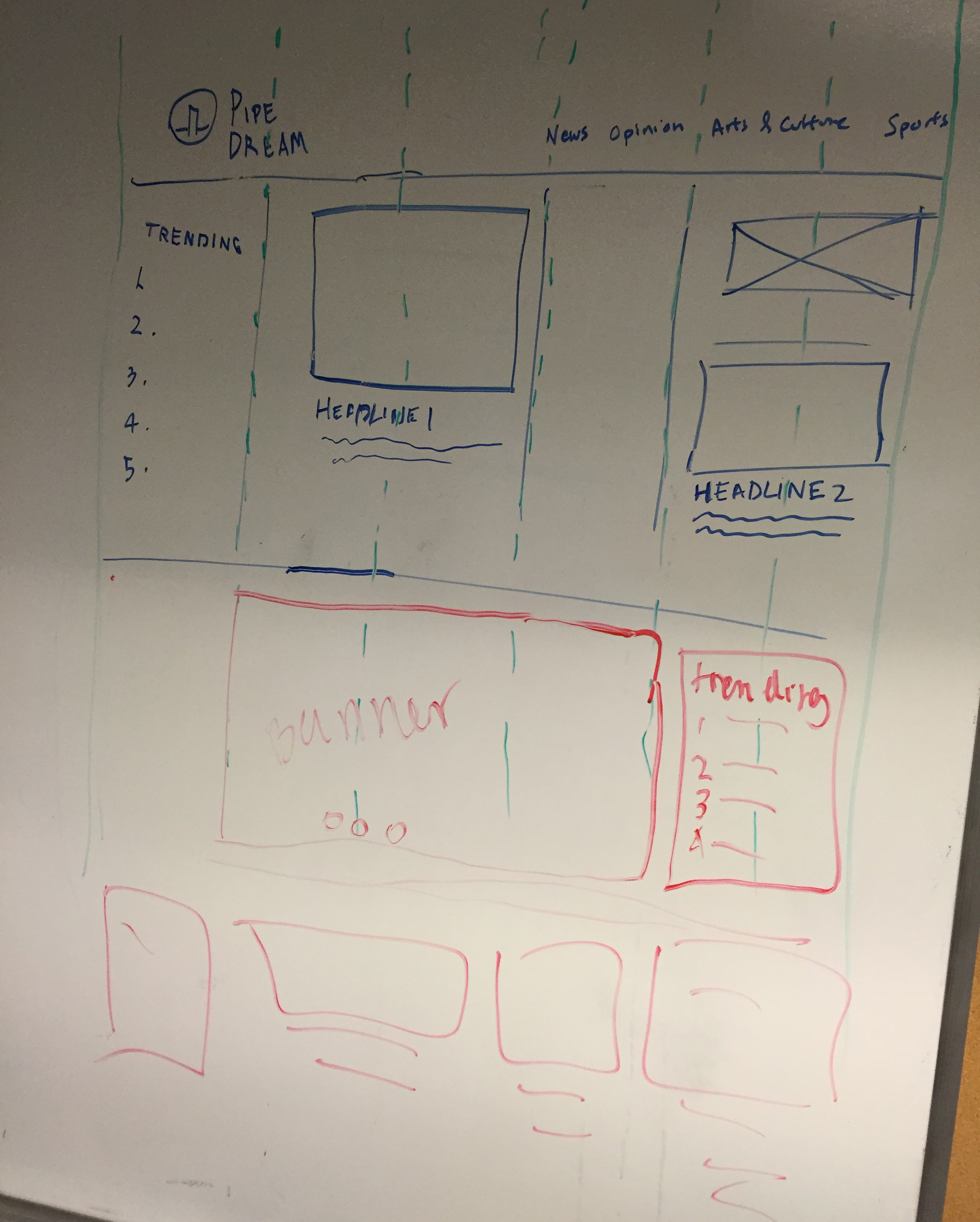
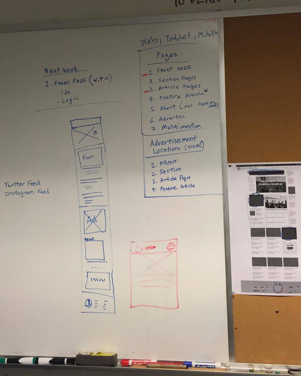
I designed the home page desktop-first because the larger screen size provided more challenges and layout posibilities. The rest of the website's pages were designed mobile-first becuase they had less complex functionality.
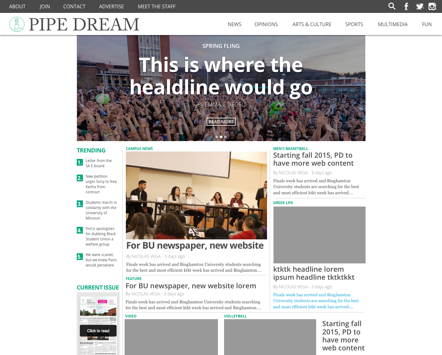
As I went through mocks and iterations of the home page, new questions arose. What if the most important article doesn't have a relevant photo? How will advertisements be incorperated into this layout? How would a photo's orientation change the layout? What if a headline is really short or really long?
For the final home page layout, I created an experience that solved our goals. Based on feedback from user testing, the rotating image carousel is engaging but it should not take up the full width as to not be overpowering. I implemented a column layout is a consistent mental model of print edition but highlights digital capabilities. I included a section for prominent content without a photo in the top left column and redesigned the "trending" section with to look more modern and clean.
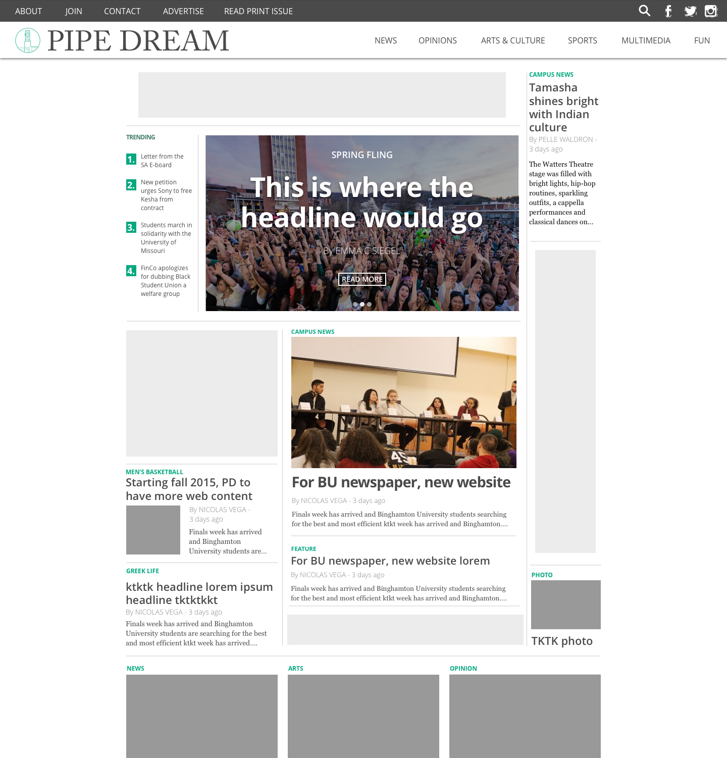
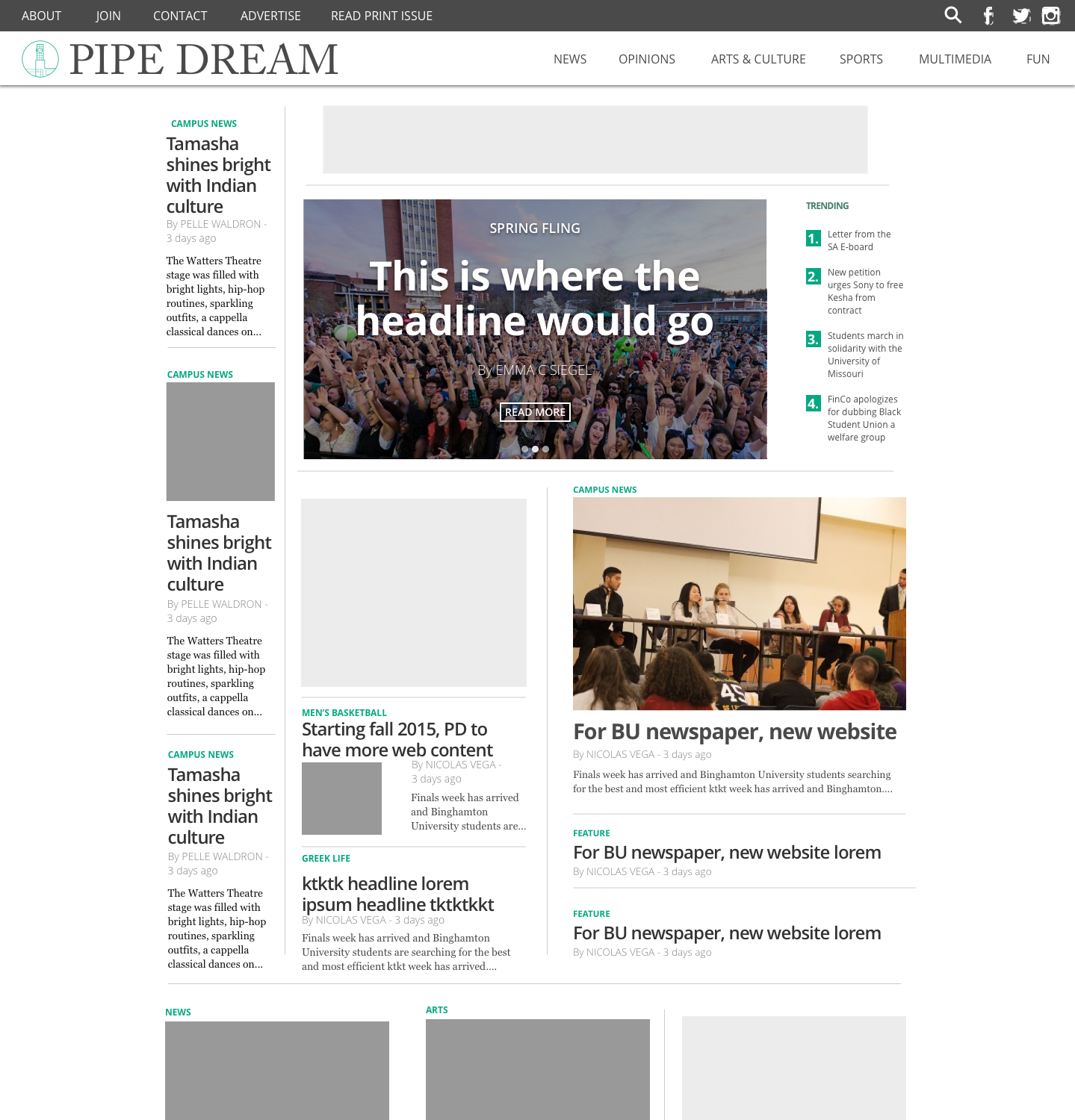
Article page
Because each article has unique content, each one deserves a unique layout the shouldn't be just a cookie-cutter template. To do this, I included various size and location options to display photos and graphics.
Feature article page
I created a new "feature article" page for long-form features, photo essays, other special articles that deserve an even more unique experience. My goal was for this experience to look different from regular articles but still be on-brand.
Solution
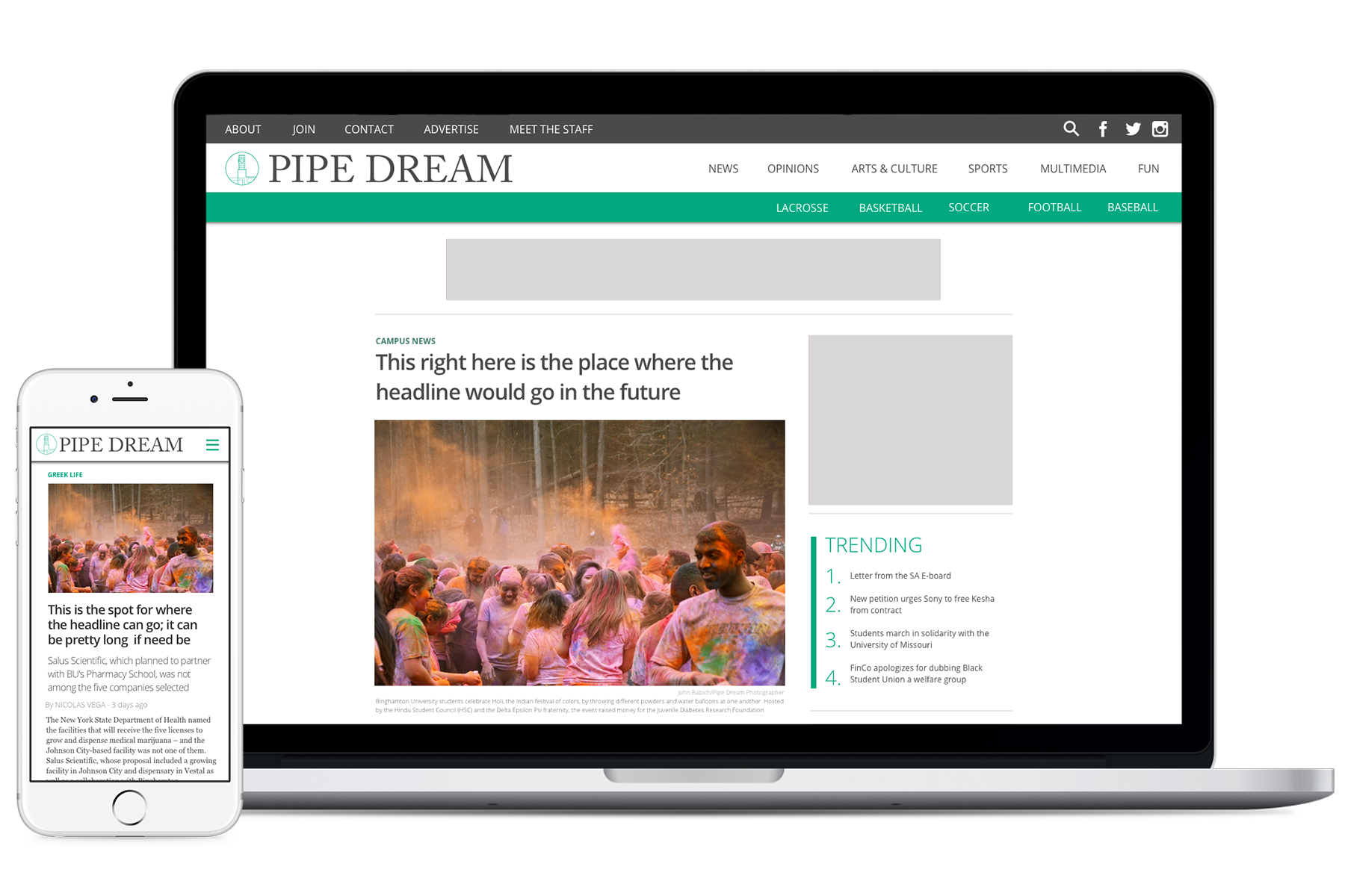
The redesigned mobile and web experience were validated as done when users were satisfied and goals were met. The new visual design maintained consistent branding with the print product, modern and credible. We developed a simple experience so users can focus on content but included interactivity and created a platform to highlight digital content. The new website encourages users to stay on the site and view more content by suggesting more content. A responsive layout was tested on many screen sizes, screen resolutions, browser types to ensure accessibility for users on any device.
Challenges
Though we ultimately created a successful solution to our problem, we faced many challenges along the way. These challeges didn't set us back but pushed us to move forward. As a team of students, we had never done a project like this before so we were figuring it out as we went along. Every step of the project took longer than expected; we faced roadblocks from schoolwork and other obligations. We went through weeks and weeks of bug testing before producting a product of which we were proud. Dynamic content posed many challenges for us. As Pipe Dream's content changes at least twice per week, different photos and text string lengths would create new design challenges.
Launch
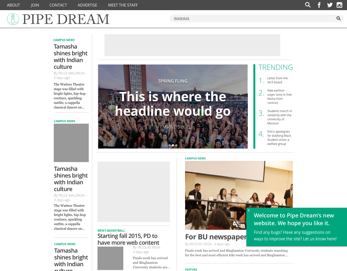
Almost a year after I proposed the website redesign, the new Pipe Dream website launched in April 2016. I created a pop-up on the home page to gather feedback from our users. In two weeks, 89 users sent in overwhelmingly positive feedback and meaningful suggestions.
Results
Since launching the Pipe Dream's new web experience, users' average session duration increased by 9% and average pages per session increased by 4%.
Though we received overwhelmingly positive feedback from users, I have been regularly updating the experience with design changes based on feedback from users and reassessing the experience's ability to meet the goals set out. As Pipe Dream's writers continue to produce new content, the web team is invariably presented with new challenges and is working towards creating successful solutions.
Work
Taylr
interaction & visual design, hackathon

interaction & visual design, ux research
Pipe Line
interaction design, project management
Pipe Dream site
interaction design, project management
KeepUs
interaction design, visual design
OurGear
interaction design, visual design
Tip Calculator
interaction design

Illustration
visual design
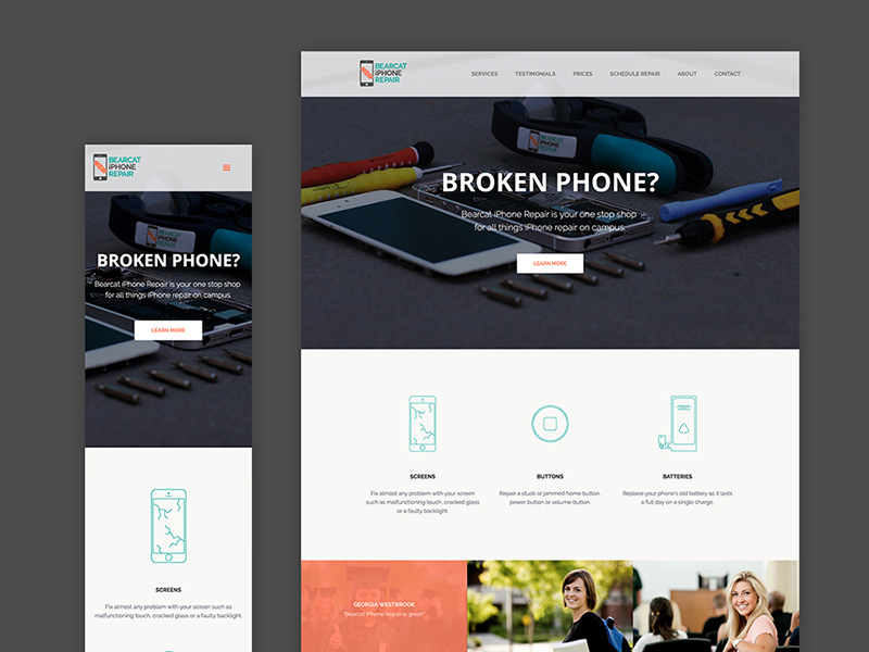
iPhone Repair
interaction & visual design, html/css
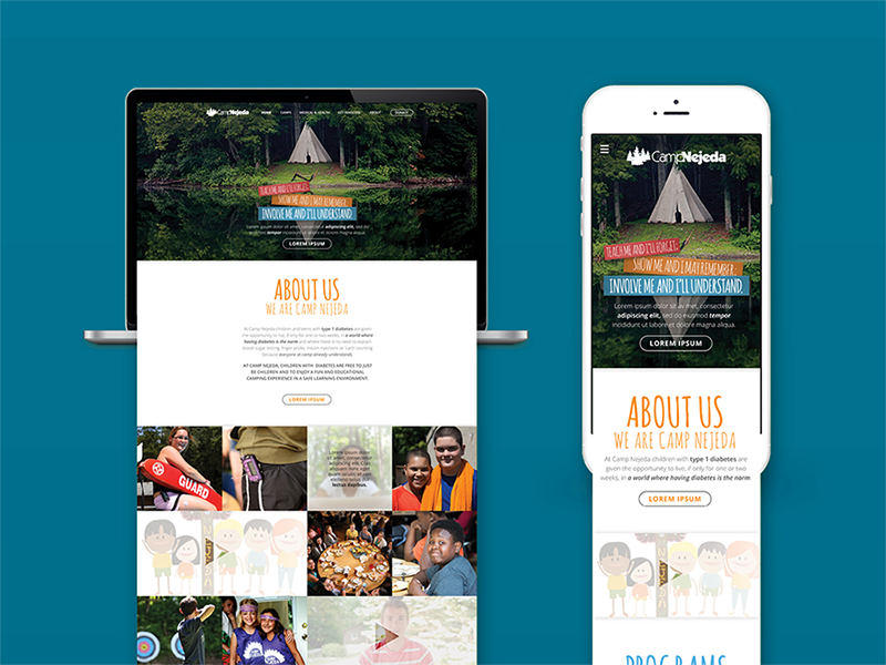
Camp Nejeda
interaction design, visual design
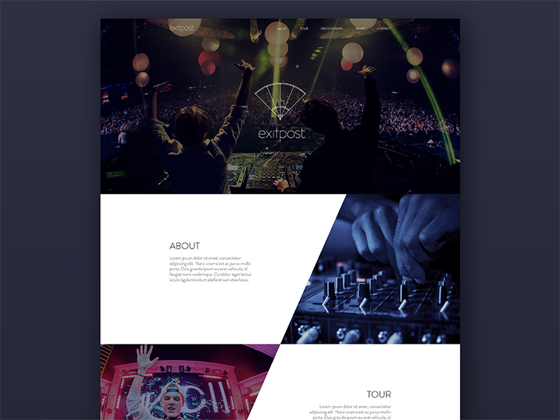
Exitpost
visual design

Island of the Self
motion design
Pipe Dream
interaction design, visual design
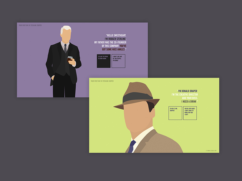
Mad Men
interaction & visual design, html/css
Graphic Design
visual design