KeepUs
Interaction Design, Visual Design
Spring 2015
Overview
It's rare to find someone who actively enjoys carrying around a stack of business cards in their wallet. Rather than keeping contacts' information on a piece of paper in a wallet, it can be kept digitally in KeepUs, a professional networking mobile application for digital business card sharing. In the app, users can create their own business cards and exchange their digital cards with colleagues.
Team & Contributions
For the development of this app, I collaborated with the co-founders of KeepUs, Aaron Jiji and Andrew Brick, a team of software engineers. As UX designer, I developed the visual design for the branding and app as well as the app's interaction design. I also conducted user testing.
Goals
Brand core values: network, connection, and community
Visual identity:
- Maintain professionalism while still creating a positive experience
App experience:
- Users can create their own business cards and exchange their digital cards with colleagues
- Delightful experience, focus on community
- Simple app functionality with clear intent
- Streamlined navigation, fast and easy experience
- Focus on accessibility for on-the-go users
Understanding the problem
Prior to designing the visual identity and experience of KeepUs, we began by identifying our target users: adult professionals in any career field. One of our main goals for the KeepUs experience was to focus on accessibility for on-the-go users with potentially slow internet speeds.
I conducted research to fully understand the problems surrounding the KeepUs experience. I ran a competitive analysis on other networking apps and websites, with a focus on user experience paths from on-boarding through daily active-use cases. I also interviewed potential KeepUs users to find out what they would want to see in the app.
Visual identity
I began the design process by creating a visual identity for the brand based on their core values of network, connection, and community. The goal for the KeepUs branding was to maintain professionalism while still creating a positive experience.
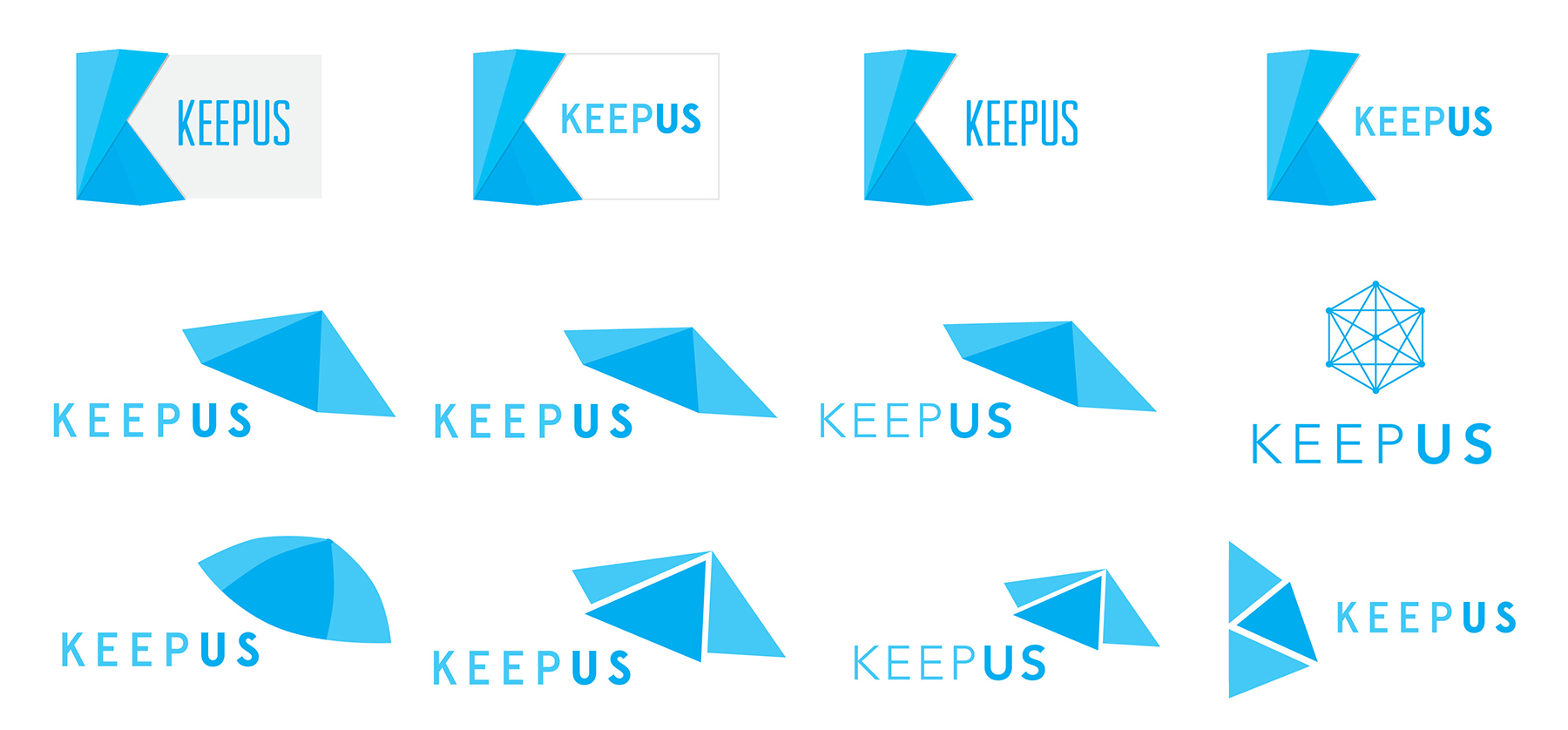
Logo comps
I decided to use geometric shapes, sharp edges, and a bright color to portray the app's modern digital approach on the classic business card concept.
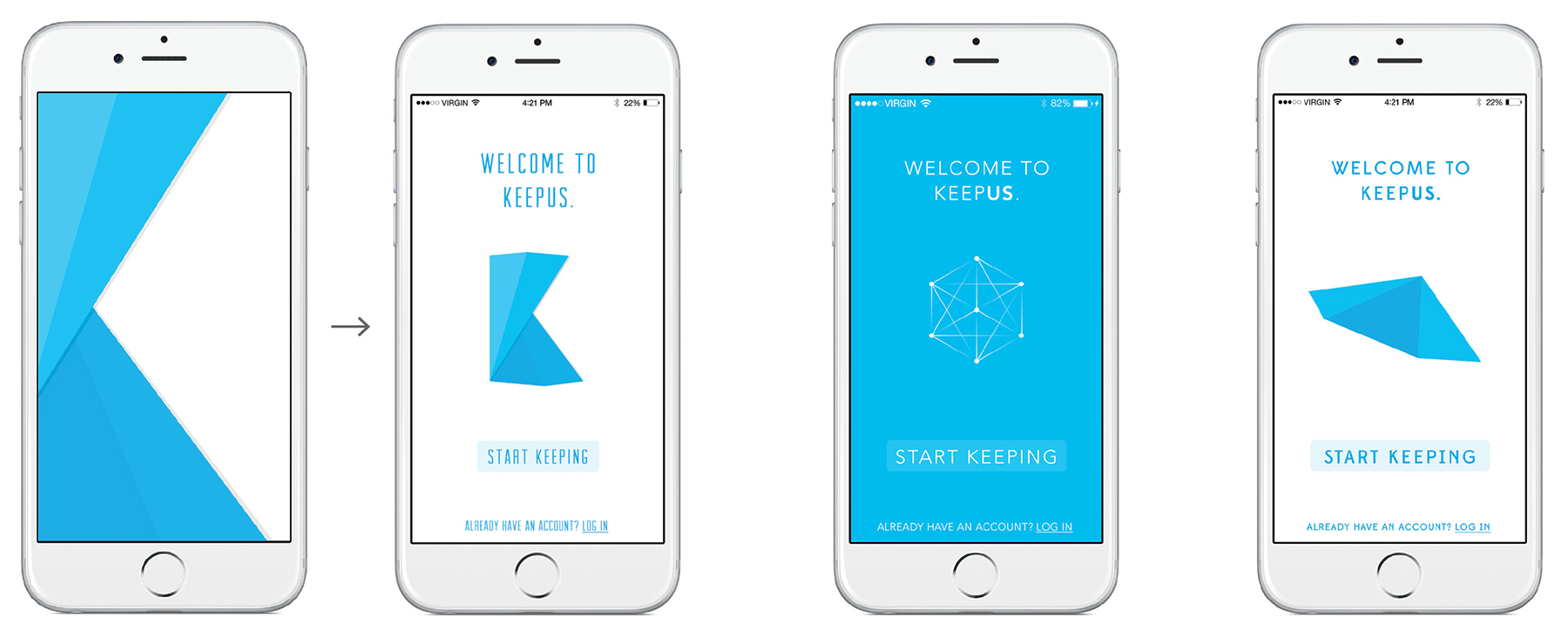
Splash screen mock-ups
To portray a positive experience, I envisioned animated splash screens with the top three logo options.
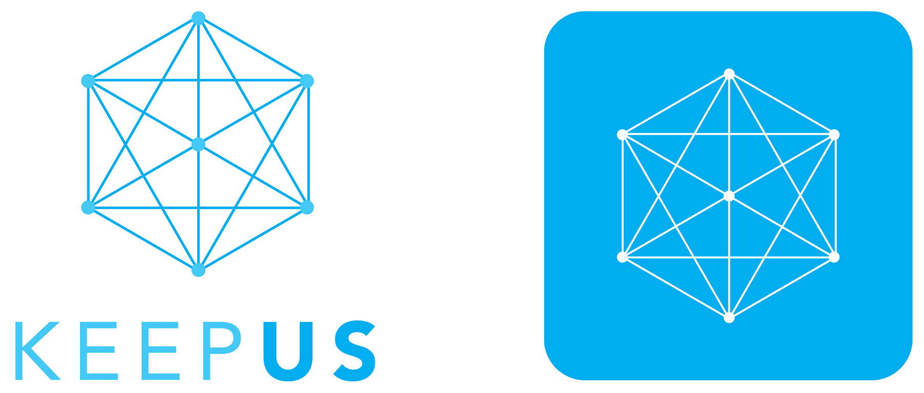
Final logo & app icon
The final logo was chosen based on its ability to meet the goal of expressing the app's core values and personality.
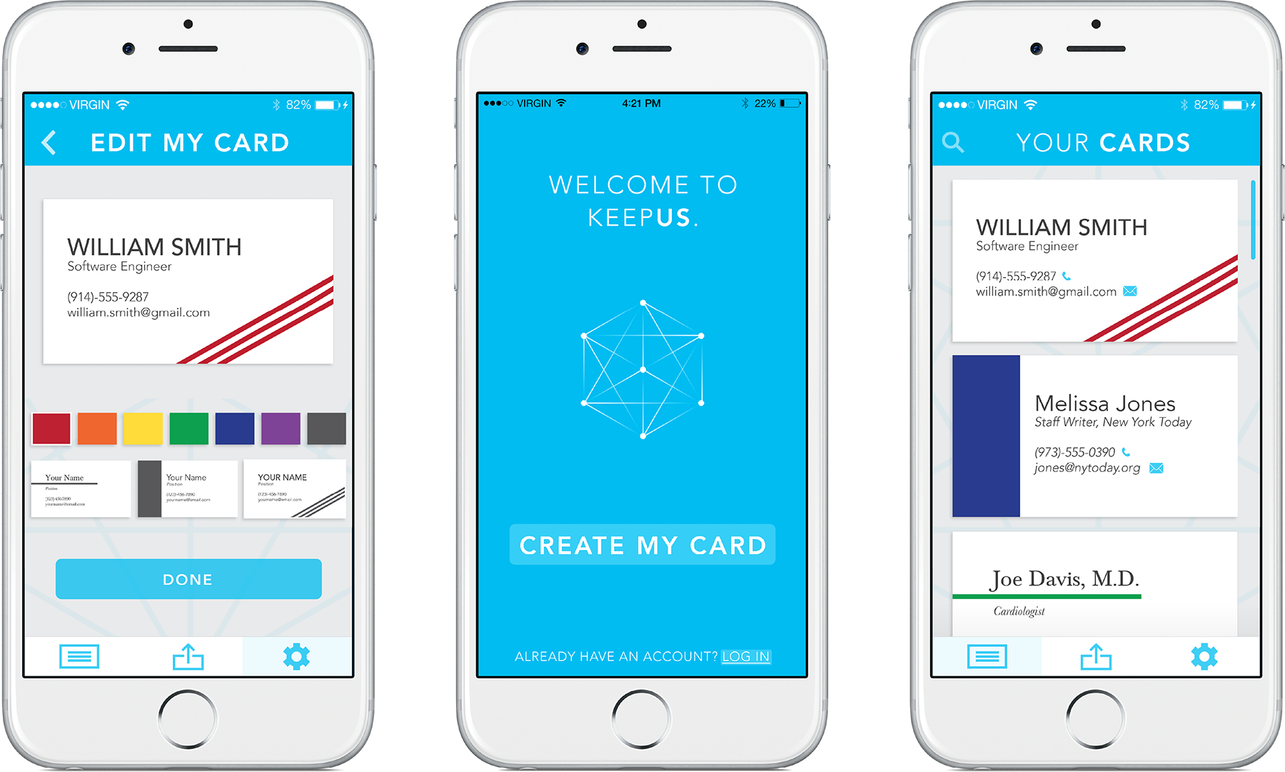
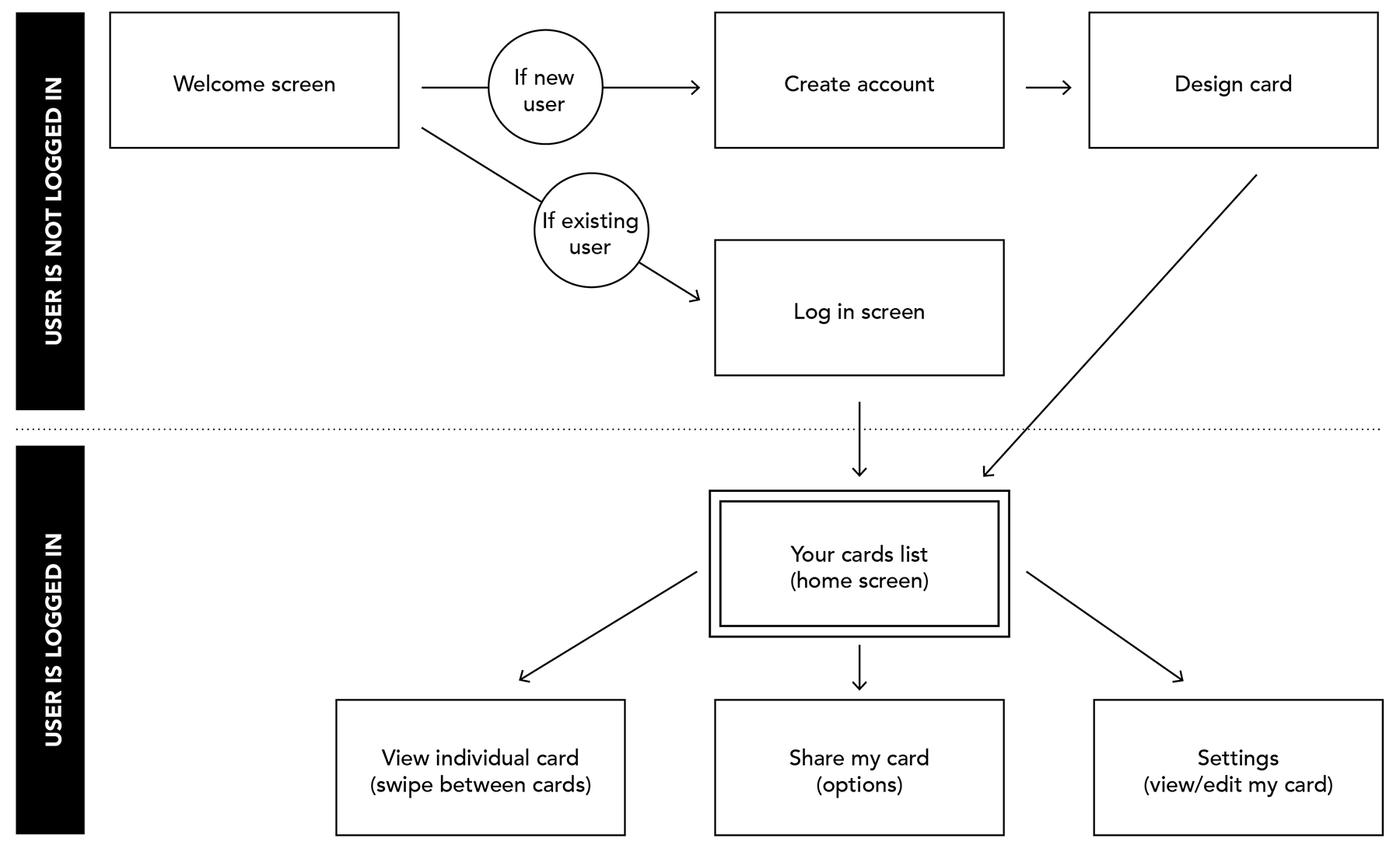
Mapping the app's critical user journey
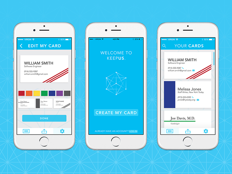
I created a sitemap of the ideal path a user would take through the KeepUs experience. This journey begins with the welcome screen and continues through the app's main functions of users creating and sharing their own card and viewing the cards that they have collected. The critical user journey highlights the different paths between user types: those who are not logged in to the app (either new or returning users) as well as users who are logged in to the app.
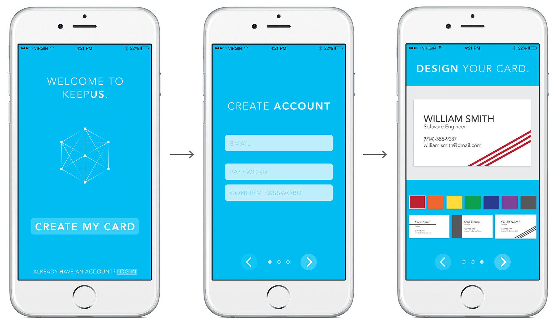
Onboarding experience for new users (gamified & delightful)
Though remaining professional, a core value of KeepUs is community, so we wanted to ensure that the app's entire experience was delightful and clear.
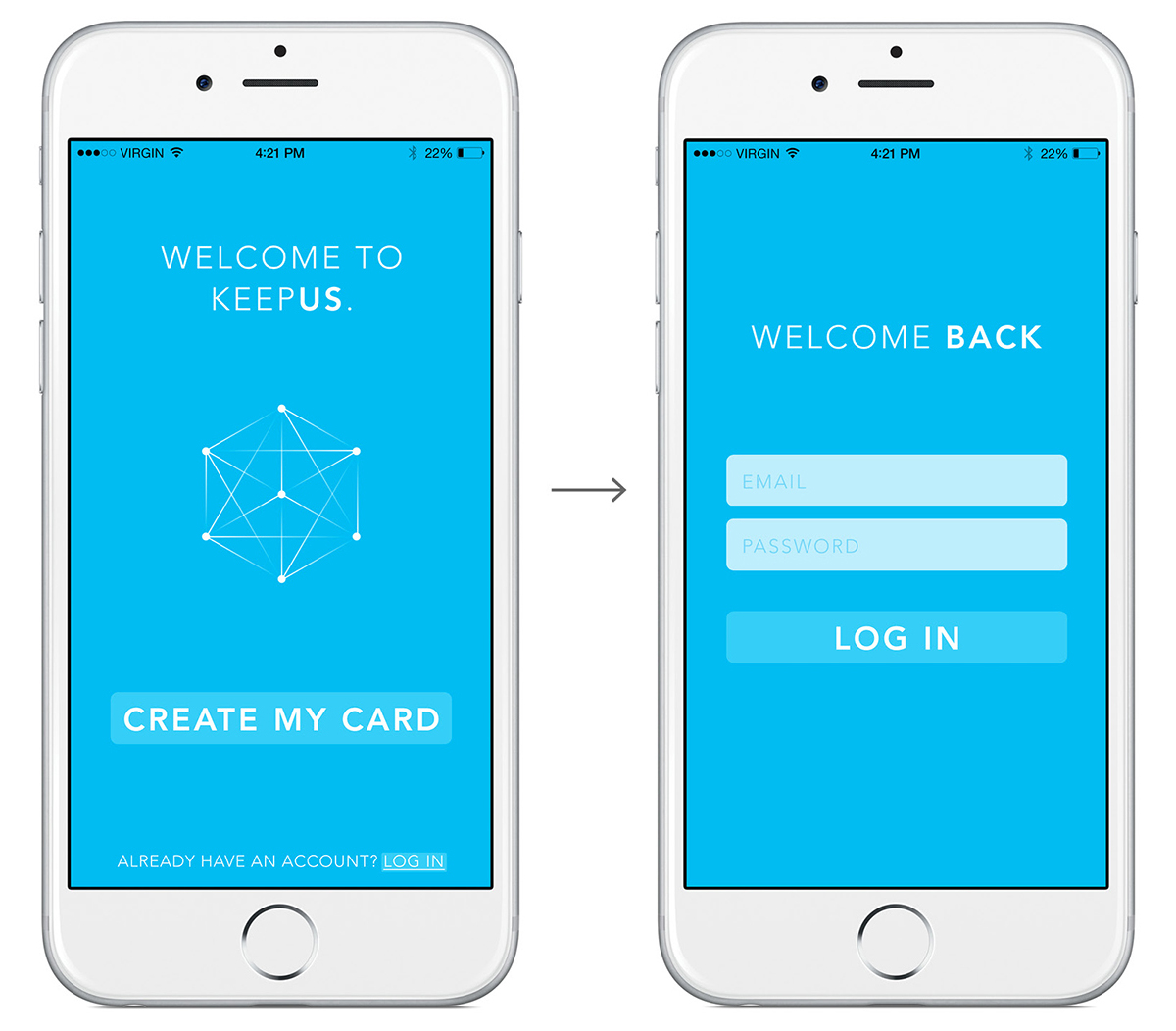
Onboarding experience for existing account
The onboarding process should be as simple and quick as possible. For users who already have an account, they can log in to KeepUs with a no-frills onboarding experience.
User research
Throughout the design process, I conducted user research by testing concepts and features with potential KeepUs users, college students with experience in professional networking.
Home screen process
Once a user has created an account and is logged in, they will be taken to the home page of the "Your Cards" page. This is a card view list of all of the cards that the user has collected.
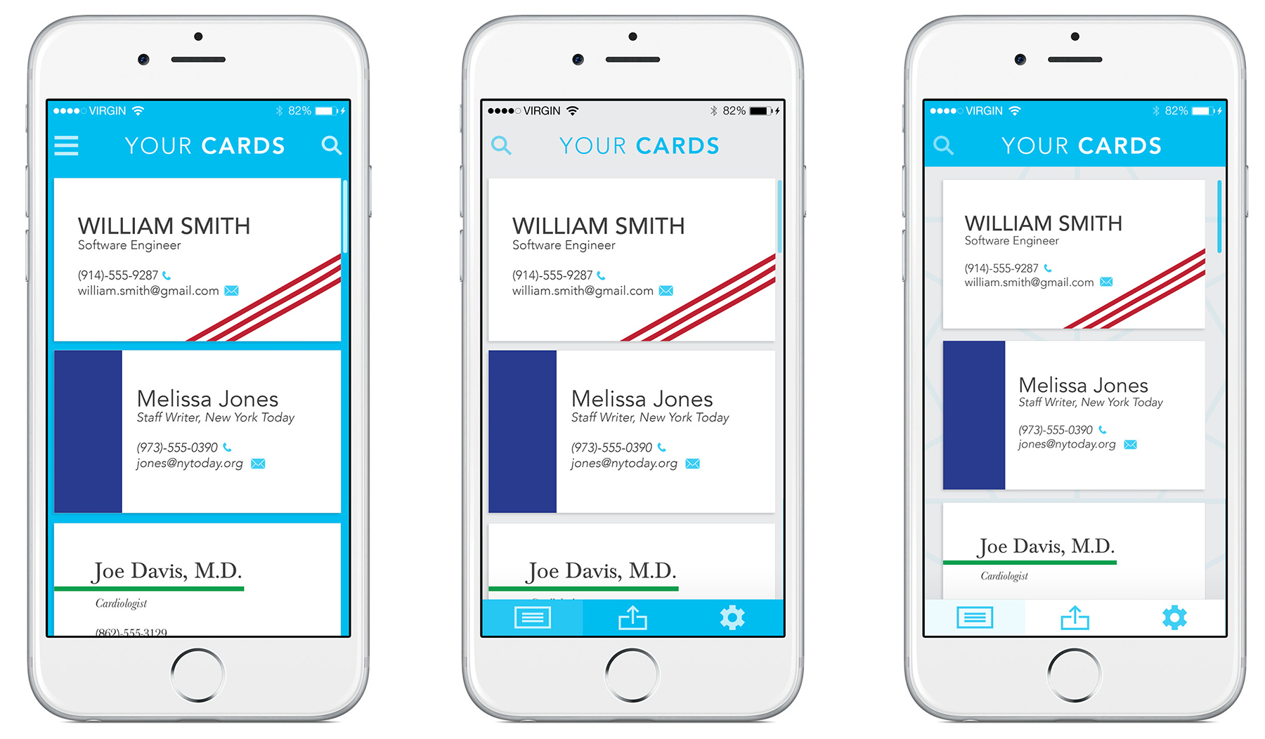
Navigation
Based on feedback from the users, I changed the navigation from a hamburger/sidebar to an always-present bottom bar for a simplified navigation experience.
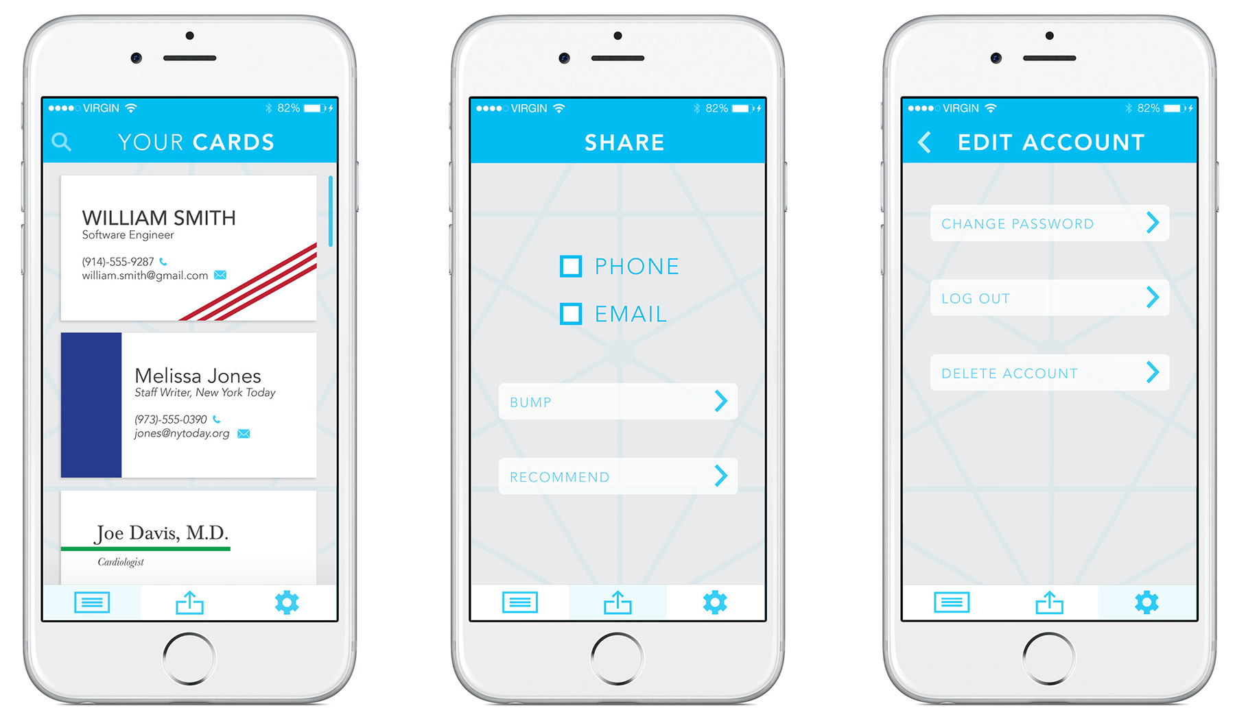
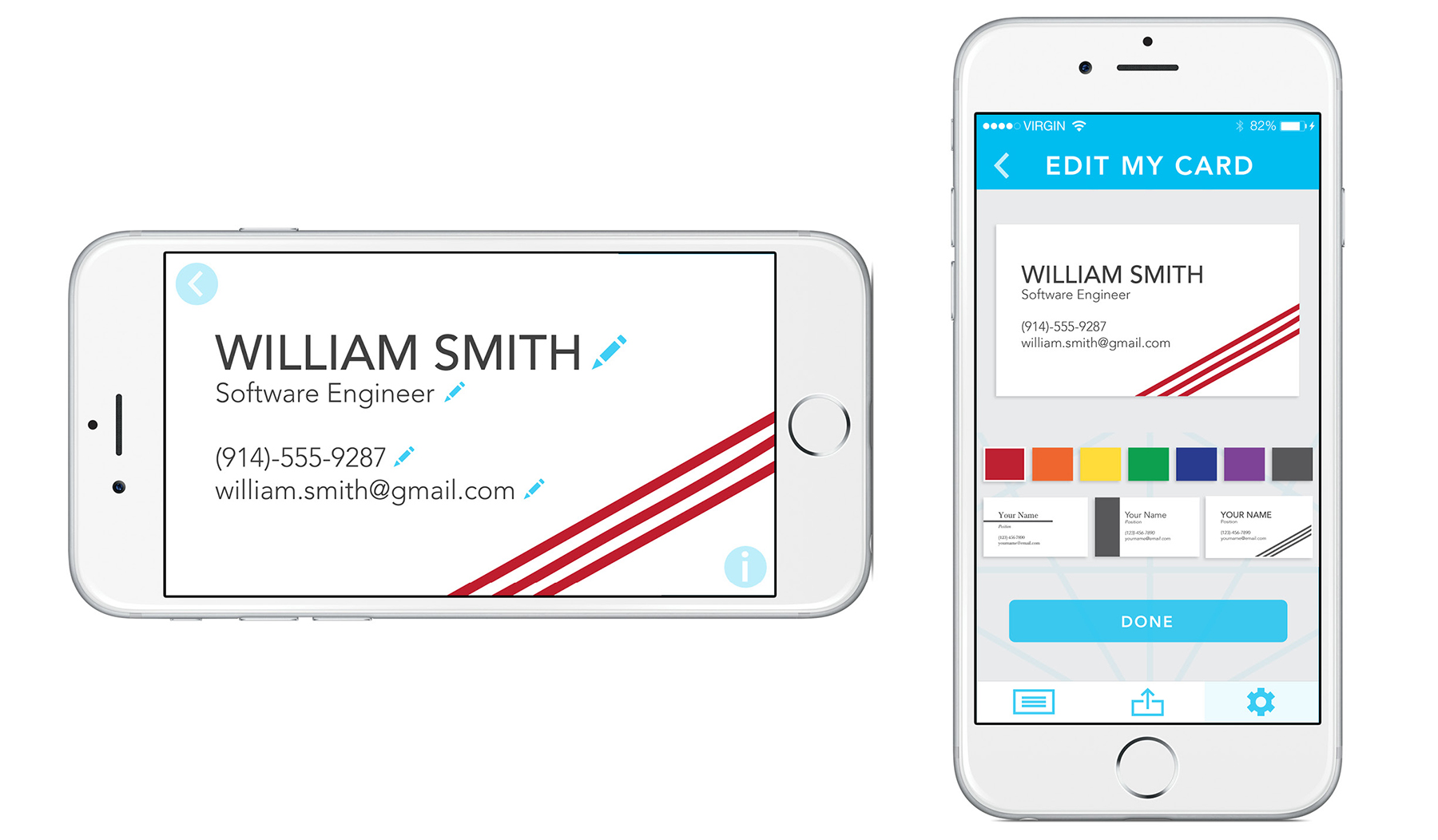
Single card view
When a user selects one of the cards from the home screen, they will see a full screen view of the individual card. Initially, there was a feature for users to flip over the virtual card to access contact functionality. In user testing, I found that while users enjoyed the whimsicality of the virtual card flip, they felt that it was an unnecessary extra step to access important functionality. To simplify the experience to remove the heavy animation, I moved the contact buttons to be always present on the front of the card.


Editing card/account, parallel mental models
To maintain the simplistic experience of KeepUs, I implemented parallel mental models throughout the app. For a user to edit the contact info or design of their card, I used the same mental model as the single card view and of the card creation of the onboarding experience.
Solution
The final app experience was evaluated based on its success in satisfying potential users (validated in user testing) and its ability to achieve our goals (validated by team) of simple navigation, fast and easy journey, and a balance of professional and delightful experience.
Challenges
We encountered many challenges while creating KeepUs. In order to maintain reasonable loading speeds, we made the decision to remove heavy animations while still keeping more minor animations for a fun experience. Because we were developing KeepUs on a college campus, we didn't have access to a large base of potential users and only tested the app with college students, a narrow demographic.
Changes
Looking back on KeepUs, the biggest change I would make is to expand app capabilities to give users more reasons to use the app and more reasons to come back and remain engaged. For example, proximity notifications to show other KeepUs users nearby, like a "professional Tinder."
Work
Taylr
interaction & visual design, hackathon

interaction & visual design, ux research
Pipe Line
interaction design, project management
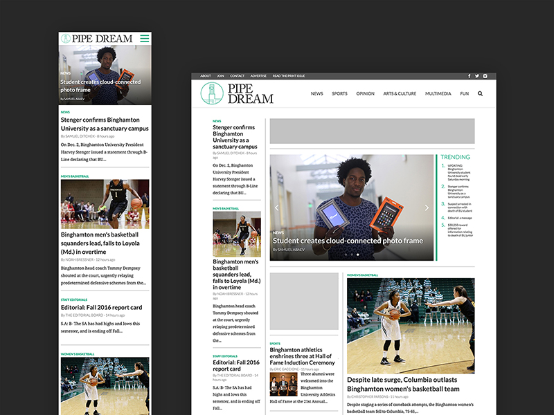
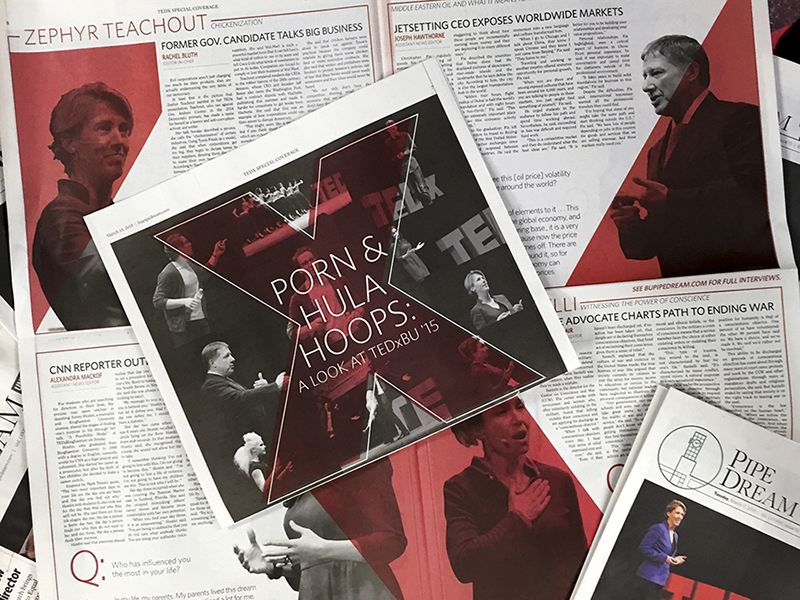
Pipe Dream site
interaction design, project management
KeepUs
interaction design, visual design
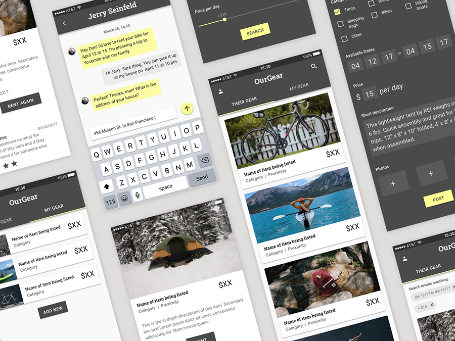
OurGear
interaction design, visual design
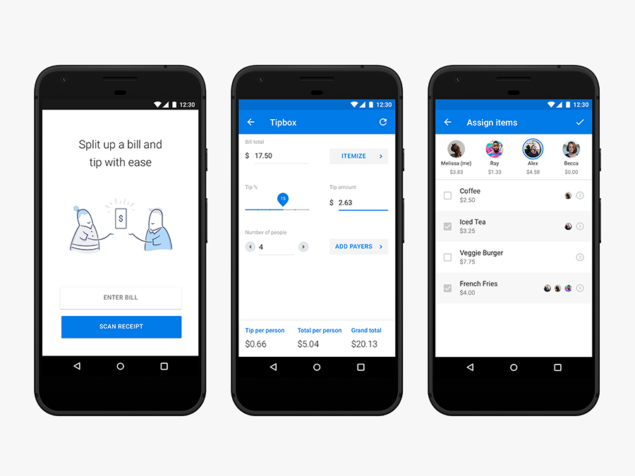
Tip Calculator
interaction design

Illustration
visual design
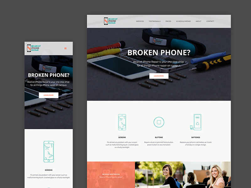
iPhone Repair
interaction & visual design, html/css
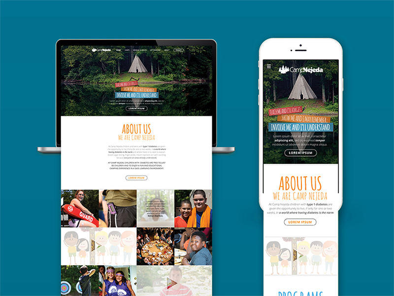
Camp Nejeda
interaction design, visual design
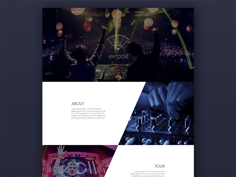
Exitpost
visual design
Island of the Self
motion design
Pipe Dream
interaction design, visual design
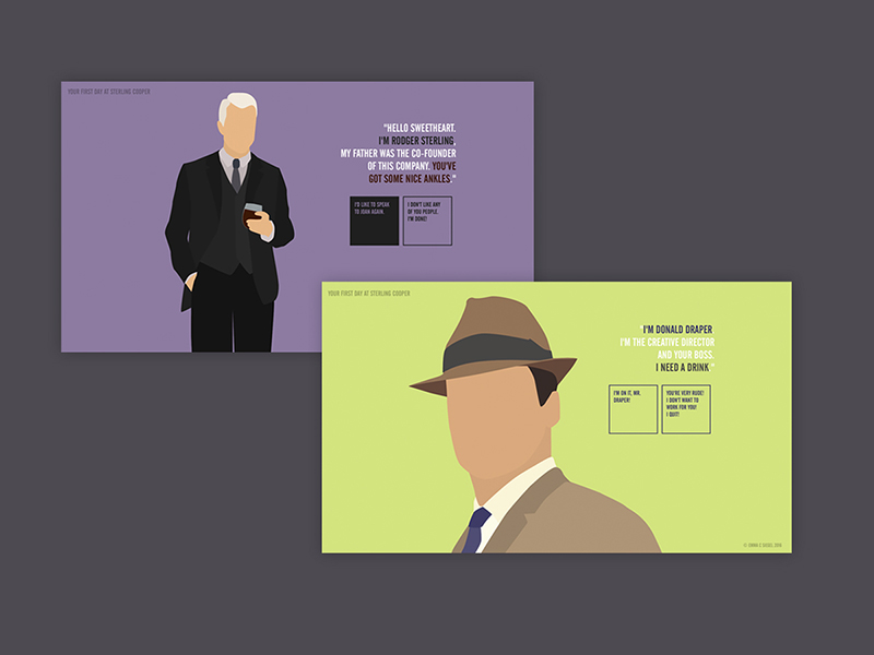
Mad Men
interaction & visual design, html/css
Graphic Design
visual design