Pipe Line
Project Management, Interaction Design, UX Research
Spring 2017
Overview
Pipe Line, Pipe Dream's cleverly named publishing workflow management system, was built in 2003. While the newspaper has evolved, Pipe Line has remained the same over the past 14 years. We set out to identify the key problems and improve the experience for Pipe Dream's staff members who spend dozens of hours per week using Pipe Line.
Team
To ensure the success of this project, we assembled a diverse team to include as many perspectives as possible. We included staff members to represent each of the sections, as well as equal representation from older staff members with more experience and younger staff members with a fresh perspective. Though I was the main UX designer for the team, I made it a priority that every member of the team felt empowered to bring new ideas and make design decisions.
Project manager/UX: Me
Front-end/design: Casey Tin
Front-end/Managing Editor: Rohit Kapur
Newsroom Tech/back-end: Michelle Tan, Henry Zheng
Content Editors: Jeff Twitty, Noah Bressner, Gabby Weick, Caleb Schwartz
Copy Desk: Shauna Bahssin
My Contributions
I worked on the project management and interaction design. I led the team through brainstorming and design thinking exercises, created plans, assigned tasks and designed mock ups. I also organized user research.
The Problem
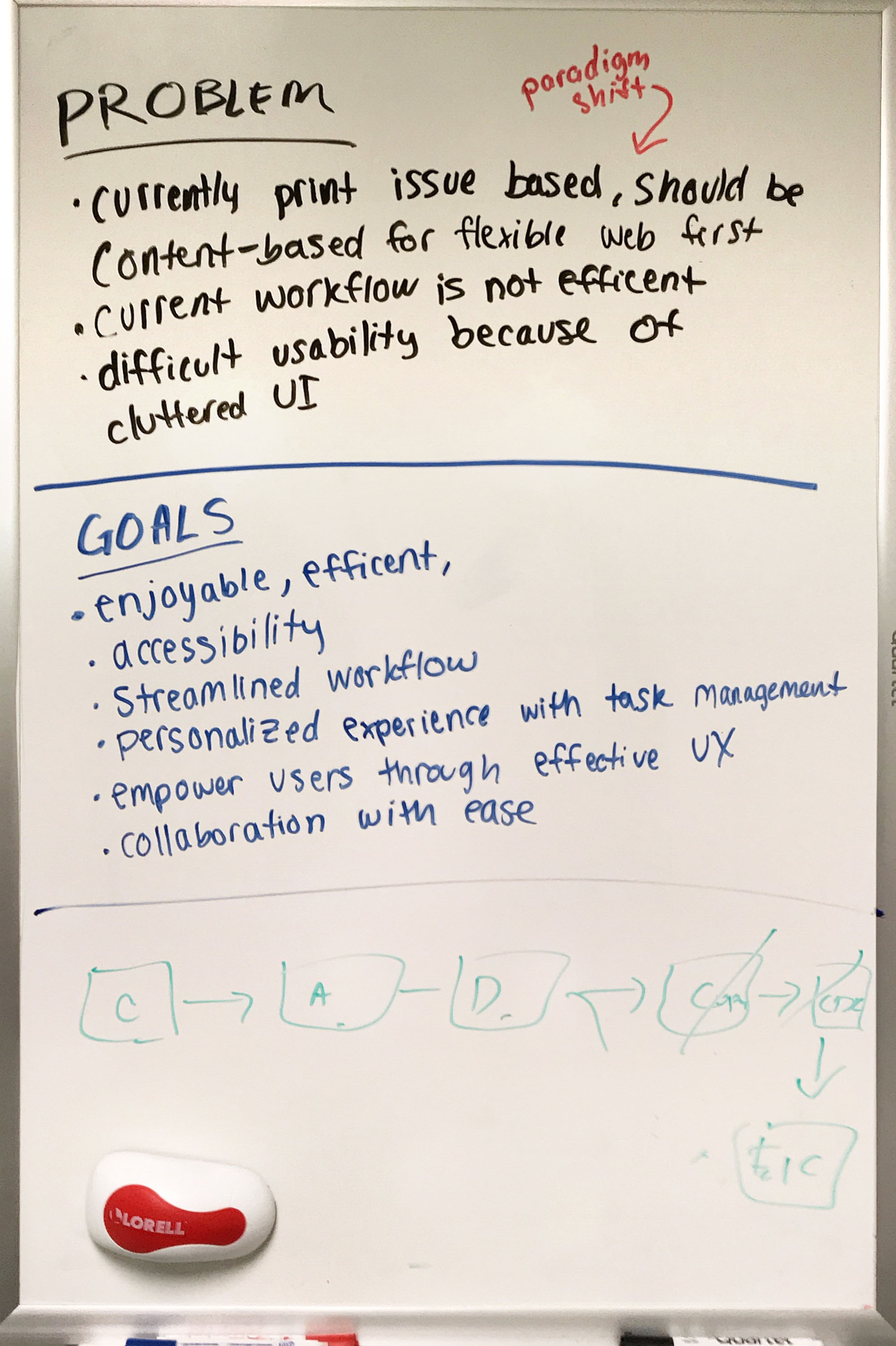
Through research, surveys, user interviews, and brainstorming, our team determined that the main problem with Pipe Line is that the current system is print issue-based. In order for Pipe Dream to move forward to a web-first model, our workflow management system would need to be content-based in favor of web-first and flexibility.
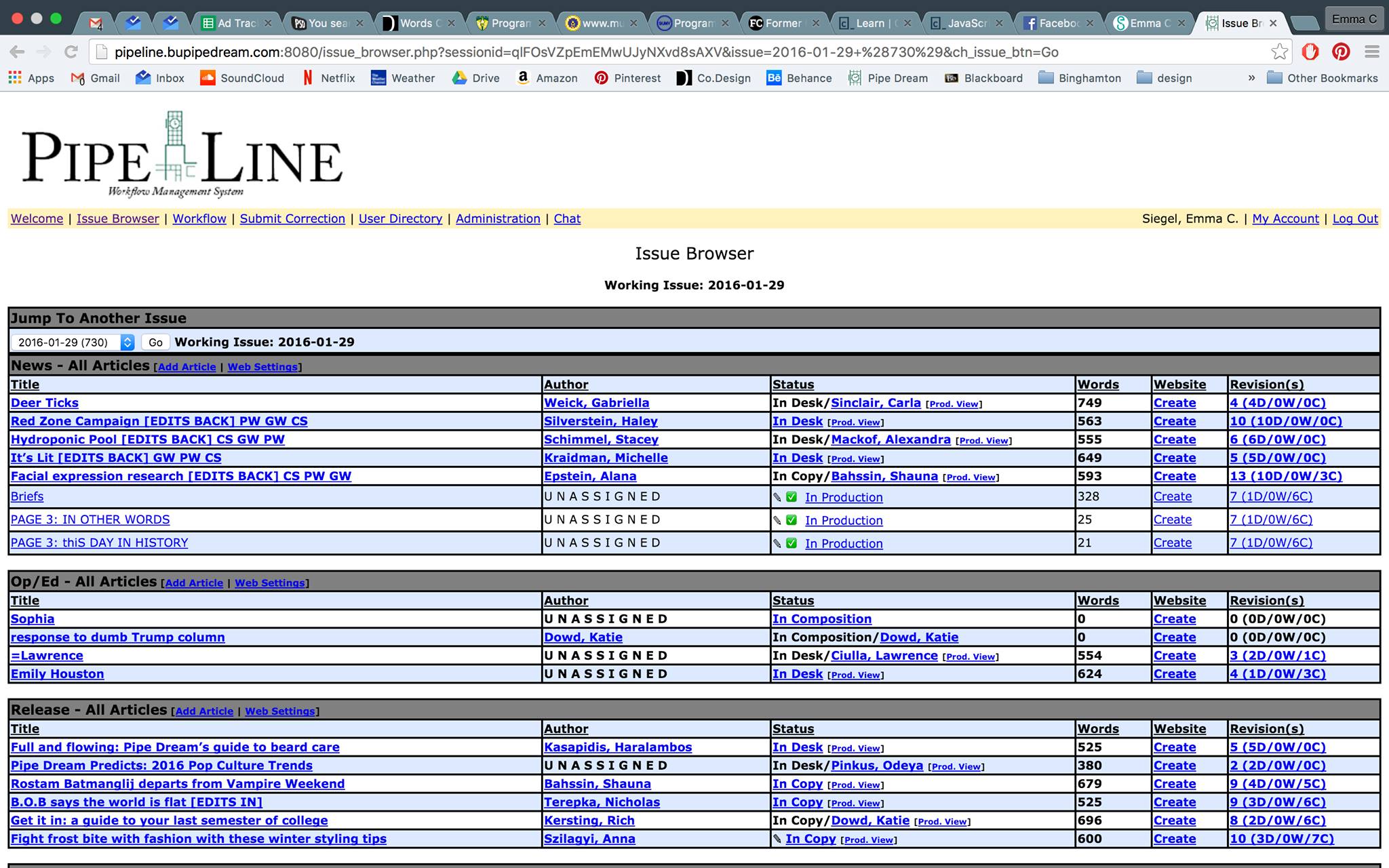
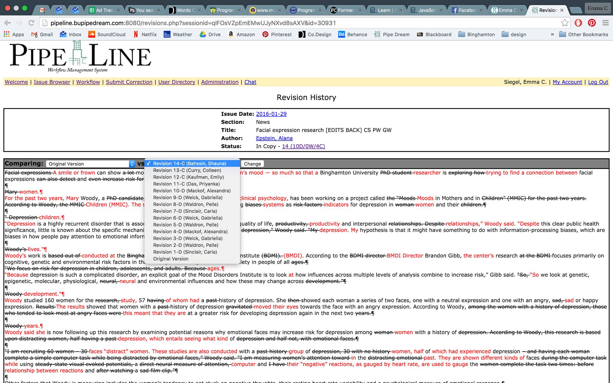
Old Pipe Line
Issue Browser: This is a list of all of content in a given print issue. Though it communicates a huge amount of information, the interface is visually overwhelming.
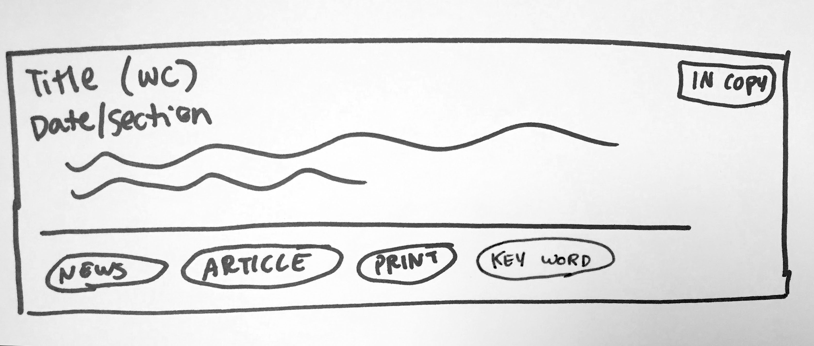
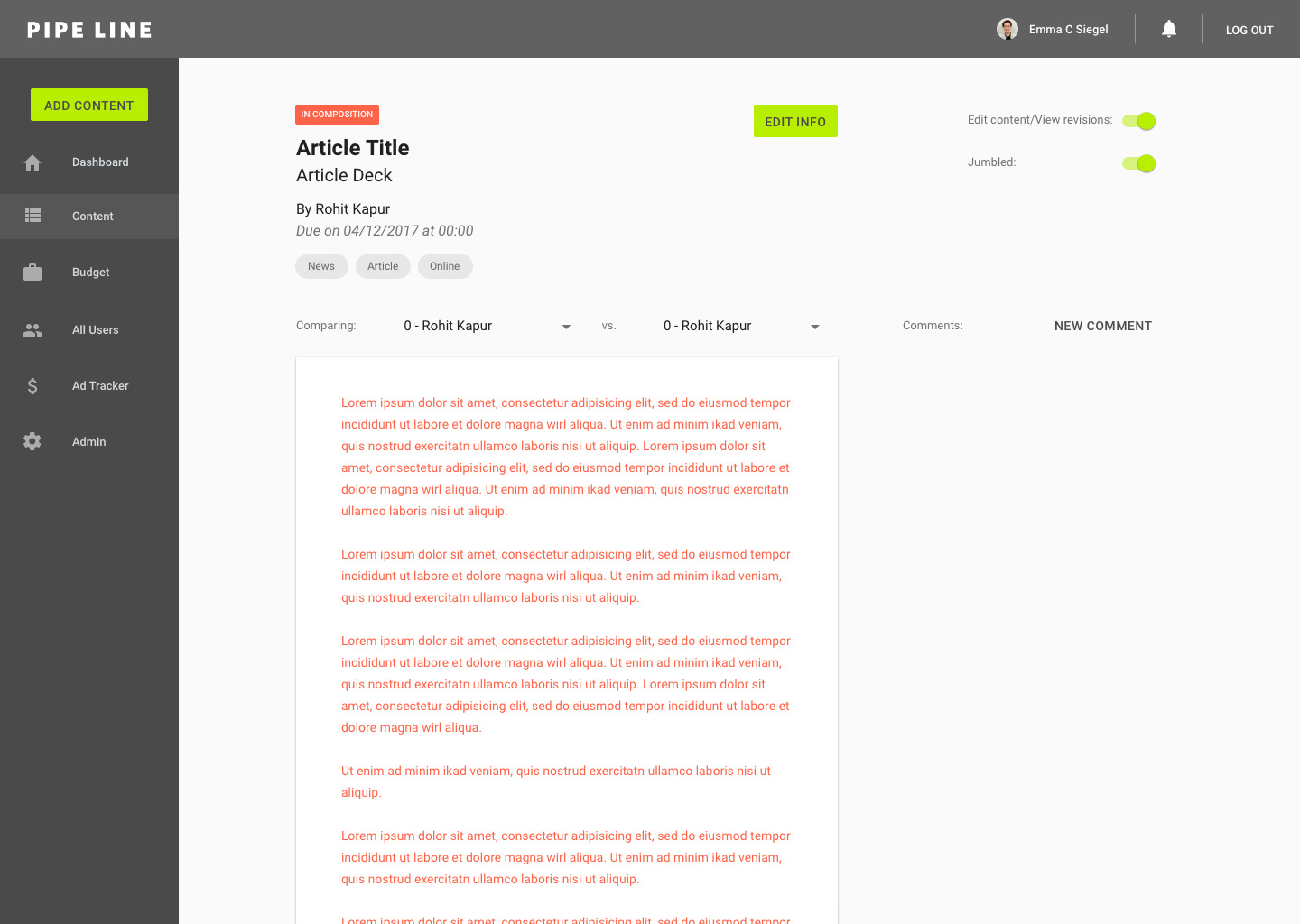
Article: Users can view and compare revisions on an article. In another view, they can edit the text of the article and see a jumbled placeholder version of the text.
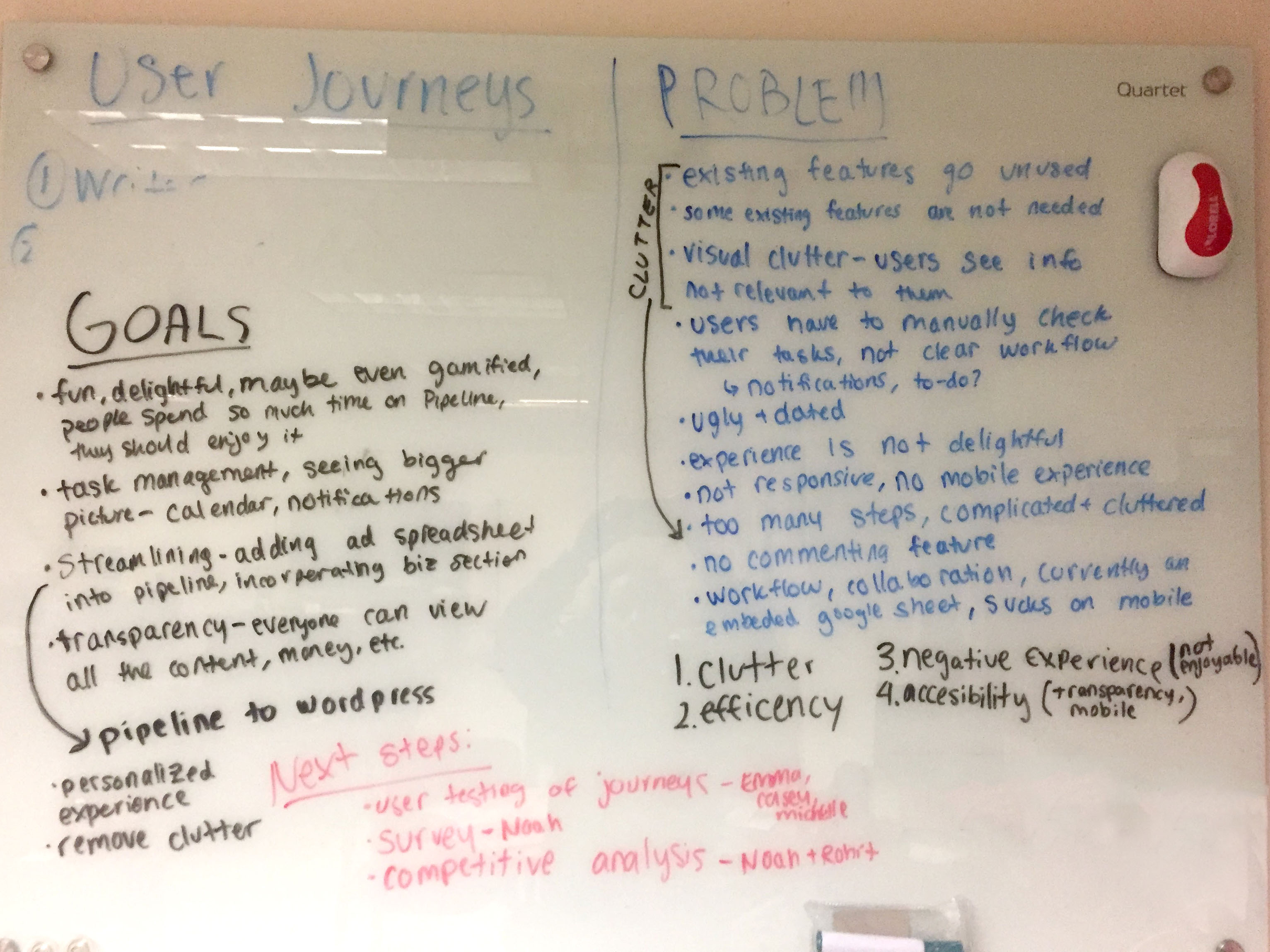
3/25/17: Kick off
Our goal for this meeting was to begin to assess some of the current problems and set initial goals. I led the team in brainstorming based on our own experiences with Pipe Line and general feedback from staff.
We focused problems into four main categories: clutter, efficiency, negative experience (not enjoyable), and accessibility (transparency, mobile). The initial goals we set included delightful experience, task management, streamline workflow, transparency, personalize experience, remove clutter, collaboration
Survey
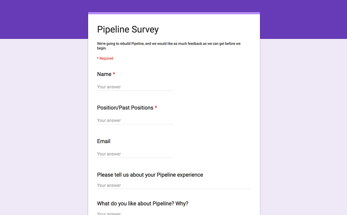
In order to generate a database of user feedback, we created a survey and sent it to both current staff and our alumni listserv.
Questions asked: Name, Position/Past Positions, Email, Please tell us about your Pipe Line experience, What do you like about Pipe Line? Why?, What do you dislike about Pipe Line? Why?, What ideas do you have for the future of Pipe Line?, Other comments
LIKE:
"Pipe Line felt ancient to use - it was slow, ugly, but at the same time very functional and got the job done."
"It works pretty well but sometimes crashes and loses edits."
"I liked that it had a lot of steps to ensure the article was read by enough people and couldn't accidentally get pushed to print. It showed dummy copy for designers to use so draft text wasn't accidentally printed which was good."
"Everything is in one place, version control."
"It's better than not having Pipe Line. I like how I can go through revisions, see previous issues, and how it tracks edits."
"It works."
DISLIKE:
"Hard to keep track of things, not everything (like online article stuff) is there"
"It's old. It's based on the concept of print issues."
"The system felt very secretive and there was a lack of transparency with all the content. There are a bunch of unused features, and some things just straight up make no sense."
"Navigation is clunky."
"The width of the articles is way too wide and makes readability difficult."
"I don't like the design of the page; it gets more and more unpleasant to look at as the night progresses."
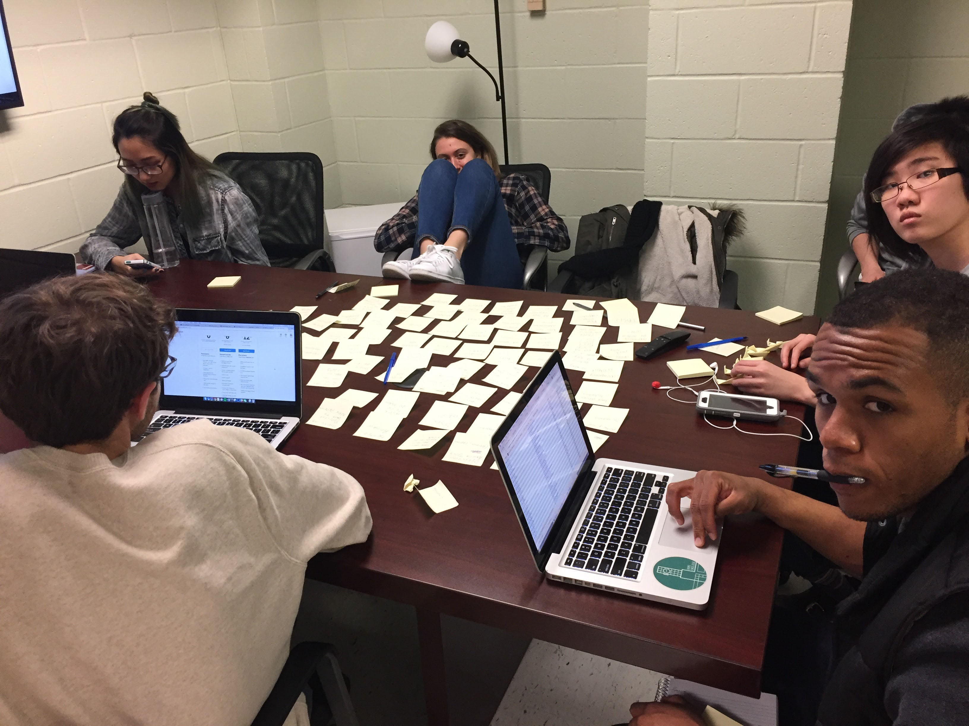
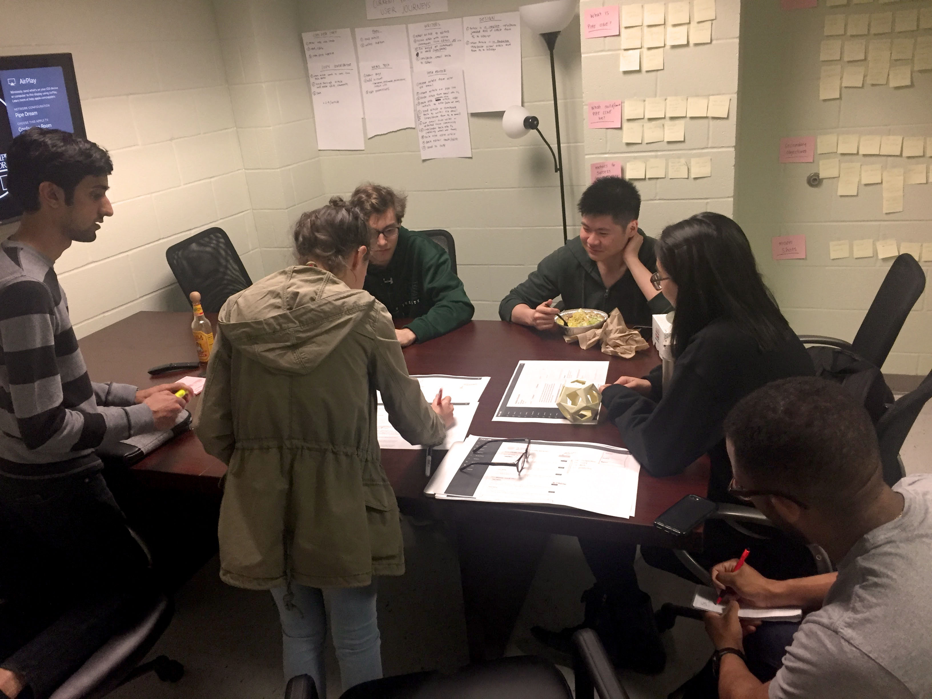
3/30/17: Brainstorming
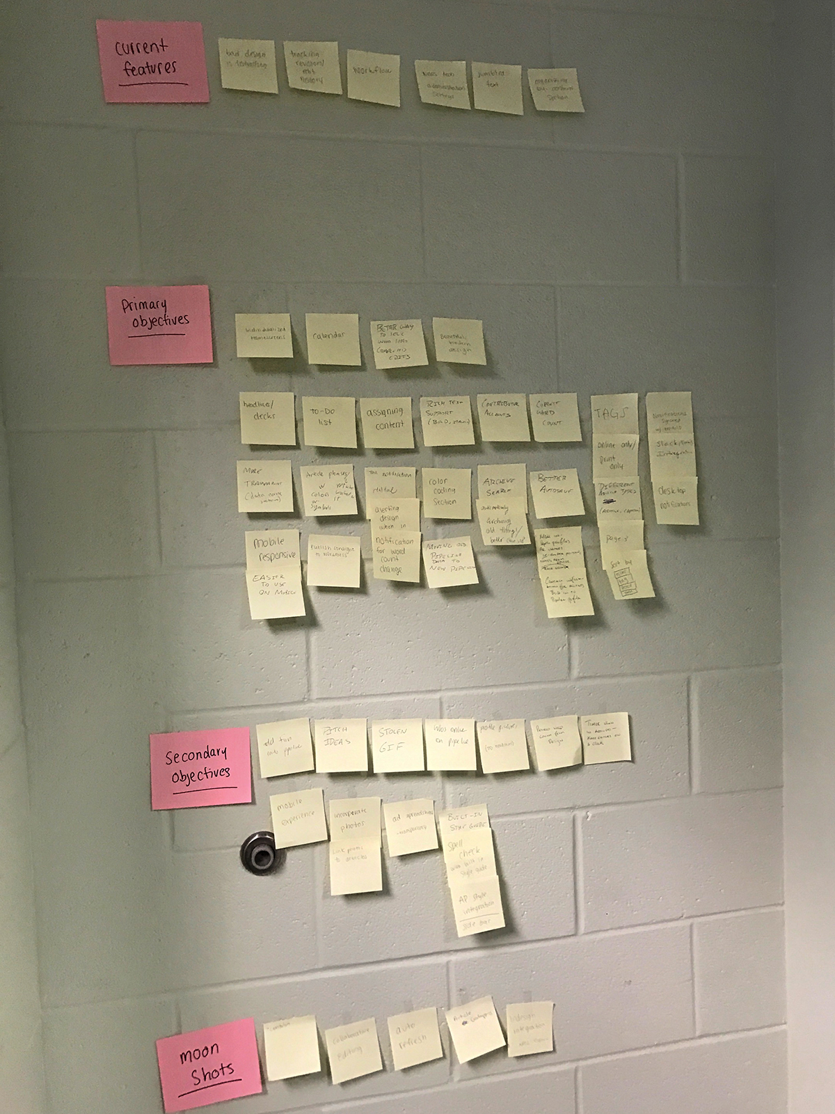
We projected and read through survey responses and wrote down feedback/pain points/ideas on sticky notes. I facilitated a design thinking brainstorming session with the team. We set ground rules of positive feedback, don't shoot down ideas, and that there are no bad ideas in brainstorming. We began by divergently brainstorming ideas and then collaboratively discussing and further ideating. We wrote every idea on a sticky note.
Once we felt we had a sufficient amount of ideas on the table, we sorted them into four categories: current features, primary objectives, secondary objectives, and moon shots. This would help to focus the direction of the project and set priorities.
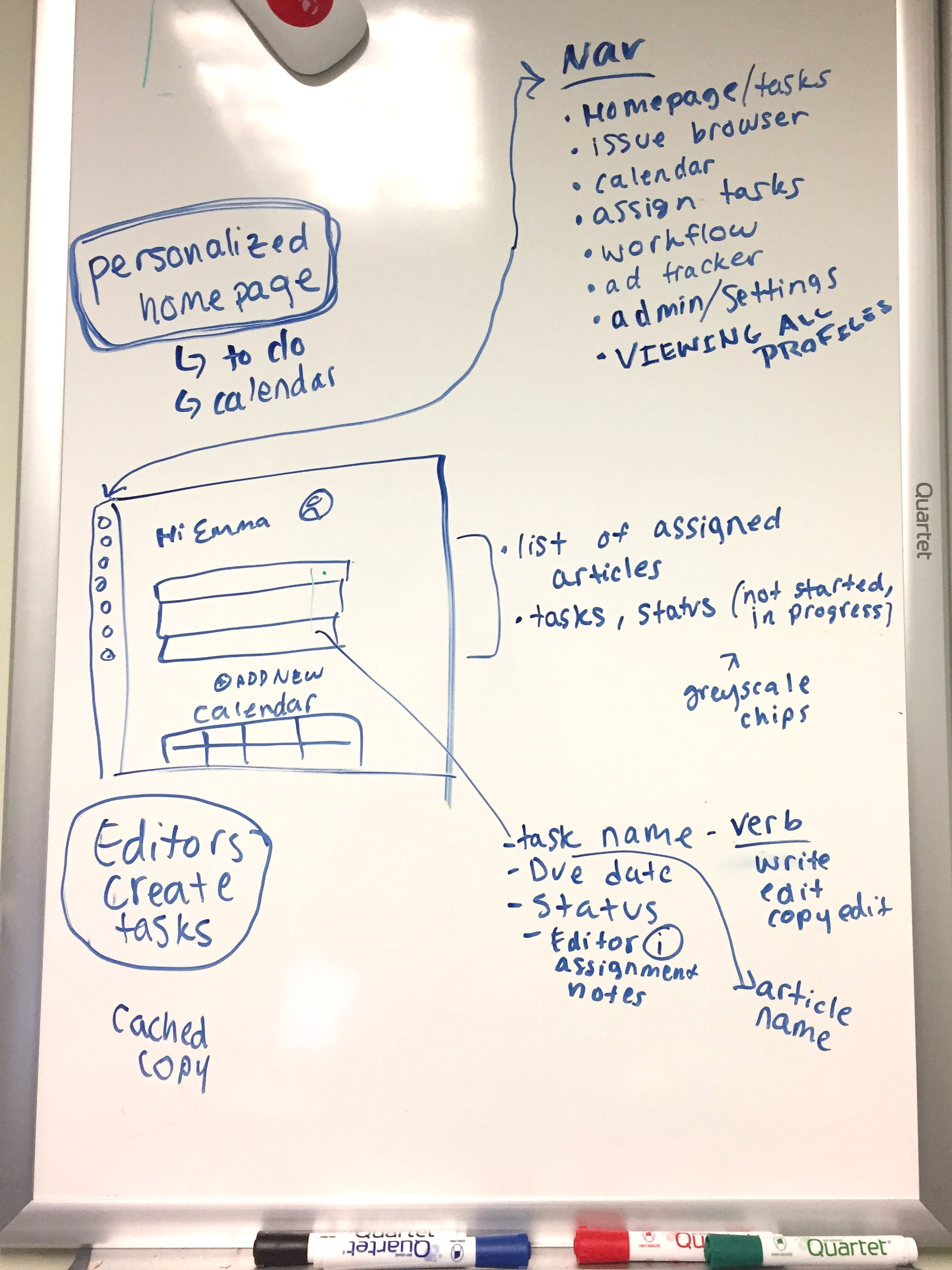
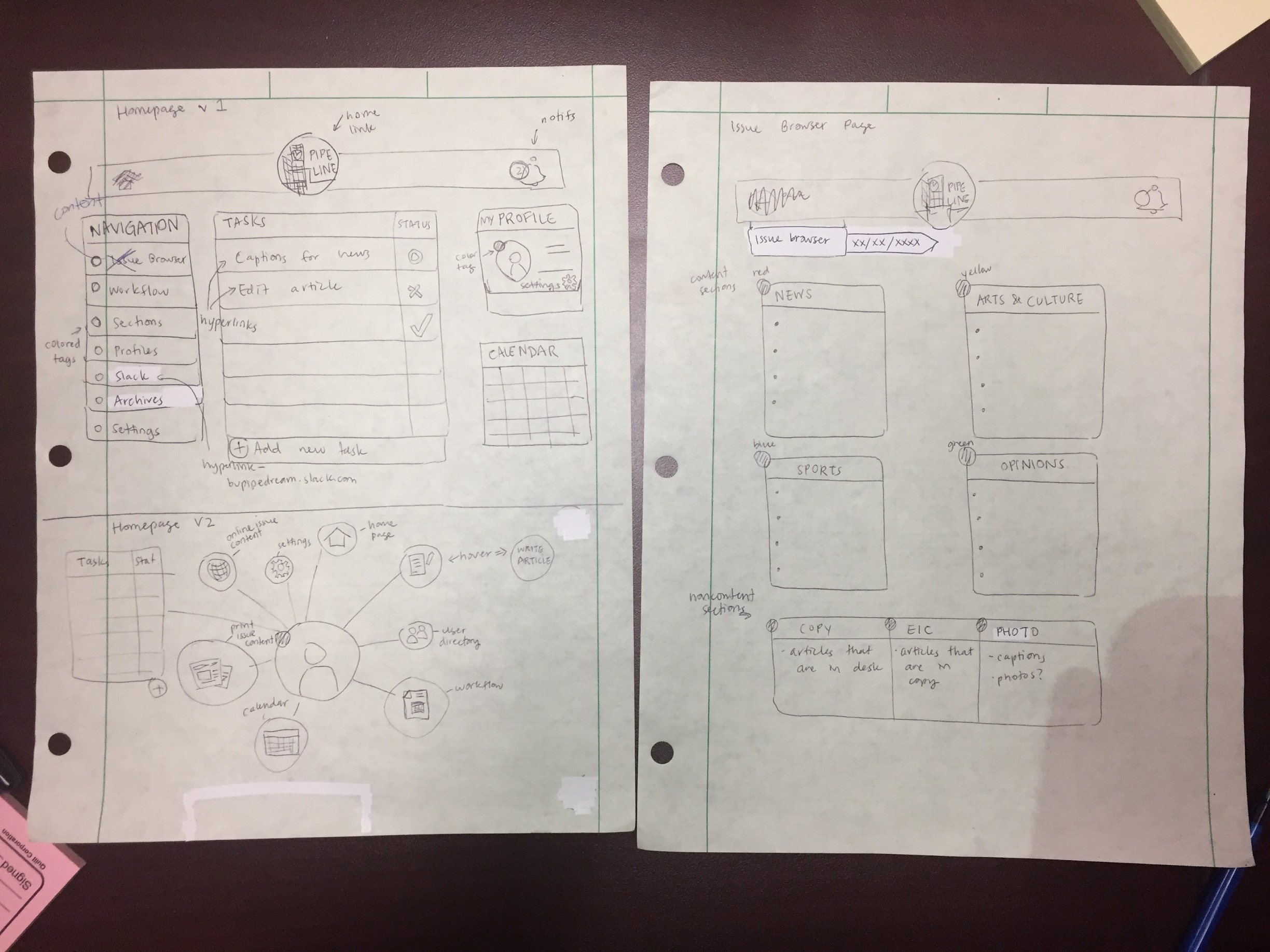
We then created an initial wireframe concept for the homepage that would include a task list and the information that task items may contain. We established potential focus pages for the app's navigation.
Next steps: everyone make some wireframes for how they might envision each page of the Pipe Line experience as well as user journey through the app. At the next meeting, plan to discuss the ideas we came up with and then go from there
4/2/17: Narrowing Project Scope
The goal for this meeting was to further narrow the scope of the project. At this point, we'd done a lot of brainstorming so we needed to narrow down the ideas and figure out exactly what we wanted to do.
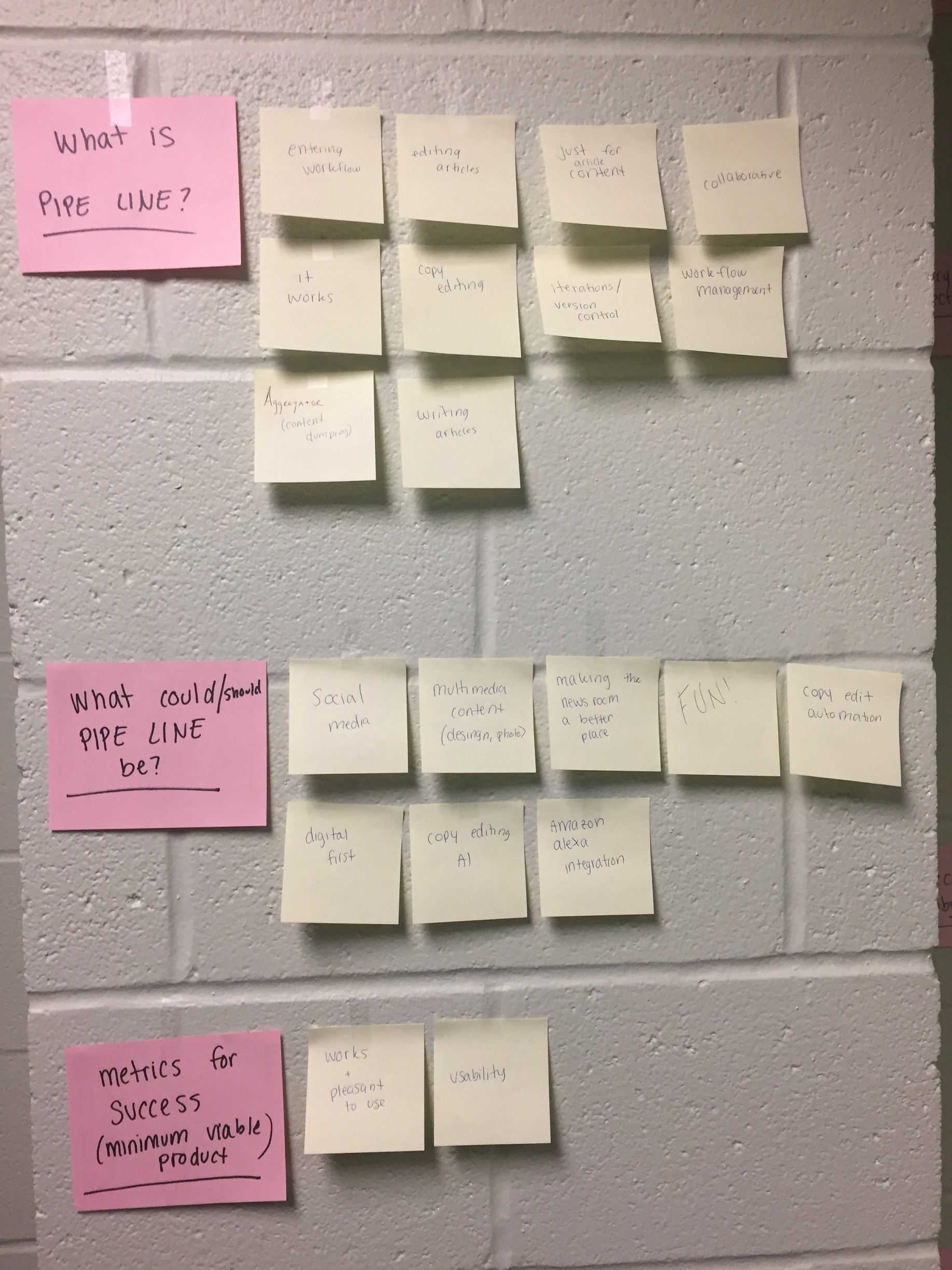
I started the meeting by facilitating a brainstorming exercise to narrow scope by asking the team three questions: What is Pipe Line? What could/should Pipe Line be? What does success look like for a minimum viable product?
We established that Pipe Line is a workflow management system focused on writing and editing content. Pipe Line could be anything from a social media platform to an automated copy editing system. Pipe Line should be fun and focus on digital-first publishing. We narrowed the scope of the project to focus on what the minimum viable product would look like: task-based instead of issue-based in favor of digital-first publishing patterns. We determined that our metrics for success are creating something that works and is usable.
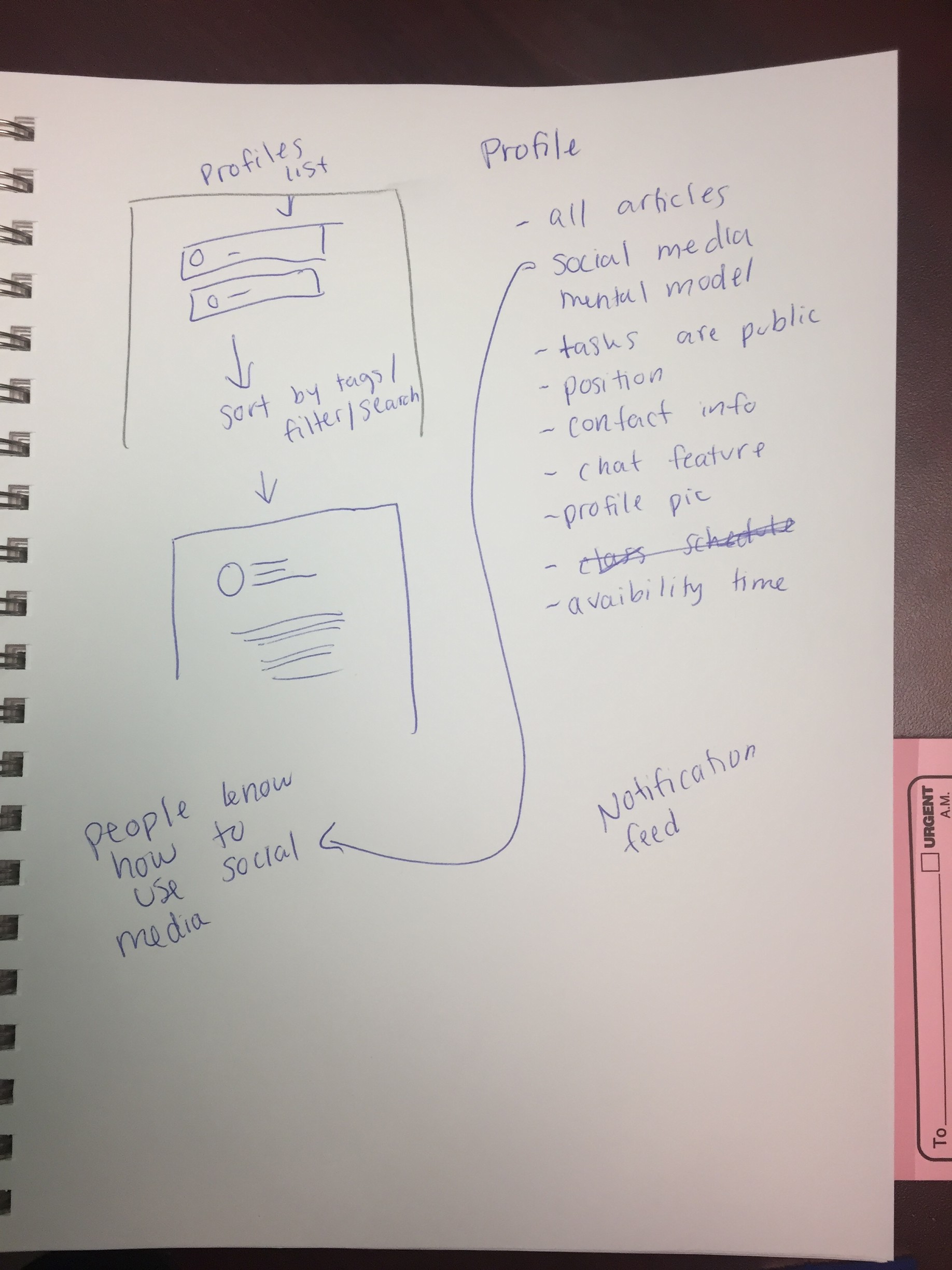
We discussed the wireframes and ideas we created. We expanded on the concept of using a social media mental model to organize the app, which would be based around task feed, notifications, and user profiles.
Casey's Sketches:
Jeff's Sketches:
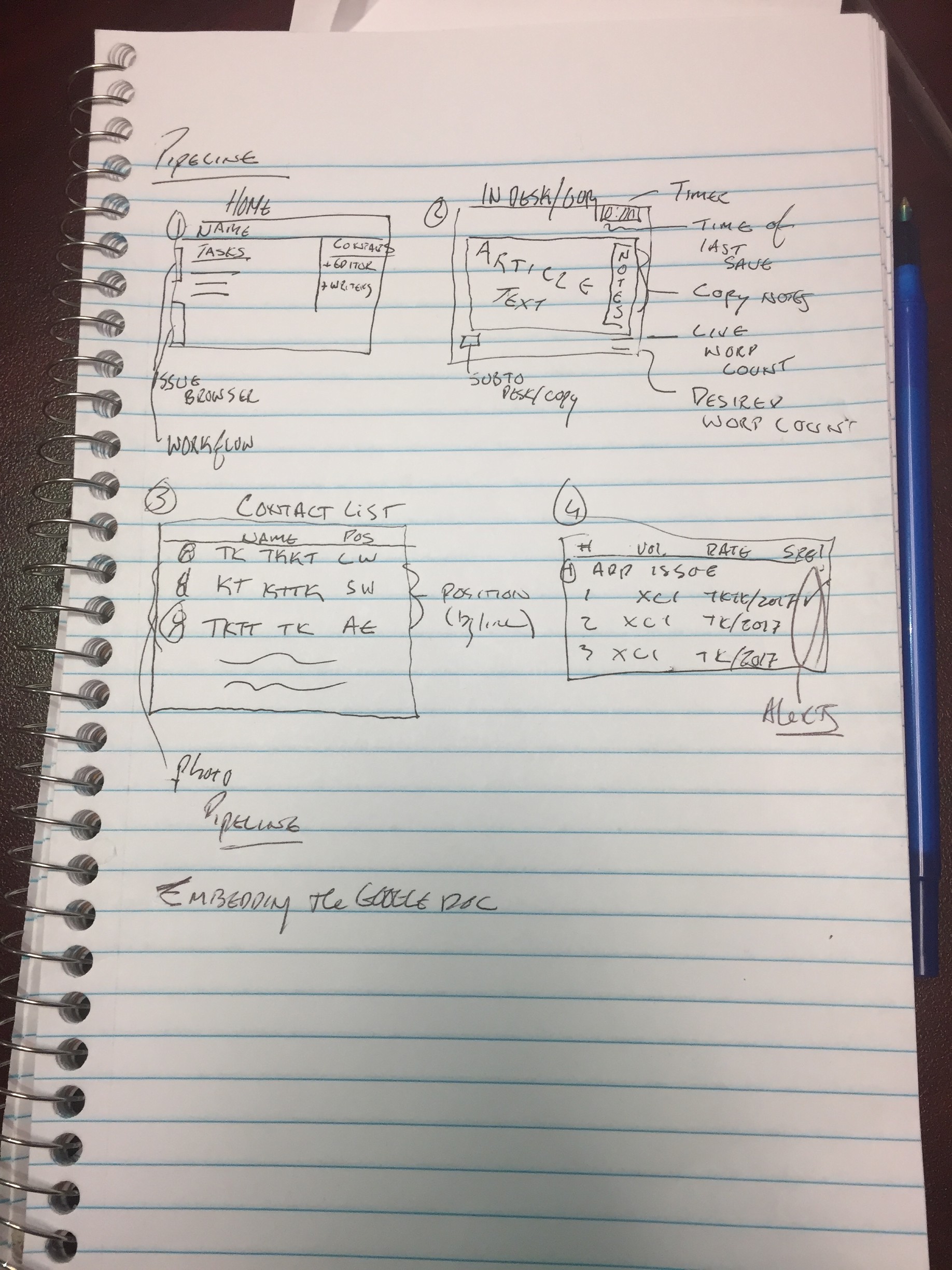
My Sketches:
In terms of scope, we also discussed the overall project plan and deadlines. As it's already April, there are only 4.5 weeks of class left in the semester. Three of us on the team are graduating at the end of this semester so we want to get as much done as possible to help the people who take this over when we're gone. We also are facing technical limitations. We have Michelle for the back-end but she'll need a lot of help and we're struggling to find a student who will take on this lofty project. Our goal is to have the concept, UX and, if time allows, visual design figured out by the end of the semester. We'd also like to get started on the back-end before the semester ends but then the rest of the development will happen over the summer/next school year.
4/5/17: User Journeys
We interviewed staff members from each of the main user types and outlined the user journeys in the current Pipe Line experience of each of the user types.
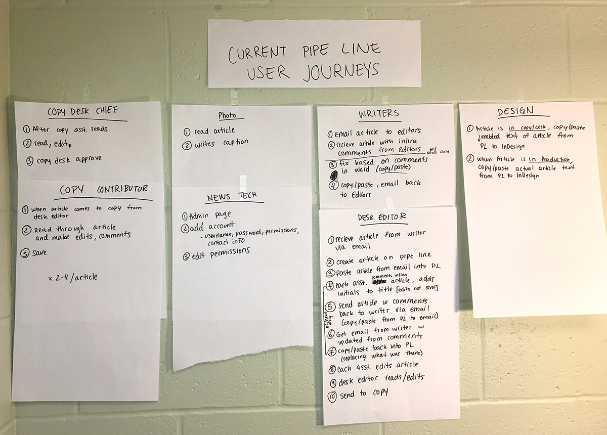
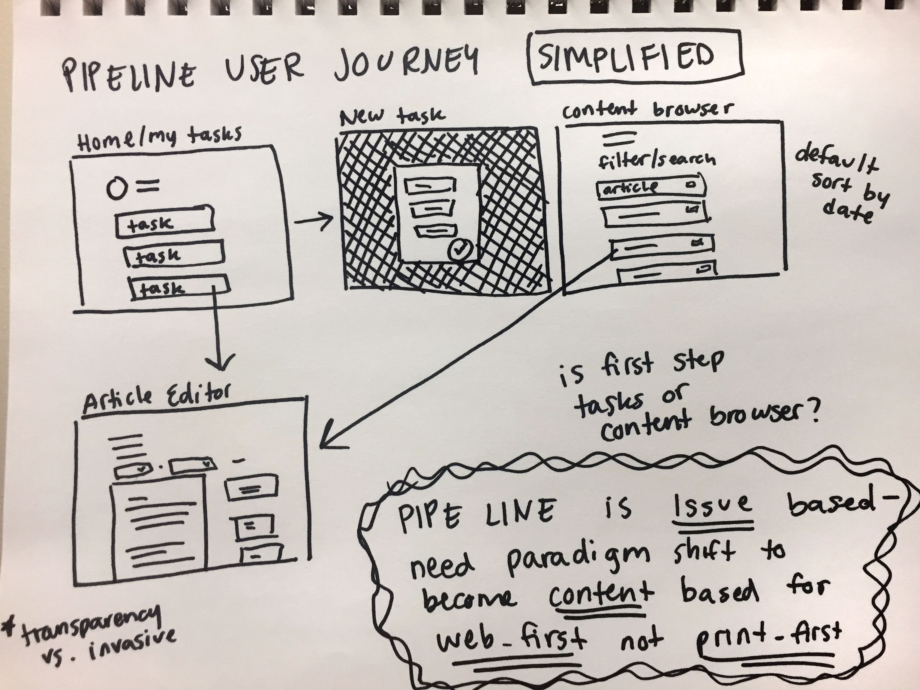
From the competitive analysis results and looking at the current user journeys, we were able to determine that the main problem with Pipe Line is that the current system is print issue-based, rather than content-based in favor of web-first content. With this key problem and our UX goals in mind, we were able to further narrow the focus of the project by establishing that the most simplified user journey for the new Pipe Line experience would include four screens: home/my tasks, content browser, article editor, and new task creation.
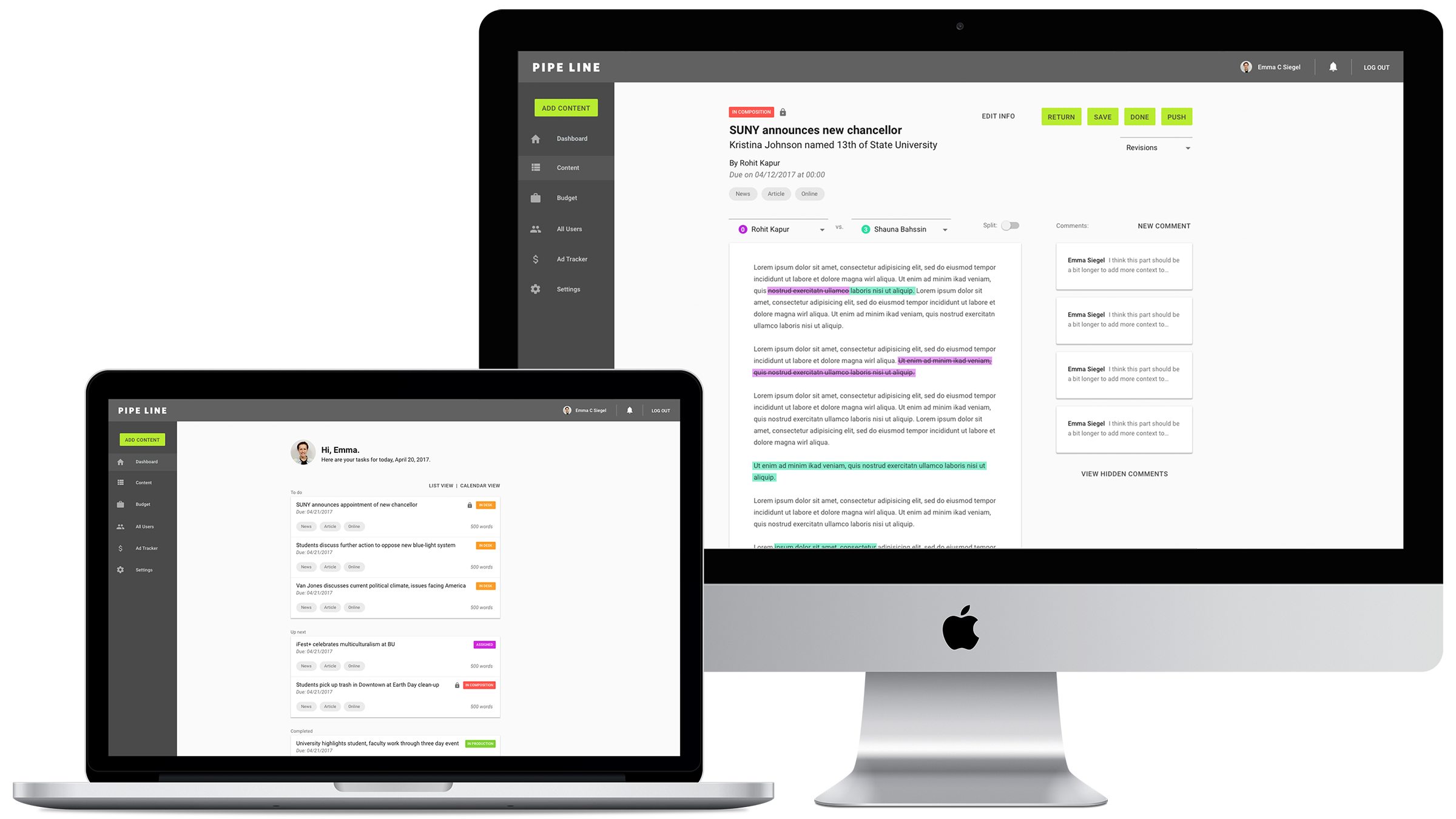
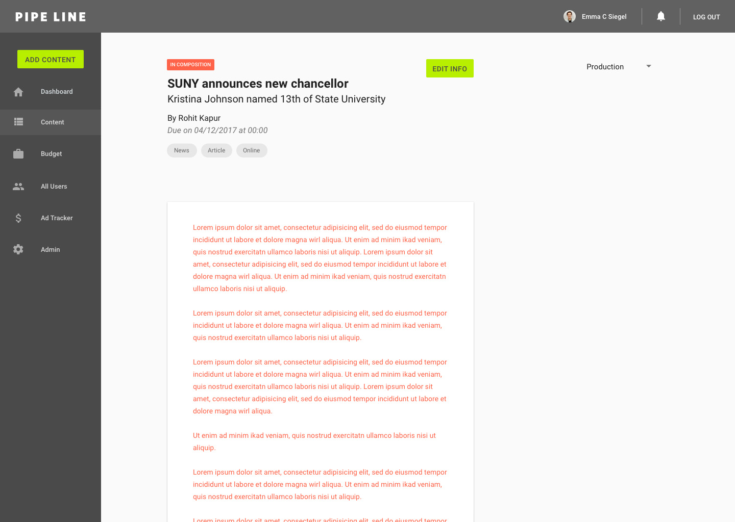
4/12/17: Initial Mocks (V0)
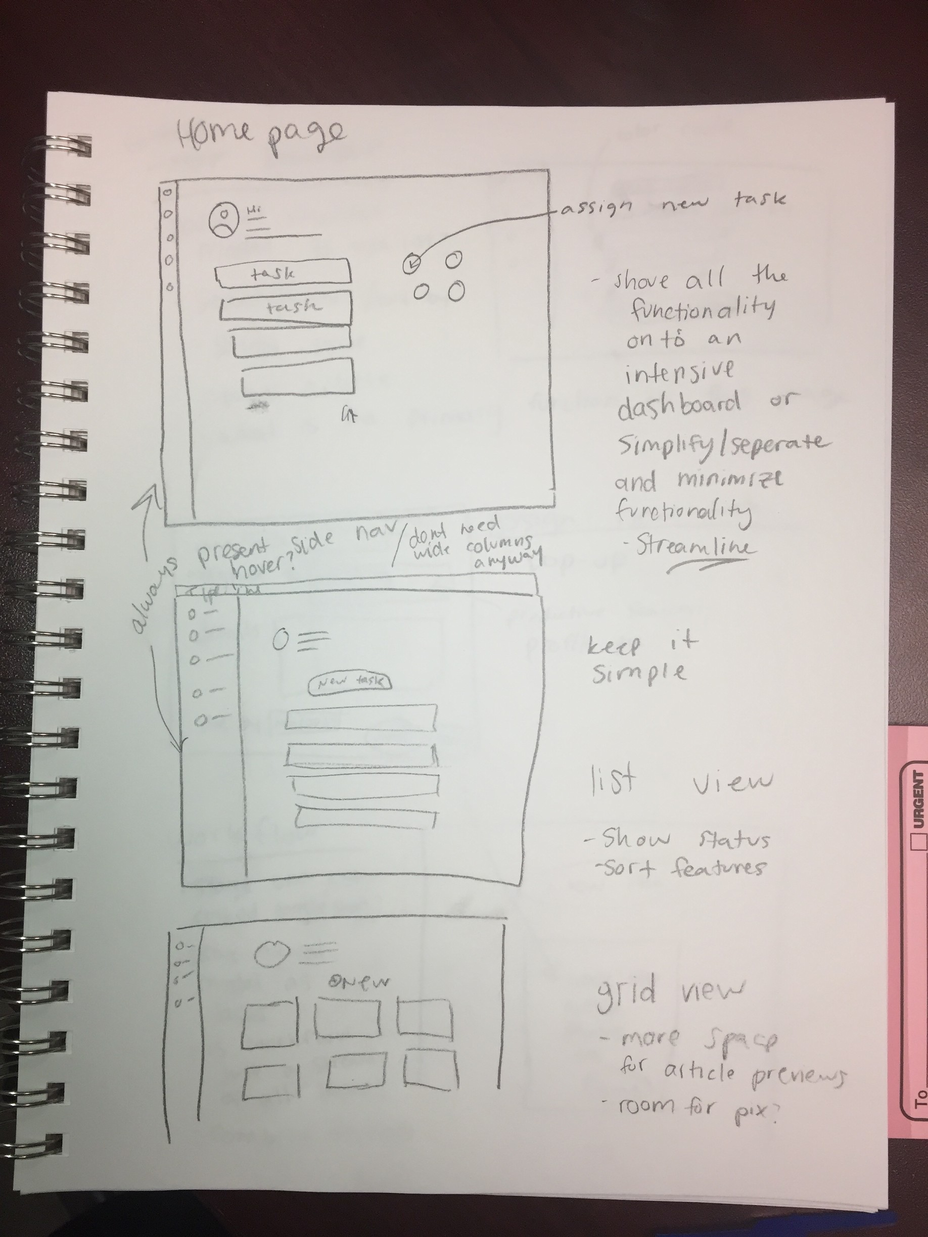
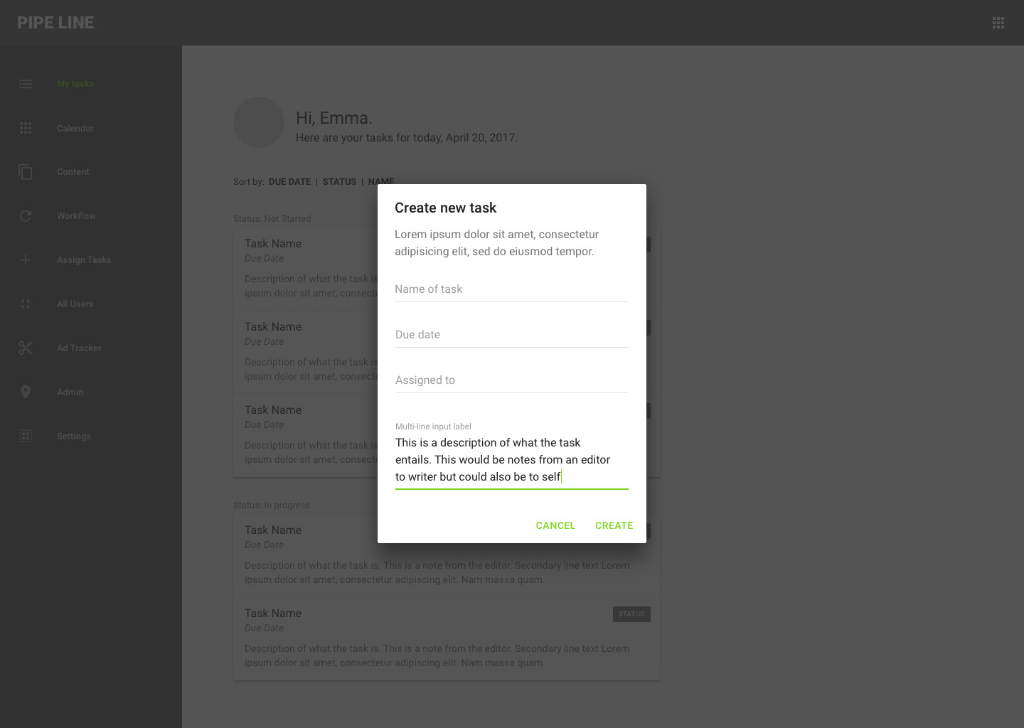
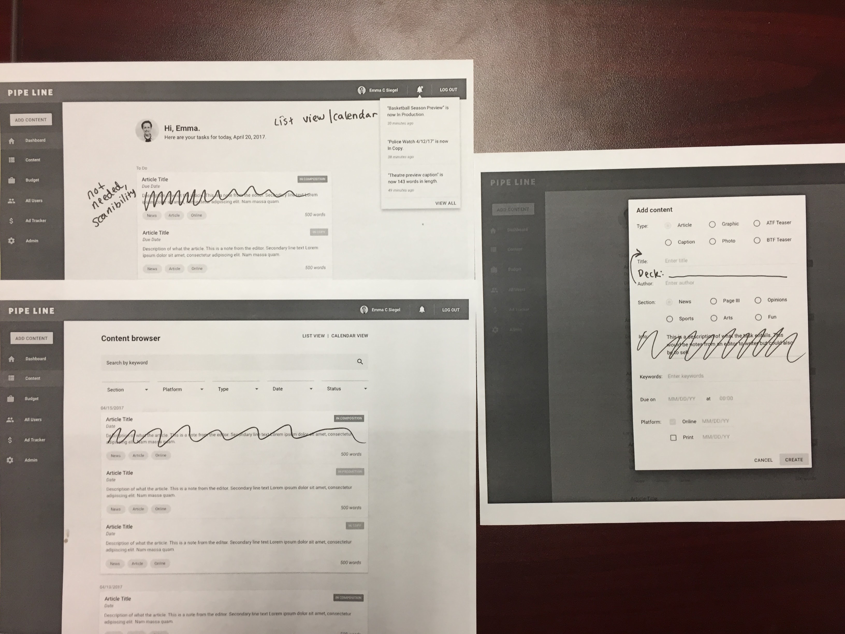
Over spring break, I set aside time to create initial mock ups of the four key screens of the experience: home/my tasks, content browser, article editor, and new task creation. With our goal of accessibility and fast experience in mind, I chose to use a material design-inspired visual design system. My plan was to create a set of initial mocks and then discuss them with the team to brainstorm other directions in which to iterate and move forward. As the primary designer on the team, I kept in mind that my teammates had less experience with creating web apps, so giving them the mocks as a visual aid would help them to brainstorm ideas. Disclaimer: all of the icons in these mocks are placeholders.
Home/my tasks: options for "new task" call to action
Article editor: use cases through the experience

New task dialog:
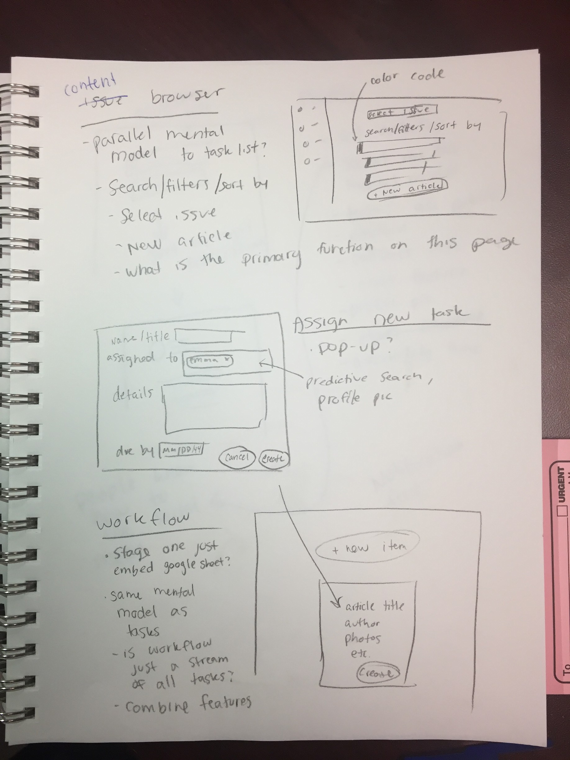
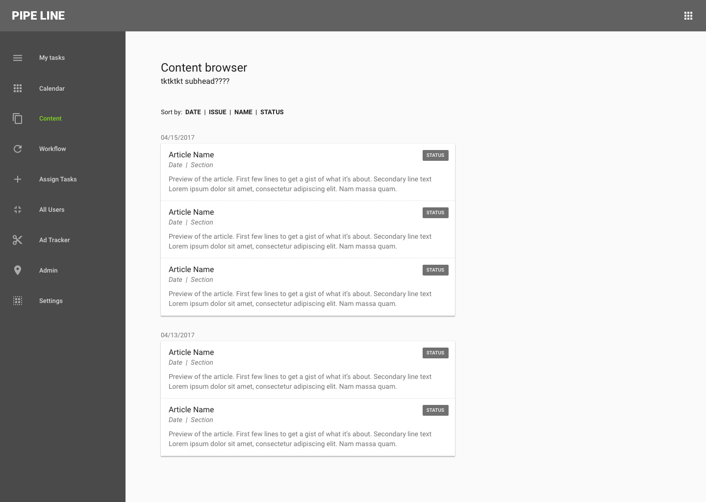
Content browser: parallel mental model to my tasks
Next steps: print out mock ups and critique, pro/con, suggest changes and improvements; discuss how current mocks will work into user journeys, what other screens are needed
4/25/17: Revisiting problem/goals, testing/critiquing v0 mocks
At this point in the process, since the scope of the project had become more focused, I felt that it was time to revisit our problem and objective. I led the team in a brainstorming session to refine our problem and redefine our goals for success.
With our new goals in mind, we critiqued the mock ups I created for the four main screens of the user experience. We also went through the mocks with other members of the staff to get additional user feedback.
We suggested that Pipe Line's new homepage (previously called "My Tasks"), should be called "My Desk" to reflect a parallel mental model to our staff working in the newsroom.
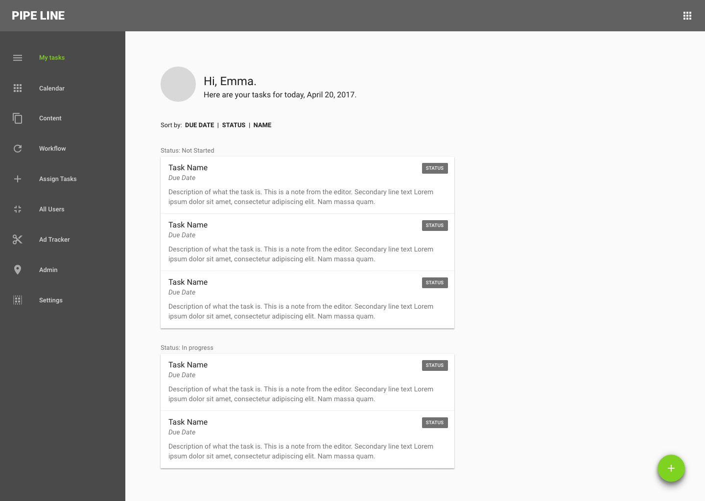
With the goal of streamlined workflow in mind, we decided to change the phrasing of the call-to-action button from "new task" to "new content" because the button will be used to create a new article (which would therefore generate tasks for users) rather than tediously assigning tasks to each user every step of the workflow process.
For the placement of the "new content" button, user feedback polled in favor of the button living in the top of the sidebar navigation because it would be universal on all the pages and therefore globally accessible. Users felt that the small plus icon in the nav was too subtle and the floating action button in the bottom right corner was out of the way. Some users chose the button location above the task list but we decided to move forward with the button on the sidebar in favor of accessibility.
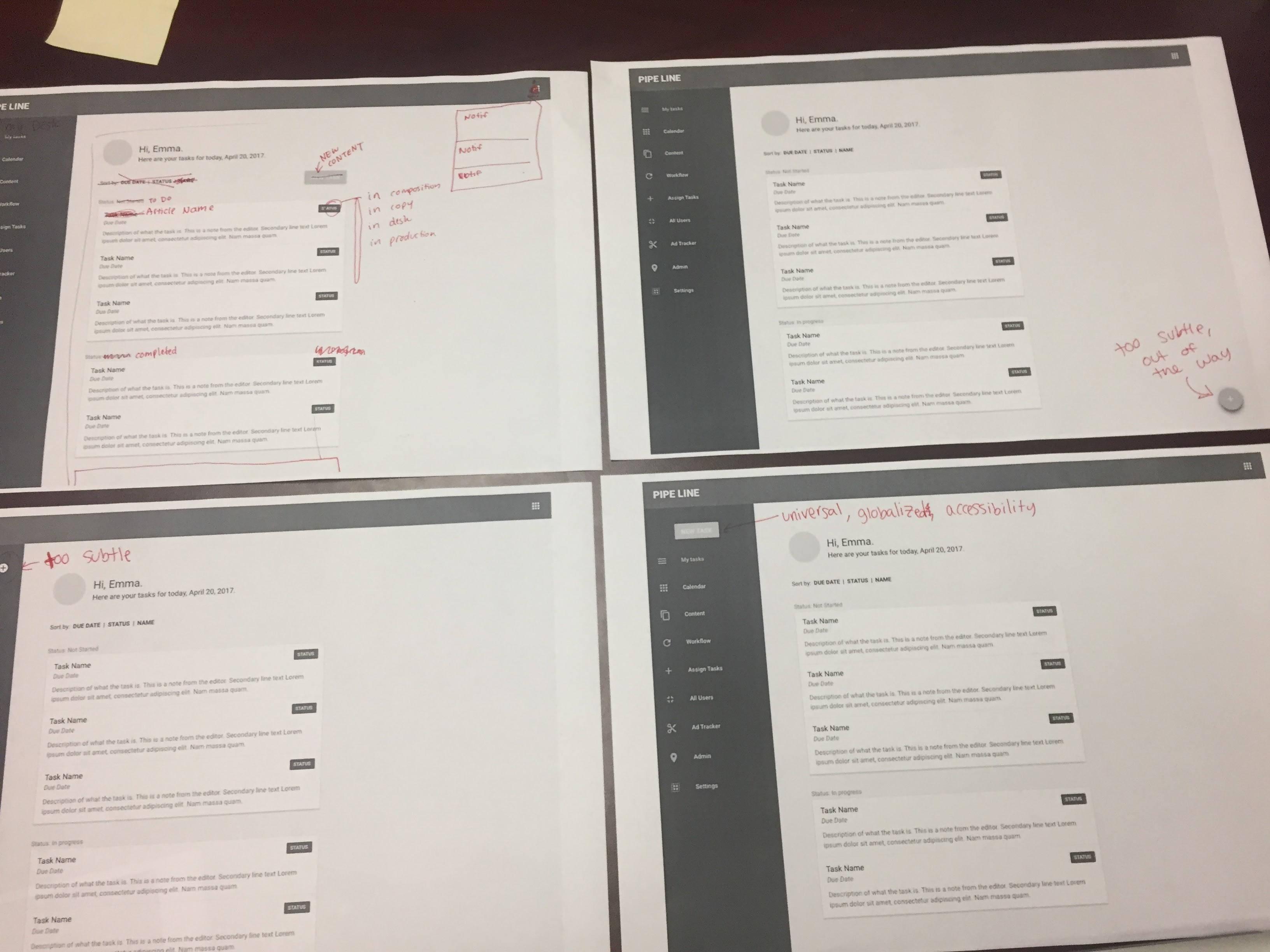
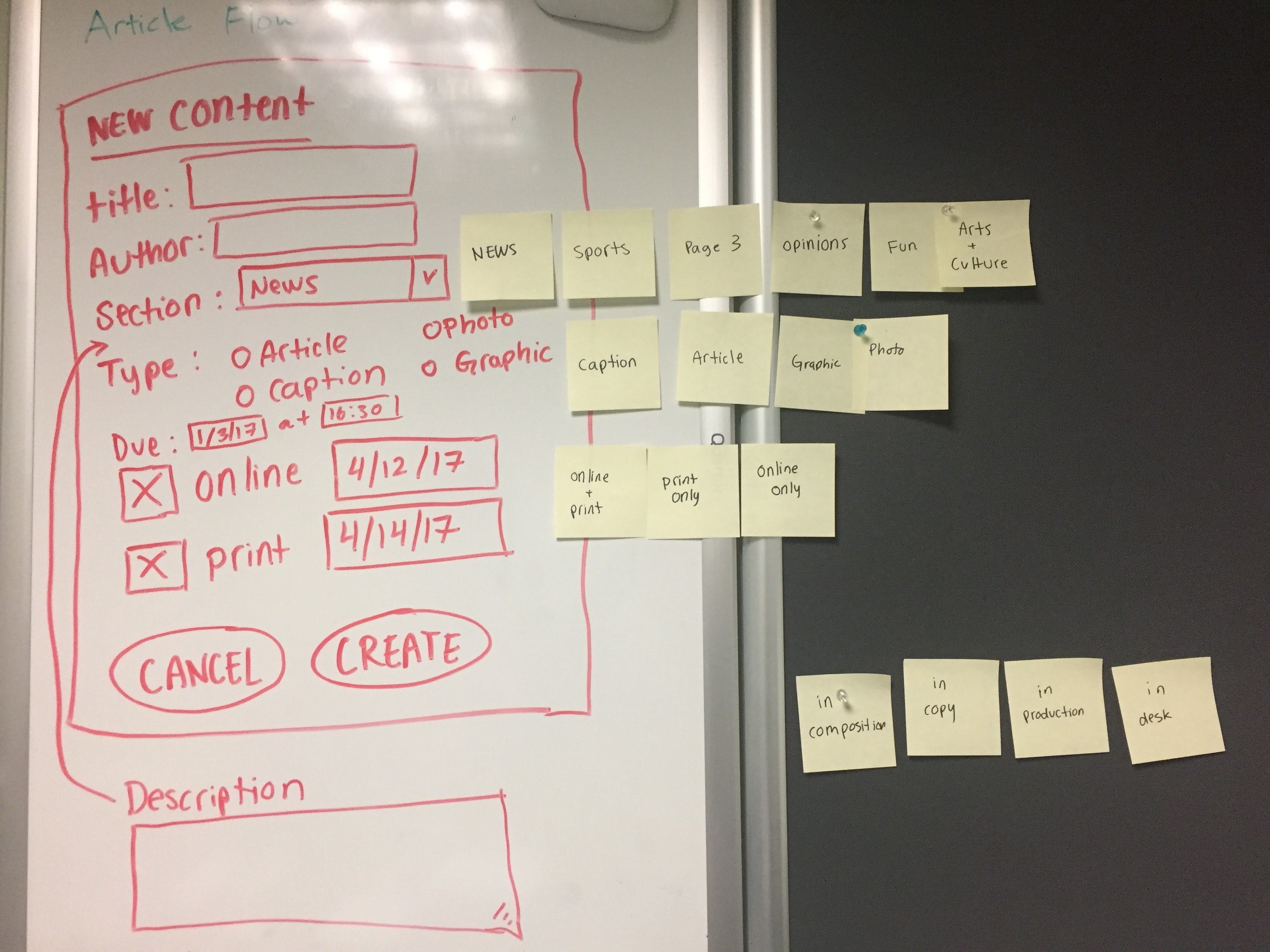
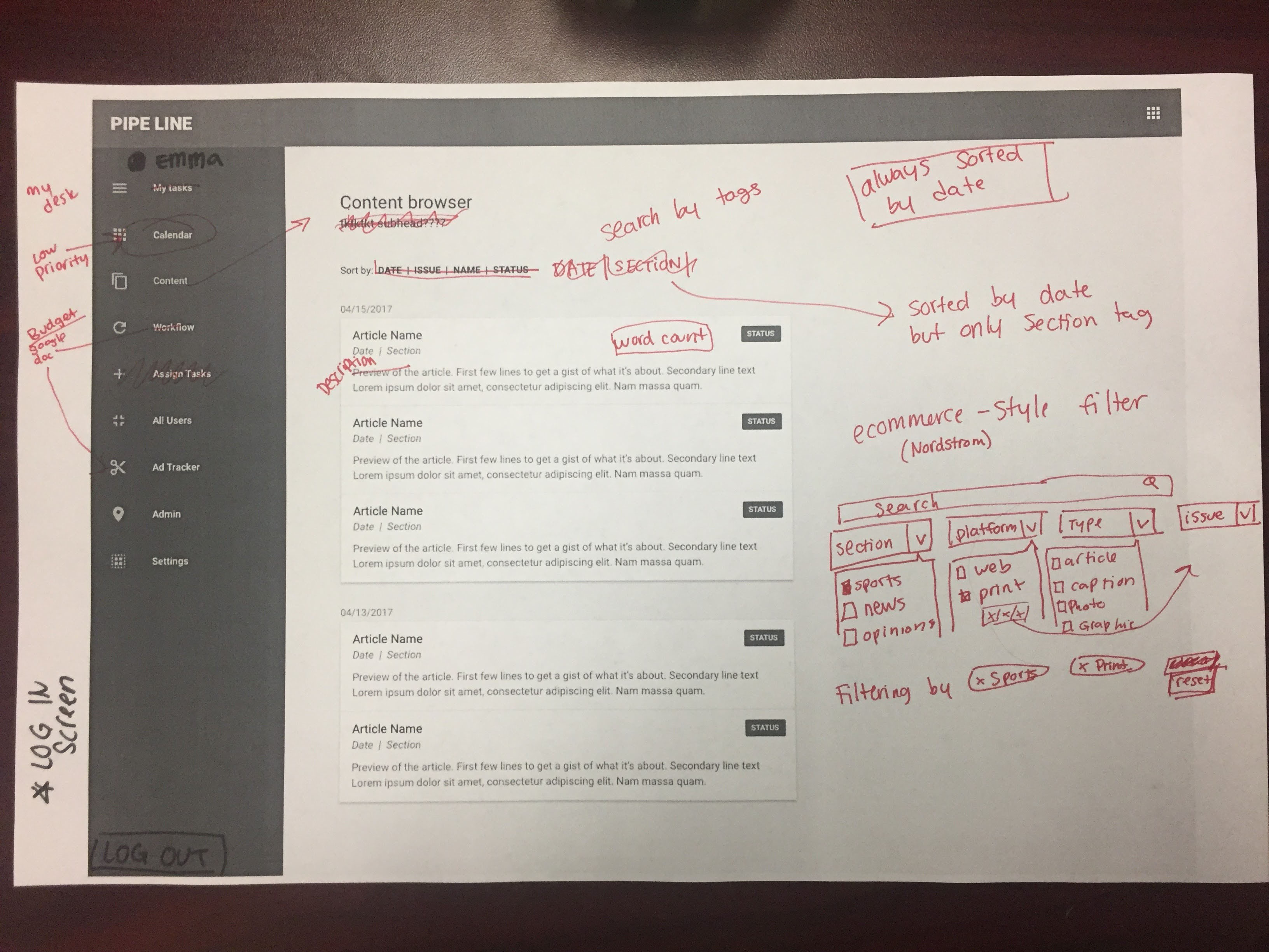
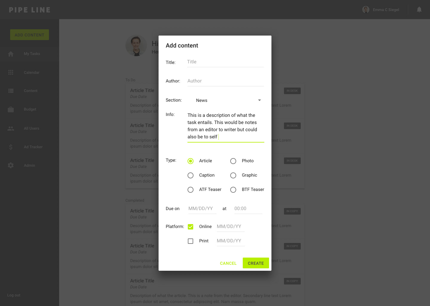
For the experience of adding new content, we went back to the drawing board to discuss the concept of tags in content organization. We brainstormed what potential tags could exist and divided them into four categories: section, type, platform, and status. We then sketched out a wireframe of a "new content" dialog that would include options for all of the tagging categories and information.
In the article editor page, we discussed filling in the gaps of the experience by ideating the process of adding new comments that will be tested with users after being mocked up.
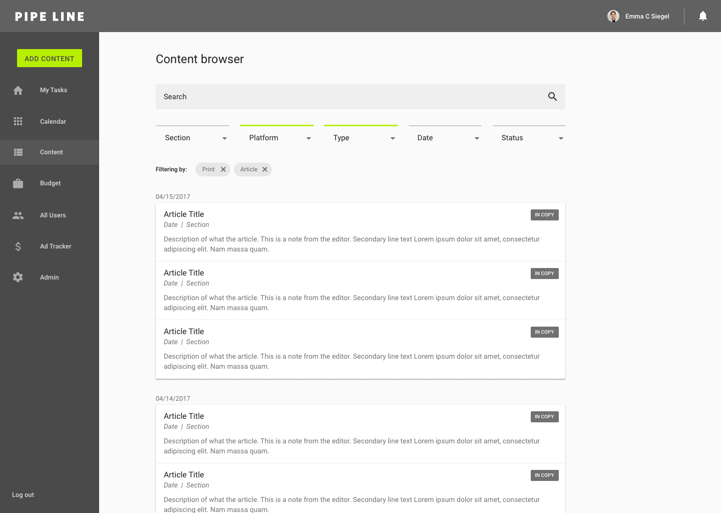
For the content browser, our discussion mainly regarded accessibility of content through sorting, searching, and filtering. From discussions with users, we decided that the content should be always sorted by date, with the most recent content at the top.
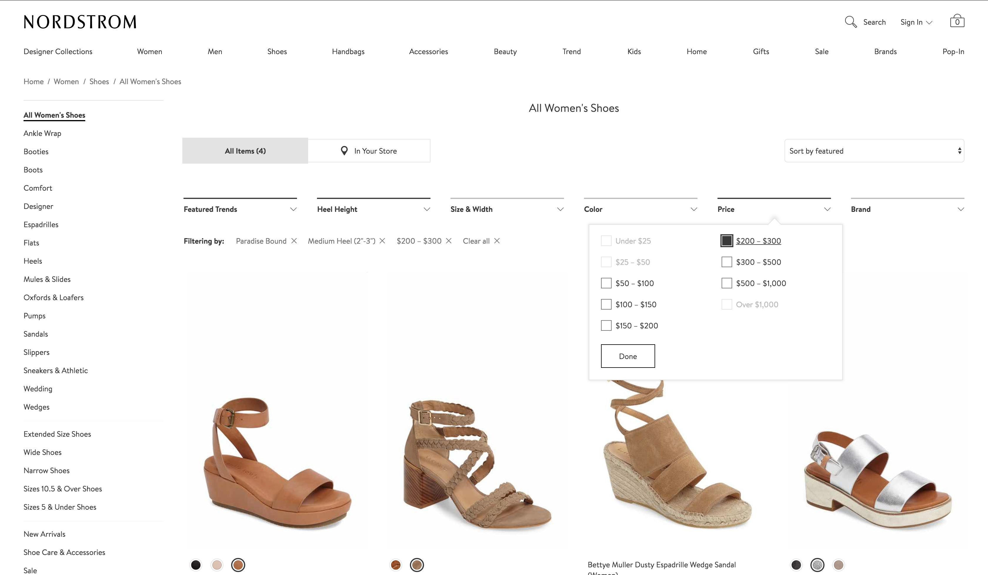
With a multi-layer tagging system now in place, we needed to figure out a simple way for users to filter by specific tags, which live in different categories. I recalled recently browsing shoes online, where I was able to filter my results by color, price, size, etc. I suggested to the team implementing this strategy used across ecommerce websites.
Searching for shoes on Nordstrom's website:
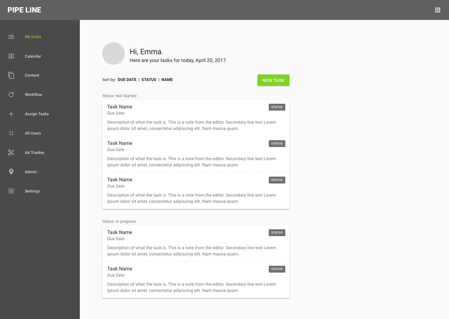
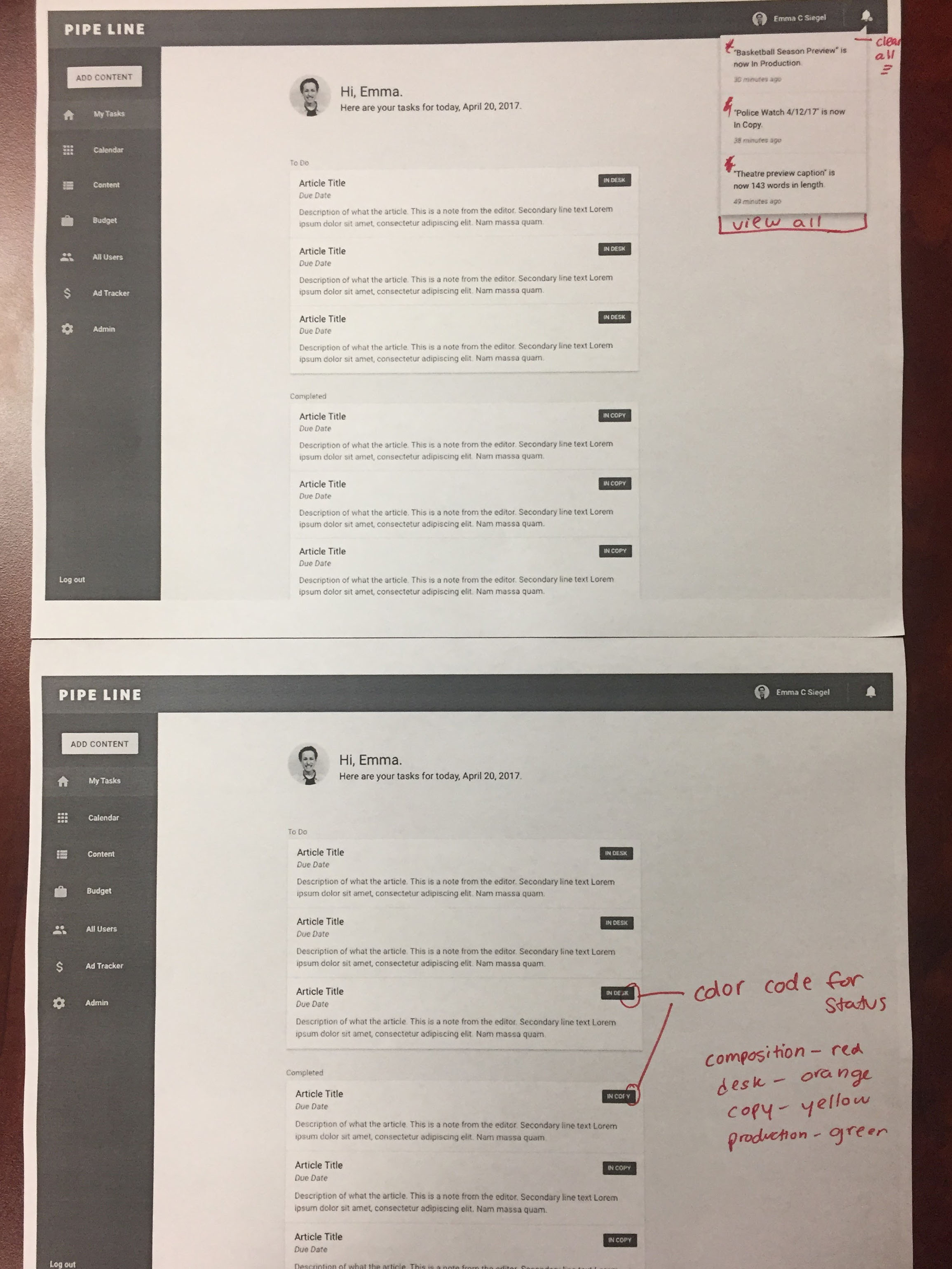
In terms of the sidebar navigation, users agreed that they liked the nav bar on the left side because it was out of the way but always present. As per our previous conversation, "my tasks" will be renamed "my desk." We decided to add on top, the user's photo and name so they know they're logged in. I'm going to mock up a few different ways to present that, which we will test with users.
Since all of the icons I used in the first iteration of mocks were just placeholders, we brainstormed what each of the icons could look like in order to provide a quick visual assistant to users in the navigation. We agreed that the notifications icon (top right), could be a bell, my desk could be a home/house, calendar should remain a grid, content could be a list, workflow (which will be renamed budget) could be a briefcase, all users could be a people icon, ad tracker could be a dollar sign, and admin should be a gear. For the next meeting, I'll implement a new icon set and we'll test them with users.
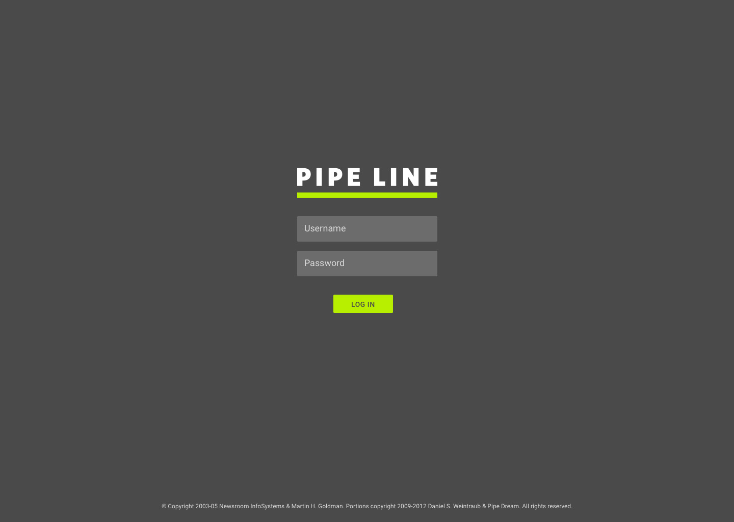
Moving forward, we'll need to add a log in screen and a log out button.
4/26/17: First iteration of mocks (V1)
I iterated on the first set of mocks based on team discussions, user feedback and project goals.
Log in:
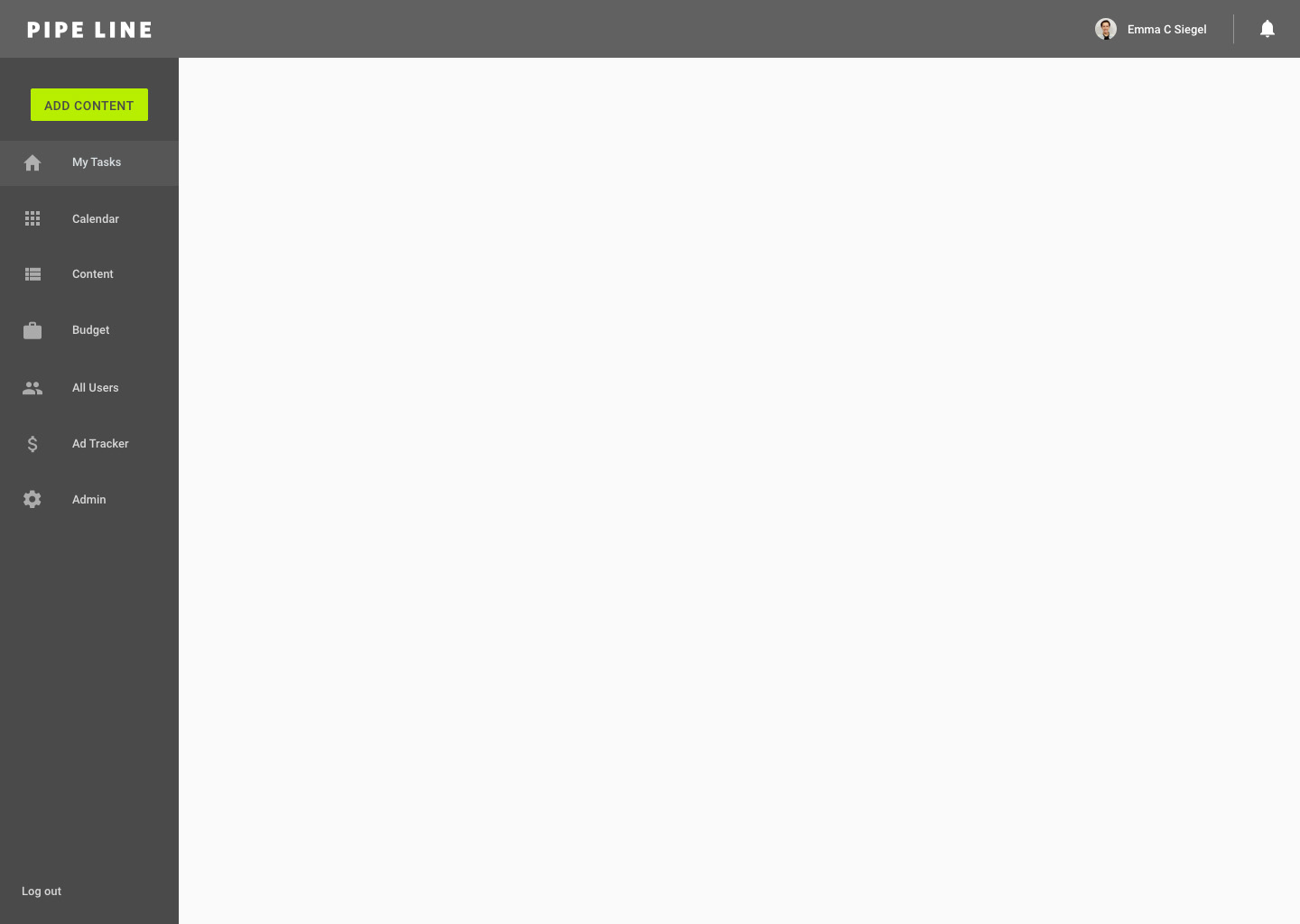
Isolated Navigation:
Home/My Desk:
Home/My Desk: scroll
Home/My Desk: notification
Add Content:
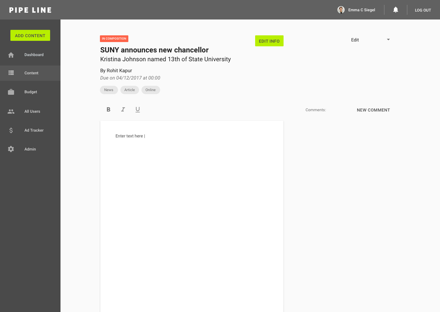
Content Editor: blank
Content Editor: with article
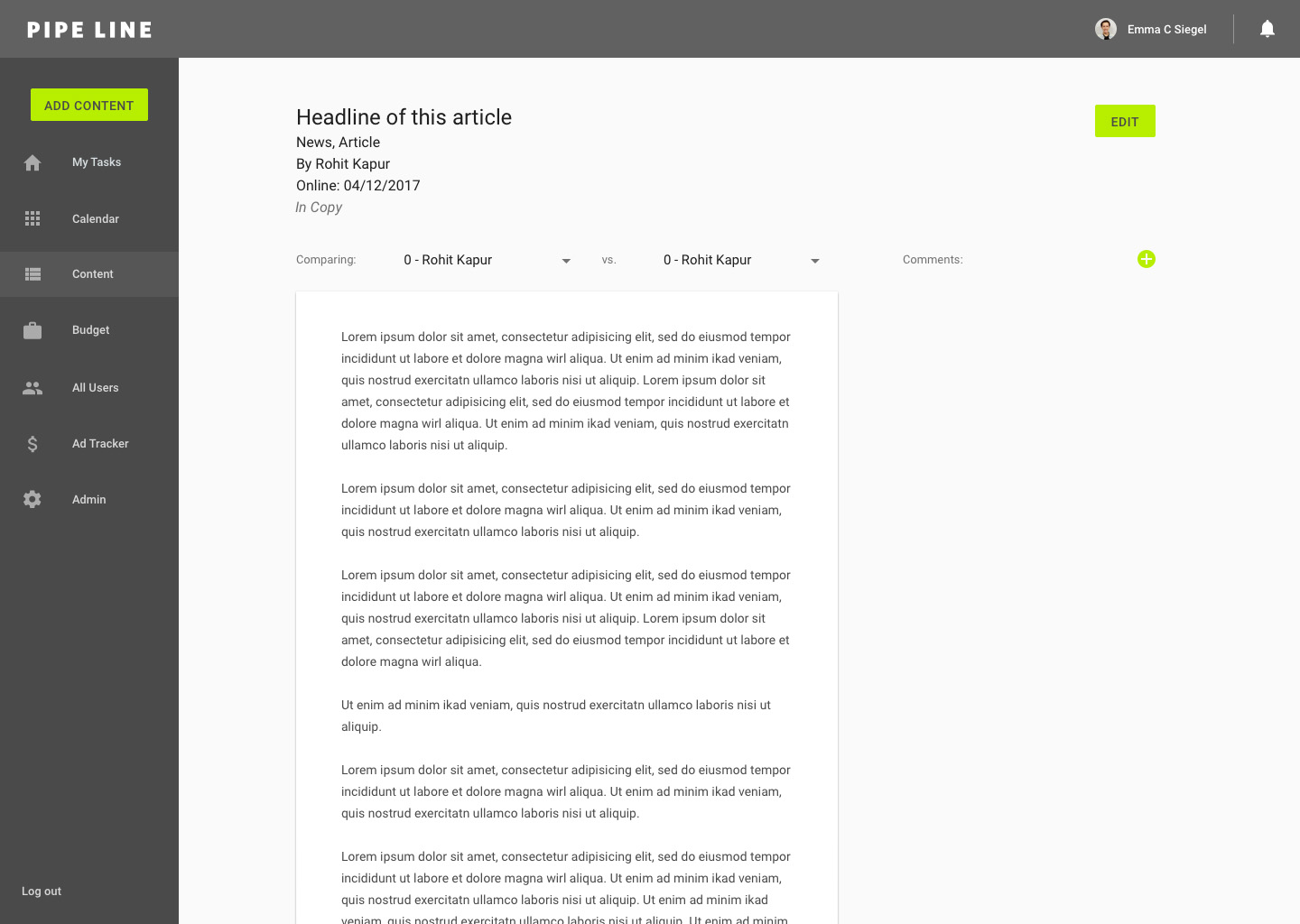
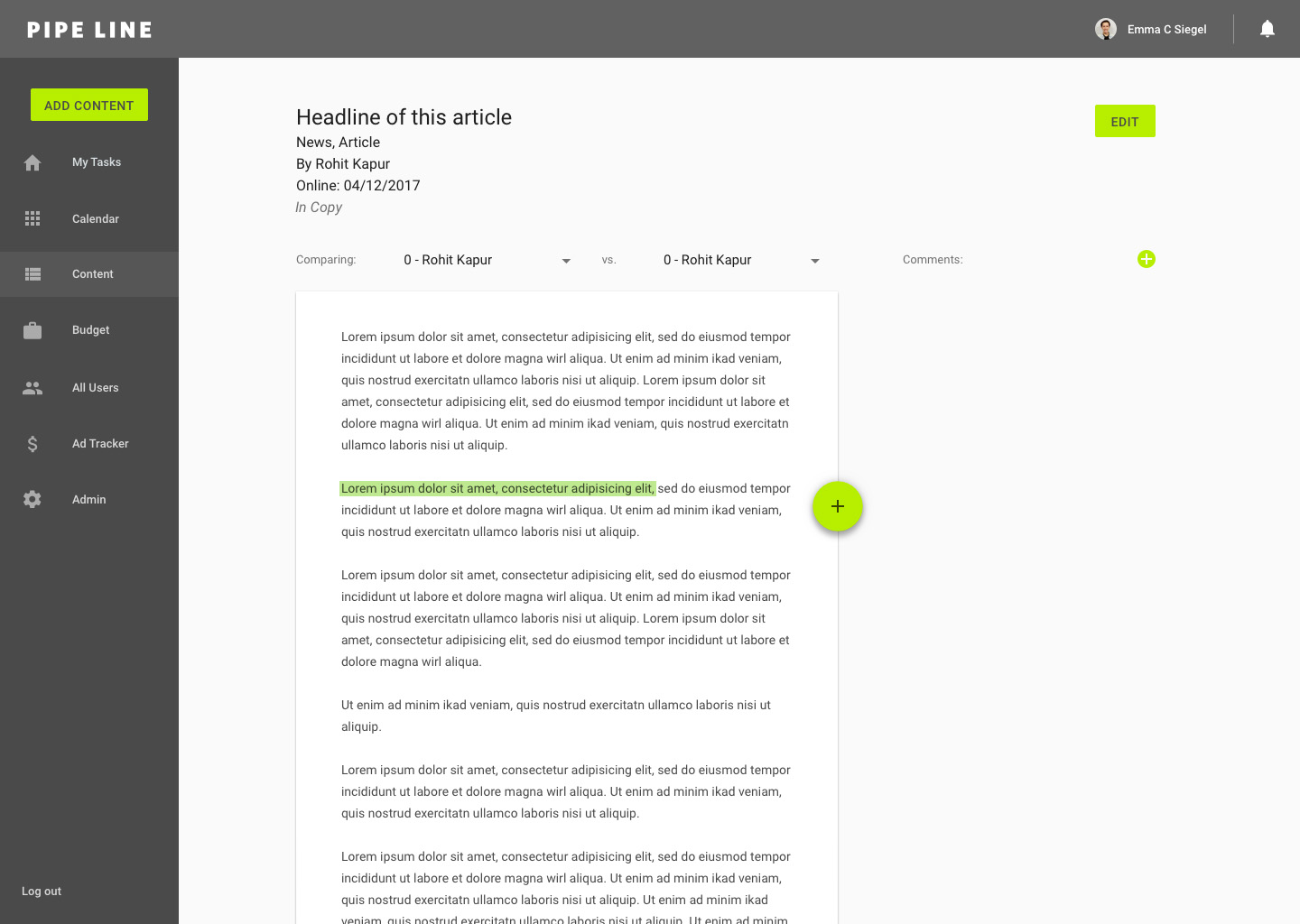
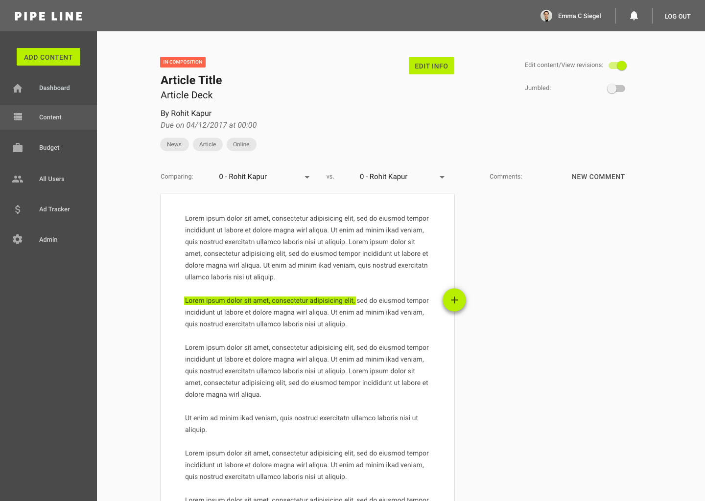
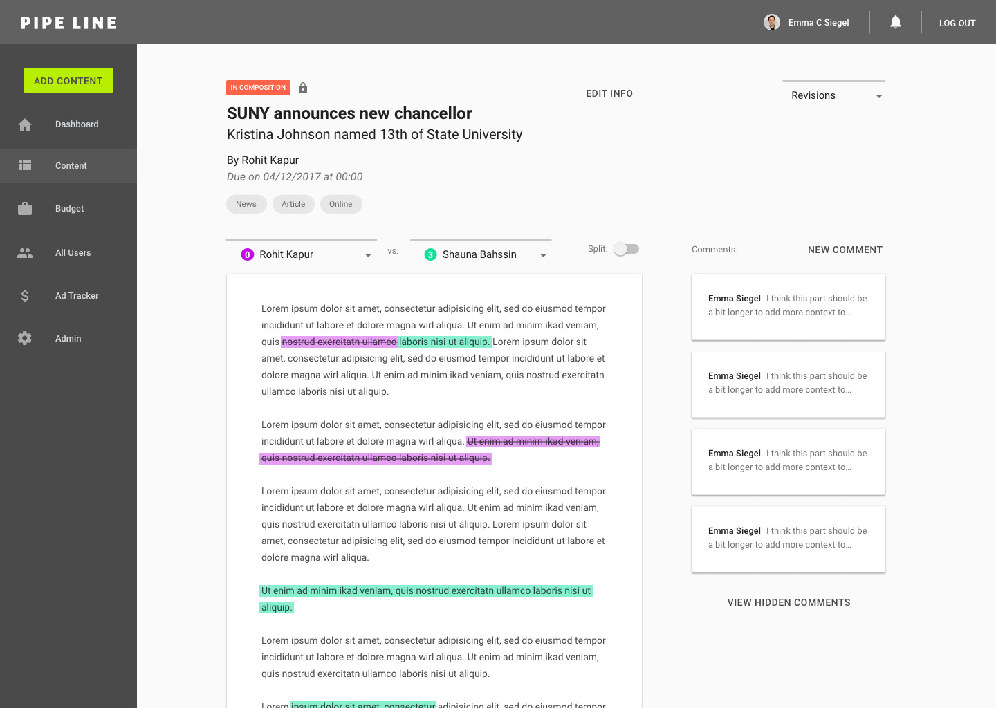
Content Editor: highlight
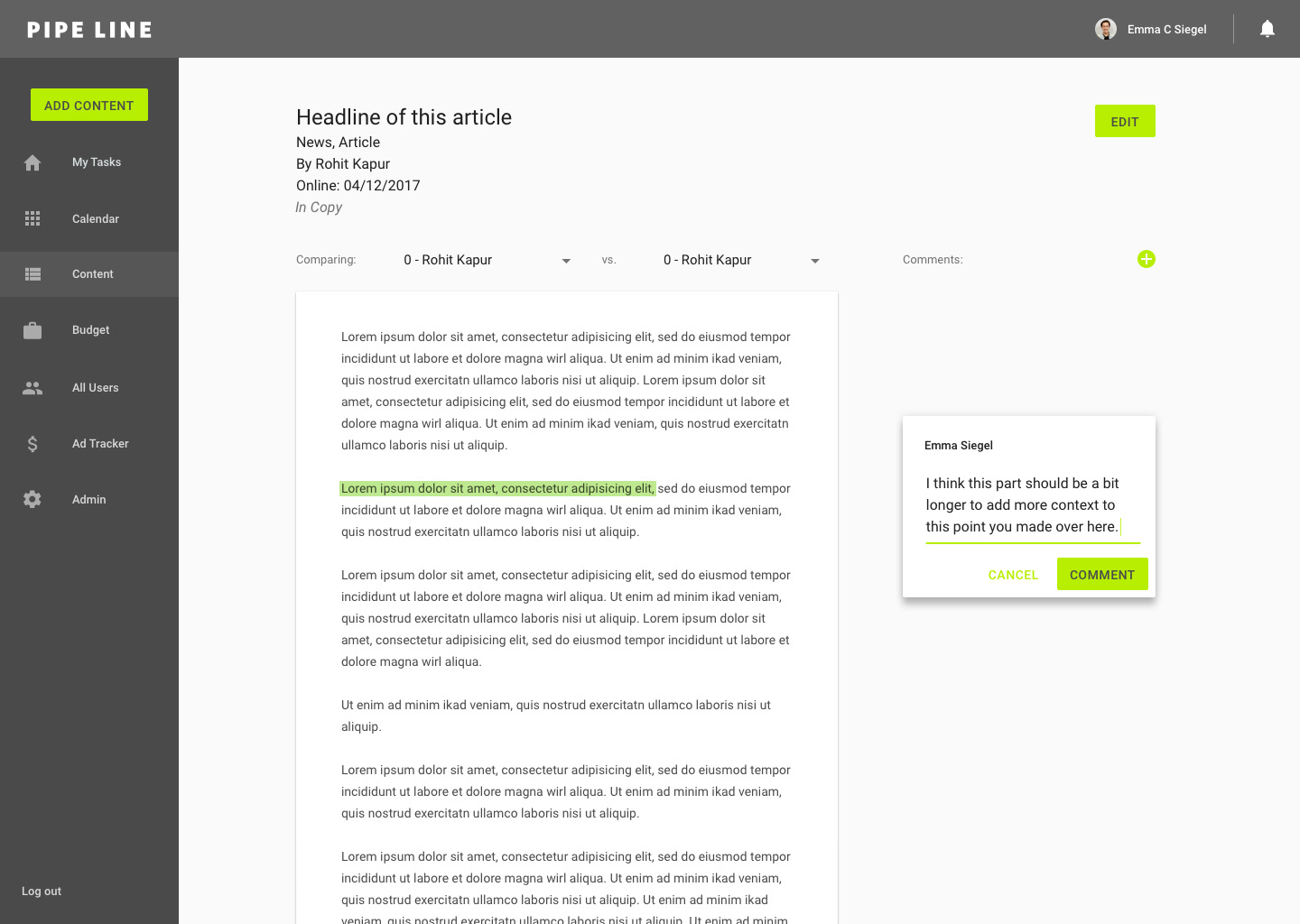
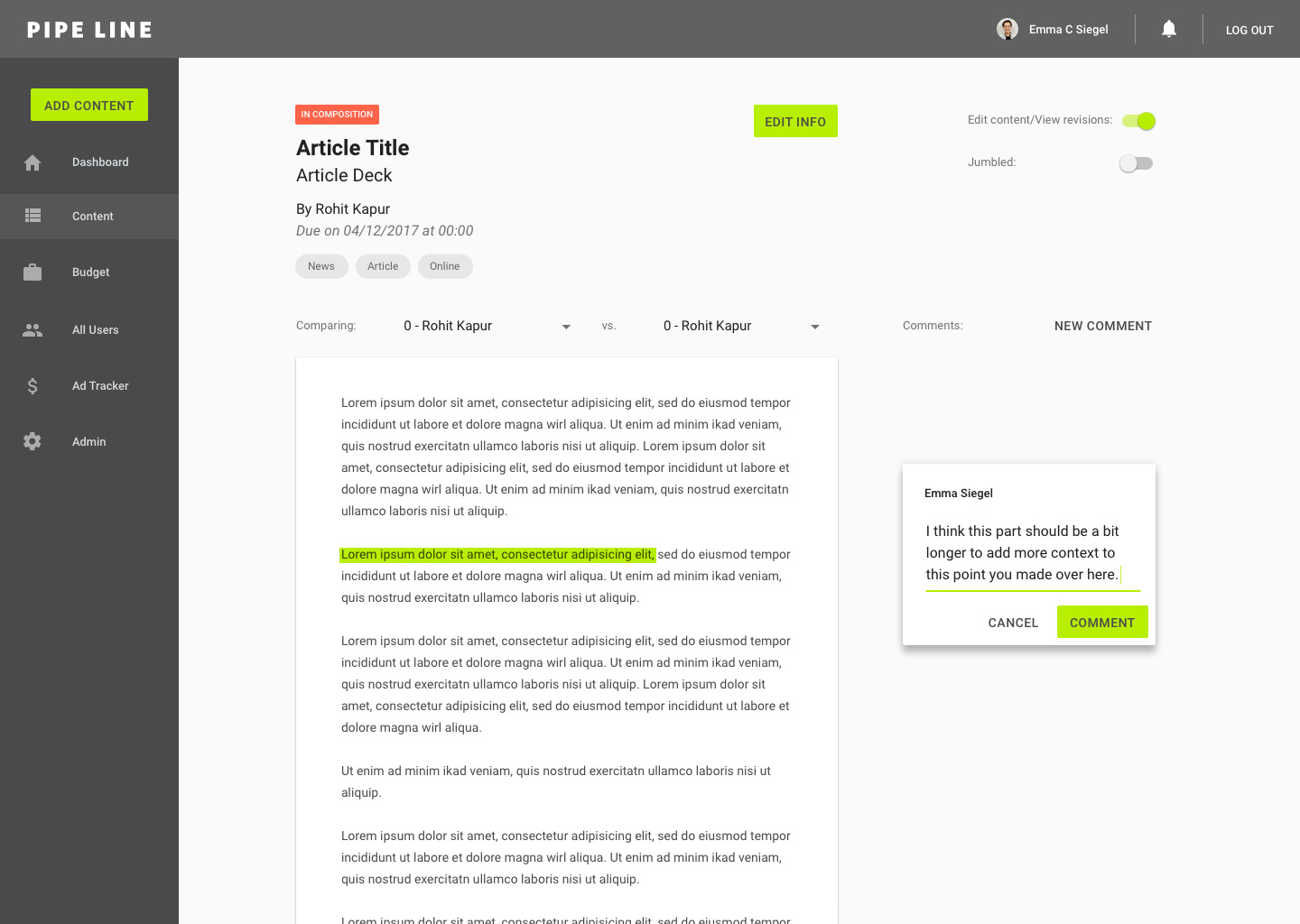
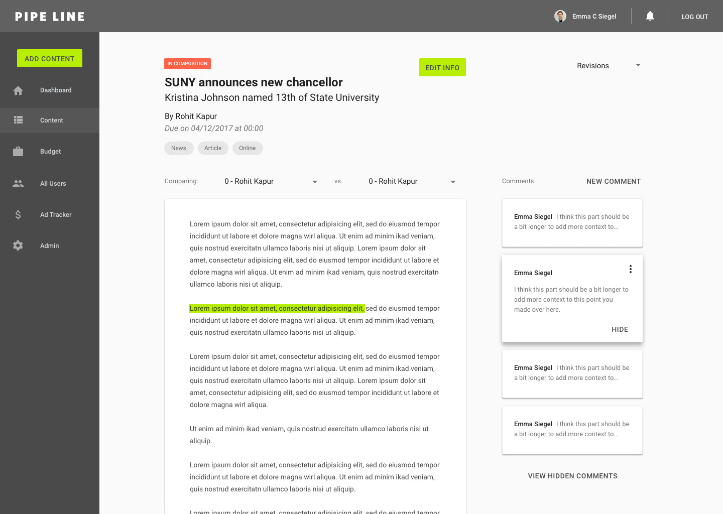
Content Editor: new comment
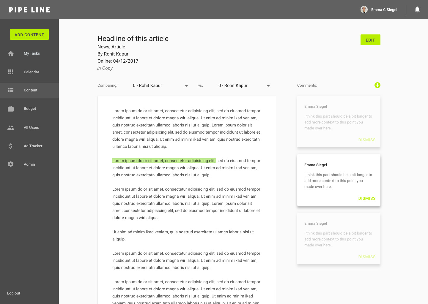
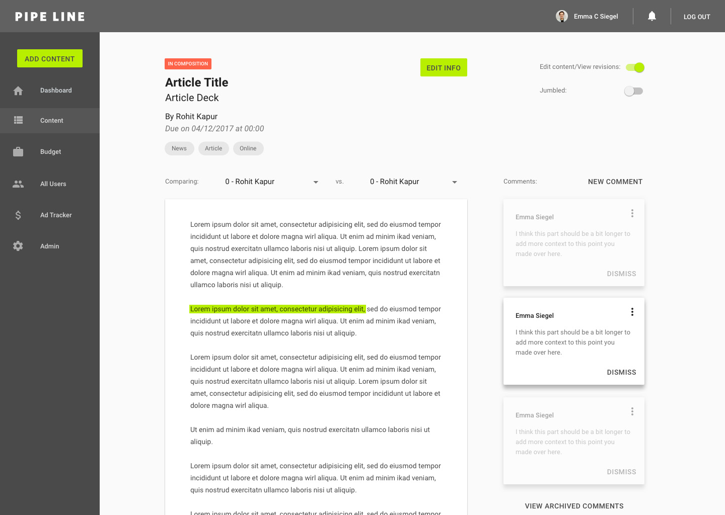
Content Editor: view comment
Content Editor: version edit
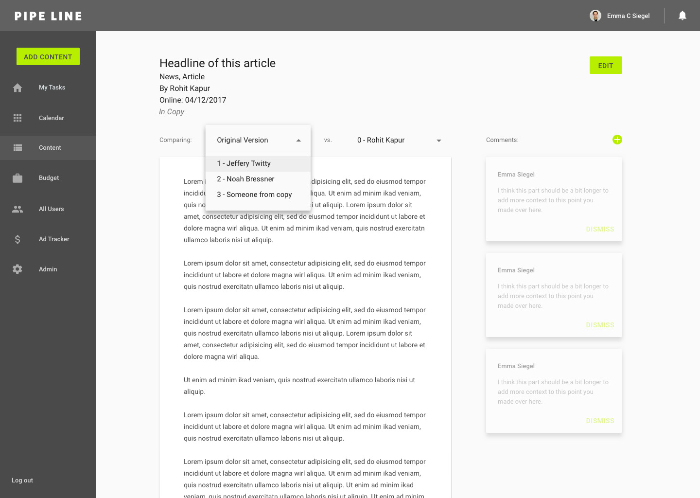
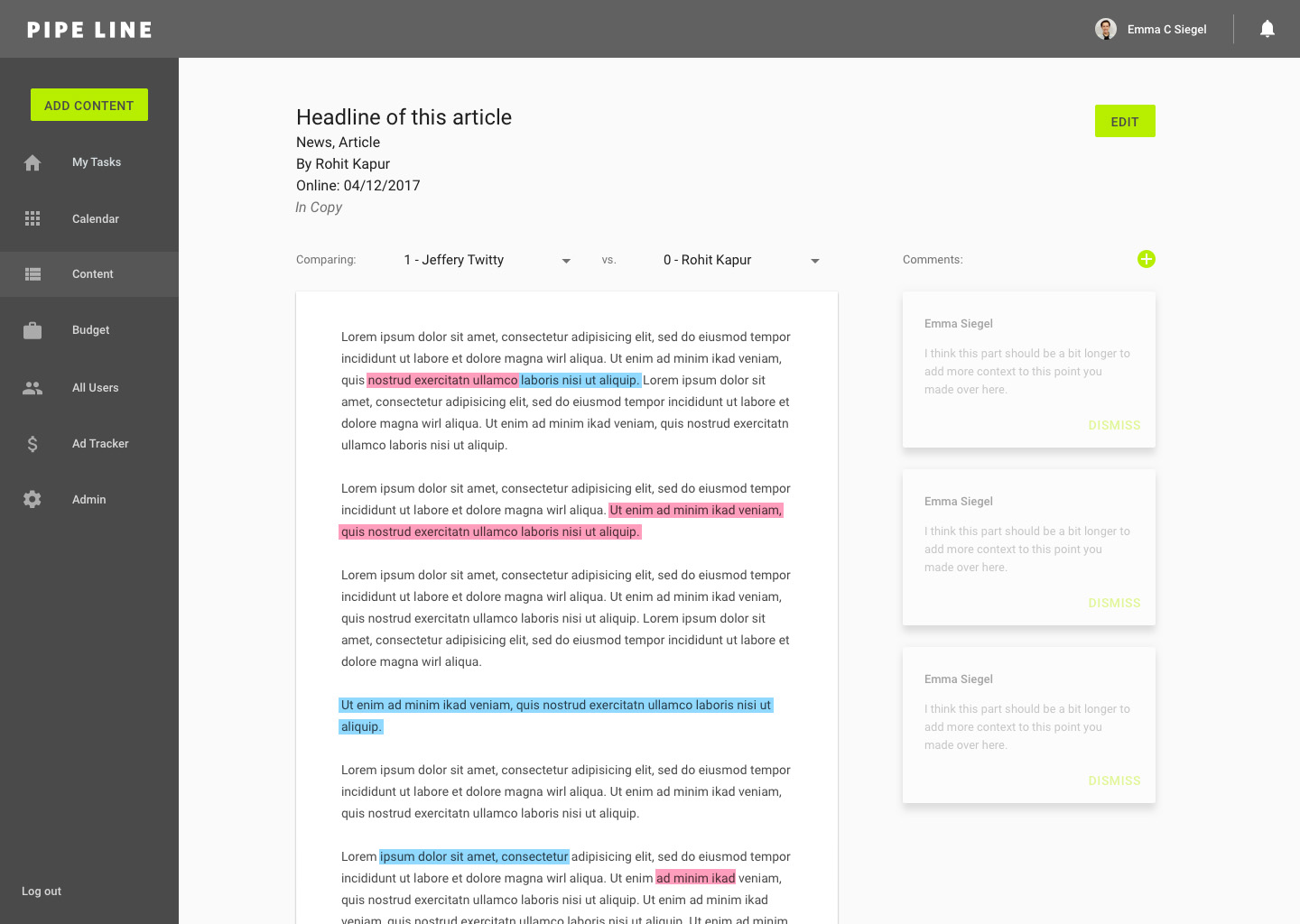
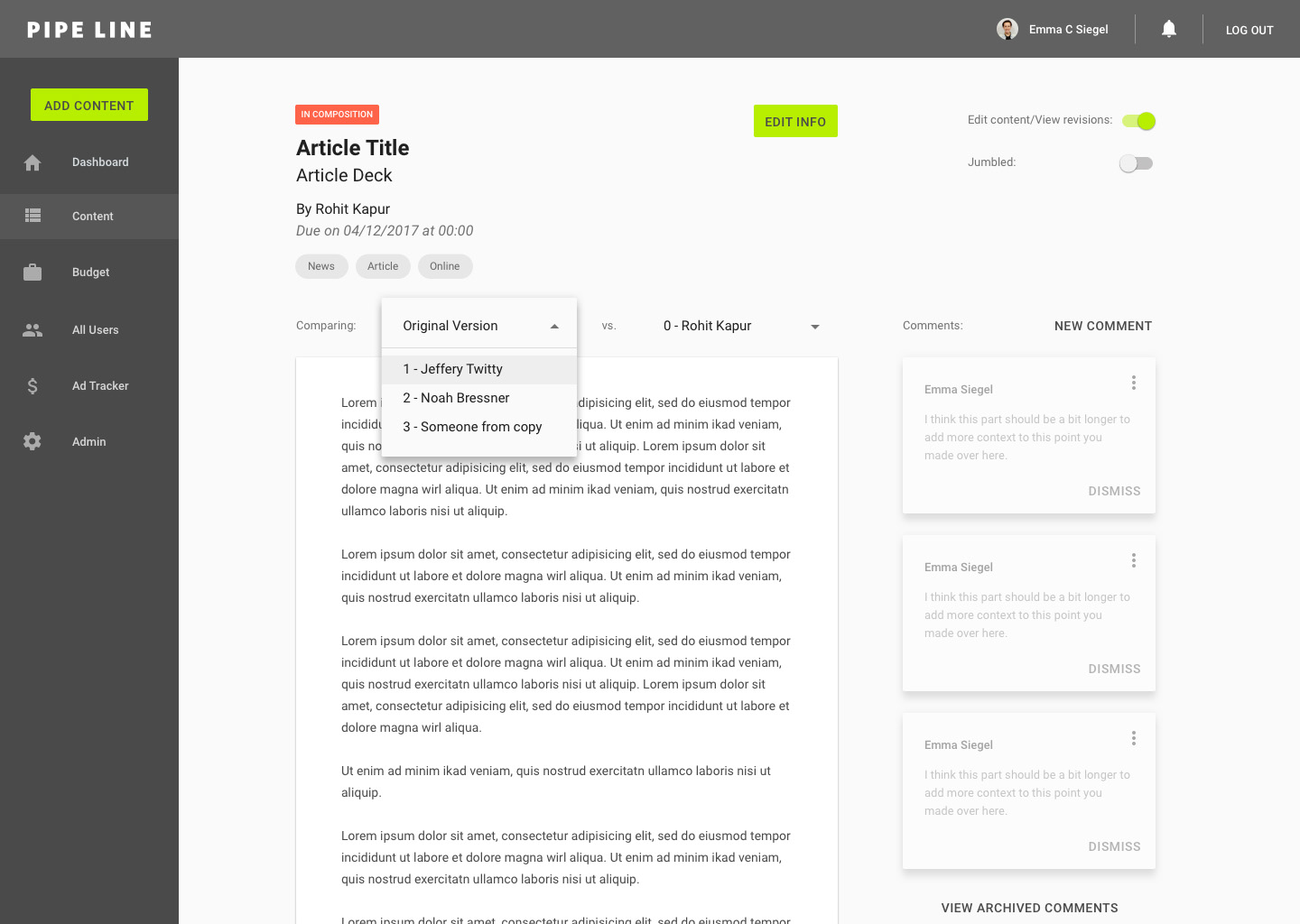
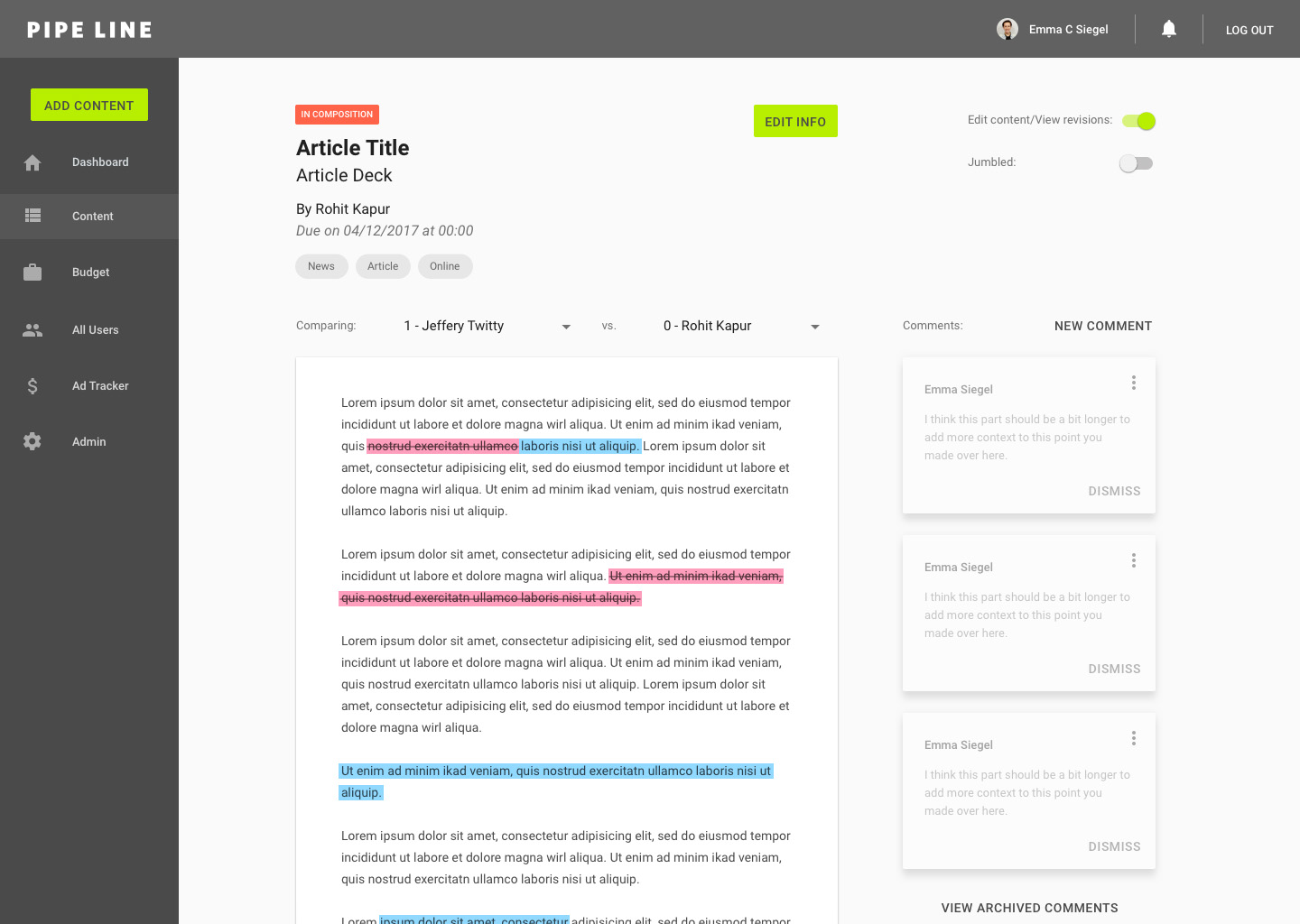
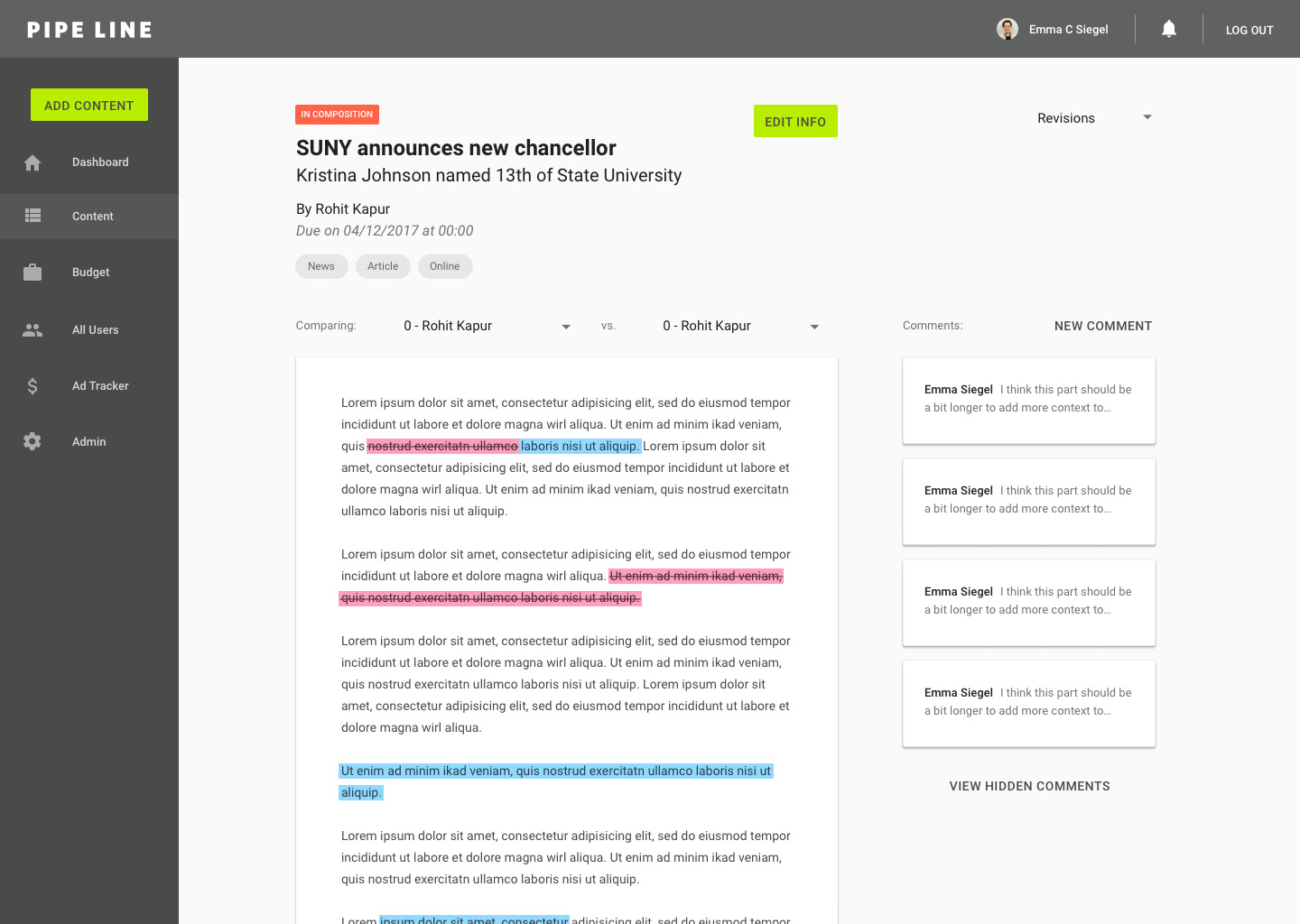
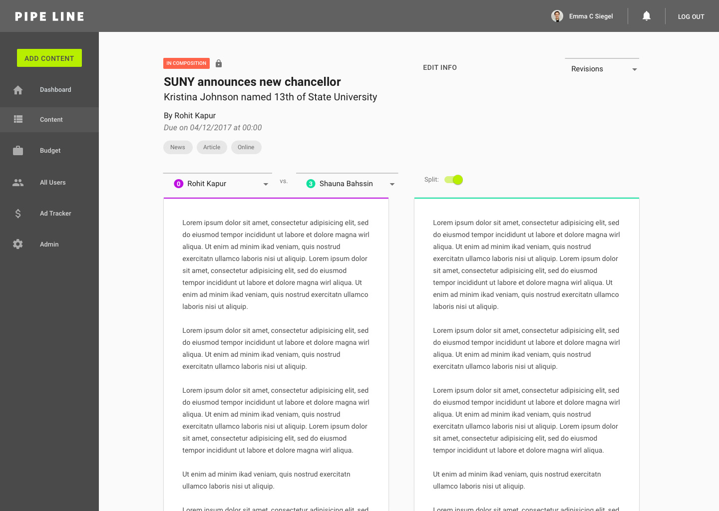
Content Editor: version compare
Content Browser:

Content Browser: filter selection

Content Browser: filter results
4/27/17: testing/critiquing v1 mocks
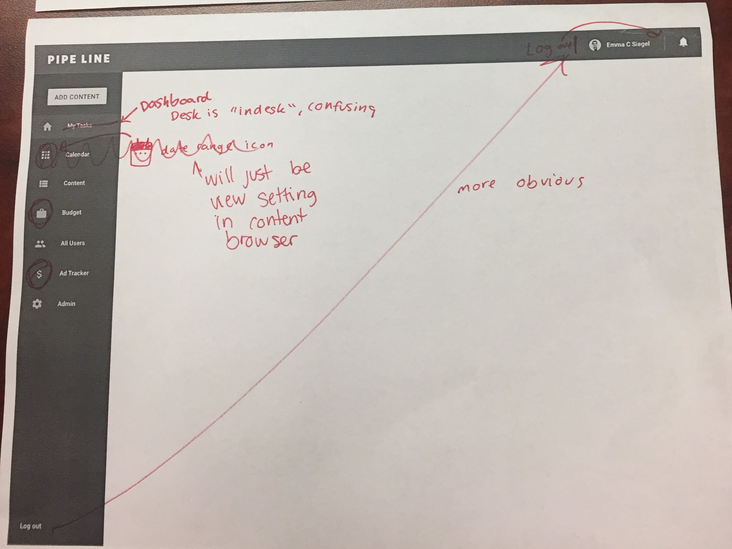
The goal for this meeting was to critique the first iteration of mocks. I printed out the mocks on our black and white printer to mark up, and I projected the color mocks from my computer onto the TV for everyone to fully visualize what the mocks will look like on screen.
Navigation:
We began by discussing the navigation. Some users felt that the "log out" button was in too subtle of a location. We brainstormed ideas of how we could make "log out" in an accessible location, but not too accessible of a location that users would accidentally click it. Someone suggested that the user name/photo on the top right would have a pop up when clicked on, which would have options for view profile and log out. In favor of our goal of simple experience, we agreed that a pop up might be an unnecessary amount of clicks. We'll try the log out button in the top right, a potentially more accessible and obvious location.
Based on user feedback, we determined that the icons for budget and ad tracker could be more relevant. We're putting that on the back burner for now but plan to revisit the idea with a brainstorming session in the future.
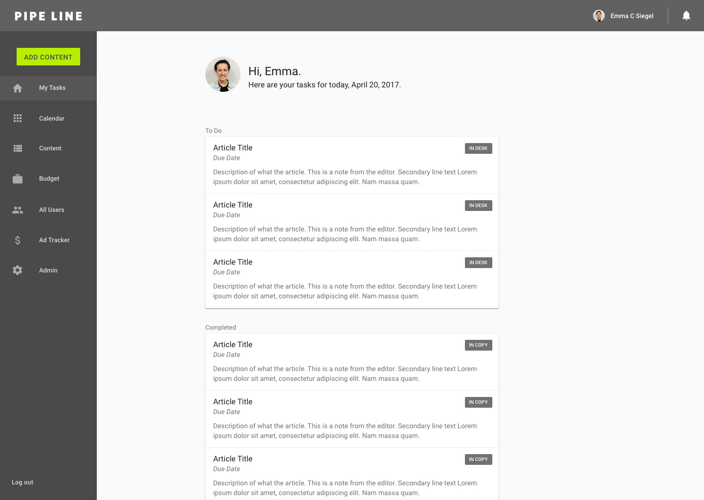
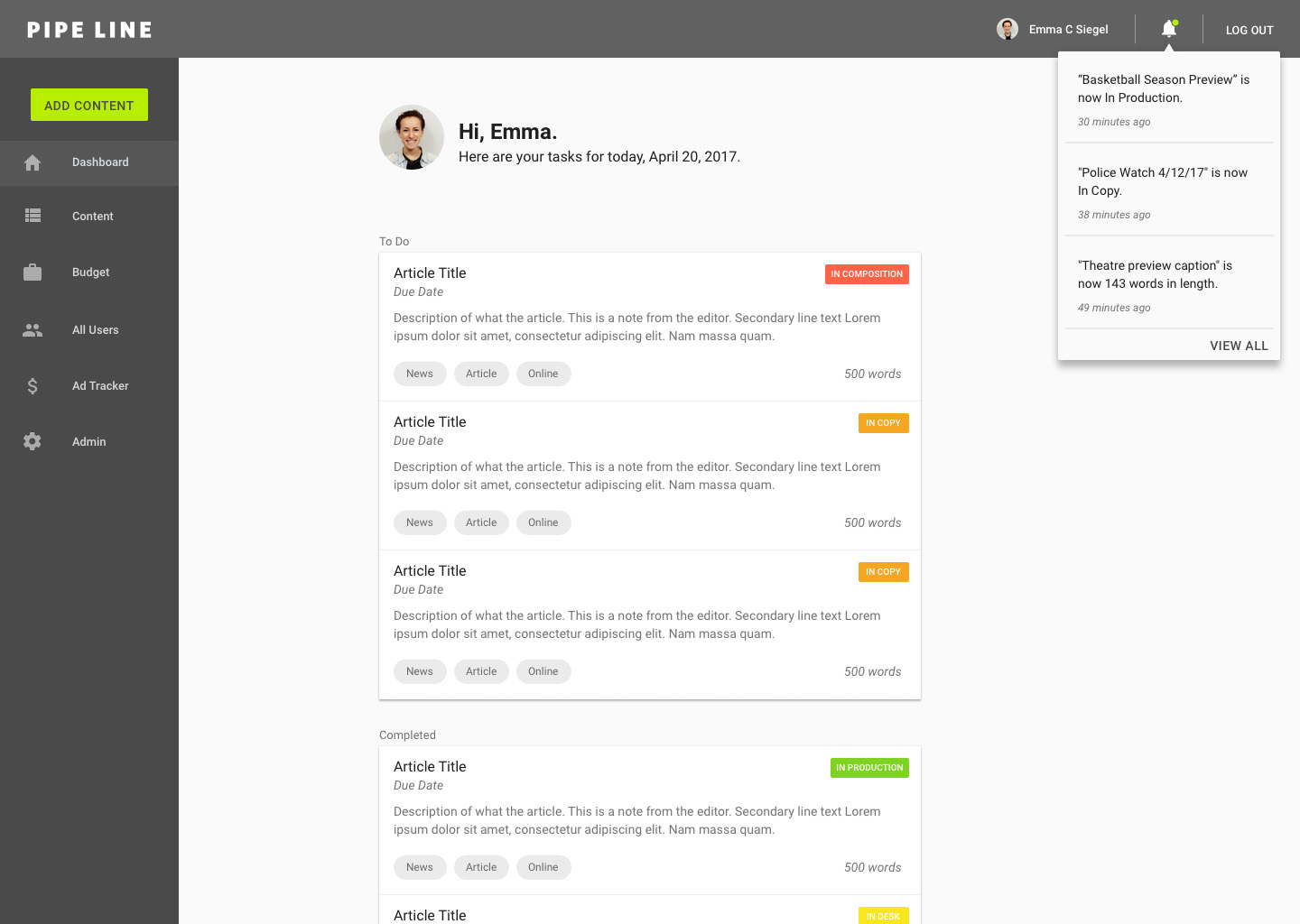
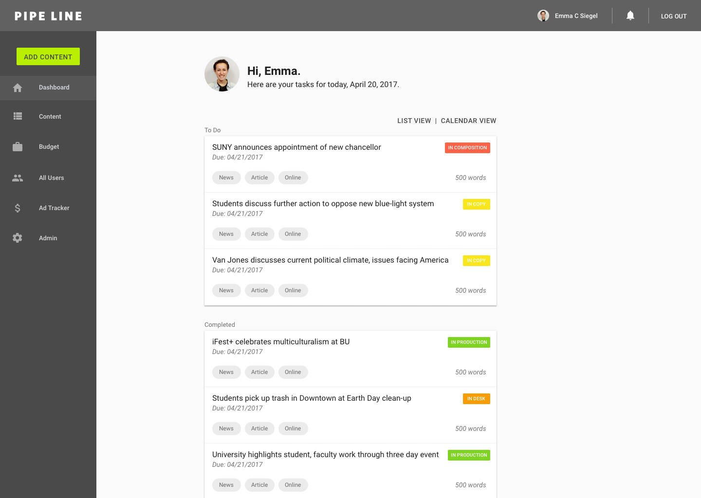
Some users pointed out that "My Desk" was a confusing name for the homepage because "In Desk" is one of the status options for a piece of content. To avoid any ambiguity in the UX, we decided to change the name to "Dashboard" so users know that it's a place to see their personal and relevant information.
The calendar tab in the navigation was a feature that we had discussed in earlier iterations of brainstorming. Essentially, the calendar would be a view mode of the content browser but arranged by date in a traditional calendar format. After discussing, we realized that this feature could be combined into the content browser as a second view option (with list view being the first).
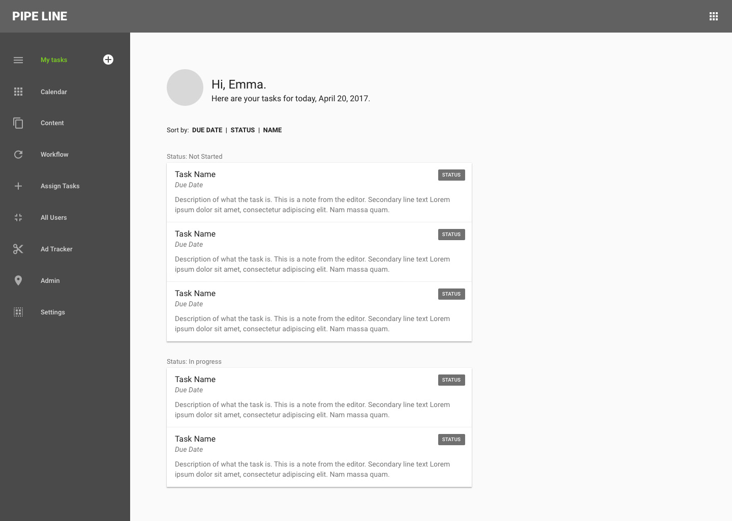
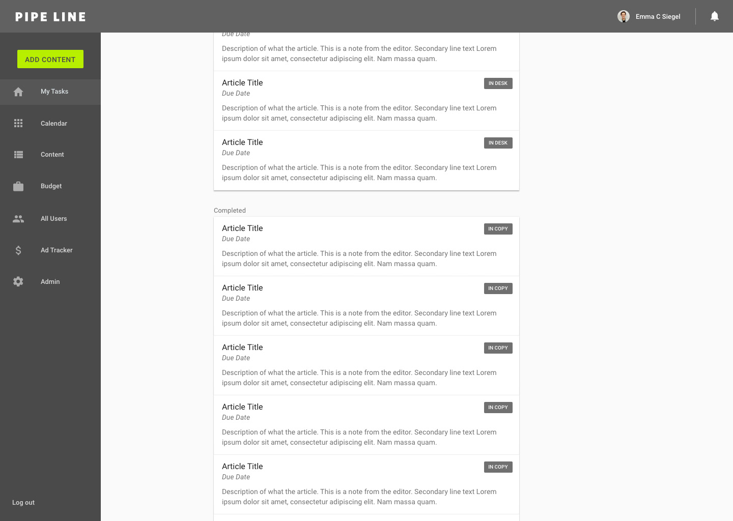
Dashboard (previously home/my tasks/my desk):
With our goal of quick experience in mind, a user suggested that the status chips be color coded to easily differentiate between statuses when scanning through the list of content.
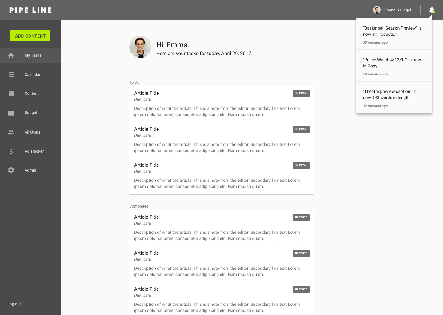
Based on the goal of transparency and accessibility, we ideated that a feature for users to view all of their notifications could be implemented.
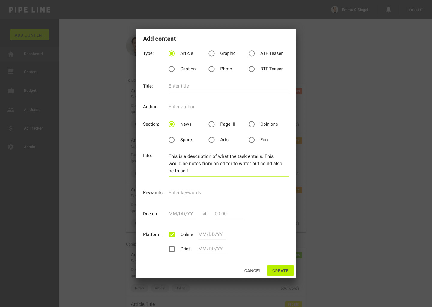
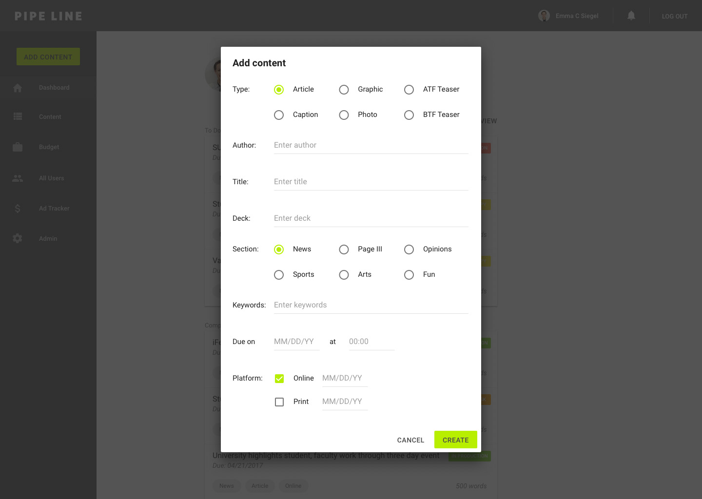
New Content:
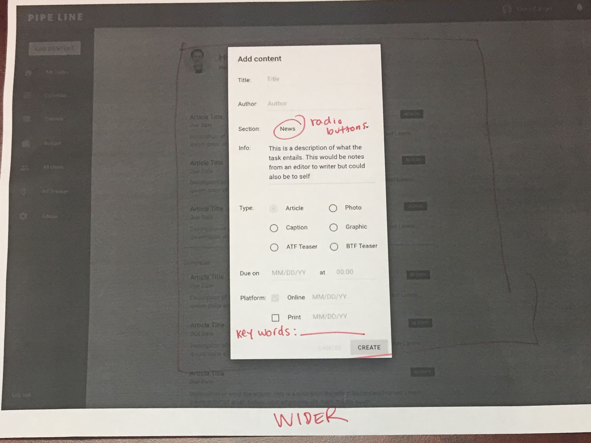
Users suggested that this dialog for content creation felt crammed. To make the experience more enjoyable, I'm going to try redesigning it wider to give each field more breathing room. With the goal in mind of creating a fast experience, I suggested using radio buttons for the "section" field as well to have one less click for users.
Based on a discussion with the team, we're going to add another field called "keywords" for users to add more specified tags to content and allow for flexibility in scaling the platform and moving forward.
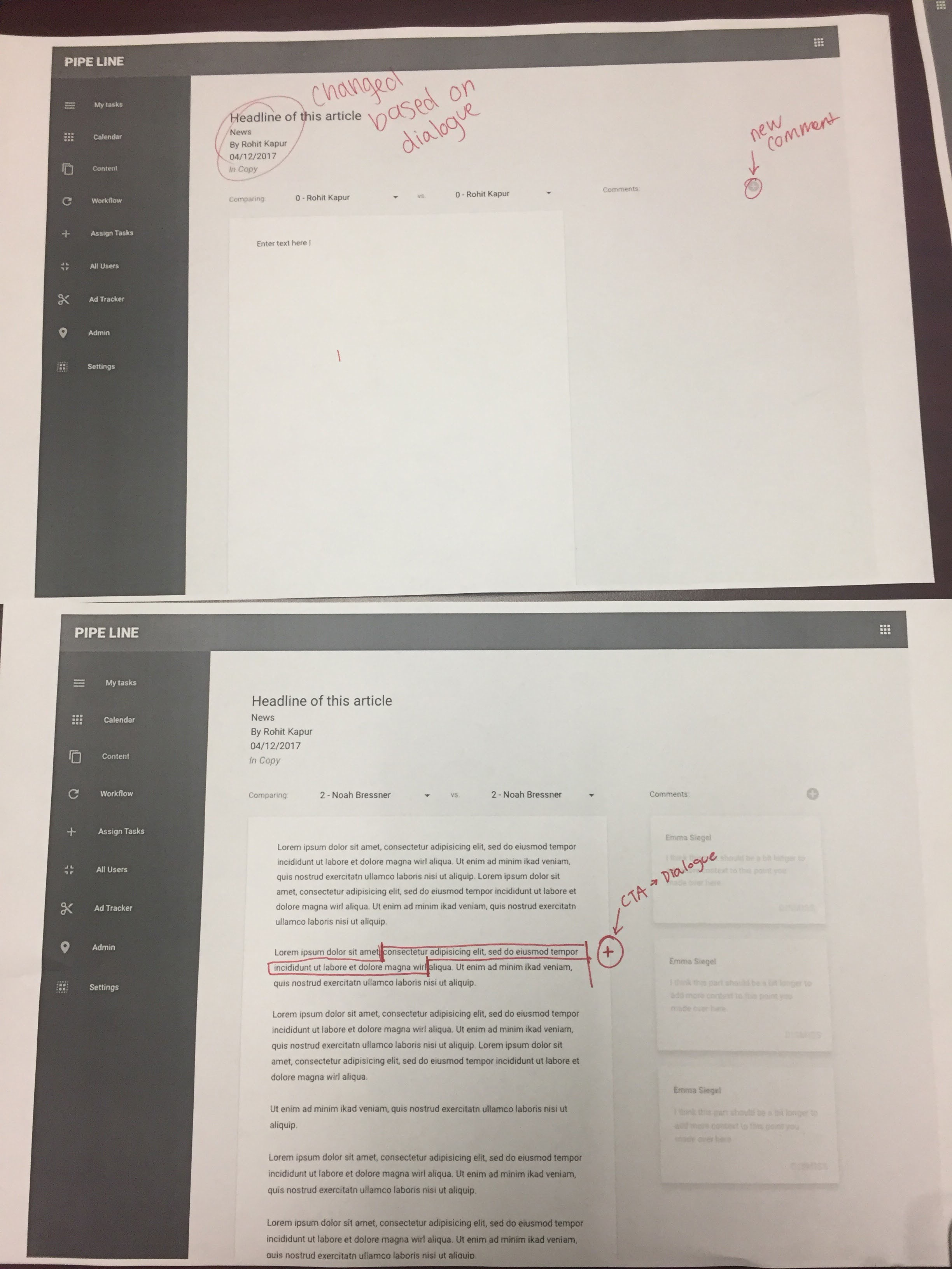
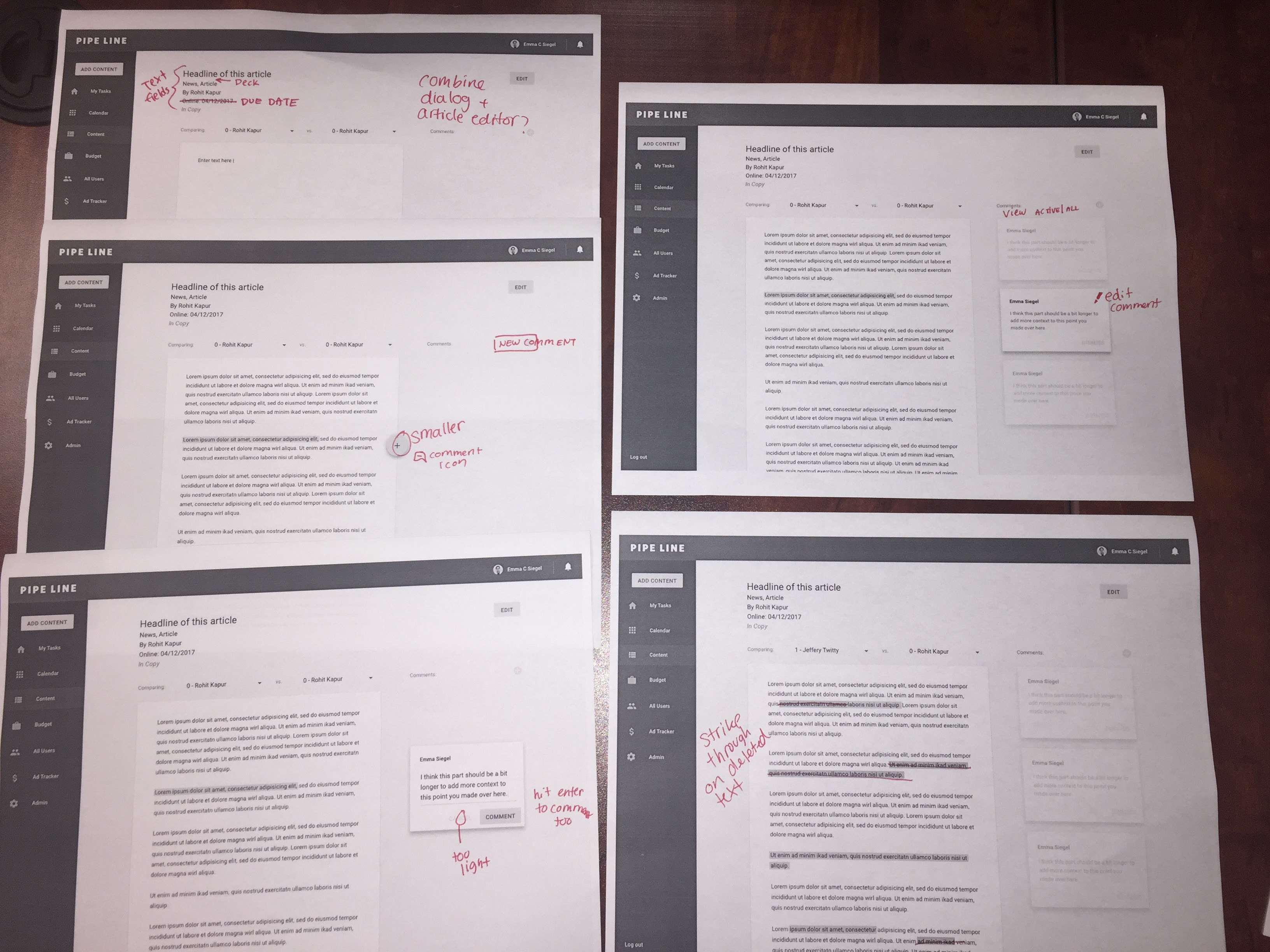
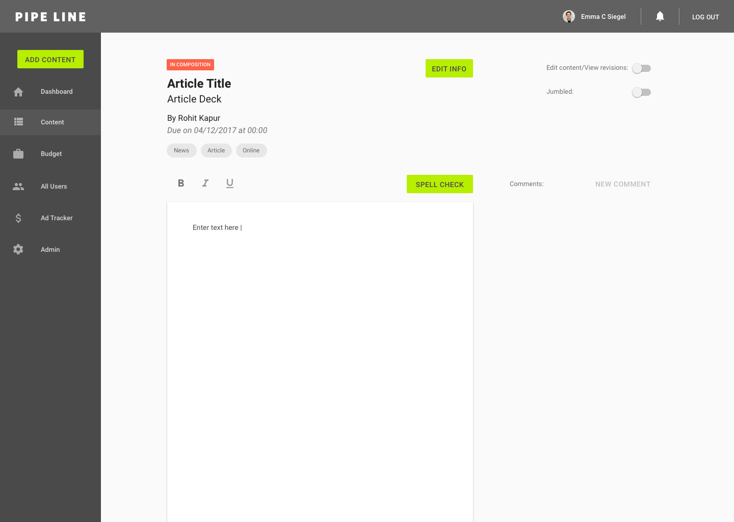
Editor:
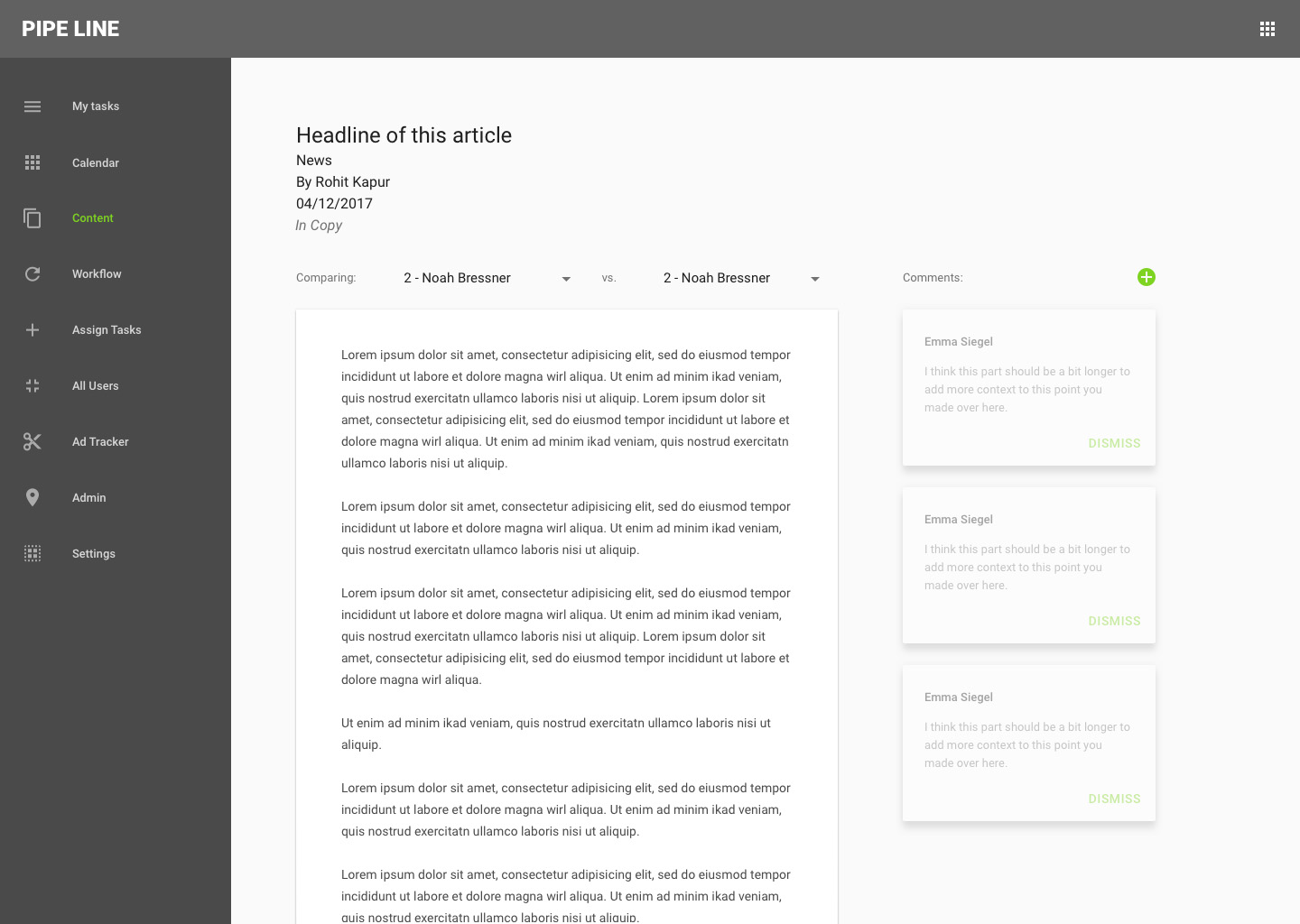
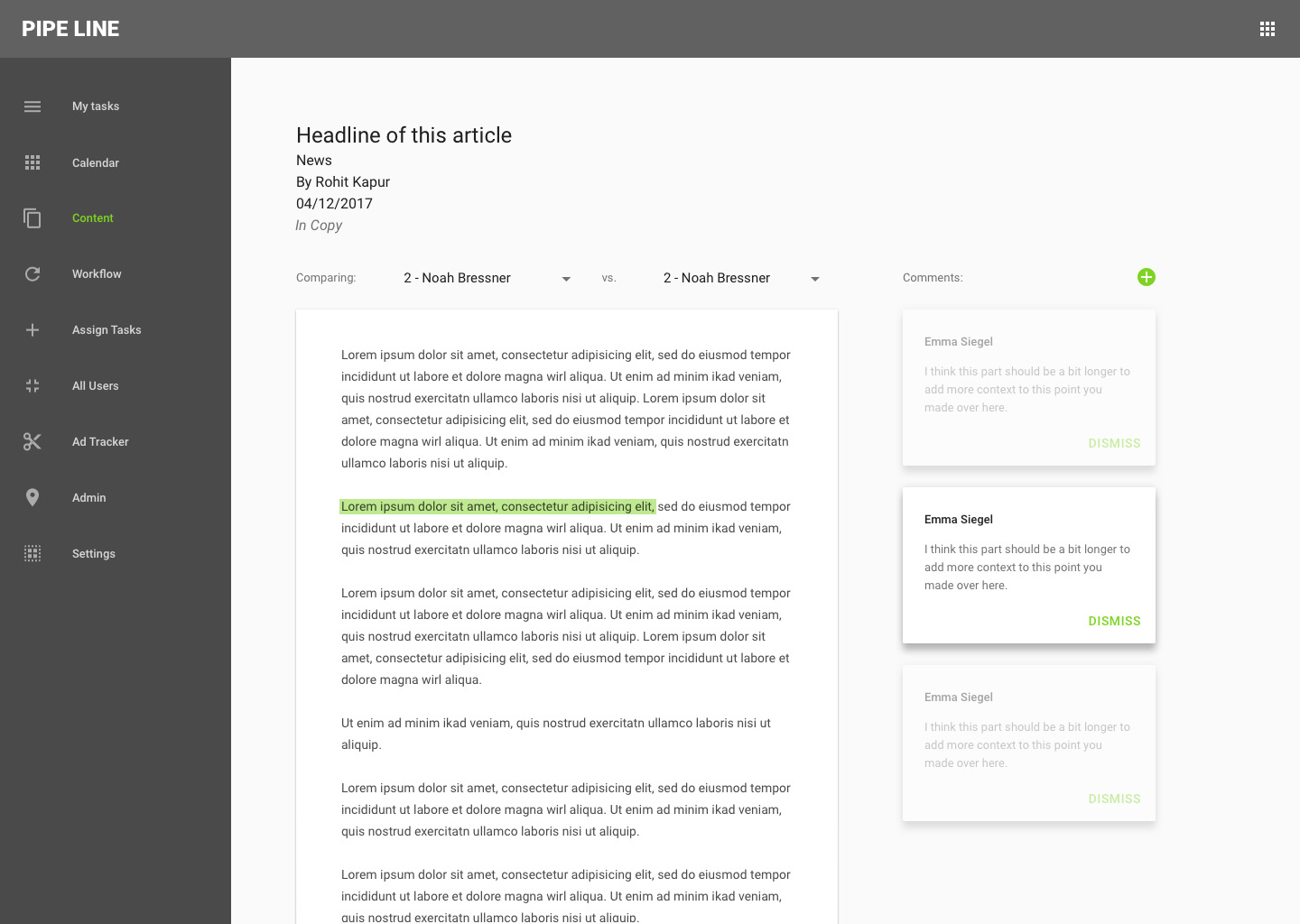
Some functionality that users suggested for the content editor include editing comments, strike through on deleted text in the comparison view, and the ability to view dismissed comments. In order to improve visual accessibility (which we were able to really notice in the black and white print outs), the light green on white buttons ("+", cancel, dismiss) will be made darker in the next iteration.
We're also going to add a field for the article's deck (subhead) to streamline the experience between Pipe Line and posting content to Pipe Dream's website.
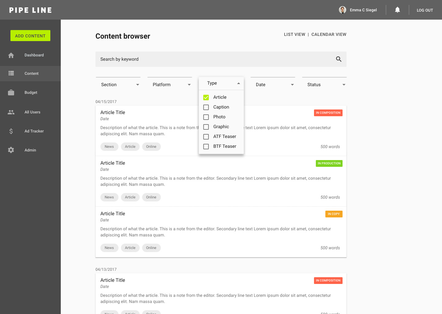
Content Browser:
As per the previous discussion, we're going to add keyword tags and have an option for calendar view. Based on user feedback, I'm going to add check boxes in the filter selection drop downs to allow for multiple tags to be selected in a search query.
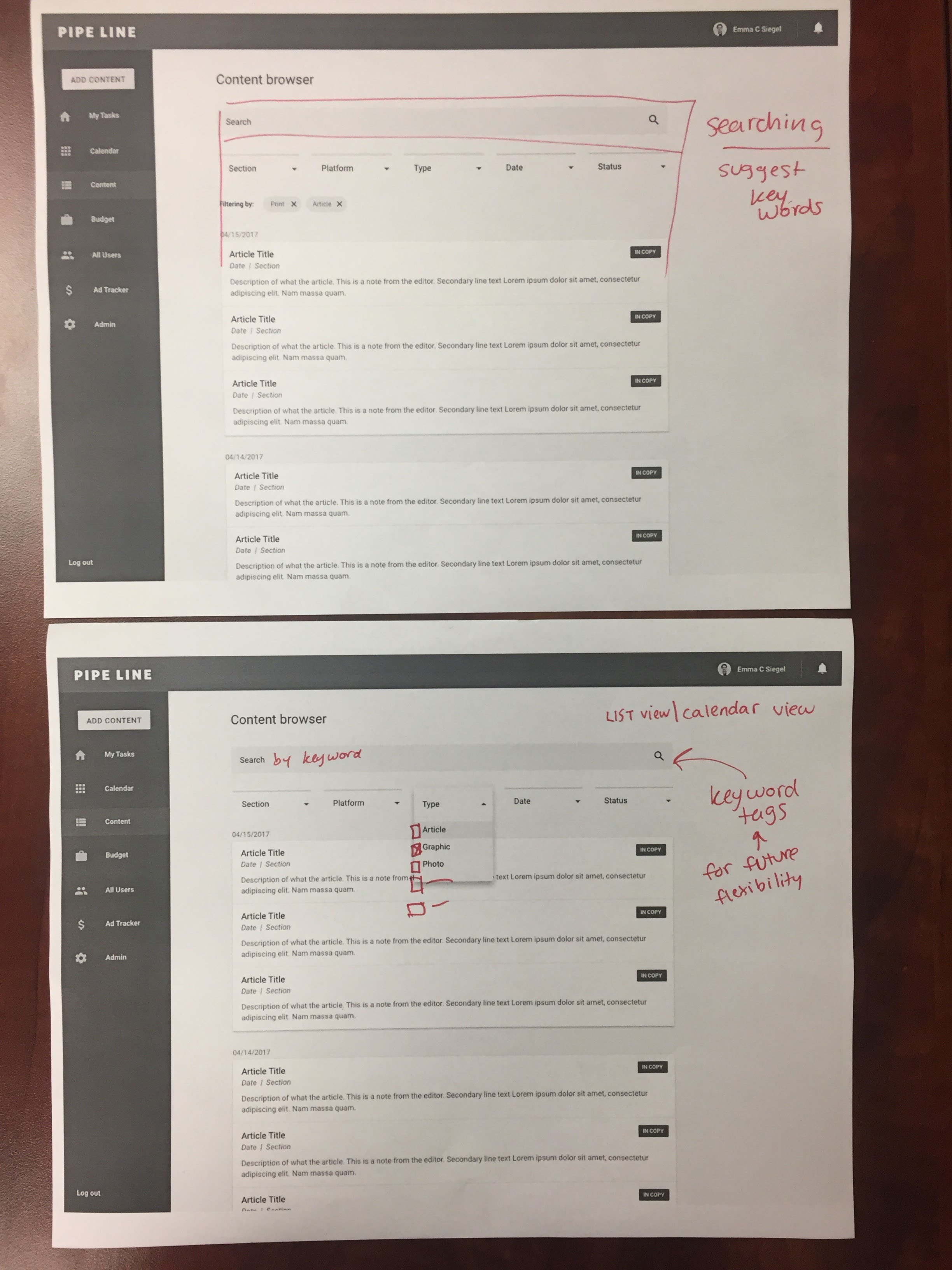
To improve scannability, I created a wireframe of a modified content card design that would include chips for each of that piece of content's tags.
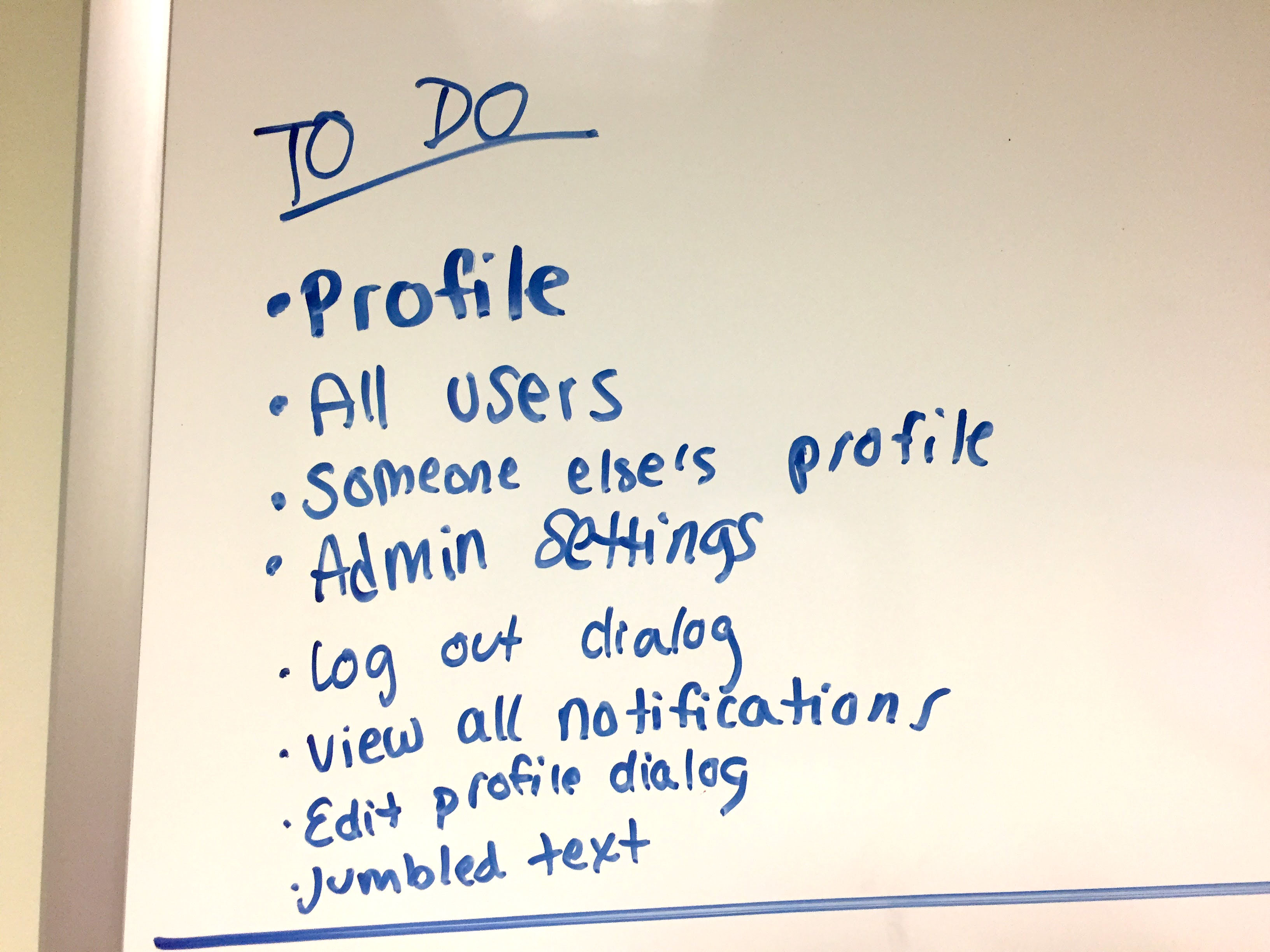
To Do:
To keep the team organized and on track, we discussed a to do list of the features that we still need to have to create the minimum viable product.
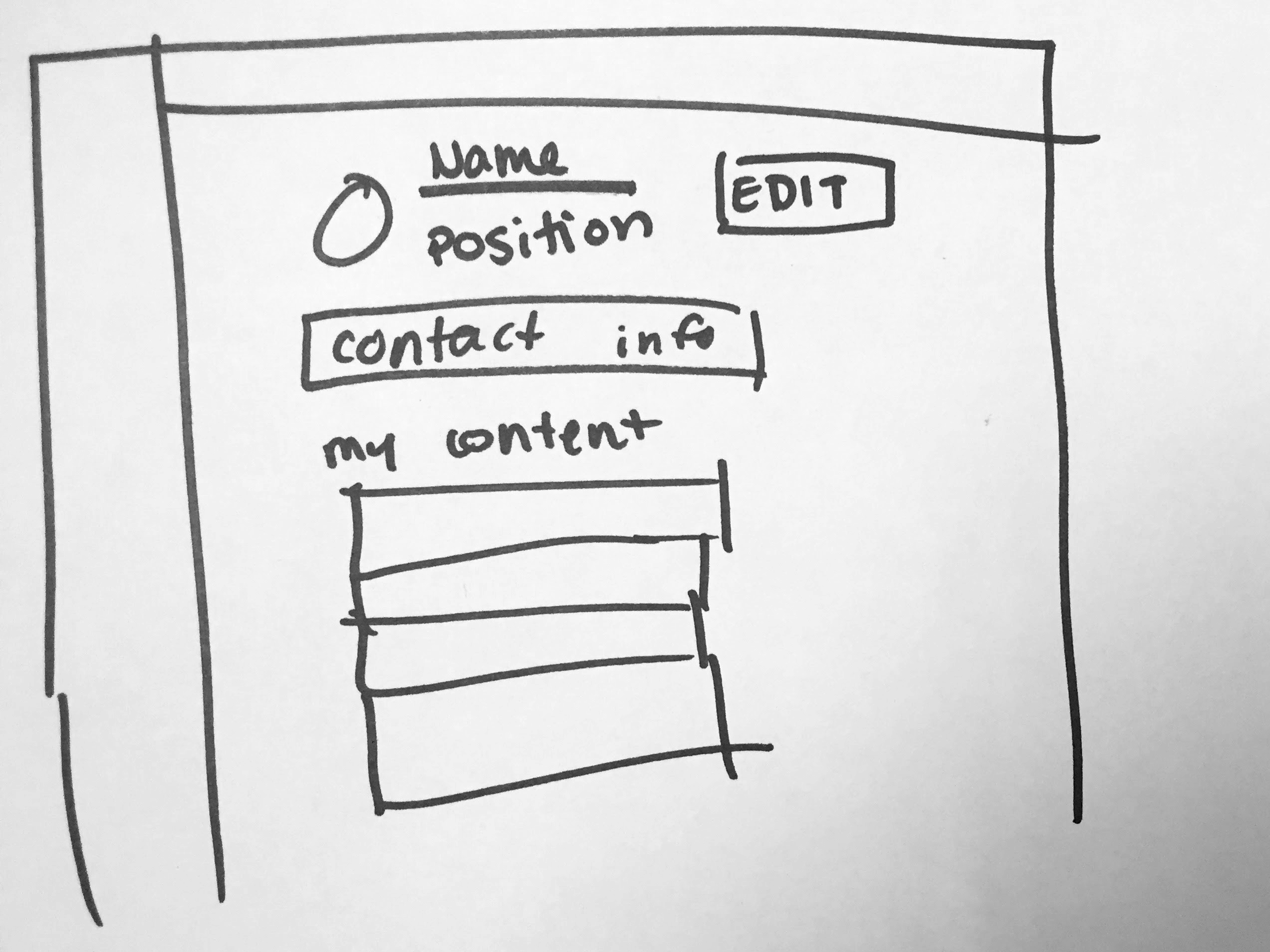
Looking forward, we discussed a wireframe for the user profile page.
4/29/17: Second iteration of mocks (V2)
For the next iteration of mocks, I focused on tightening up the visual design and focusing on visual hierarchy. With the goal of efficiency, I decided to bold the page titles to help users quickly see what page they're currently on.
Dashboard:
All notifications:

Add content:
Content Browser:
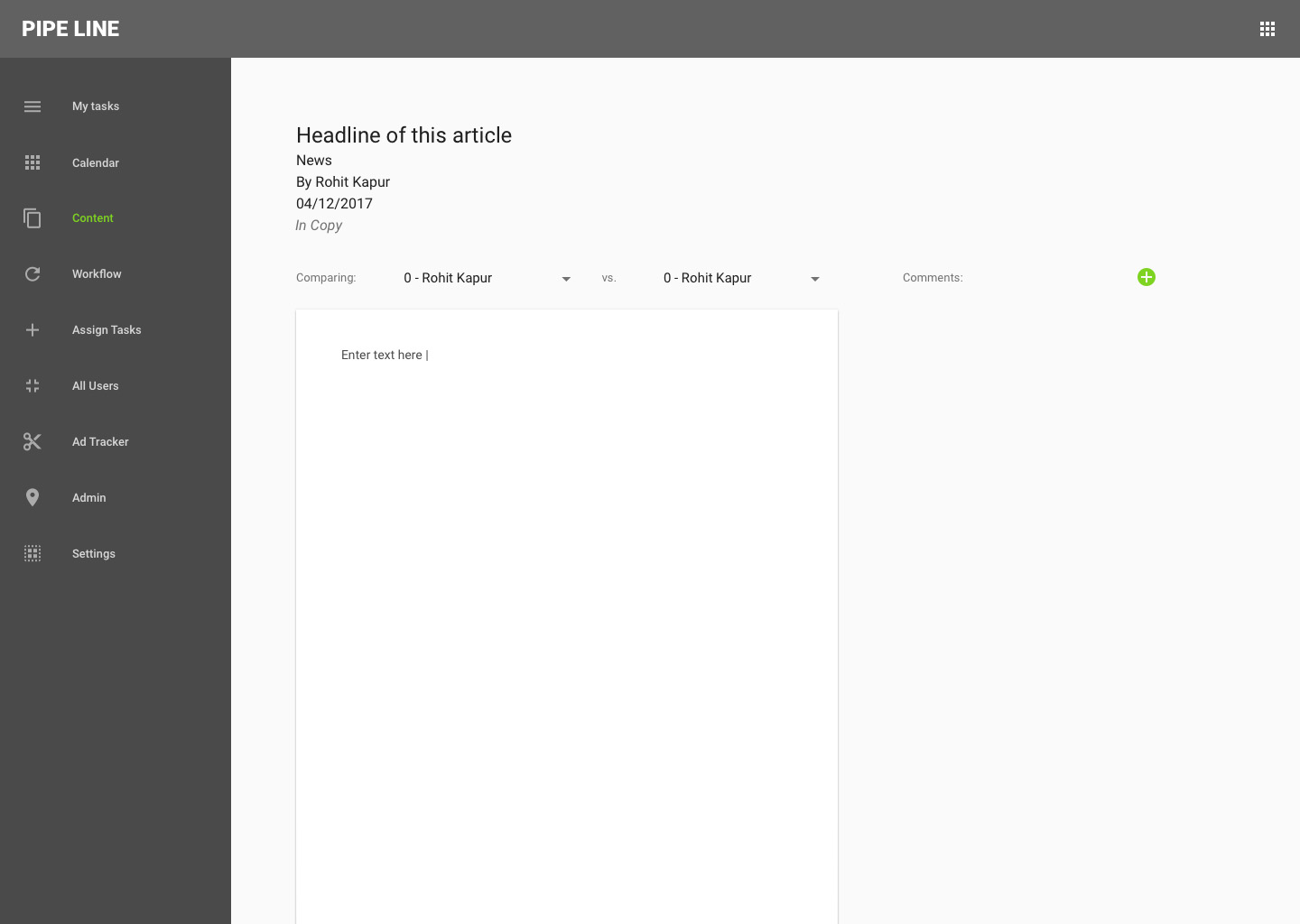
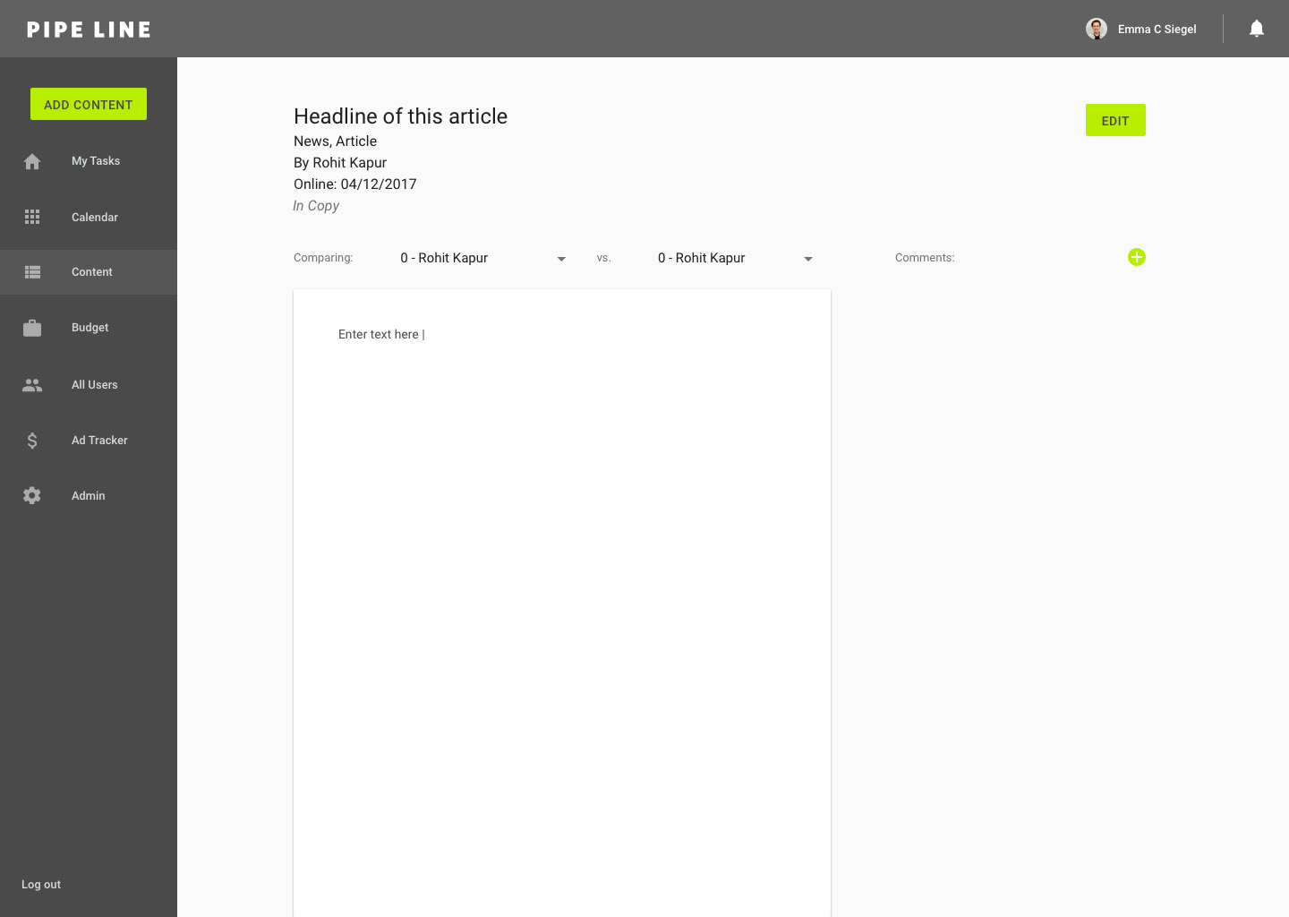
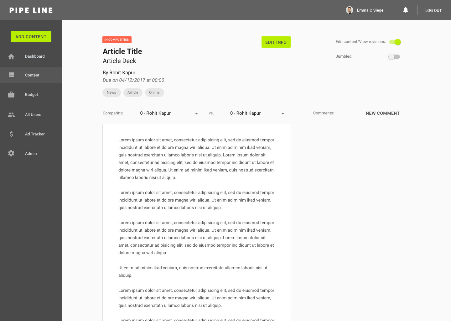
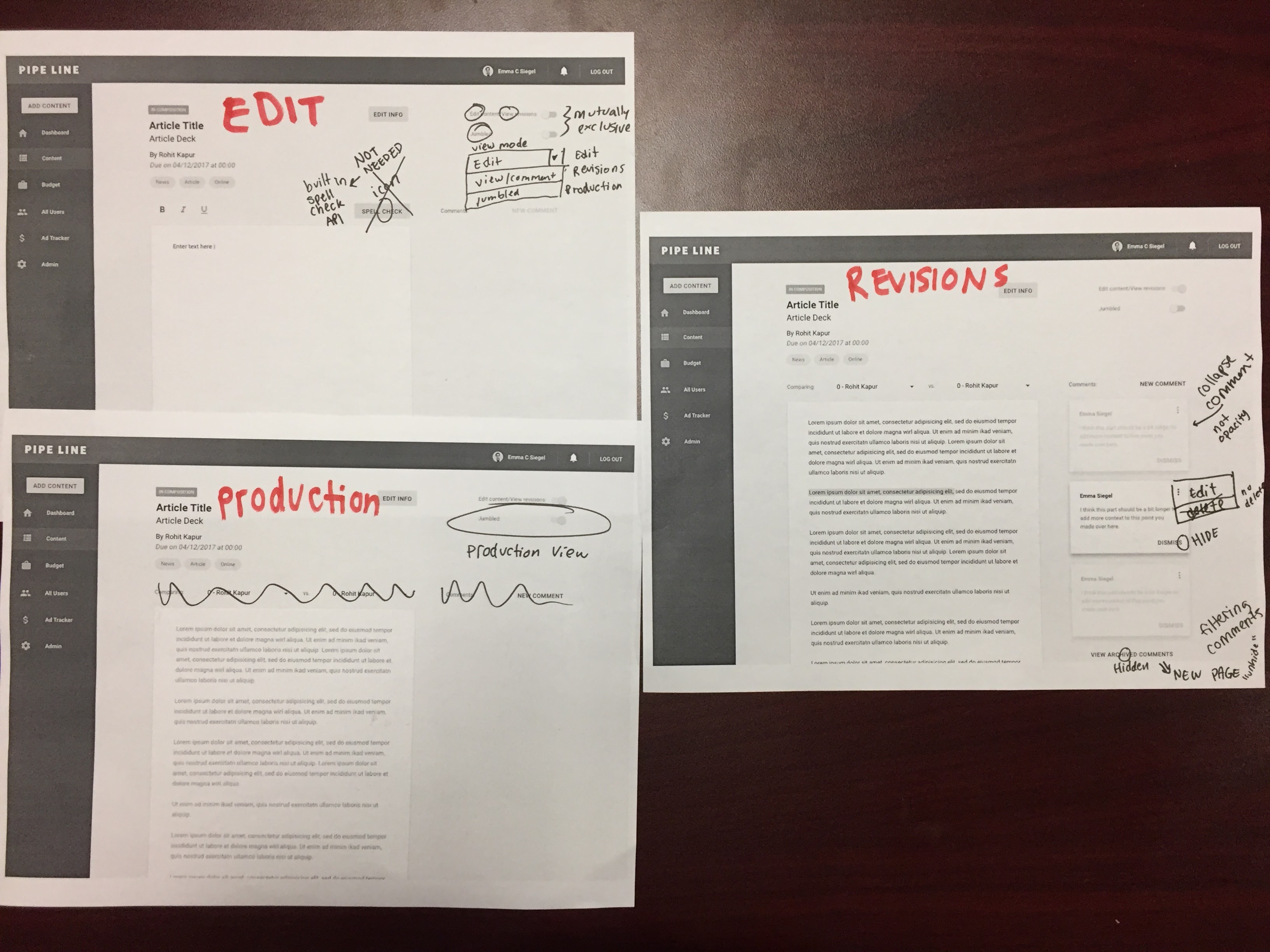
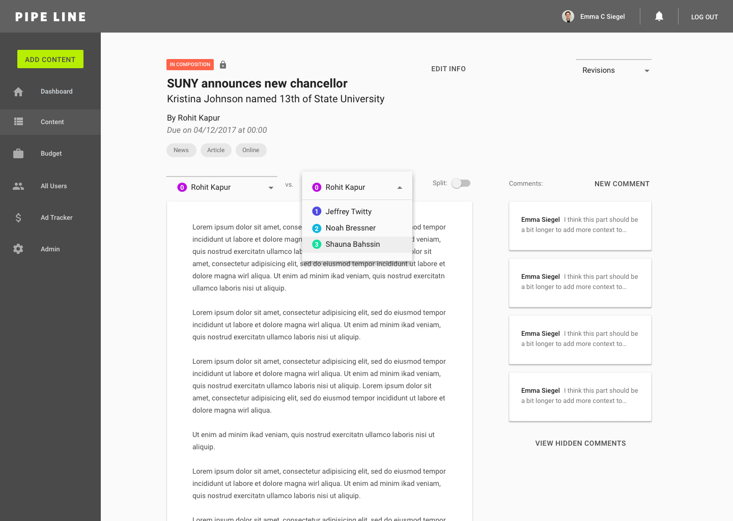
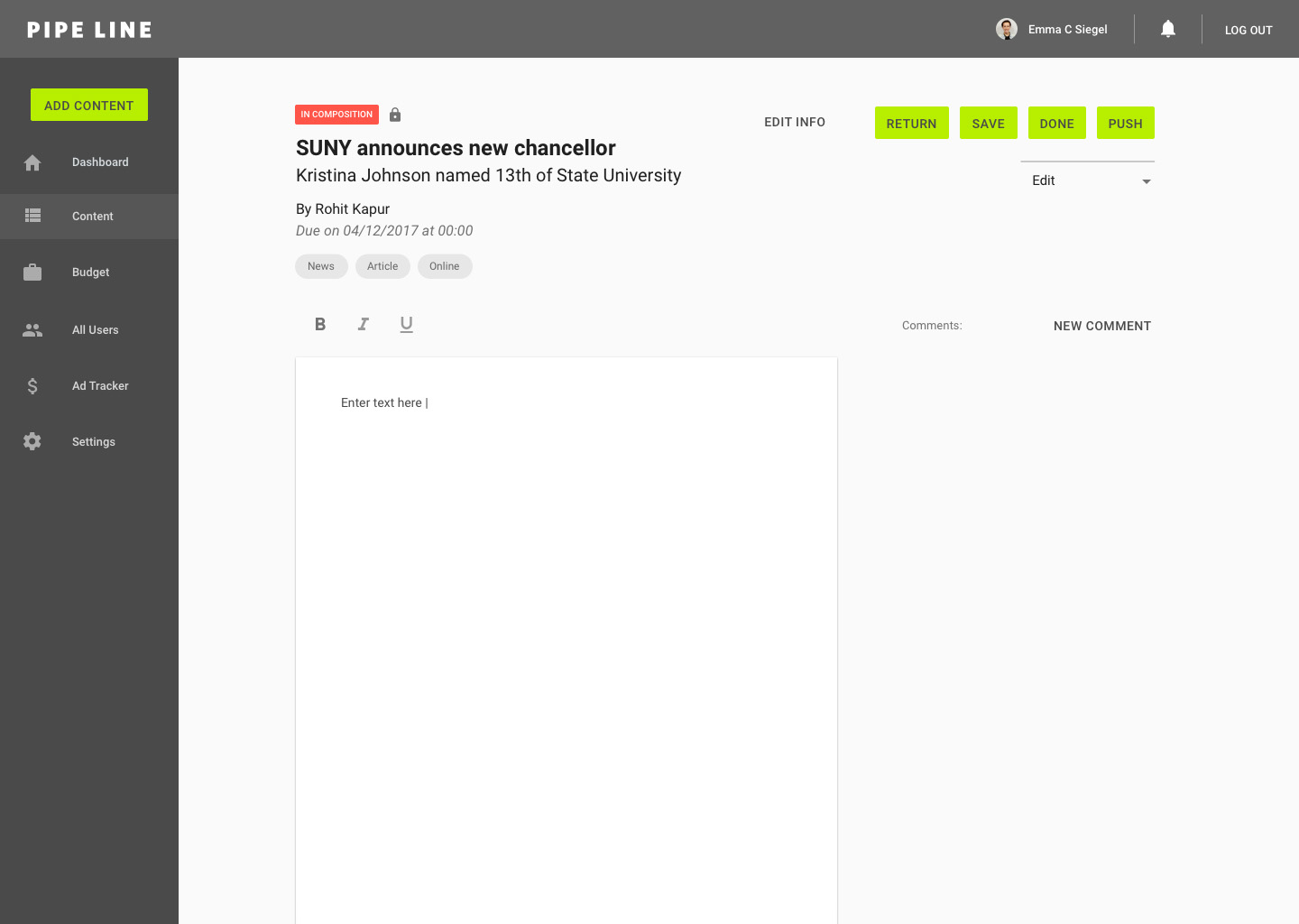
Article Editor: Upon having additional conversations with users, it came to my attention that there are actually three separate experiences to view articles in Pipe Line: composing/editing, viewing revisions, and production view (jumbled text for designers before content is "in production"). Currently, each of these experiences is accessed through a different hyperlink on the issue browser. With the goal in mind of streamlining our users' workflow, I wanted to figure out how we could combine these three experiences into a single interface. I thought of using toggles to switch between modes, which I would share with my team and test in the next meeting. For the "edit" view, I replaced the revision selection toolbar with options for text formatting and spell check.
4/30/17: testing/critiquing v2 mocks, scrum board
Based on user testing results, we decided to remove the description field from content cards and the content pages because users felt it wasn't necessary. One user commented on the challenge of scanning through articles with these large cards and suggested that removing the description would help to quickly scan and be able to view more content above the fold.
With the goals of accessibility and personalized experience, we suggested that users could benefit from a calendar view, not only in the content browser, but in the dashboard as well to provide flexibility and a parallel mental model.
For the content editor, we discussed the experience of switching between view options. Users agreed that the toggles were ineffective, mainly because the three options are mutually exclusive. We weighed the options of radio buttons or a dropdown and felt that this was a heavy action that deemed the user's two clicks of using a dropdown. In terms of the names for each tab, conversations with users led us to "edit," "revisions," and "production."
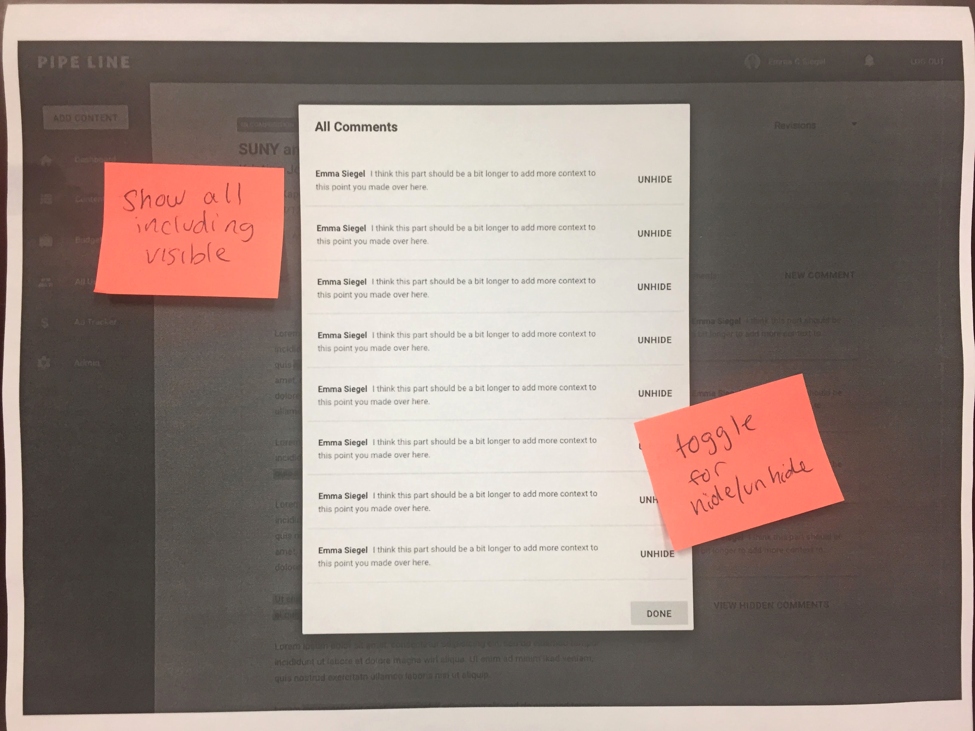
For the experience of commenting on articles in "revisions," we decided to change the wording from "dismiss" to "hide" for the action to seem less detrimental. The hidden comments will live on a page where users can select to "unhide" them. We also ideated a collapsed view of comments rather than a lower opacity, to favor more comments being visible on the screen and also ensuring a less confusing UX.
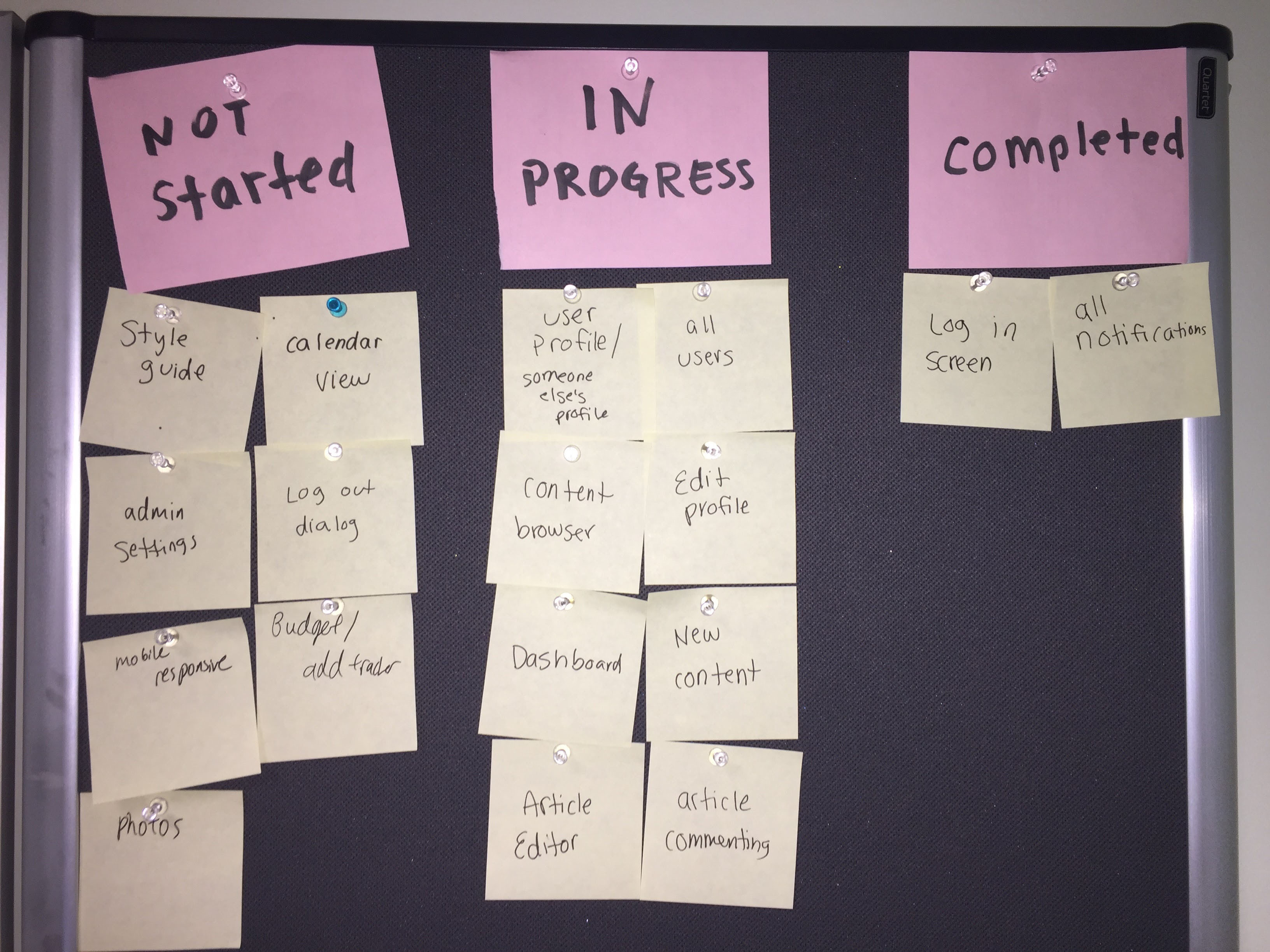
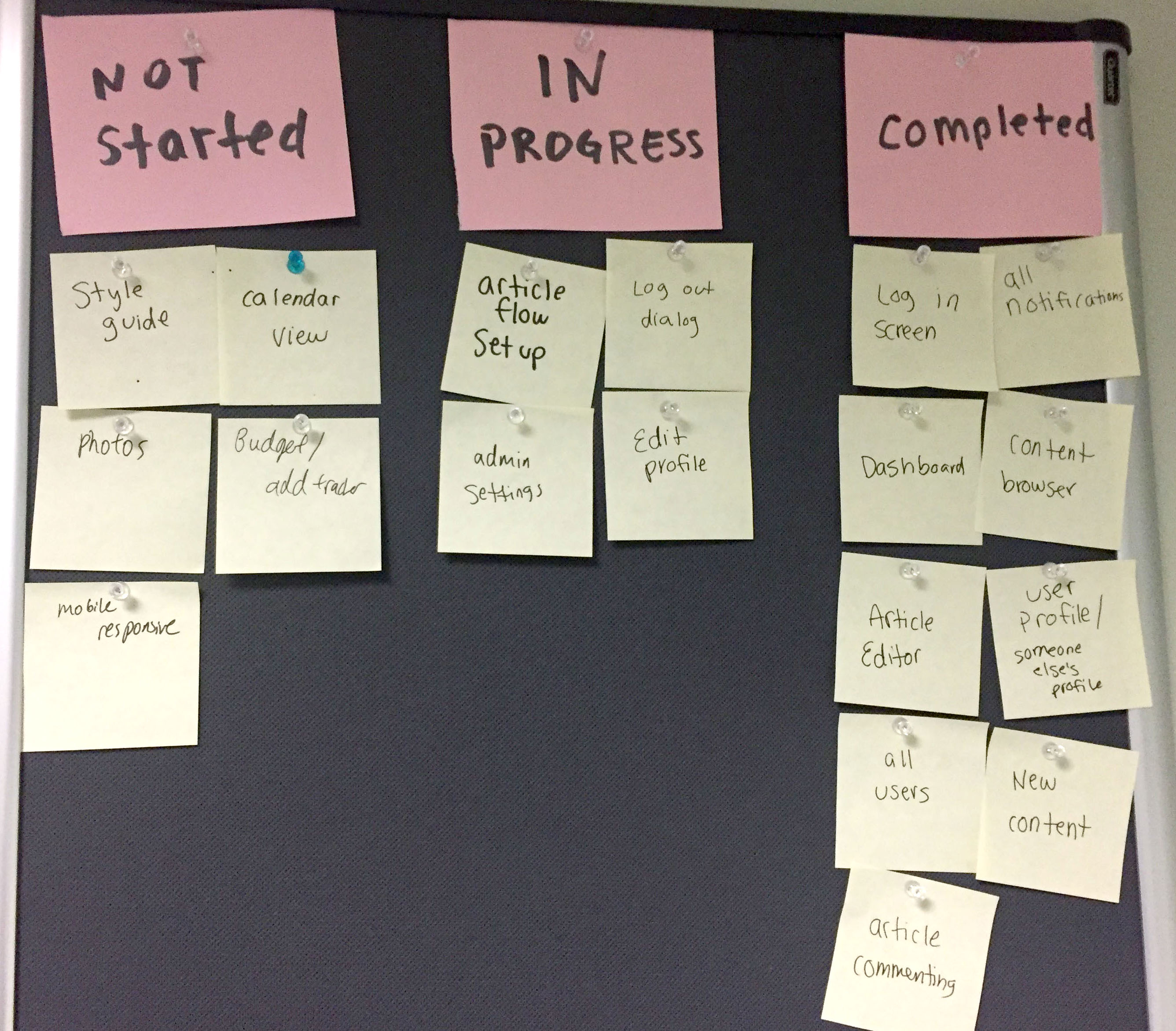
Now that our focus was expanding to encompass the full Pipe Line experience (as opposed to just the "simplified" user journey), I felt that it was necessary to organize all of our tasks. I created a scrum-inspired board to organize tasks into "not started," "in progress," and "completed." Our team revisited our walls of brainstorming post-its and brought back some ideas that we had put on the back burner such as built-in Associated Press and Pipe Dream style guides for copy editors and photo integration.
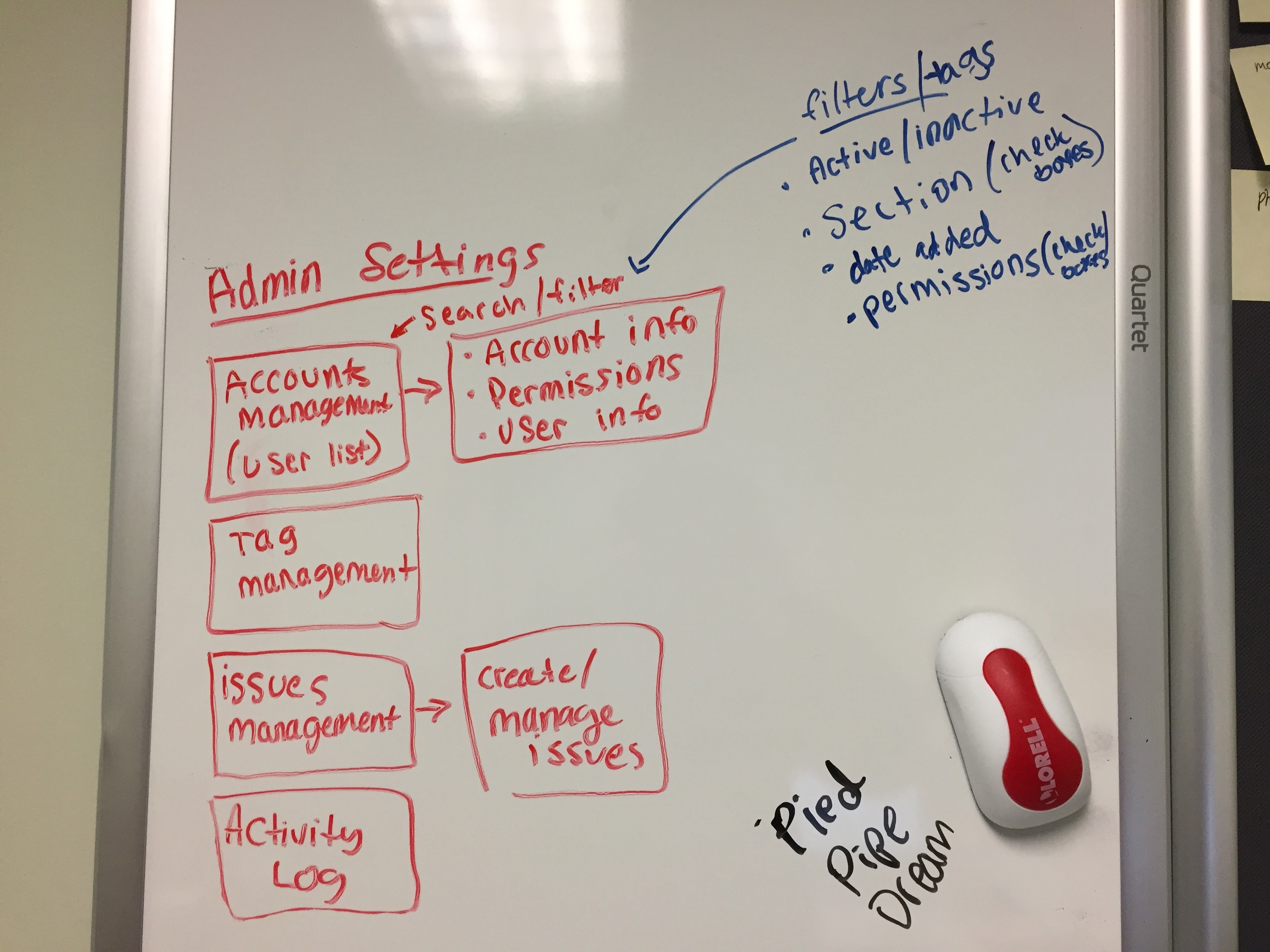
We ended the meeting by having Henry, Pipe Dream's newsroom tech manager, walk us through the current admin settings in Pipe Line. He told us that he has a pretty good experience with the way these settings currently worked so we're going to try to keep the experience similar but with accommodations for new features.
5/1/17: Third iteration of mocks (V3)
To help users in testing sessions and my teammates better visualize the mockups as a live product, I replaced most of the placeholder text with real Pipe Dream headlines and decks.
Dashboard:
Add content:
Content browser:

Content editor: edit
Content editor: revisions
Content editor: revisions comment view
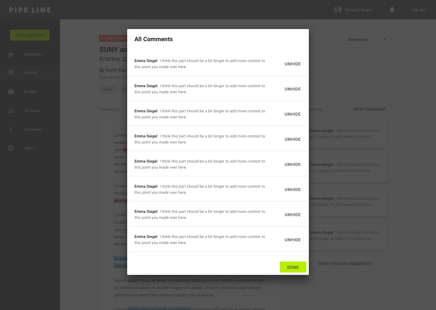
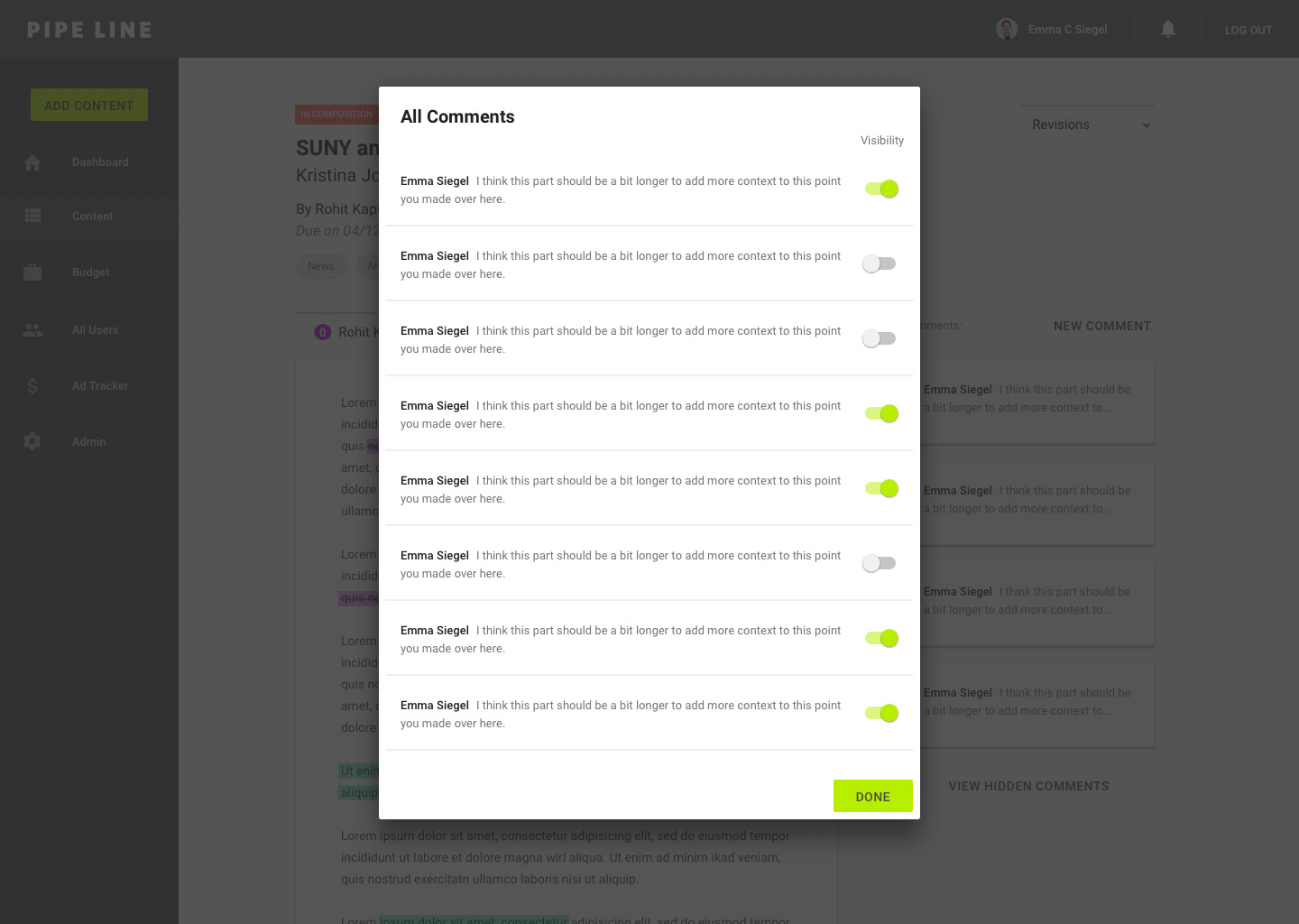
Content editor: all comments
Content editor: production
5/2/17: testing/critiquing v3 mocks
At this point, the members of our team felt pretty satisfied with the mocks we had designed so far so we decided to bring in more users for testing. Based on conversations between our team and the paper's Copy Desk Chief and Opinions Editor, we were able to brainstorm new ideas to improve the overall experience and expand the product's use.
Dashboard:
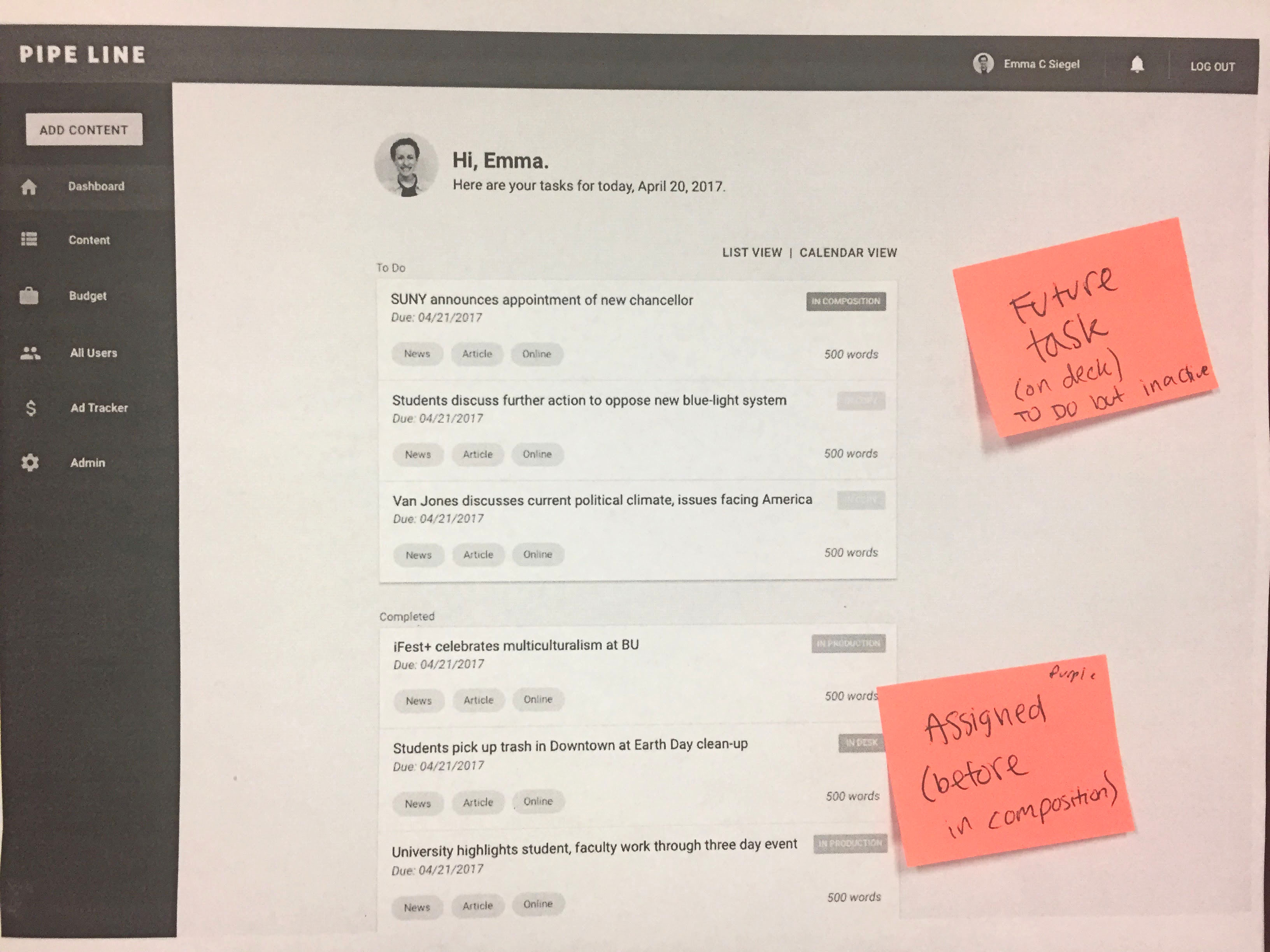
Users suggested that it would be helpful to not only list current and completed tasks but also to include future tasks so that they could have a good grasp on how much work they have ahead of them. Our team also ideated a new status tag called "Assigned" for articles that have been assigned but not yet composed. The addition of this status tag and the future tasks could help users to make their workflow more efficient through a transparent and informative experience.
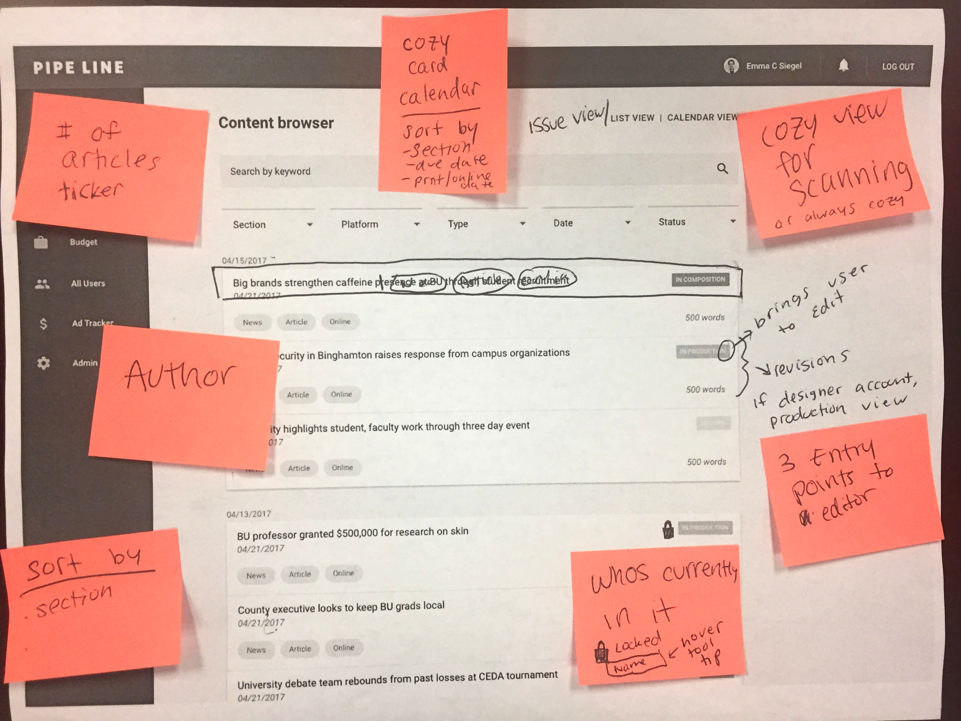
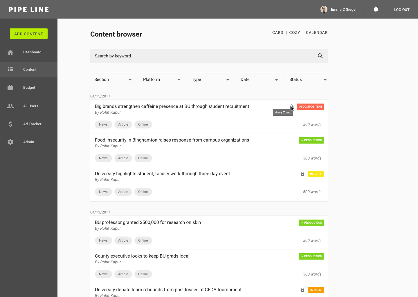
Content browser:
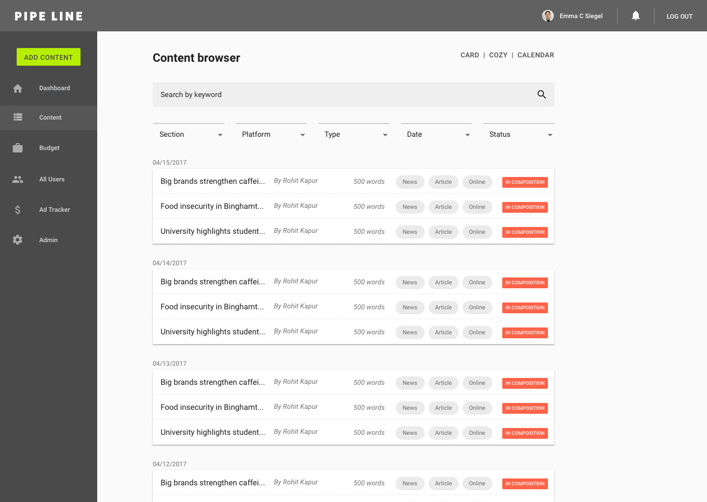
Users' biggest complaints were focused on the lack of scannability. Though they agreed that the amount of open space was visually appealing, they felt the design's main flaw was that it did not present as much information on the screen as the old cluttered, yet effective experience. To solve this problem, we came up with the idea for a "cozy" view (similar to the view options of Gmail), which would allow users to further personalize their experience by switching between view options that worked for them.
In addition to filters, users suggested that it would be helpful for sorting features such as section, due date, and print/online.
Users pointed out that the old Pipe Line experience had three entry points to the article viewer: one for each edit, revisions, and production. To give users easy access to each view, we discussed that clicking on the status would bring users to "edit" and that clicking on the card would bring users to revisions. If the user's account type is "designer," clicking either the card or status would bring them to "production" view.
Another feature that users suggested included a lock icon to identify articles that are currently being edited and a tool tip with the current editor's name upon hover.
Editor:
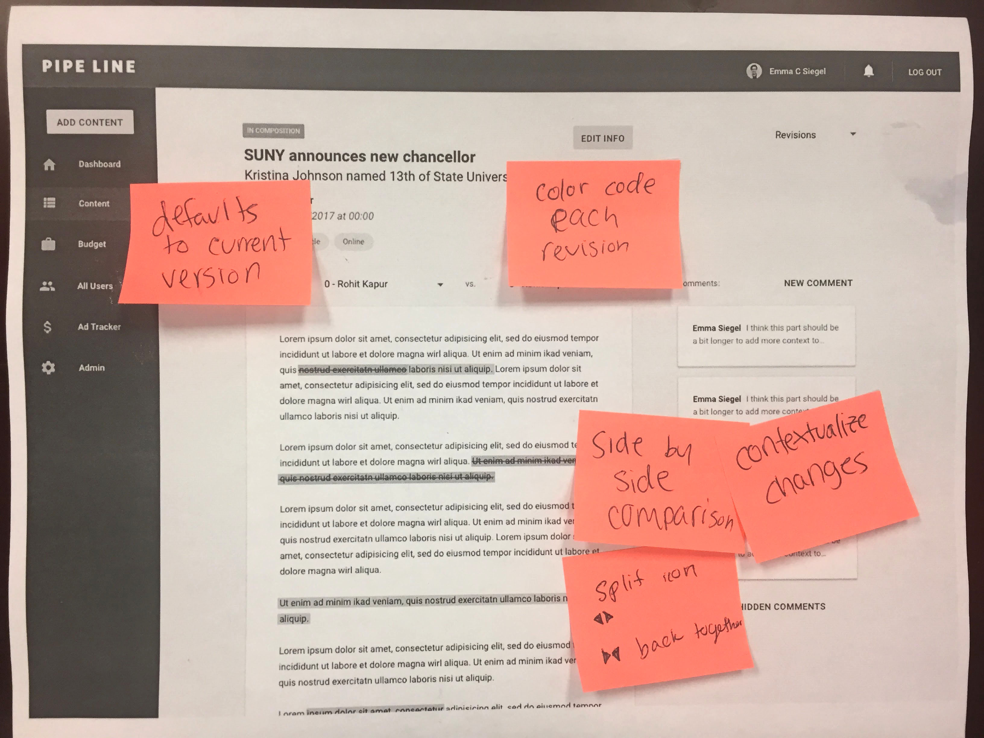
Users suggested that it would be helpful to color-code each revision for easy visual identification of edits.
One user told us that he frequently opens Pipe Line in two windows to view revisions side-by-side to fully contextualize changes. He suggested a "split view" mode for users to easily compare revisions side-by-side. We ran the idea by the whole staff: a few users said they had done similar hacks to create a split view and others agreed that this new feature would be helpful.
All comments view:
We decided to include both hidden and visible comments and create a toggle system for visibility in order to create a more transparent and streamlined experience.
5/5/17: Fourth iteration of mocks (V4)
In addition to the feedback from our previous meeting, I designed the first iteration of mocks for functionality beyond the core experience including admin settings and user profiles.
Content browser: card view
Content browser: cozy view
Content editor: version change
Content editor: version compare
Content editor: split view
Content editor: all comments
All users:
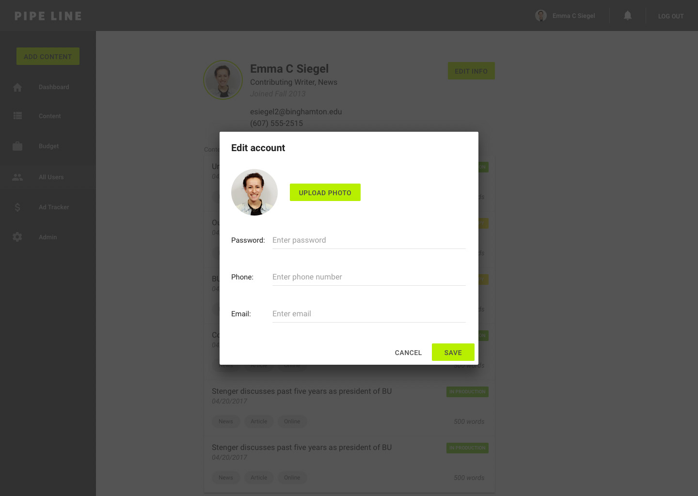
User profile:
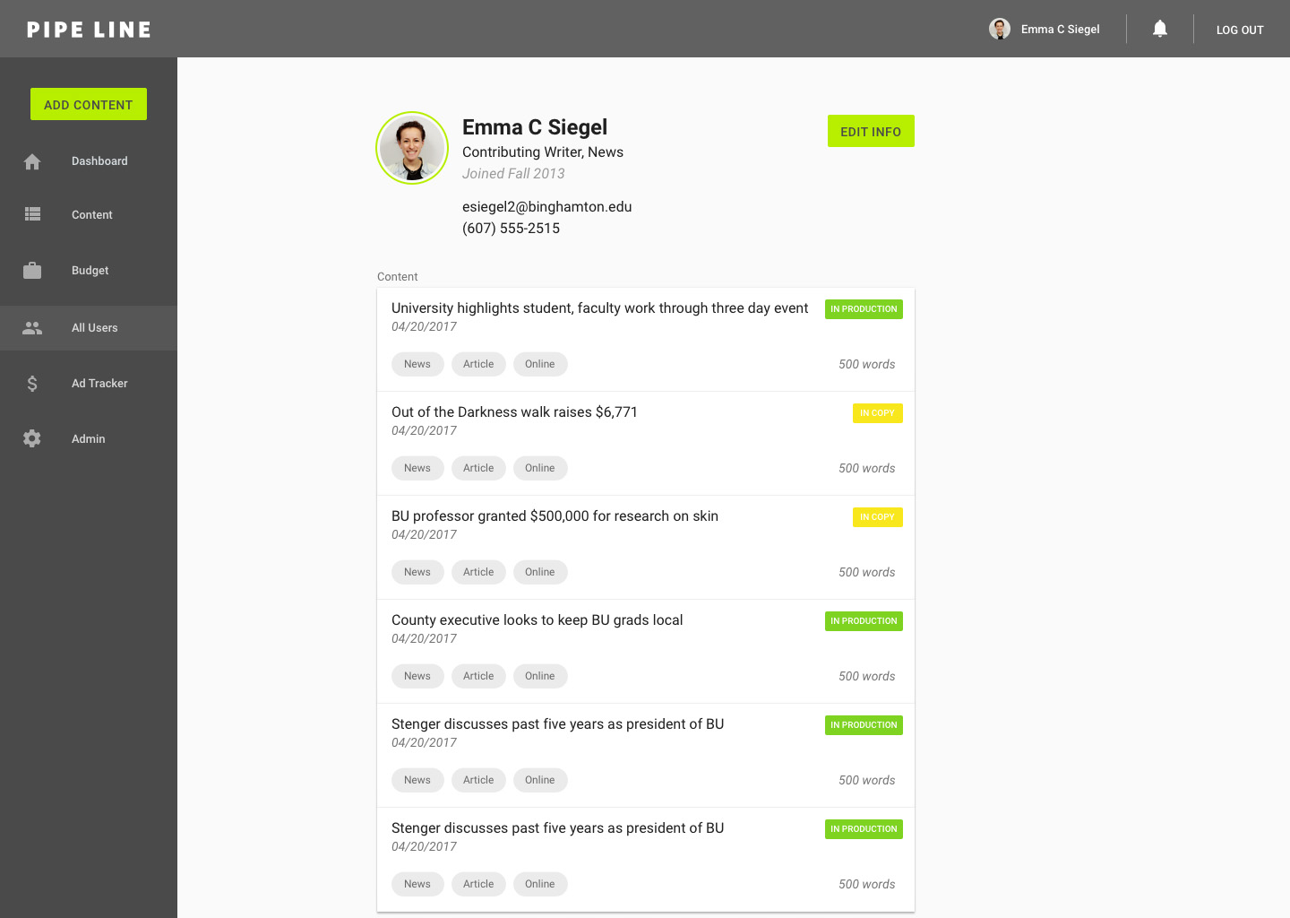
User profile: edit
Admin:
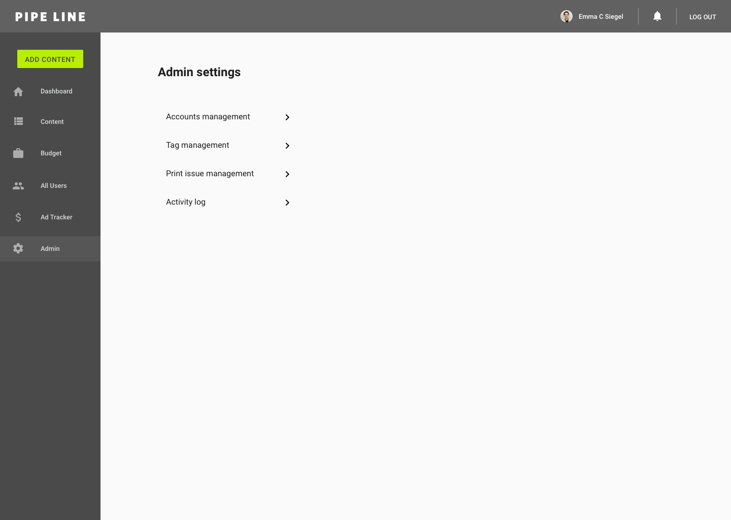
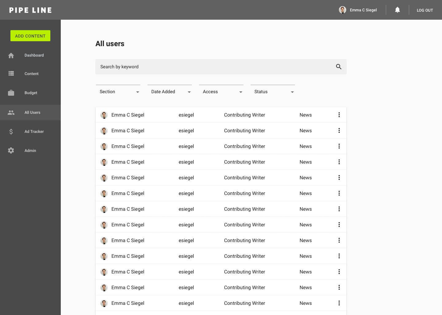
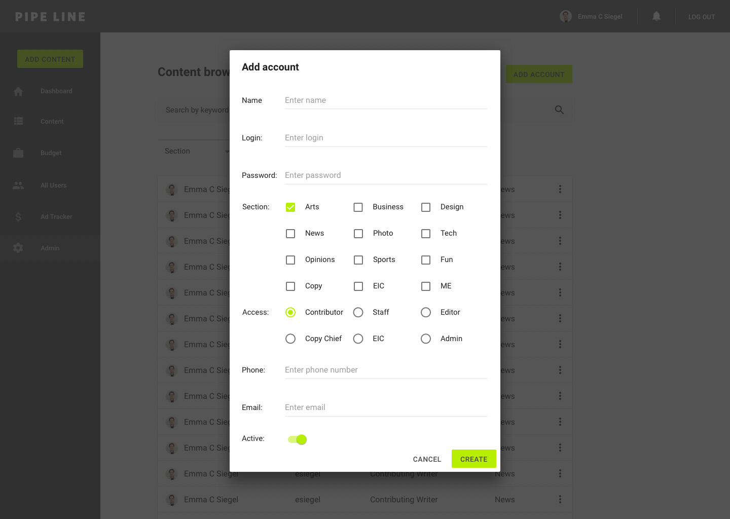
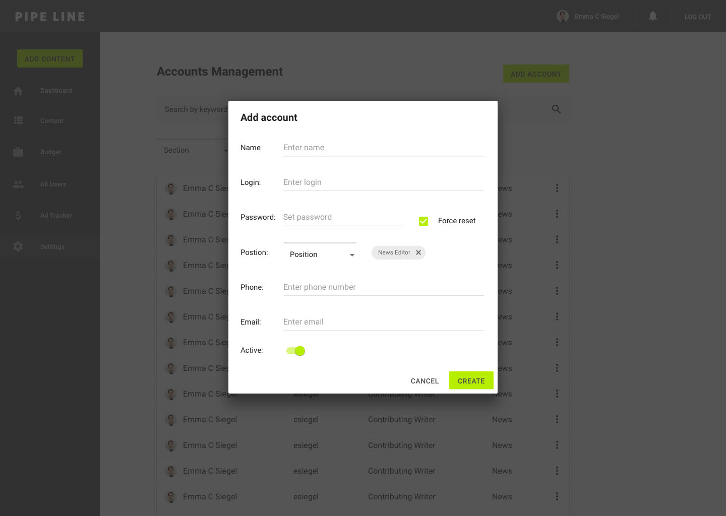
Admin: accounts
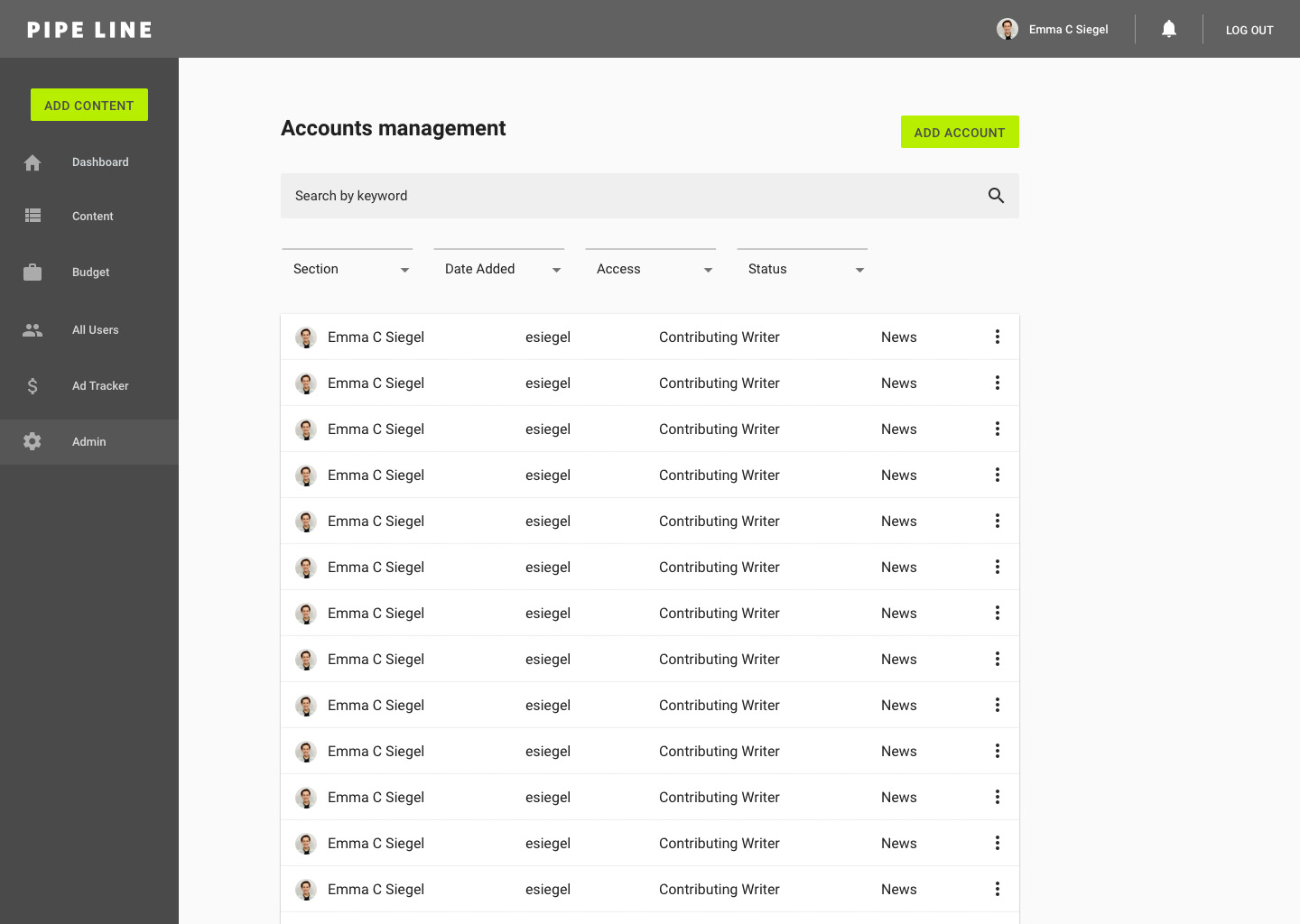
Admin: add account
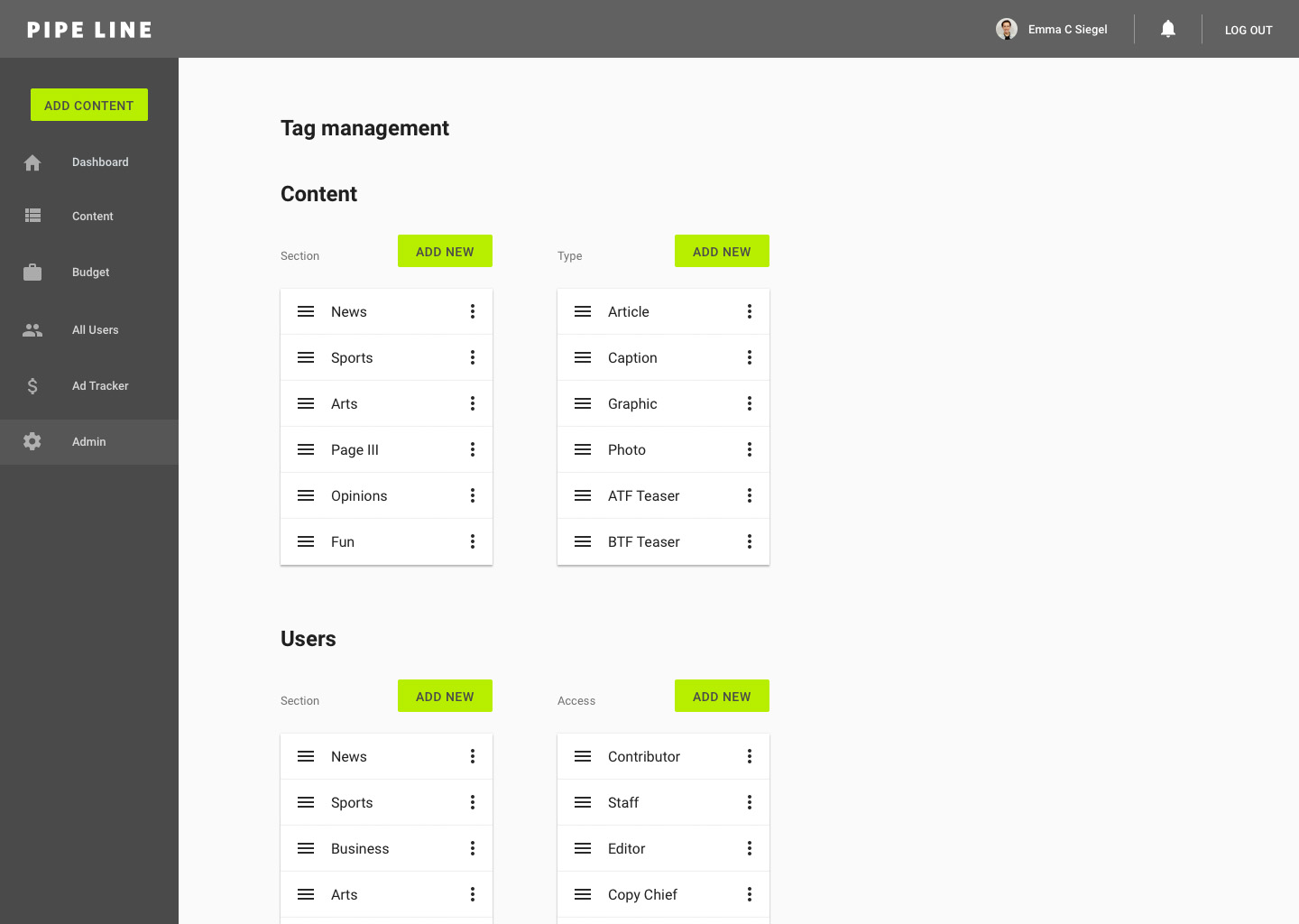
Admin: tags
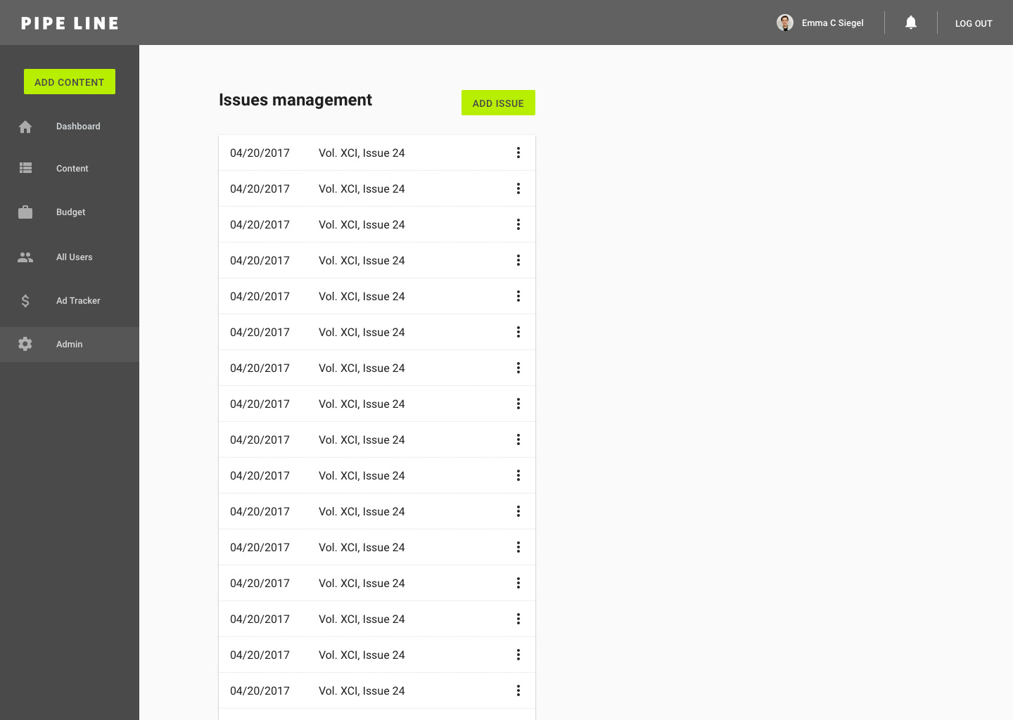
Admin: issues
5/7/17: tying the experience together with content flow
At this point, our team validated the core experience as completed based on its ability to meet our goals and on users deeming it successful in testing. Aside from minor feedback on admin and account settings, our next challenge was to figure out how the logic of the user's entire experience would work.
In addition to the user's experience iterating through content, we had to consider the content's experience iterating through users. Our team came up with the name "Content Flow" to describe this journey.
We brainstormed that content could have a default journey set up based on it's type and section. Content flow set-up could happen during the content creation experience. Users could view the default flow and then edit the flow if need be.
Nonetheless, we also had to consider that the journey is not always linear and often goes through multiple iterations back and fourth between Editors.
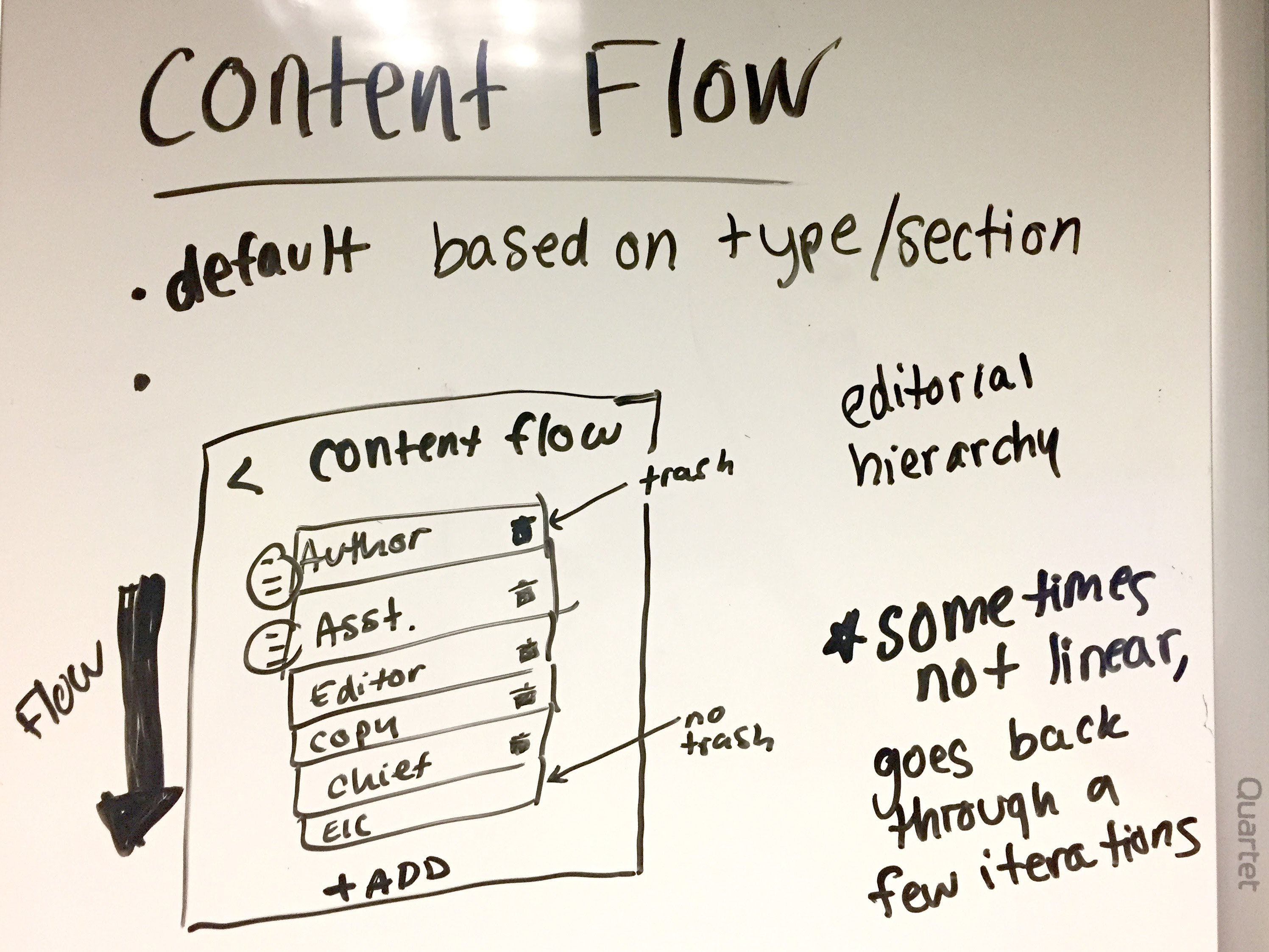
We decided to table the discussion on content flow to allow for further divergent brainstorming until our next meeting. We also planned to discuss with other users and crowd source ideas to create a solution to this challenge.
5/8/17: Fifth iteration of mocks (V5)
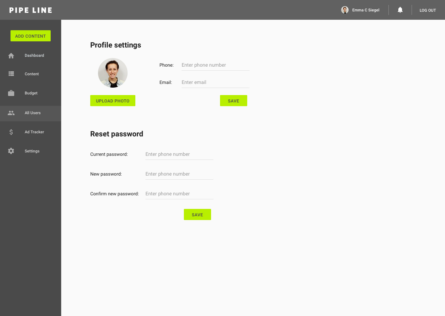
For the experience of creating and editing an account, we conversed with Pipe Dream's current and past Newsroom Tech Managers. To make the experience as clear and transparent as possible, we added a password reset option to the admin settings and created an experience for users to edit their account, profile and password.
Admin: add account

Account settings:
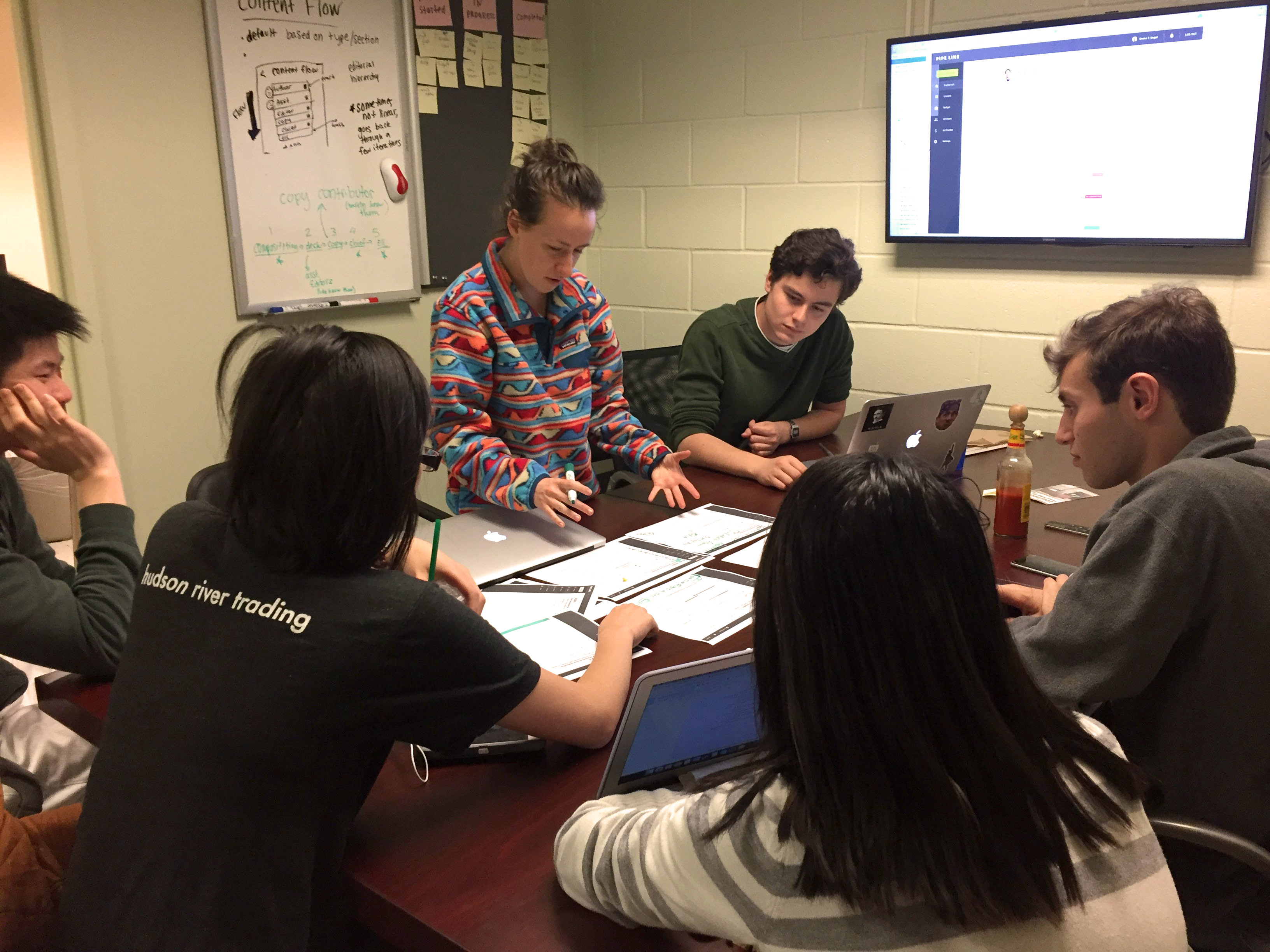
5/9/17: Content flow
In our final meeting for the semester, our team focused on the holistic Pipe Line experience and resumed the discussion on Content Flow.
With our goal of transparent experience in mind, we identified that an important aspect of Content Flow would be to show how far along a piece of content is in its journey. Looking at the current mocks of the content editor, we brainstormed various locations where this journey identifier could live.
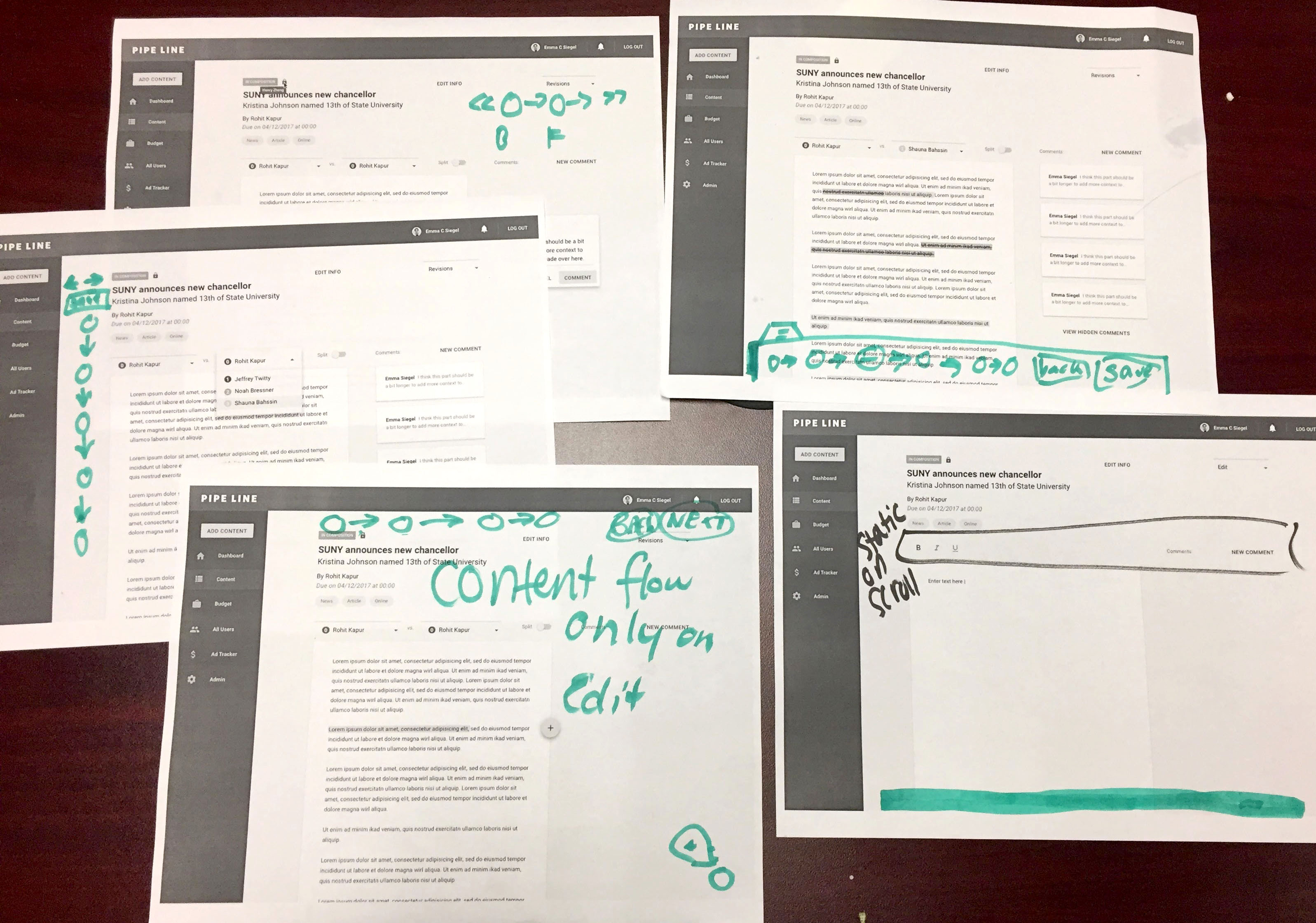
However, upon revisiting the content flow journey, we were reminded that it is not only non-linear, but it is also inconsistent because of user groups. For example, because multiple people hold the title "Assistant News Editor" or "Copy Contributor" a piece of content may go through all or just some people in that group.
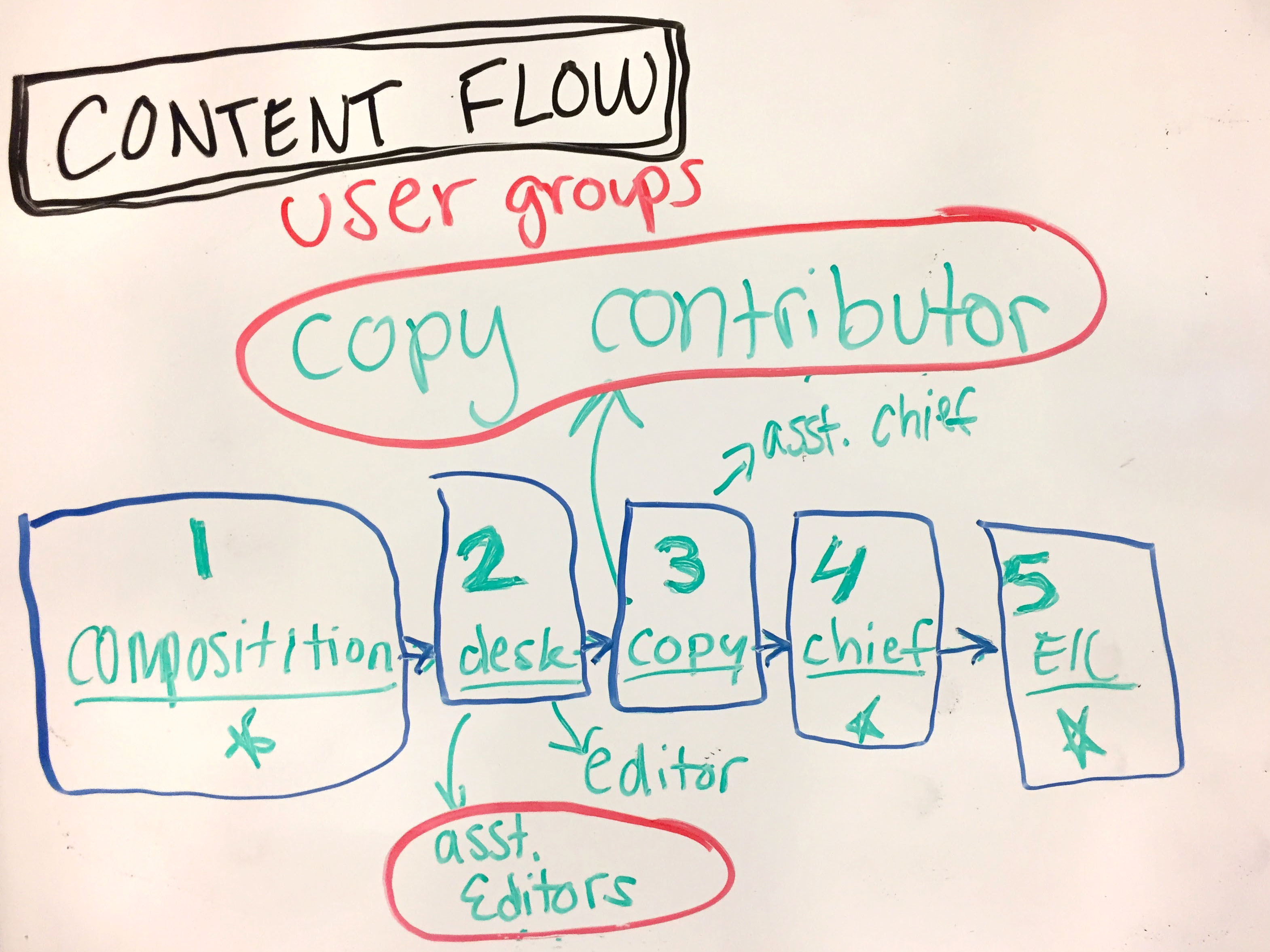
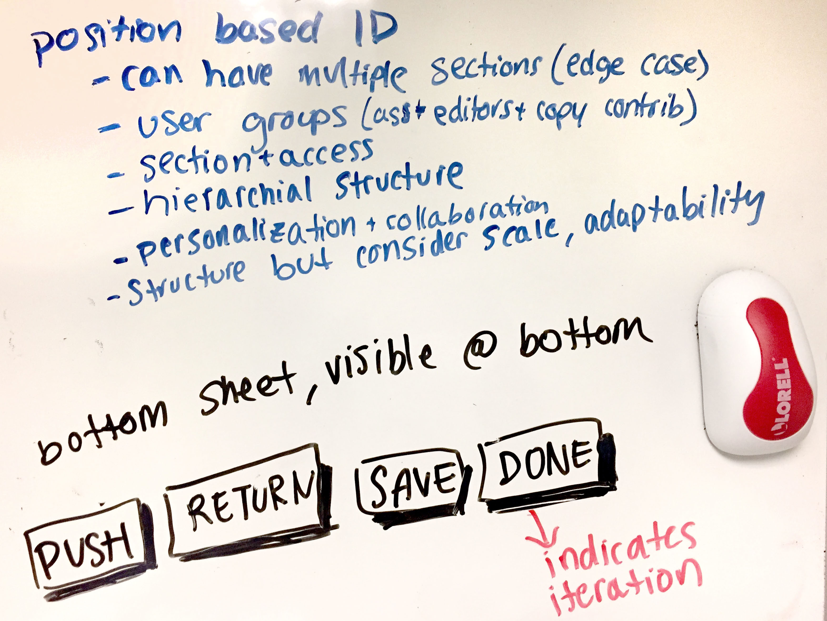
To solve this problem, we suggested that user accounts are tagged with a position-based identification (PID). This would enforce a hierarchical structure by grouping users, therefore allowing multiple users to hold the same position and allowing one user to hold multiple positions. PID would correspond with account permissions and would help form a personalized and collaborative experience in Pipe Line. Lastly, the PID system would create a structure that is flexible enough to adapt to scale.
Based on our goals of streamlined workflow, personalized experience and user empowerment, we ideated on simplifying users' experience with content flow. Since Pipe Line knows a user's PID, it could only display content flow calls-to-action that are relevant to the user such as saving changes and move content forward and back through the journey.
5/11/17: Sixth iteration of mocks (V6)
In the final iteration of mocks, I implemented our discussed changes for content flow, user identification and the respective features for scale and adaptation.
Admin: add account
Editor: with content flow
Admin: tags
Admin: content flow
MOVING FORWARD
The next step for Pipe Line is to begin the development process. I sat down with our team of developers to go over the flows and mocks. Throughout the design process, I kept detailed notes of our meetings and rational for design decisions that I passed on to the team. I gave the team a crash course in Sketch and showed them around the design files so they could reference design specs including colors, fonts, spacing and more. During the dev process, the team will conduct more user research and adapt changes as needed.
Challenges
Unique use cases: With each user we interviewed, we discovered that each user has a unique use an experience with the product. We strived to create an experience that would work for everyone with options for customization. While working on creating a widely usable experience, we focused on known and potential edge cases to ensure that the experiences were accessible, usable and delightful for all users.
Adapting for scale: Though in the design process we focused on the current use cases of Pipe Line, we were constantly keeping in mind flexibility of the application to adapt to scale and new use cases. In the case that Pipe Dream adds a new content section or a new type of Editor, we wanted to ensure that Pipe Line's experience would swiftly adapt to the change. We also kept in mind the possibility of other publications using Pipe Line and how the structure of their content and workflow may differ from ours.
Special thank you to Sketch symbols and Sketch version control!
Work
Taylr
interaction & visual design, hackathon
interaction & visual design, ux research
Pipe Line
interaction design, project management
Pipe Dream site
interaction design, project management
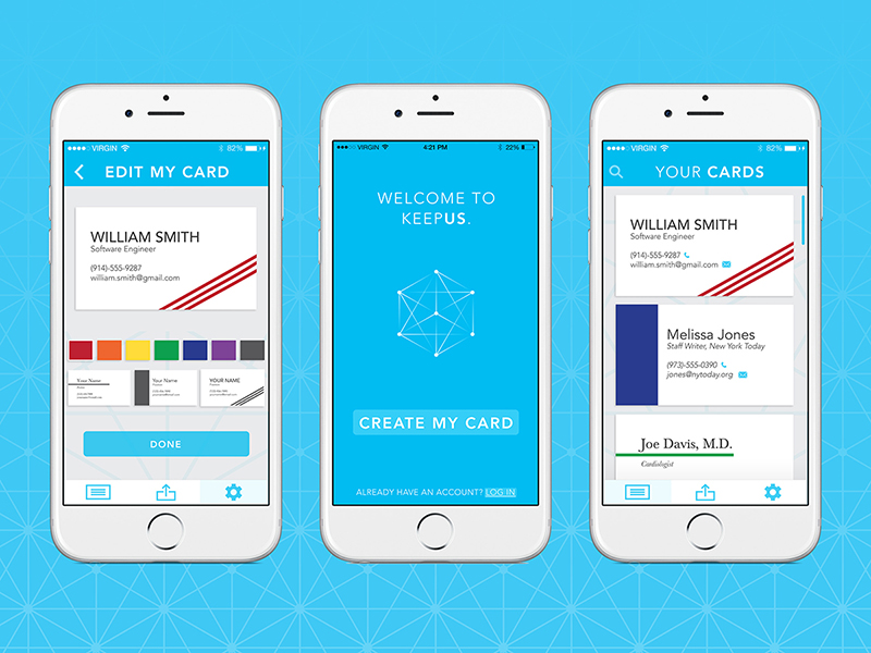
KeepUs
interaction design, visual design
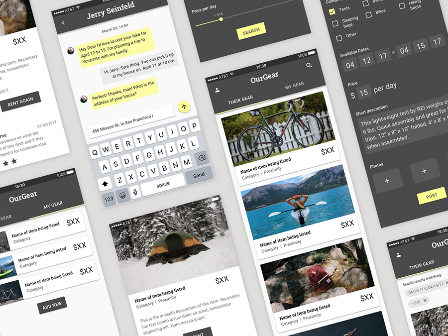
OurGear
interaction design, visual design
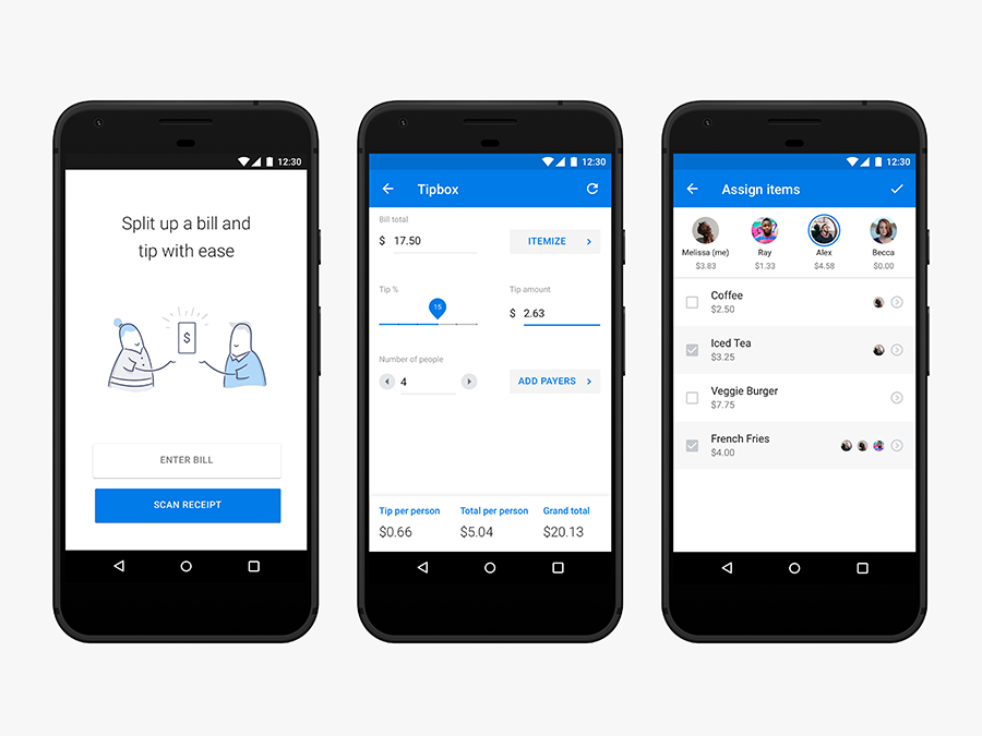
Tip Calculator
interaction design

Illustration
visual design
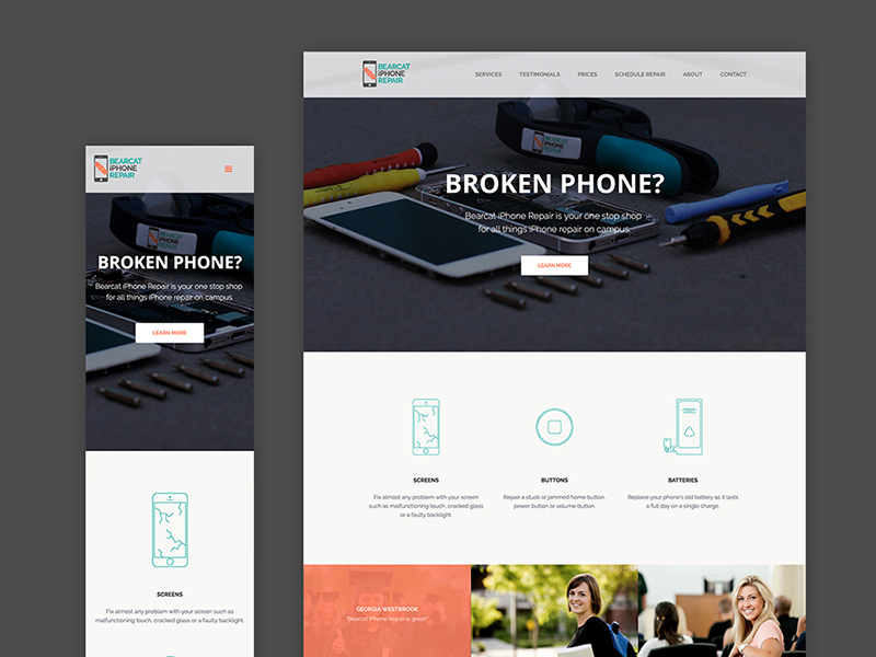
iPhone Repair
interaction & visual design, html/css
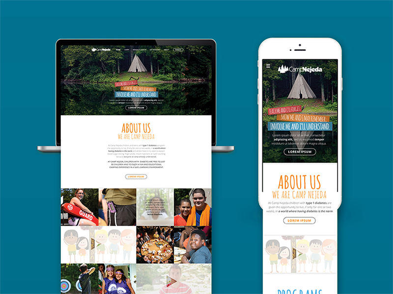
Camp Nejeda
interaction design, visual design
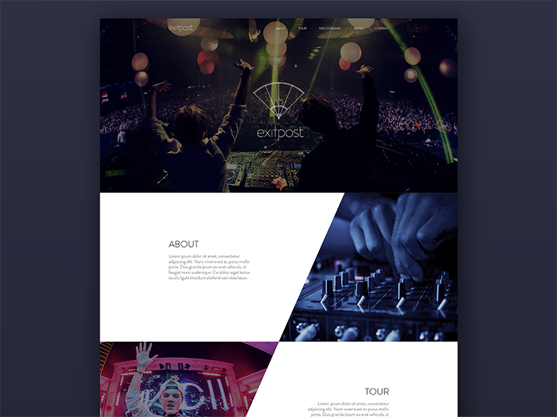
Exitpost
visual design
Island of the Self
motion design
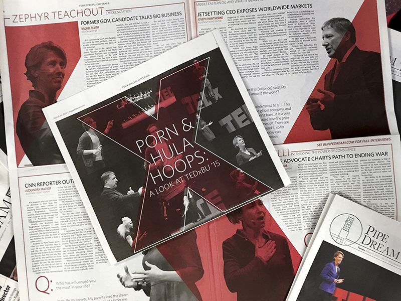
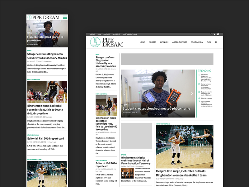
Pipe Dream
interaction design, visual design
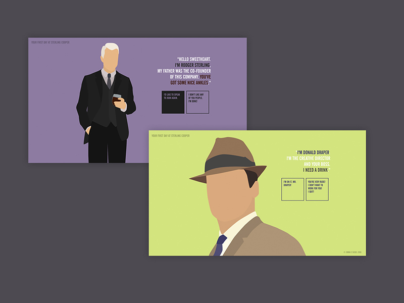
Mad Men
interaction & visual design, html/css
Graphic Design
visual design